Responsive design is no longer a fade or something to impress. Building websites that are perfectly rendered no matter by the accessing device is a normal practice. It’s true, not all the aspects of responsive design are solved, but step by step the web design community will find a solution for all existent issues and bugs.
The reticent people regarding responsive design invoke the fact that building responsive structures don’t let the designer enough freedom to express. As a consequence, responsive websites will look fade or even ugly. It can’t be denied that being responsive implies many restrictions, but it’s totally wrong to think that it’s impossible to create stunning online presences. Well, too much freedom, may kill creativity, therefore we should look at the full half of the glass.
Anyway, the future is reserved for responsive websites! It’s enough to study the offer of tablets, smartphones or of any handheld devices. The various operating systems and the multitude of screen sizes should convince everyone that responsiveness is the solution. Imagine how the Internet would look having a website version for each screen size! Much more, in the next years more and more discrete devices will be available for sale, i.e., Google Glass. Clearly, a website that looks OK on every screen size is the solution!
If you are not yet convinced that a responsive website may be awesome, then the collection below will help you in making a clearer idea. All next websites are awesome and at the same time, responsive!
Collection of 20 Stunning Responsive Design Examples
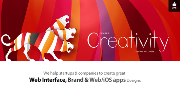
Subsign
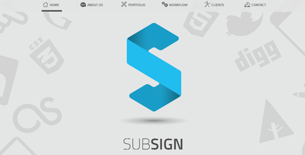
Subsign is a really cool website! It is based on a flat structure and the color combinations used impress any viewer. Another interesting feature is the use of a one single page layout. Definitely, the website is an example to sustain that the designers’ creativity is unlimited.
Sagacify
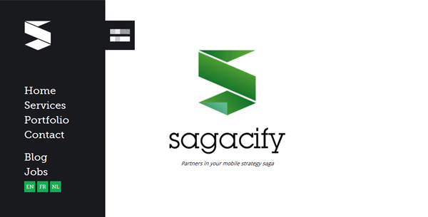
Quite probable, the most interesting part of this website is the discrete navigational menu. In spite of that, Sagacify is an accessible and usable website and it demonstrates that simplicity is beautiful. The smart use of tiles is another plus of this website.
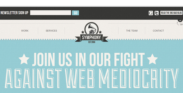
Kickpoint
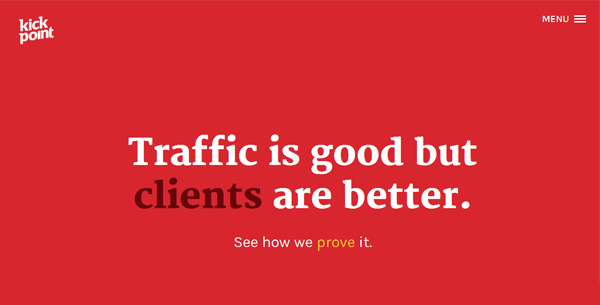
Fortunately, responsive design doesn’t mean only restrictions and issues. It’s also about HTML5, CSS3 and JavaScript and these are the basis of impressive websites, Kickpoint proving this idea. The animations used are very attractive and overall, the website deserves to be included in this list.
Jens Lehmann
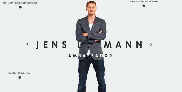
Jens Lehmann was a very good German goalkeeper and it seems that his website is at least as good as his evolutions for Arsenal London. Lehmann wanted to impress his fans with his less known facets: coach, commentator, ambassador and speaker. We wish him good luck and congratulations for such a cool website!
A Day in Big Data
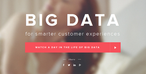
White, red, black, nice typography and talent are the ingredients of this website. It seems that flatness is highly appreciated by the design community once so many websites are flat/almost flat. This website contains many interesting items, the most attractive being the page transitions system. Did you notice the discrete string of rhombus on the right extremity- each rhomb represents a page; isn’t it a cool idea?
Kick My Habits
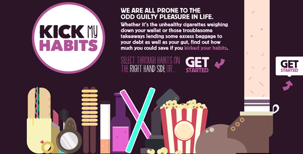
This website is special: it doesn’t only have a superb design, but also a cool idea behind. It helps everyone to determine how much money is spent weekly on various habits. I strongly recommend giving it a try!
Hot Dot
Hot Dot is a web design agency and their portfolio must stand apart in order to attract clients. Undoubtedly, they managed to create a wonderful website. Personally, I like the background very much- it’s a super 3D effect!
Barbara Olszańska-Żywalewska

Barbara Olszańska-Żywalewska is the owner of a beautiful portfolio. I may be subjective, but I fell in love with this website: from page transitions to illustration used, everything is amazing. The single downside of this portfolio is the media player- I guess that not everyone is interested in listening that kind of music.
Wallmob
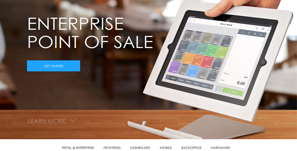
Wallmob is a technology inspired website and it is an example of aesthetic and beautiful design. It doesn’t have something special to let viewers in “awe” but the talent of the creator is obvious. The images used in addition to good typography are the best points of the website.
Matthew D. Williams
It is one of the best portfolios I ever visited: the website is perfectly structured and every item of it is added in order to let the viewer admire the uploaded works. In this way, anyone can make an idea about the designer’s skills without being disturbed. The design is modern, very discrete- there is no surprise that the portfolio’s creator used gray as predominant color.
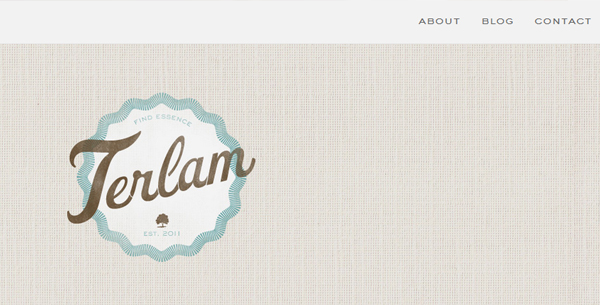
Viljami Salminen
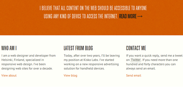
It is the duty of every designer to create websites that are accessible to everyone and every type of devices. It seems that this idea is the motto of Viljami Salminen, a talented designer from Helskinki. His website is very simple, allowing an enjoyable navigation no matter the screen size of the device accessing it.
Fuzzco
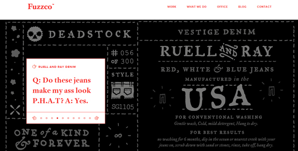
Usually, red is used to highlight some elements of a website. Fuzzco comes with a new idea: to use this color for content. Apparently, it’s not a very good idea, but after seeing this website, it’s quite probable to change your mind. Definitely, it’s a must see website!
Rally Interactive
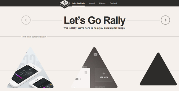
Flat design was the hottest trend of this summer and many designers embraced this style. Much more, it seems that it will be the trend of the year in web design. Somehow, it was normal to become bored by the skeuomorphic elements and to ask for more simplicity. This website reveals that flat is a good looking solution and there is room for more original ideas. I.e., the circle items are particularities of flat design, but the designer uses here triangles and some nice effects. I think it was a good idea, wasn’t it?
Web Design Swindon
This website is a very nice mixture: the background and the illustrations used are vintage, but the layout is flat. Usually, mixing two almost opposite ideas into a single layout doesn’t have a nice result, but this website is a very happy exception.
Designmodo
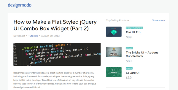
Realizing a good looking design is a difficult task, but creating a real good design is the work of divine inspiration. We tent too often to neglect that a good design should also work perfectly…something looking great but that has no utility is just “another kind of nothing”. Designmodo is a wonderful blog: the design is attractive, and it also works for the users. The white background and the blue shades create the best environment for reading the blog posts. The positive aspect of the blog is that the good design is “assorted” with high qualitative articles, therefore it deserves to be daily checked.
Web Place
Both designers and users state that simplicity is a key factor of a website. Unfortunately, despite of its meaning, simplicity is extremely hard to achieve. Less elements means that the website is incomplete, too many elements means that it’s not efficient. Web Place is a great responsive simple website…nothing more or less, just what is vital.
UIG Studio
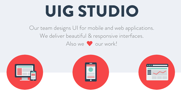
UIG studio is another example of high quality responsive design work. The simplicity and the focus on the content are the main features of this website…in fact, the features of a quality website. Bonus points are given for the site using a web accessibility widget. Mobile responsiveness is critical for accessibility, as people with certain disabilities rely solely on their phones to access websites.
Trionn Design
It’s practically impossible not to be attracted by this website. The header is vibrant and eye-catching and it is the guaranty that people will pay attention to this stunning online presence. It’s a very smart idea, because the rest of the website is very simple. Congratulations to the designers, they applied perfectly the recipe of success: headers attract the visitors while content maintains them!
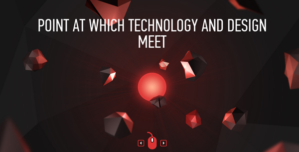
Cyclemon
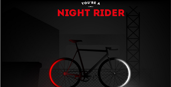
This website has as main purpose convincing people to buy bicycles. Definitely, it fully accomplishes its destination. The impressive scrolling effect and the illustrations used are the “forte points” of the website. Each bicycle has its peculiarities that are appropriate for various types of people, therefore visit this website and determine which one is suitable for your taste.
Grega Žemlja
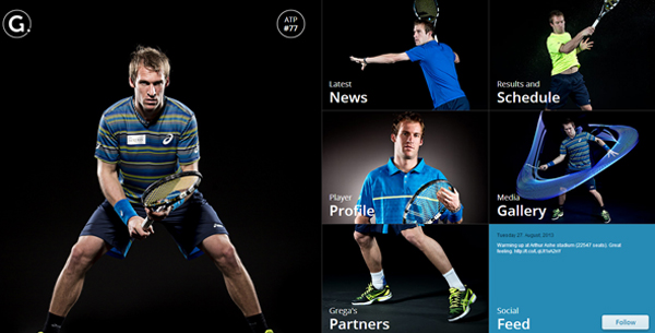
Grega Žemlja is a very good Slovenian tennis player and his personal website is a real masterpiece. The page transitions effects are very cool, everything is dynamic and the overall effect is that it doesn’t let the visitor get tired. If you are not a fan of Grega, then it’s impossible not to love his website!
Reflection
I hope that these examples convinced everyone that responsive design is a solution for the future of web design. Taking into account that in the near future new gadgets, i.e. Google Glass, will be released, it became even more evident that it is the single viable approach regarding the website construction. Do you like these websites? Please share us your opinions via comment form!


 9 Ways to Increase Your ROI in Your Website Design
  [Review + Giveaway] Now UI Kit PRO – Perhaps the Last UI Kit You’ll Ever Need
  Introducing eWebDesign Version 3!
  [Review + Giveaway] Ultra Theme by Themify – How Powerful and Flexible Is It?
  [Review + Giveaway] 5 Developer’s Licenses for Simplemaps.com ($2495 Combined Value)
splinterteal Mar 5, 2014, 2:57 pm
why is my site not listed here ?