Looking back at the past year, it seems like it was just yesterday that we were wowed by the popularization of one page or parallax websites. After Flat Design refurbished what we know about good design, websites became enhanced by different trends that seem to make web design better and more beautiful. 2014 is a few notches away from saying goodbye, and we would expect a few things that trends that might become popular.
As designers, it will be cool to easily adapt to such trends. Of course it entails a lot of changes. Having to change your taste of what beautiful design is, will never be easy. It requires some transition. Sadly, sometimes, before you can even adjust, the trend is already so famous that you’ll just be riding the bandwagon.
But how good will it be to really be one of the early adapters? Of course, this will require you to become one of the movers and shakers of the design industry. That, or you just need to be aware of the little changes that happen.
So what are the things that seem to rise up the buzz in the web design industry? Let’s discuss a couple of them:
Material Design
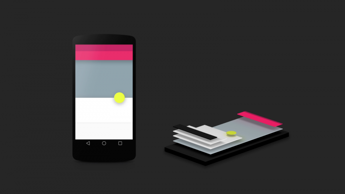
On June, during the 2014 I/O Conference, Google launched a new visual design language. They called it Material Design.
For those who don’t know what it is, Material Design is a device-adaptive design language that embraces a unified system of interaction. It is beautiful because it solves design problems that keeps most web designers up all night.
Also, one of the many beauties of this design language is that it has its free online documentation. This discusses the whats and hows of material design. It also gives an ample amount of lessons to get you started and in here you’ll learn the dos and don’ts of the whole interface: from animations to z.
Material Design has Three Principles:
- Material is the metaphor
Material is metaphor refers to the theory that surrounds a rationalized space and its relation to motion. In material design, the interface itself is tactile. Basically, it’s like paper and ink; the only difference is that it’s digital and more flexible.
This means that the cornerstone of the design is based on how light, surface interacts with movements. Materials also adapt realistic lighting and shows seams, space and movement. In material design, the surface and the edges of the material provide you a perception of reality. The use of these realities will help the user understand the relationship of each element to the functionality.
At first, you may think that material design is basically skeumorphism; but it’s not. Although it uses the same principles as skeumorphisim, material design is different because it allows a cleaner design without sacrificing the physics of the material world.
- Be bold, graphic, intentional
Material design encourages the use of large-scale typography, edge-to-edge imagery and white space to make it bolder and more susceptible for a good user experience. It lays its foundation on typography, grids, color, space and other visual elements to emphasize functionality. It provides a better aesthetic and better functionality.
- Provide meaning with motion
Motion reflects the user’s actions and allows him to have full control of the interface. In material design, objects are given to users without having to break the continuity of the user experience as they tinker the interface itself. It makes motion meaningful and appropriate. It makes the user focus and sustain attention to a clear yet subtle environment.
Truly, material design offers great solution. It will address real and changing problems. Thanks to Google and Material Design, the diversity and erratic change of devices and screens can be clearly addressed.
Additionally, now that Material Design is out, designers can achieve flexibility. The guidelines that make it easier to adapt to larger or smaller displays will surely help you design easier and better.
Material Design is not just flat design. It’s more. It is a combination of the cleanliness and object-oriented-ness of flat design and the tactility of skeumorphism.
To learn more about material design, here’s a video:
Cards
You may be unfamiliar with what they are called, but you see cards everywhere. Over the past months Cards have become popular because of how it makes mobile browsing better.
Cards are groups of information visually presented in rectangular shapes. Like most card-shaped things we know like trading cards, calling cards or even credit cards, cards in the web give quick and beautiful information stored within a little amount of space.
What makes card popular is that they are interactive. They make users do something, and by that it’s not just data-presentation. Cards, commonly present in social media and mobile apps, demand actions like swiping or dragging to make the technology more tactile to human interactivity.
Uses of Cards
Here are a few reasons why you should use cards in web design:
- To grab attention – they are interactive elements, therefore, they attract more attention than most design elements like text. Also, it being short and beautiful adds to the attention-grabbing ability of cards.
- To cater to all devices – cards are excellent for mobile apps because they give a lot of information within small spaces. So if you want to target responsive design, using them will be of great help.
- To present content – cards are short but stout. They are contained in smaller spaces but they can present the basic content properly. This makes the reader become more interested in what information can he get, thus hell read the entirety of what you want him to.
How to Use Cards in Web Design?
Of course, the answer here is pretty simple: Foster interaction. As a designer, you have to make sure your users are able to interact with the content so that it transforms into viable conversion. In order for that to happen, you have to think of how users will interact with your content and vice versa.
Types of Cards
- Card as Record – applications like Apple Passbook, Cloud Magic, Target or Citia all use cards for recording purposes. They are storage of data for further uses.
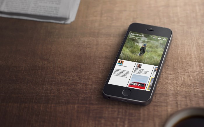
- Card as Teaser – cards provide excerpts to articles and content. Examples include Facebook, Flipboard and Pinterest.
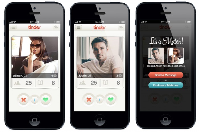
- Card as Alert – card alerts are time-sensitive choices that notify you of something. Common applications include Tinder, Seer and Jelly.
Conclusion
These two trends are already there, but not as famous as other trends are. My advice? Study them before they get famous. Why? Well simply because it’s better to fight a war that you have prepared for than to prepare for a war you’re already fighting. Think of it.


 Teamstack: Team-as-a-Service Provider with Convenient and Secure Solutions
  Aviationstack API Review
  The Anatomy of Great Website Design that Google Loves
  11 WordPress Design Trends for 2019
 How You Can Boost Conversions with Minimalist Web Design
Monica Savasta Dec 16, 2014, 9:21 pm
I am really hopeful that Paralax web design will die. My fear is that it will die a slow horrible death. I have trouble every time I try to book a flight on Virgin, as an example of a website that should never have gone Paralax.
Oh, and BTW, it’s not that I have a hard time adapting to “beautiful” design. Paralax is not beautiful on a laptop or large screen. It’s ridiculous. There I said it!
Card design and material design look much more hopeful. And, I hope will adapt to laptop/big screen much better than paralax. I am being brave enough to disagree with many designers who think Paralax is great. I think it is more the bastard child of good responsive design. My 2 pennies worth.
Rudolph Musngi Dec 19, 2014, 10:39 am
I somehow agree that parallax design is not exactly beautiful. However, it started to be something innovative, thus masking its potential problems. Card and Material design really look hopeful. They focus on interactivity and works alongside with functionality.
dreamtreps Mar 5, 2015, 8:50 pm
I think its give me more information.And its a good idea.
Jonathan May 5, 2015, 7:32 pm
Some interesting concepts. Personally I think we’ve hammered to death the web interface and need something that is more…
Ideally simple layouts (we have a tonne of pages at our disposal) – with perhaps one simple idea (cards motif perhaps). Content that can be added to in sections by the community (sort of cross between CMS and Wiki).
Full control of layout without worrying about this device and that device – who cares. There will always be new devices – resolution is getting higher and higher – smart devices, bigger and bigger. Do we really want to re-invent a website every 6 months because some new tech comes out? (rhetorical question)
As always focus on content and the way in which it is portrayed. I think infographics go a long way towards something… perhaps… include hyper linking stuff and decent content and maybe we are getting closer