No one can deny that the internet, design and technology in general have changed over the years. Not only they have changed, but we, as creators and consumers, have changed as well. Things are happening so fast, it’s hard to stay afloat and keep track of what’s in and what’s out. We feel compelled to dish out new things and ideas literally month after month. Consequently, the trends change phases quicker than the moon. 2018 was an exciting year for WordPress design, but from what it seems, 2019 is going to be even crazier. Let’s take a look at some of the upcoming trends for the last year of the twenty-tens.
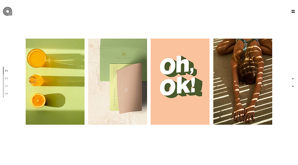
1. Asymmetry and Broken Grids
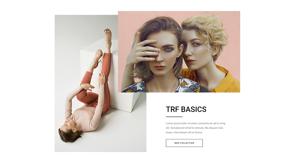
2019 may just be the year of design rebellion, when some well-established rules get broken in favor of bolder, more dynamic choices. Speaking of breaking things – broken, irregular and asymmetrical grids seem to be on the rise, at least judging from some of the themes we peeked at recently. Layouts will be all over the place, with text and images overlapping as if in some unintentional code error. Playing it safe, with tidy, symmetrical layouts is apparently so 2018.
The deliberately irregular patterns, sliding images and elements overlapping all over the place are meant to spark the interest of the viewer, presumably oversaturated and downright bored with the clean, neat and by-the-book layouts.
Designers beware, though. The line between edgy and messy is a very, very fine one. With this sort of design choices, your website can either appear as visually striking and innovative, or it can come off as cluttered and sloppy. Your main goal is to convey all your visual and textual messages in a clear way, so try not to overdo it and don’t overstep the line.
2. The Demise of Pop-Ups and the Rise of Sticky Elements
We all probably agree that pop-ups are useful and serve a very important purpose. However, over the past couple of years, the use of pop-ups has become so exaggerated that the users now perceive them as obtrusive and rude. They’re like flies, really. In fact, we could even talk about users being downright “pop-up blind,” not even noticing these annoying little guys anymore.
To overcome this, designers are resorting more and more to sticky elements instead. Smart, nicely designed and strategically placed sticky elements are probably going to take you way farther than pesky pop-ups. They offer (and collect) important information, but without disturbing the visitor. In 2019, we’re probably going to see sticky bars at the top or the bottom of the page being explored more and more, and not just for promotional purposes.
3. Maximalism (But Also – Minimalism!)
Some say that minimalism is dead. Not just in web design, but in general. Take a look at some of the recent runway shows of the biggest couture houses, and you’ll see what we’re talking about. Clean, quiet and reduced style is making way for bolder choices, louder graphics and an absolute rejection of empty space. Well, that’s not quite right – empty or negative space is there, but it is reduced to the minimum, and it is precisely there that all the action (i.e. messages) take place. This may be a passing trend or it may, like minimalism, stick for another decade or two. We just have to wait and see.
On the other hand, minimalism is also having something of a comeback. Better yet, it’s being overhauled and revisited. Right now, there are so many minimalistic websites out there, it’s no longer interesting to anyone. Minimalism has become norm-core, so to speak, and it was time for a change. In 2019, designers will smartly use animations, various fade-in effects and engaging scrolling to make room for more spaced-out content and therefore more clear space.
So, which of these two will overcome in 2019? The truth is, there’s no definitive answer to this question. Some sites may benefit from maximalistic design, while others will thrive on minimalism. For instance, minimalistic approach is probably still a better choice for e-commerce sites, where the accent needs to be on products as much as possible.
4. Mobile-First Design and Thumb-Friendly Navigation
As of 2015, the majority of web searches and web traffic in general has been taking place on mobile devices, rather than on desktop computers. This is a trend that does not show signs of stopping, which is why developers and designers alike have already embraced the “mobile first” model. More importantly, when indexing websites, Google prioritizes mobile-friendly websites. This means that, if a website is not 100% mobile ready, it is as good as dead, as far as the world’s largest search engine is concerned.
The mobile-first design means that when a website is designed and built, the starting point is the mobile version, not the desktop one. This is something that a lot of companies have been doing for quite a while but it will become a definitive must in 2019.
Responsive themes are hardly a trend per se. They should rather be considered as the best practice. Still, mobile-first does count as a trend since mobile usage is only going to rise even higher and responsive websites will require even more focus and attention.
Another thing worth mentioning here is the thumb-friendly navigation, designed in a way that optimizes the use of thumb, especially the right thumb. According to research, most people use one hand to hold and operate their mobile phones, with thumb being the main tool. Even when the mobile device is held with both hands, in the majority of cases the most used finger will be the thumb. Thumb-friendly navigation means placing the most frequently used interactive elements within the thumb zone. The top left corner of the screen is no longer the go-to place for menus, as it is the hardest area to reach. This trend is going to be explored more and more in 2019, with design changes reflecting the way we use our phones and interact with mobile sites.
5. Saturated Color Schemes
Just as designers no longer feel like playing it safe with tidy, regular layouts and symmetrical grids, they are also starting to experiment with color schemes. The general rule of thumb always used to be to “keep it toned down” – no loud colors, as those are considered tacky, vulgar, even offensive to the viewer. Well, the tide is turning, it seems, as bright, bold, over-saturated color schemes become a major trend for 2019.
The so-called web-safe colors are becoming obsolete, a last-years trend, even though this particular trend lasted for well over a decade. The dull, pastel websites with toned-down colors may be visually and stylistically safe, but they’re hardly an expression of an innovative spirit. For this reason, more and more designers are opting for daring colors that really make websites pop.
Another reason for this trend may be the fact that bright, bold, saturated colors actually look terrific on retina screens, which are also gaining momentum.
Finally, bold colors are very hard to manage and they are definitely not for everyone. Designers consider pulling such colors off as a kind of a feat, an endeavor that testifies to their skill, expertise and good taste.
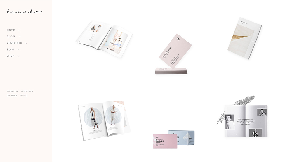
6. Vector-Heavy Design
Many of you have probably already noticed that more and more designers use vector illustrations for their websites. This sort of a solution is ideal for a number of reasons. First, it’s definitely more innovative and inspiring than the use of, say, stock photos. Everyone appreciates a good illustration, and if we have to choose between a super-cute vector illustration of a couple sitting on a bench in the park and a generic photo of the same scene, it’s clear who’s going to win.
Another reason is that vector-heavy websites showcase their author’s originality and uniqueness. Everyone can purchase a stock photo to use in a layout, or even snap a photo on his own. But not everyone can come up with a smart, cute vector illustration that benefits the overall style of a website.
Plus, even if you don’t have a vector designer on hand or don’t want to hire one, vector illustrations are available for purchase online via various marketplaces.
For all these reasons, and because of the obviously positive emotional response the users have to vector illustrations, we are certain that vector design is going to go through the roof in 2019.
7. Monochrome Palettes
Choosing to design your website in all blacks and whites is a daring decision, to say the least. Monochrome is definitely not for everyone. But we have noticed that more and more designers are toying around with the bold, black and white schemes, especially when designing sites for the creative industry.
What makes black and white such an interesting, effective choice? Well, every color tells a story. Every color conveys an emotion. They say that black and white are not even colors, but combinations or reductions of all other colors. The color white spells clean, innocent, empty, fresh, new, while the color black is strong, assertive, all-encompassing, aggressive even. Combined, the two form a perfect symmetry. More importantly, they leave enough room for other elements to shine.
In addition to all-black and white websites, we have also noticed the use of color accents combined with a completely monochrome palette. These are generally used in strategic places, to accentuate points of interest on the page, as well as calls-to-action. This is a very smart choice that is not only visually striking, but also highly efficient in terms of user experience and interaction. Considering all this, it’s no wonder black and white websites are going to be a thing in 2019.
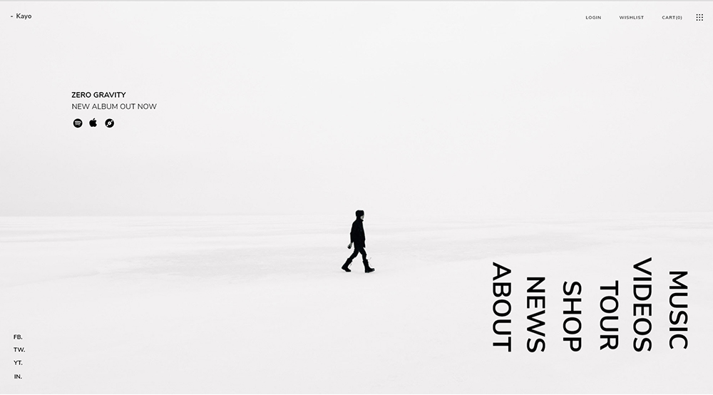
8. Bold Typography Choices
Again, a trend that may not be particularly new, as we have seen it a lot in 2018, but, nevertheless, a trend that’s only going to increase. Bold, loud typography choices are on the rise as designers feel that exploring the volume of a type can really allow for other elements to set in around them in a way that accentuates certain messages. Big typefaces also, paradoxically, allow for empty spaces to exist without seeming unfinished.
One of the factors that contributed to the rise of “loud” types is the wide availability of custom fonts. You no longer have to include them as rendered images in JavaScript – now there are ready-made sets you can purchase (oftentimes, they are already included in a WordPress theme) and easily embed into your website.
Another thing we noticed that is probably going to become even bigger is the use of serifs. You know how they always used to say serifs are for print, sans serifs are for web? Well, that’s another rule that’s going to oblivion, apparently. Serifs add a certain special flavor to the page, provoke a sense of sweet nostalgia and even instill a somewhat distinguished, literary vibe.
On the other side of the spectrum we have saturated, messy, even broken fonts and irregular distribution of types across the screen. This is part of the asymmetrical trend we talked about earlier and works amazing for some websites, especially those with flat design.
9. Video Becomes Even More Prominent
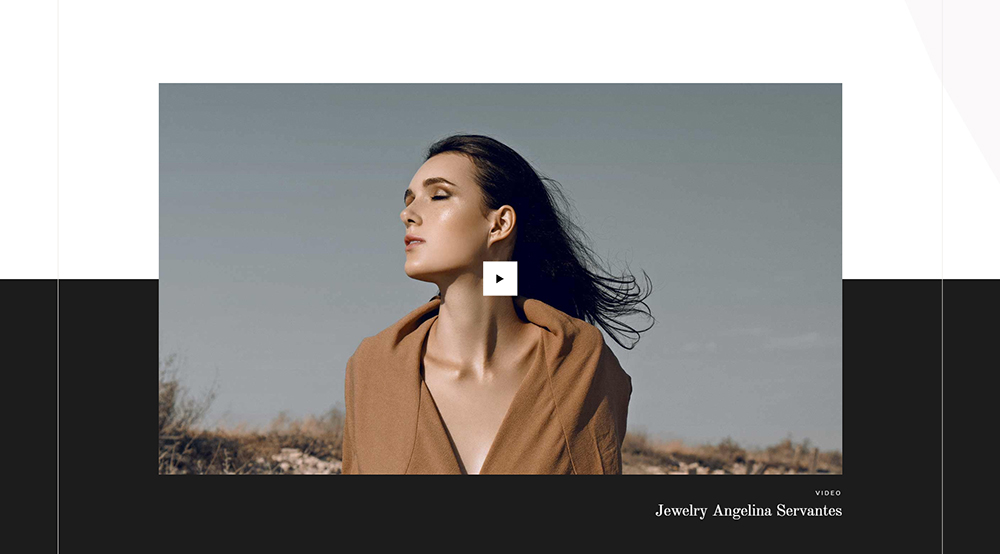
Video as content is becoming more and more important. Everyone is rushing to post videos on their websites, in whatever context. It can be a video header, video background (often with parallax), a pop-up, a video page with how-tos, video showcases… Riding on this trend, designers are trying to create more space for videos or to come up with innovative, creative ways to display them.
Video headers are going to be particularly big in 2019. Looped video headers have been available since the WordPress version 4.7, and this possibility is going to be explored to the maximum in the coming period. In fact, the video-first approach in web design is something that many websites are already opting for. One of the reasons for this is that social media networks are focusing a lot of attention on streaming and video in general, so WordPress is naturally quick to offer easy integrations in this aspect.
Also, have you noticed how dynamic backgrounds were a big thing in 2017 and 2018? Well, in 2019 they’re going to be even bigger, but based more on video than on images or animations. Fullscreen video is a great design tool. It leaves a great impression but doesn’t pose a distraction.
10. Gradient is Back
Oh, gradients. They were so big a while ago when all that ‘80s nostalgia rolled in. They kept quiet for a while, and now they are back, with vengeance. As it happens, retro trends never really go away. They just scatter across the hectic stylistic landscape we live in today, poking their head out every once in a while to make a big splash. Well, in 2019, it’s time for gradients to take center-stage.
Gradients also fit the bold color scheme trend. As per their nature, they allow for the use of extremely expressive colors that change their dynamics and gradually tone down, for a memorable effect that is both daring and tasteful.
Another thing that makes gradients a popular design choice is the fact they allow for creation of (almost) new colors. You take colors that are perhaps even a bit worn out due to overuse in web design, combine them and get a completely unique visual result. Not to mention that they represent a cool “cheat” for websites that don’t offer much in terms of illustrations, photos and unique imagery.
Gradients are also neat when combined with similarly conceived image filters, and we are definitely going to see a lot of those in 2019 across the web.
11. Virtual/Augmented Reality
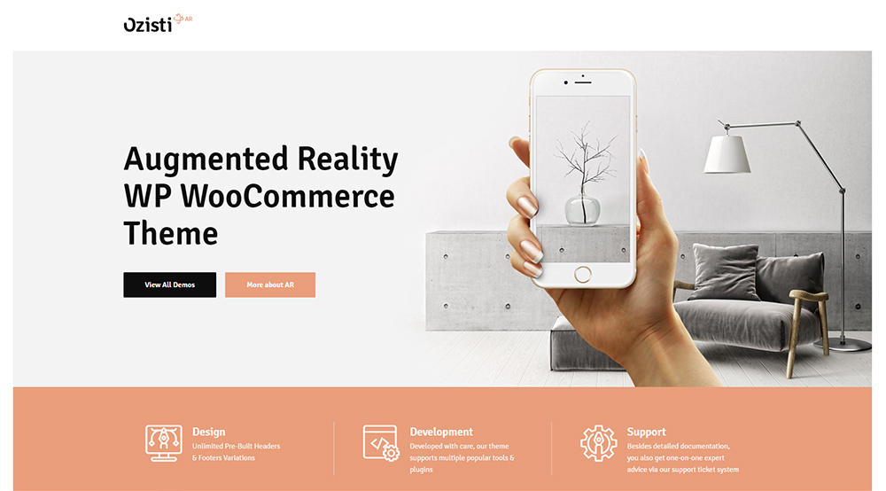
Web design must always follow broader technology trends, or it’s going to become irrelevant. If tech says “virtual and augmented realities are the future!” design is already at the drawing board, coming up with an innovative solution to implement it.
In 2019, virtual and augmented reality are going to be even bigger, as VR/AR hardware prices go down and the technology becomes more accessible. WordPress already comes with VR integration capabilities and there’s also the popular WebVR API with a number of builder tools based on it.
Virtual reality is probably on its way to transforming the nature of web design forever, just as it is already transforming the way we view and interact with web interface. Now, it’s important to point out here that virtual reality in WordPress is not exactly like virtual reality in, say, Johnny Mnemonic or Matrix. It’s way more practical than that – and that’s precisely why it will become ever more relevant.
For instance, a website with virtual reality elements may offer a 3D view of a layout, a product or a space. If you think about it, you’ll probably remember having some sort of VR/AR experience on a website, most likely an e-commerce shop. Well, you’re probably going to see even more of it in the coming year.
Conclusion
There you have it – old trends revisited, new trends imagined, some of them crazy, some of them rational. For better or for worse, these are the trends that are going to mark the year 2019 in WordPress design. If you’re in the industry, better take notes. The train is taking off soon and you definitely want to be on board!


 6 Must-Follow SEO Tips For Every WordPress Photoblogger
 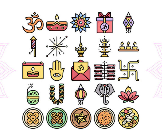 Freebie: Diwali – Creative Kit
  All Websites Should Feature Videos and Here’s Why
  Free Resources for Web Designers and Developers
 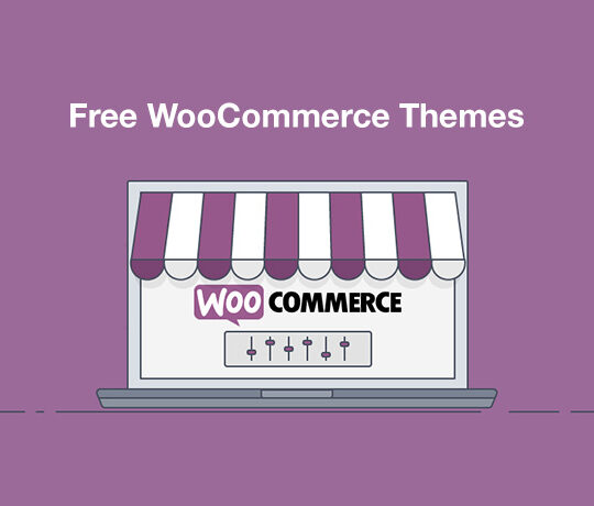 Top 16 Free WooCommerce Themes
DAVID Apr 10, 2019, 4:47 pm
Hello ,
Nice your blog and i am impress. About WordPress Design Trends more do update. Thanks