A landing page, sometimes called as a lead capture page, is usually used for analytical purposes on the web, but not only. Sometimes start-ups that release smartphone applications decide to create landing pages for those, instead of whole websites. You can find some pretty good and creative examples of them on the internet, but I have decided to make your job easier today and do it for you.
So below you can see my favorite creative landing pages that can be found out there. Let’s take a look at them together.
Landing Page Examples
Statusboard
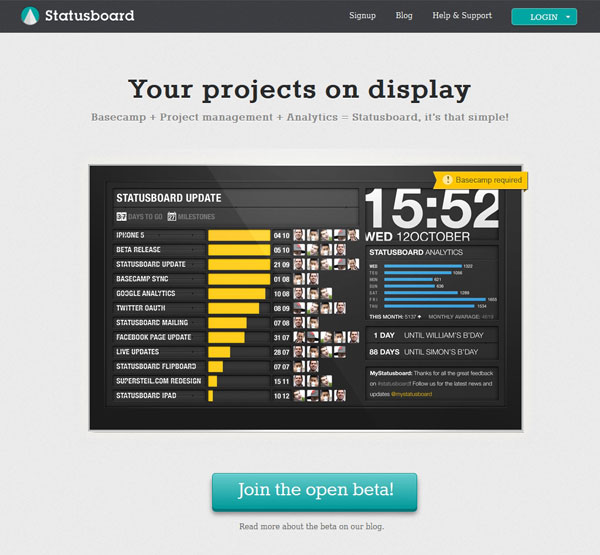
Statusboard is a great example of how to make a landing page for a product that is currently in beta. What they do by this simple, yet not simplistic example is that they show people just arriving on the page exactly what the product is about.
This is the key in creating a landing page, therefore I believe this example is a very good one.
Bord
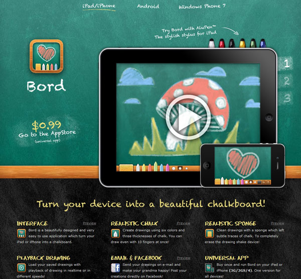
This second example is one of the ones that I liked the most because it is very creative and because it brings the whole experience and environment of the app to the website. Moreover, you can actually see that this happens, thanks to the design of the landing page, where both devices that this app works on are showcased – as well as how the app looks on each one of them.
Bord should make people feel like they are chalk drawing and this is what inspiration the landing page tries to give you; and it actually manages to!
Instagallery
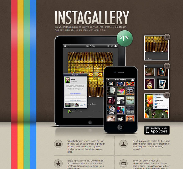
Although not an official Facebook product, as Instagram is, Instagallery definitely looks like it. This is because Instagallery is an app that will allow people to browse galleries of posts on Instagram in a different way than with the original app.
When looking at this landing page, you actually get the feel that you are using an Instagram app – which can both be a good or a bad thing. But by just looking at this landing page, you understand right away what this app is all about – and this is only positive.
Tea Round
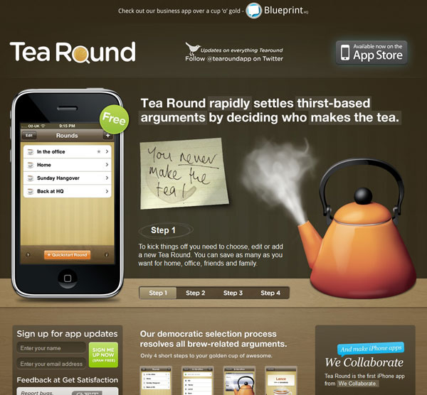
I like this landing page because it offers a lot of information about the app, as well as images so that visitors can get used to the app’s feel. However, if there is something I am not entirely fond of, then that is the fact that there is not too much negative space.
I feel that while the concept and the idea are really good, the design could be a bit better. Nevertheless, this is also a creative example that needs to be showcased here.
Sprout Social
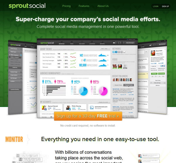
This landing page is another good example because it features images and graphics from the actual application, which normally familiarizes visitors to the feel and environment of the product.
This will make sure that the user knows what he is throwing himself into, as well as it will make sure that users feel informed about what the app looks like.
This one actually works more as a one-page website, but I have decided to showcase it here because it comes with all key elements of a landing page – most of them put very well into practice.
Bundlr
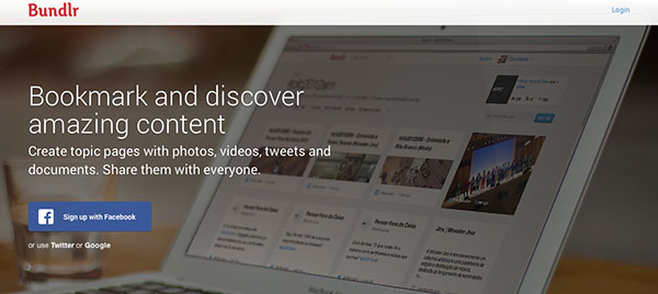
Bundlr is one of my favourites because it is very simple, while also telling a short story about the actual product. It explains users what the product does with a short tagline and a description and frankly, this is what landing pages have to do – so this one is a great example of a simple, yet useful landing page.
Ringer
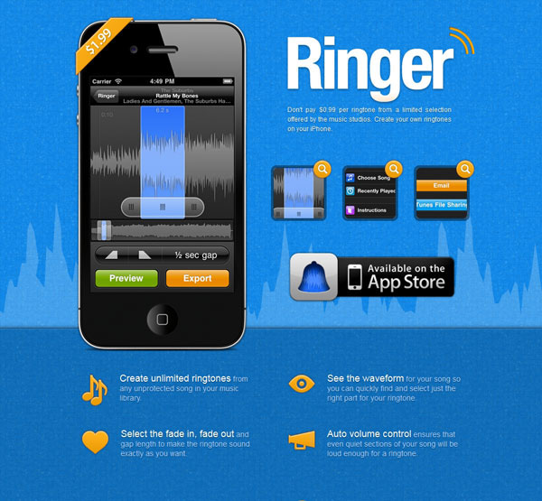
Ringer’s landing page is also very well designed because it offers enough information to the visitor about the application, without throwing too much of it at him.
Moreover, the application screenshots used show the user how the software works, which will only make it easier for him to cut his own ringtones when he will use the app.
Only one small observation… why is the price not featured anywhere?
Fliprate
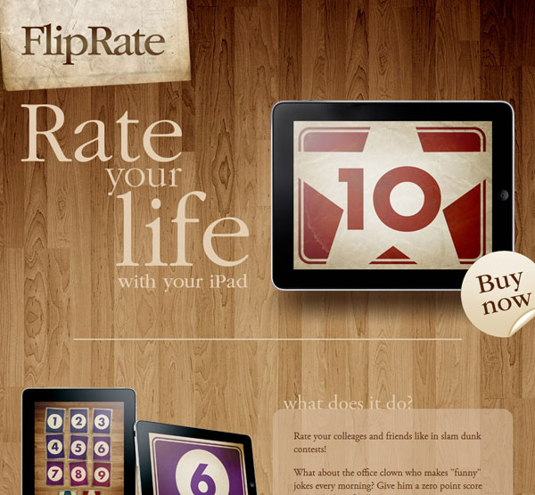
The design of this landing page deserves special attention. It is very simple above the fold, which will make you understand what the app does, and if you want more information, you are free to go below the fold, where you will find some other information.
eCoki
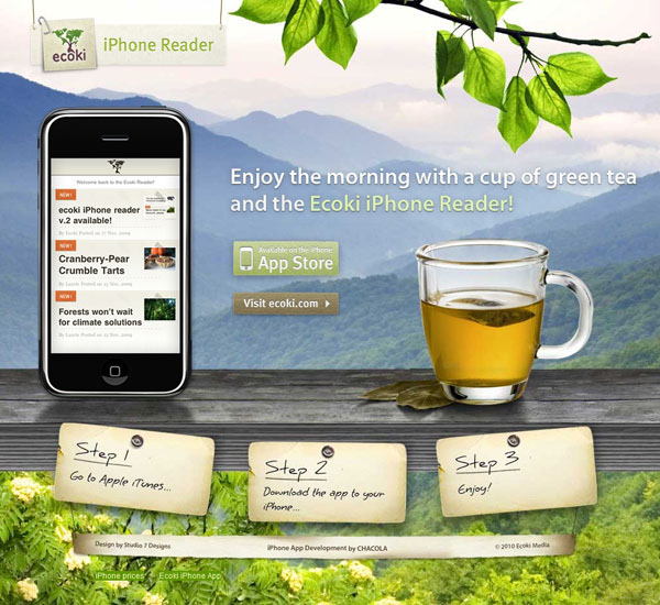
What I like about this example is the fact that it combines the feeling of nature with the pleasure of reading – and this is definitely the purpose they had for designing the landing page like that.
In my opinion it works very well and I like the fact that they show a preview of how the app looks on the iPhone. But maybe it’s time to change the iPhone 3G to the iPhone 5? It would most likely make the user think that the app is for the most recent phones as well…
Nota
Although a very long landing page, this one also works very fine and is actually one of the ones that I like the most, because of its simple design, use of negative space in the Apple style (below the fold), short taglines with description and high-quality images.
If you go through the whole page you will know how to use this app and what it is it can do. You won’t know the price though, which is something that bugs me.
Flightcard
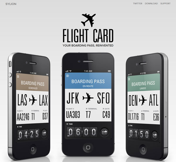
Although since the launch of Apple’s Passbook, Flightcard hasn’t been such a success anymore, their landing page can still set the guidelines of how to make this thing work.
They also use high-quality previews of their work, customer testimonial and brag a bit about some other features and achievements.
SmugMug
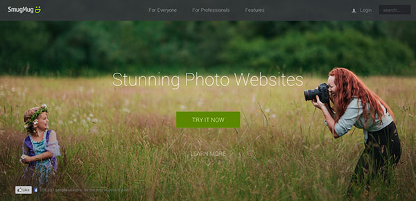
I like SmugMug’s landing page because it is based on visual impact a lot and I generally love these ones. When you first enter the page, you will get drawn in this beautiful world of amazing photography and you won’t want to leave. This is what is going to keep you on the page to find out more about their product.
Tumblr
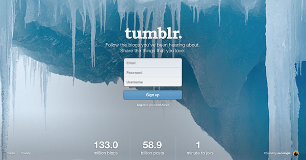
Another good and well-designed landing page is Tumblr’s (I am wondering why…). They definitely set the guidelines on how to make this thing work well.
Their landing page is so simple and yet informative and makes the user wants to try the product simply because so many others do. This great landing page has been definitely through lots of A/B testing and if this is what they use, it means it works great for them.
Tap Monkeys
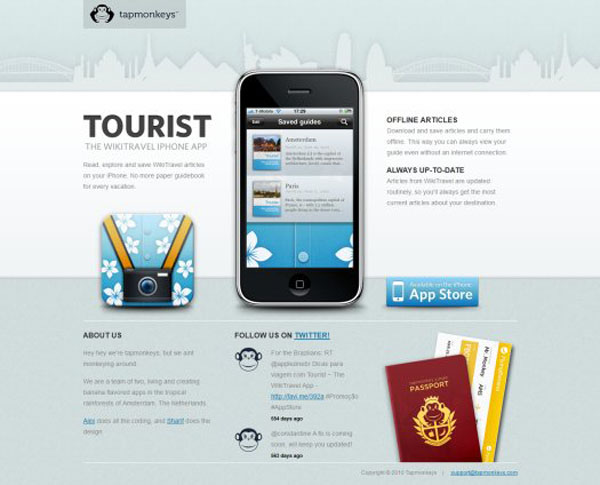
This last example is also one of the ones that I like because it explains in short and understandable sentences what it does – and this is the purpose of a landing page.
I am also quite sure that this one has been through some split testing, so if they still have it after quite some time, it means it works very well.
With this last example we close off today’s showcase. I hope you found some inspiration in the examples above, so that you can design yourself a great landing page that will work for your product and purposes.
I am looking forward to hear your replies and comments to this showcase, which examples from above did you mostly enjoy and why?


 [Review + Giveaway] CSS Hero – The Fastest Way to Customize the Design of Your WordPress Site
  Introducing Iubenda’s Privacy and Cookie Policy Generator for Websites and Apps
  20 Super App-presenting Websites
  Avoid These 7 Usability Mistakes When Designing Websites
  Clean and Uncluttered News Websites are a Reality Nowadays