Website are easy tools for attracting customers towards a brand. If you’re successful in building an appealing website, there are greater chances for gathering the attention of targeted audience. In addition to visual features, usability comes up as a key point of concern among individuals who’re looking ahead to render a great user experience via their website. If you’re a web designer, I’m sure you’d be well familiar with the importance of incorporating extensive usability within the website.
Well, usable websites offer an amazing user experience and grow your chances of converting visitors into high-paying happy customers. Smart web design decisions can actually take you towards the path of success. Being a web designer, you need to delight and satisfy your visitors, rather than annoy or frustrate them. As you read through this blog, you’ll come to know about 7 common website usability mistakes that are being committed by web designers. So, let’s get going.
Usability Mistake No.1 – Inappropriate usage of pagination
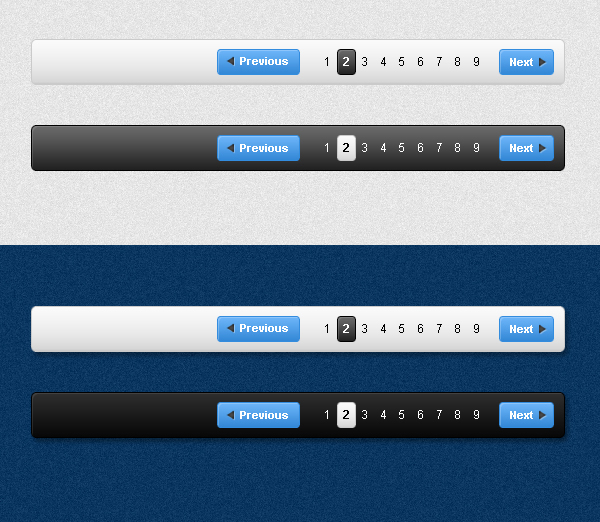
Using pagination for websites with long list of items makes sense but now web designers have started using it for web pages that contain articles, blogs, press releases etc. Although using pagination in such a manner serves as an excellent tool for squeezing money from ads, it sounds annoying to the visitors. Additionally, websites containing such pagination have lesser chances of getting crawled by Google and other popular search engines.
Usability Mistake No.2 – Skipping a communication channel
User engagement is a vital element of every website. There are web designers who often neglect this fact and skip including a channel that can allow visitors to get in touch with the website representatives. There are website that even don’t have an email address or a contact form. If you want to build strong work relationships with your visitors, its important to incorporate a good communication channel that will keep you connected with the visitors.
Usability Mistake No.3 – Including tiny clickable links
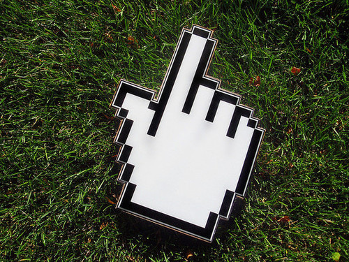
It makes complete sense to ensure that the hyperlinks are easy to click.But, there are designers who opt for including multiple tiny links on a single page, making the visitor annoyed. Hence, it is advised to opt for larger clickable links that make it easier for the visitor to hover his/her mouse over the link and see the contents.
Usability Mistake No.4 – Using same title for multiple web pages
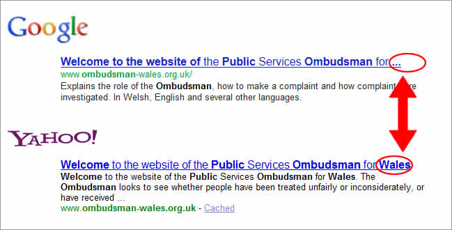
There are web designers who opt for using the same title for multiple web pages. This is wrong. With duplicate titles used for several web pages, the website can lose its chances of getting crawled by Google and other popular search engines. The website’s ranking gets adversely affected when the web pages contain same title. While surfing through your website, visitors can easily figure out whether they’ve landed on the right place or not.
Usability Mistake No.5 – Sustaining outdated permalinks that point nowhere

Most of the web designers often tend to ignore the importance of managing permalinks for a website that has been restructured or moved to a different domain. These old permalinks need to point to an active web page. A 301 redirect is the best solution for making such outdated permalinks point to existing pages on the website.
Usability Mistake No.6 – Lengthy Registration Forms
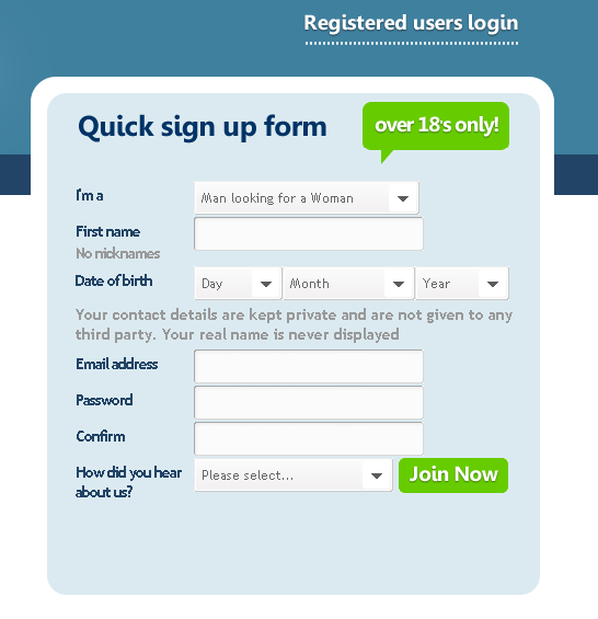
There are web designers who oftenmake the mistake of creating Registration forms with several fields. People want to invest a lesser amount of time and efforts to register on your website. Keeping this in mind, the web designer needs to shrink the count of form fields to make website visitors sign-up without wasting their time and energy. The must-have fields of a Registration form include the username, email address and password. It is important to keep the form as short and crisp as possible.
Usability Mistake No.7 – Not including a ‘Search’ option

People start looking for a search box as soon as they land on a website. Such search-dominant users get turned off by websites which don’t include an extensive search functionality. Whether you’re running an online store or a blog, a seamless search functionality will enhance your visitors’ count by an incredible level. There are web designers who neglect the importance of including a ‘search’ functionality within their site. This is wrong and must be avoided as a whole.
Concluding Words
By avoiding the aforementioned usability mistakes, it is feasible for every web designer to come up with a design that exactly matches the requirements of the client. Hope you’d have loved going through the post and derived good knowledge from the same.
Please do share your valuable feedback/suggestions using the comments box below.


 [Review + Giveaway] CSS Hero – The Fastest Way to Customize the Design of Your WordPress Site
  Introducing Iubenda’s Privacy and Cookie Policy Generator for Websites and Apps
  20 Super App-presenting Websites
  Clean and Uncluttered News Websites are a Reality Nowadays
  20 Great Websites Having Video Backgrounds