
About five or six years ago, I started dabbling with graphic design tools, particularly Photoshop. Over the years, I have learned through articles and tutorials online the fundamentals of design and I began falling in love with it.
The satisfaction it gave me to see my work being used was unparalleled. Perhaps, if I haven’t gone astray, I would have made a name as a graphic designer myself. But despite as my relatively rich experience in graphic design, I began craving for something more, and that is when I started studying web design.
Consequently, as I look back at what I learned through the years, I began a debate in my mind. Am I a graphic designer or a web designer? And are all web designers, graphic designers?
The arguments on both ends perhaps has risen a bit of a conundrum, since the two sides have so much in common that they sometimes conflict with one another. However, the purity of either side is clearly debatable when we take into consideration that each of the design, be it web or graphic, is actually a diverse and multifaceted discipline.
In this article, we will be trying to answer the question and perhaps arrive at a single conclusion whether you guys can be called graphic designers too.
Similarities between graphic designers and web designers
While both design medium are not exactly alike, in the macro perspective, they both play with different aesthetic elements that vary in their approach.
Both fields are essential for user-interaction and experience
Both fields revolve around two main ideas: user interaction and experience. Indeed, the argument here is evident: web design is user interaction intensive, while graphic design is experience suggestive.
Web design has a clear cut priority for user interaction; it also takes into account the economics of design to complete the overall UX or user experience. On the other hand, graphic design is usually associated and often hazily classified with just the print medium, which actually constitutes a very small part of the industry. Graphic designers go hand in hand with engineers and manufacturers in creating more efficient, simple-but-beautiful ergonomically helpful products that range from toilet paper to buildings to in-app illustrations you enjoy.
Both fields make use of visual techniques
Evidently, both discipline highly value visual techniques.
Color theories in web and graphic design
“Colour theory is a central and often overlooked area of design. On a simple level, the colours on the warm side of the spectrum – such as red and yellow – are bold, uplifting and energetic, while their cooler counterparts, blue and green, exude calmness and feel more reserved. This is particularly relevant when it comes to branding: on an emotional level, in terms of how consumers feel when they look at it; but also on a practical level, in terms of market standout.”
Indeed, the use of colors in both facets of design help in creating a perfect, subtle and clear medium for sending a message. Often, these messages turn to conversions that help businesses in achieving their goals. Both graphic and web design make use of beautiful color combinations and avoid the salty ones to produce visual-and-user-friendly interfaces.
When people see websites, graphical interfaces, or maybe even visual appendages such as flyers and infographics, they become attracted to it. Their attention is so much captured by the use of colors that the message or the copy itself is easily presented unto them.
Both are Adaptive to Change
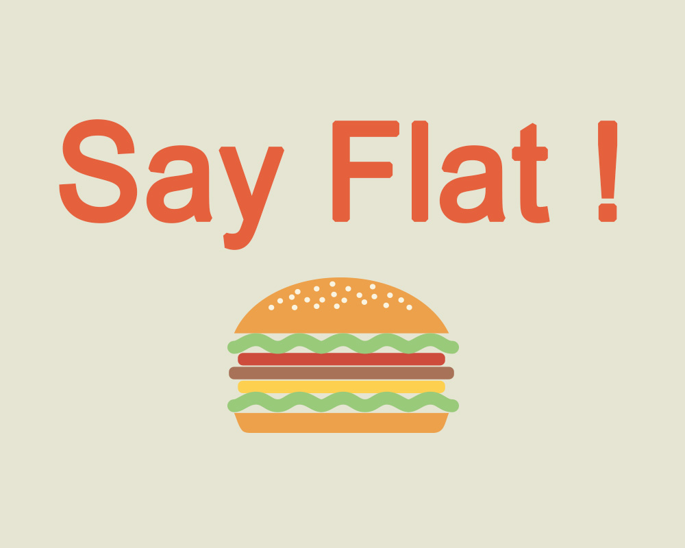
There are so much to love about this design style. It’s simple, beautiful, and presents a lighter experience. Both graphic and web design understand that the world of web design changes. It was not long ago when users were just trying to get the hang out of skeumorphism and then, gradually, the design style was eased out.
And in all honesty, Flat Design might be saying goodbye soon (or maybe evolving) as Material Design slowly becomes popular.
The point here is, both these design facets involve adjustment, and change. Both web and graphic designers are trend-conscious as they would want to make their work more appealing to more people.
The Flow of Information
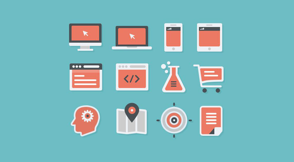
The flow of information or layout in both aspects depends highly on the output of the design. If the output is, say for example, print, the layout will follow a grid layout. If the output is the web, the layout must take into consideration the “F-pattern” layout.
In graphic design, the underlying concept most commonly followed is the rule of thirds, where each part of a surface can be divided into 9 equal parts, and the main object of focus must be in one of the intersecting lines. Other concepts, such as the golden ratio spiral or the Fibonacci sequence spiral are also common elements in print layout design.
On the other hand, in web design, while the grid layout’s basic concepts are at still at play, the quintessential success of the flow of information is defined by the “F-Pattern” layout by which web users scan pages. This means, if following the rule of thirds, objects or words that are of utmost important to be conveyed must be displayed on the top screen, the left vertical column, and the center of the screen. Oftentimes, the web designer must take into consideration the rate of scrolling of the web user. This means that the vertical movement of the page varies highly what web content is highlighted in the user’s field of vision.
Typography
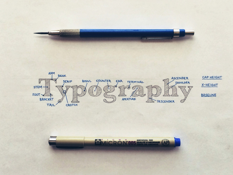
Letters and words, no matter how ‘old school’ they may seem to be, are still relevant and essential in both graphic and web design.
Without text to support the design, websites will fall into crumbles. Be it because of SEO failures or because there is simply nothing to get from the website. Remember that content still reigns as king. On the other hand, graphic design doesn’t really rely heavily on text but there are occasions where text brings out the beauty of the work.
But no matter how heavily reliant a design facet is to text, certainly, the way text is presented to the user is not something to be ignored.
Typography has long been existent, as man started to read. And with the presence of something to read, calls for a way to make that something readable.
Web and graphic designers employ different techniques to make the type stand out or compliment another element. These techniques are always directed to one thing: make the text readable. This striking similarity of text’s function in both graphic and web design makes them so much more similar.
Differences between graphic designers and web designers
It is unmistakable that both designs, though varying in outputs and medium, certainly have a lot of intersecting concepts at play. Nevertheless, there are certain traits that could not be found in one or the other, specifically the use of code and the valuation & reception of the design.
Code
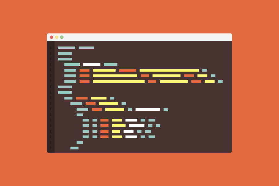
It is of utmost importance that web designers learn the fundamentals of coding by working with the basics of HTML, CSS and JavaScript. Although Google has the Google Web Designer for graphic artists who wish to put their work via the internet without knowledge of code, the working knowledge of coding can actually give a different perspective, perhaps, a design which leans more on logic, and probably an eye opener to opportunities of the muti-faceted and multi-dimensional industry that is the web.
Roles
The difference in roles is also another area that sets the two designs apart. The visual aspect of each website constitute only a fraction of the entire workload that goes in the design venture. Web design must take into consideration the fluidity of each of the principles that underlie the web page’s aesthete such as navigation, search engine optimization, form entry, usability, and commerce and conversion. All of these are the fundamentals of web design that Google, the web magnate, has identified.
The workload that it takes to create a single web page, typically takes four to eight weeks to complete a full web design project (assuming that the designer had performed well, the client can, and will, provide feedback in a reasonable rate).
In comparison to print designs which now have preset themes or generators to ease the layouting of the design output, whose bulk of time passed depends solely on the number of copies of the original print.
Both designs go through editing, however, web design, in the nitty gritty of code, can take much longer to identify the bug or glitch that makes the whole site not load properly as desired, as oppose to graphic print design, where the errors are easily pinpointed.
Conclusion
Web designers, as seen in this article, actually use several graphic design concepts, mostly relevant to minimalistic creations in art, and often do not deviate far from the original graphic design principles. They too rely heavily on creativity, although they make use of their creativity in a more economic and precise fashion to ease user experience. Like any graphic designer or artist, web designers seek inspiration in the everyday and also do not undermine the essence of peer evaluation.
The debate in the classification of web designers is rendered moot, as we have seen that though there is a difference in medium an output, web designers, like any artist, tries to make their work, a use of art.


 Teamstack: Team-as-a-Service Provider with Convenient and Secure Solutions
  Aviationstack API Review
  Geocode API Review
  The Anatomy of Great Website Design that Google Loves
  11 WordPress Design Trends for 2019
Beandesign Apr 21, 2015, 4:52 pm
While I certainly understand your point of view, I have to disagree with your definition of a graphic designer. A graphic designer’s job first and foremost is to convey information in a way that is understandable and interesting. This applies to web just as much as print media.
Graphic designers are professionals that spend years studying the rules of visual design. While photoshop is a wonderful tool, knowledge of the program does not make one a designer. It’s the intense study of visual language that makes one a designer.
That’s not to say that some coders can’t make beautiful websites and some graphic designers can’t write beautiful code.
However, when everyone calls themselves a designer, it cheapens the profession that many people devote their lives to.
René Stalder Apr 22, 2015, 2:21 pm
I do not agree with all points in the article and I do not with Beandesign’s comment.
A graphic designer might have a different role depending where he is working. While there are similarities when it comes to design a logo or advertising campaign, mostly, graphic design is more creative, while web design (or user interaction design) is more of research and knowledge about the user. I don’t know any graphic designers really bother with statistics to get their stuff done.
What I don’t like with Beandesign’s comment is the hard focus on visual design. In web design, UI design and Interaction Design, the visual part is very small compared to all the research and concept part. What we are designing is software, thus a software developer might even be a better designer in this case than a graphic designer, since he is almost native to this stuff.
Anyway, the most important point is: Web design is more about user experience and interaction than the visual part. Research can be made by a lot of people. We don’t need a graphic designer for this.
Make things looking nice? Get a graphic designer. Make thinks working for the user? Get a interaction designer or UX expert.
We should really stop thinking such visual about web design as we do in graphic design. It’s software and it’s living. If you make websites looking good, call you a graphic designer or screen designer. If you are taking the way of User Journeys, Use Cases and such things, you are on the way to a web designer, IMHO. It doesn’t matter if you use ready to use UI kits at the end to let things looking good.