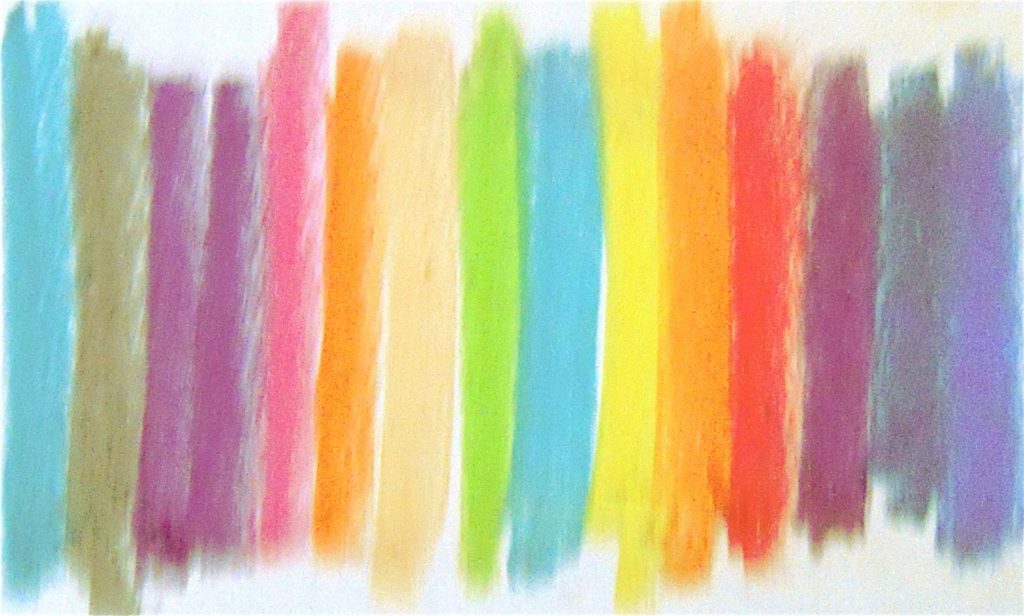
If you have been designing for a while now, you probably have a favorite color that you somehow go back to in little details within your design. In my case it’s a brighter shade of blue.
But that’s the problem with colors, isn’t it? It’s really difficult to perceive which color is described by its name, especially if colors are seen to be different depending on the eye that sees them. When you say red, there will be a lot of colors that will mean red: crimson, maroon, rose, and the like.
Good thing computers can be able to create that fine line between colors. And they do it with code.
Yep, you read that one right. To think that as a designer, you’ll have to save yourself from a lot of codes, then you are mistaken. Color, like any other thing in the world, can be broken down into a cipher. And that is made up of hex codes.
When you create an image using Illustrator or Photoshop, your computer uses a code it understands. You basically select from an array of hues ranging up to 16,777,216 unique combinations all of which are determined by six characters made up of ten numerals and six letters. But don’t think that there is some hocus pocus going on here, hex code is as logical as you can get.
Deciphering the Hex
Your screen is made up of pixels that appear dark until you feed them with a combination of red, green, and blue hues. Hex codes represent these combinations, and they can be deciphered. Think of this, being able to understand how hexes work will make you a better designer. You can easily adjust the color palettes you use by determining which of the red, green, and blue hues are more evident.
Take my favorite color for example:
The first character is a hash mark (#), it declares that the code you will be using is a hex numbers. The succeeding characters are actually set of pairs ranging from 0-9 and a-f. Each pair determines the amount of the primary additive color to use. The first two pairs are reds, the second, greens and the third, blues.
As the numbers get higher, say 9, they become brighter. In this example, you will notice that in my combination, greens outshine the reds because the value of red is just 34 and green is 98.
Now, if you’ll delve on this further, you’ll be confused that there are letters. Here’s what they are for:
Think of a solid white color. White will mean that all of the additives are at their brightest, right? So if you’ll follow what I said above, you’ll think that solid white is #999999. Yet, when you use the hex code, it shows a medium gray color. That is where the letters come in.
Since each additive is only limited to two digits, it cannot have a value of 100. To solve that, we use letters. In hex colors, letters represent a digit that is more than 9. Thus, A will be equal to 10, B to 12, C to 13 and until it reaches F (16.)
Hence, if you want to yield a solid white, you have to reach each pair’s maximum which is F. That is why white’s hex code is #ffffff.
Following this formula, you will notice that #00000 is black because all additive values are set to 0.
And so are the following:
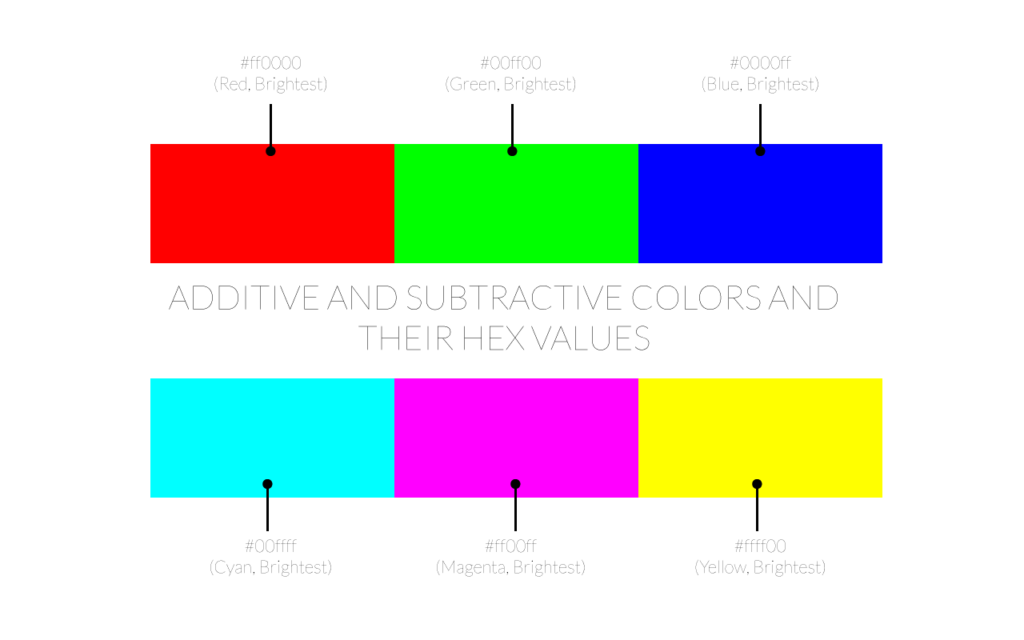
#ff0000 will be the brightest red.
#00ff00 will be the brightest green.
#0000ff will be the brightest blue.
Now, that is for RGB. If you are into CMYK and still would want to use hex codes, you should know that these colors start with #ffffff (white), and to find each value, you just have to change each pair to 00.
Hence:
#00ffff – brightest cyan.
#ff00ff – brightest magenta.
#ffff00 – brightest yellow.
Shortcuts
Now, in your code, you will notice that at times, #000000 (Black) can also be expressed as #000. This is because hex numbers can be written in shorthand and will imply that each ones place matches the sixteens places.
So white can be written as #FFF too.
In other cases, you can identify the color value of a hex by simply looking at every other character. This is because the different between the sixteens place are much more noticeable than the ones. Case in point, the difference between the shades of 84 and 97 is much more noticeable than 84 and 85. So if you want to make bigger changes in the hue of your design, it is more convenient to change the sixteens.
Real-Life Applications:
- Faded Underlines
- Better shading
- Better color-relation between body and title texts
Conclusion
Now that you know the formula, please do try to practice it every now and then. Just try to design without a color picker, and you’ll notice how much precision you’ll have and how much you’ll feel independent in manipulating your colors.
Because, as we know it, color is important in design. It sets the mood for everything, and being able to use it creatively and wisely, is something to be desired.


 Geocode API Review
  The Anatomy of Great Website Design that Google Loves
  11 WordPress Design Trends for 2019
 How You Can Boost Conversions with Minimalist Web Design
  Photo Color Correction Tips + Free Photoshop Actions