Simple coloring is some kind of a brand-new gem of the flat style, a logical continuation of its development, though it definitely is not something new. For a long time it was playing a second fiddle, and only minimalistic website designs gave it a more dominant and important position. However numerous specialists claim out that this year it will certainly come to the fore, and will tune up with new colors especially in combination with the overpowering flat style.
Though it seems, that such color solution associates with rather boring, dull and pale interfaces, it is a common misconception, since simple coloring doesn’t always mean minimal coloring. You can easily mix and match 5 or 6 colors that will effectively complement each other and still afford a quiet simplistic and harmonious appearance. It can be an elegant blend of bright or vice versa soft pastel colors that brings about a truly strong effect.
Today we try to demonstrate the beauty of mobile app design that effectively incorporate a simple coloring.
Anti-bullying network by Dima Badawi
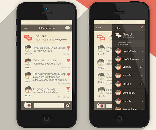
The design is based on a soft muted coloring that gives the interface a visually appealing appearance. Though it seems at first that there are lots of tones, in fact this is a quite simple choice of shades that naturally collaborate with each other.
Social Student App by Yasser Achachi
The designer capably leverages various shades of blue and green, which effectively convey feelings of conservatism and reliability. The pleasant coloring in tandem with a rigid tile style layout lets the interface look well-structured and easy readable.
Sound player app by Vincent Tantardini
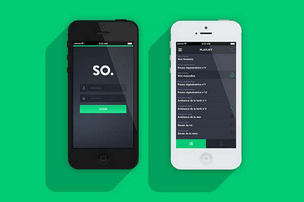
The app design features a magnificent and eye-catching combination of black and saturated green that stand in a sharp contrast to each other. The white smooth type serves as an ideal accompaniment to this judicious mix.
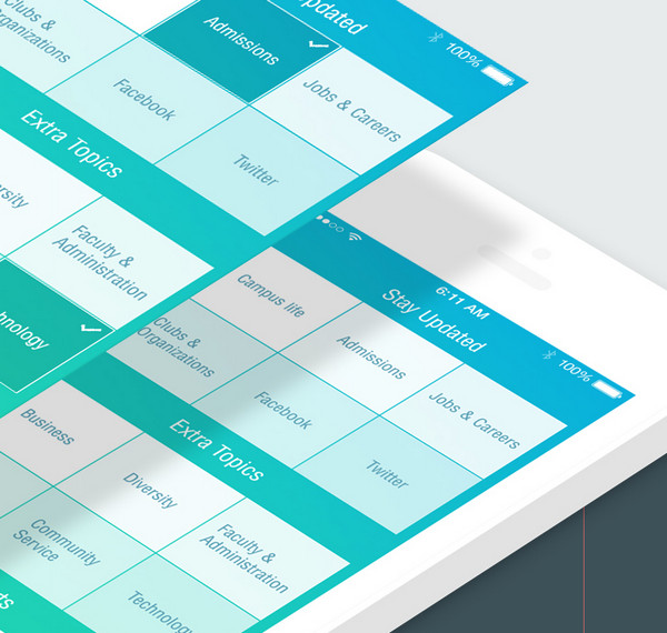
Mobile App Design by Towkir Ahmed
The designer has found a perfect balance between pink, white and lightseagreen colors, giving the interface a soft and elegant appearance. The neat line style graphics along with semi-transparent blocks fit into the design like a glove.
Tickle app by Caroline Varina Sourivong
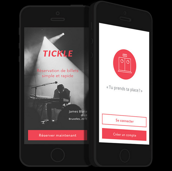
Here the color choice is more expressed, clean and precise than in the previous example. Red and white are not only blended together quite nicely, but are also able to create a striking contrast that is necessary for small screen devices.
EDM by Leonardo Zem
This is another appealing app interface design in our collection that skillfully utilizes a bluish color scheme. The tone allows adding to the design a note of temperance that in its turn provides it with a strong businesslike appeal.
Break by Youssef Wilson
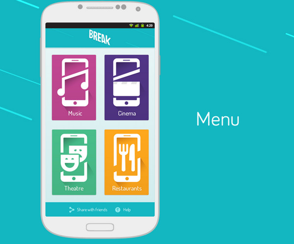
The app design is driven by the flat style that manifests itself in various aspects. The menu screen features intelligible relatively huge icons with a trendy 5 o’clock shadows that are effectively bolstered by a clean one colored background.
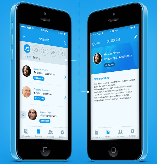
MTwister by Santhosh Koneru
Here the designer has done a great job of prototyping a well-balanced and truly unobtrusive layout. Since the app is aimed to display lots of visual data simultaneously, the color choice needs to be rather passive and should play more complimentary role and at the same time, provide text with a solid foundation.
KOOPON by Propaganda Graphics Factory
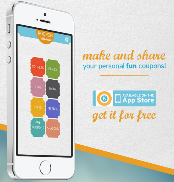
The interface features a kaleidoscope of bright colors that bursts with a positive energy. Such color combo is not accidental; it greatly helps to contribute to the idea of the app and pleasantly demonstrate fun coupons.
Wifeel iPhone App by Jules Bassoleil
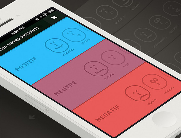
The designer ably combines together several smooth shades that are aimed to laconically complete the feel of the design. There are several discreet color schemes that are used in different functional screens.
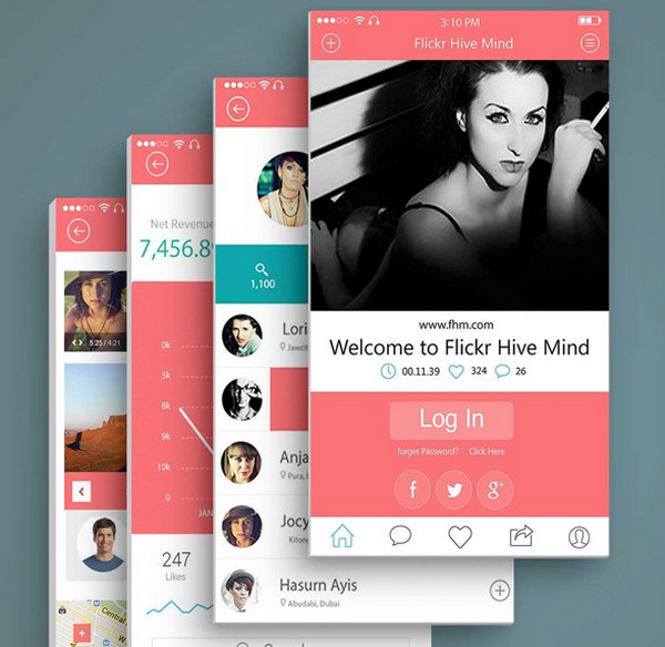
Instagram by Codebuild
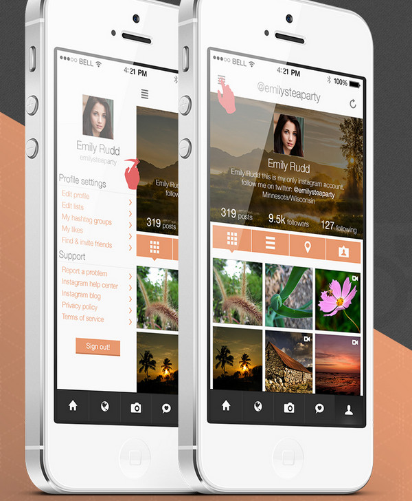
The Instagram redesign concepts are famous for its sheer abundance of images presented on a single screen, so that interfaces can’t boasts of an excellent choice of multiple colors. As a rule, such designs leverage a minimal coloring that helps the text to effectively stand out.
Split the Bill by Alice Donovan
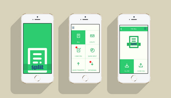
The app interface has a definitely positive and soothing appearance that is mainly achieved with a help of skillful mix of natural green and yummy creamy colors. The flat style graphics, tiny font and plenty of whitespace maintain a refined simplistic feel.
DPSDE by John Noussis
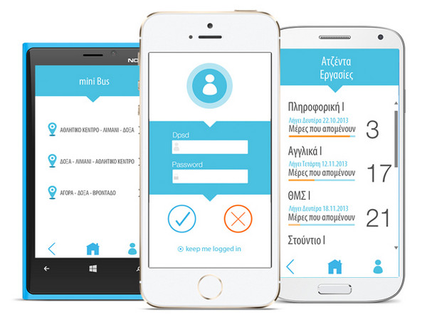
Again, here is an unbeatable combination of white and blue, which is quite difficult to screw up. The design goes for a sharper and more neat appearance.
Ephicy App Design Concept by Fabio Vicente
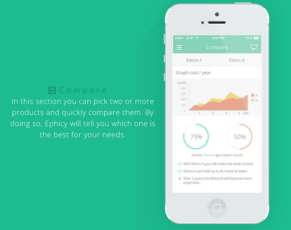
The app comprises various functional screens each of which contains of numerous widgets, blocks and text. However, an optimal selection of pastel colors allows the design to look absolutely clean and plain.
Book flights by Mattia Bericchia
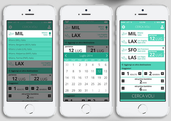
Here the color choice falls on green, white and black, where each of which carries out its own important role. Thus as usual, classic combination of black and white is used to emphasize the main content, whereas the green is used to highlight selected elements.
Hands On Manila by Mao Alducente
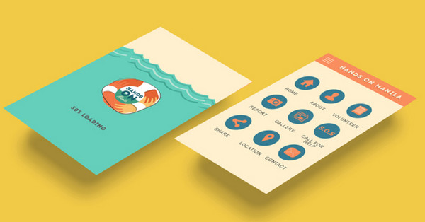
The app takes on an artistic approach that is effectively bolstered by a soft color scheme. Although the designer nicely incorporates numerous illustrations, the color choice stays quite modest and simple.
WH ReForum by Heyllow Lab
Actually the designer has chosen a vast range of bold colors, however they are not all used simultaneously. Each functional screen has its own color combo that as a rule consists of 2 or 3 tones. Such solution allows making the whole app design look eye-catching and exclusive.
PLACEAT by Adi Saputra
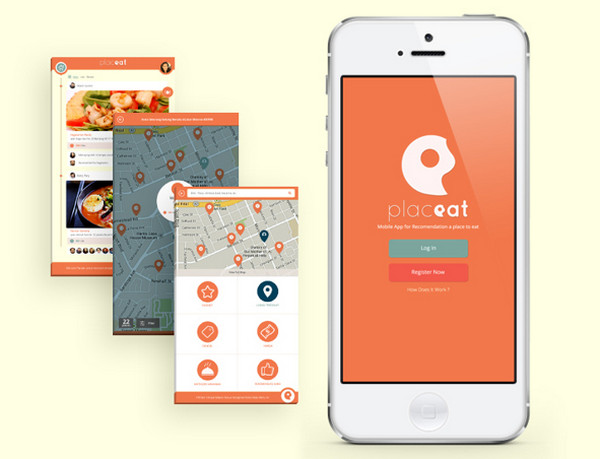
The design is based on 6 smooth complementary colors that effectively bring to life the concept and set up a quite warm atmosphere.
DigiResume by Chandan Mishra
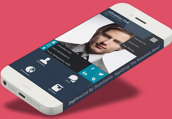
As the nameplate implies, the app is aimed to provide users with tools for building a regular resume. The predominantly dark coloring helps to keep things structured and balanced.
Flat iPhone iOS 7 by Joel Ferrell
The interface has a clean, sharp and businesslike appearance. Each screen depicts lots of data that is properly-organized. The simple coloring is the best option here.
Teamteam iOS app by Djordje Vanjek
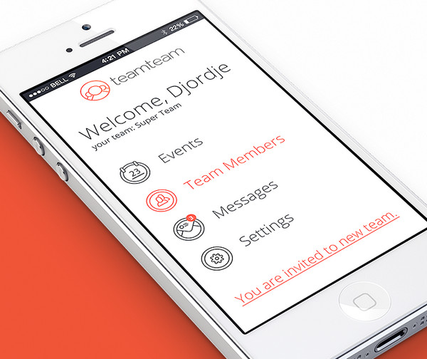
This clean and classy app interface is marked by a strong 3-tone color scheme that effectively focuses users’ attention on text.
Conclusion
Use of simple coloring especially in mobile app designs, as a rule, brings considerable benefits. And it is not only able to make the interface look legible and easy to scan, but also support the theme and provide an interface with a comforting air.
Do you prefer to use simple coloring in app designs? Why or Why not? Share with us your experience.


 Top 16 Free WooCommerce Themes
  Top 25 Free WordPress themes from 2020
  Teamstack: Team-as-a-Service Provider with Convenient and Secure Solutions
  The Anatomy of Great Website Design that Google Loves
  11 WordPress Design Trends for 2019