The responsive design is no longer considered to be a progressive enhancement; it is an indispensable and essential feature of any modern website whether it is a tiny simple portfolio or huge content-heavy online magazine.
As a designer you should take into consideration a lot of aspects beginning with ordinary type and ending with advanced complex widgets such as sliders or galleries that must undergo changes depending on a size of a screen. Certainly, there are numerous robust solutions that help to get the grips with this problem. The main point is to provide visitors with a design that will strongly support the content and improve users’ experience as well as bolster the theme.
Take a look at our fresh roundup of wonderful and well-thought-out responsive website designs that wisely take care of its appearance providing users with an optimal viewing experience regardless of size screens.
Responsive Design Examples
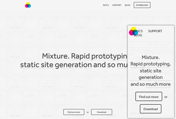
Mixture is a clean and light website with a numerous neat outline elements and a lot of free space. The mobile version also looks boxy and roomy.
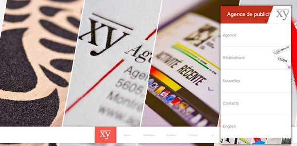
Agency XY pleasantly greets users with a full width image slider that has a lovely lopsided touch. The designer eliminates the need for slider in the home screen of mobile version, displaying only basic menu.
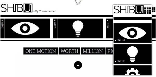
Shibui pulls its personality from a strong classic black-and-white color palette that makes the website look legible and businesslike. The mobile version echoes perfectly well with the main website.
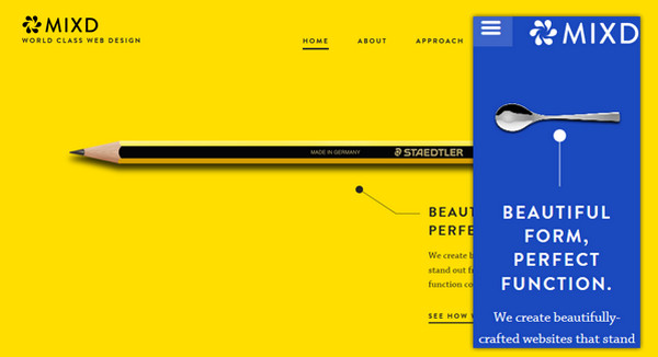
Mixd is based on a bright solid color background that ably highlights foreground elements. The smaller version of website includes the same welcoming images.
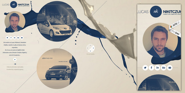
Lucas NK Nikitczuk. The website has an advanced design that helps engage users by means of its amazing fluid-style home page spiced up with a lot of circular components. The mobile version consistently represents menu items with a help of the same huge circles.
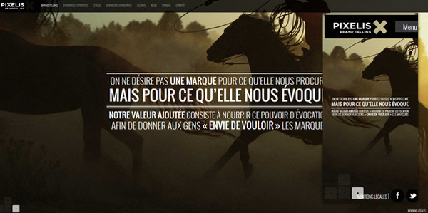
Pixelis incorporates marvelous full screen image slider that presents spectacular professional photos. The smaller versions also include slider with elegant semi-transparent controls.
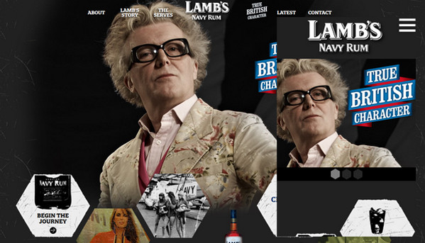
Website of Lamb’s Navy Rum has a beautiful grunge and geometry vibe that is mainly accomplished by means of diamond shape components that are also included in the mobile version in order to maintain the proper visual hierarchy.
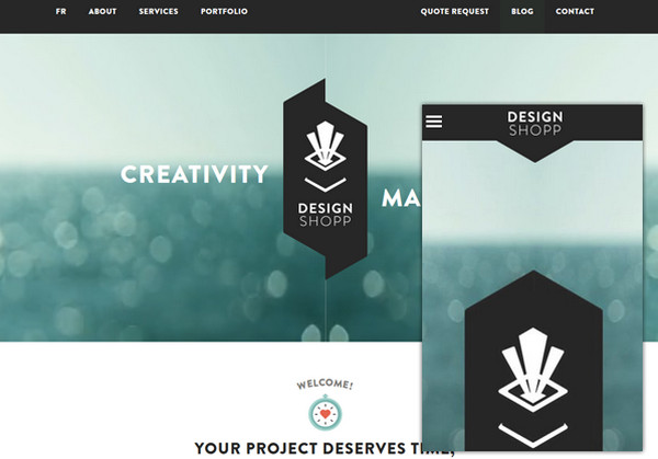
Design Shopp uses a marvelous warm and sunny seascape image with subtle motion that is transformed into a simple and static picture when the website is displayed on mobile devices.
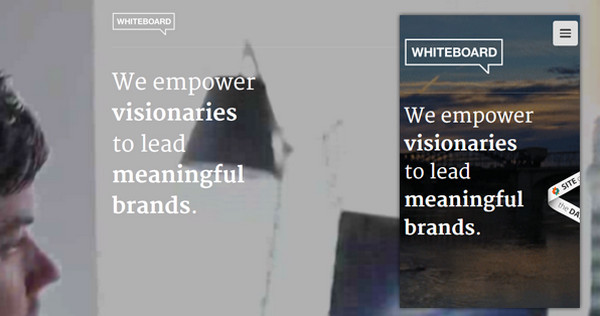
Whiteboard. The designer is managed to successfully demonstrate the wonderful animated GIF that is bolstered by crisp and neat white typography and subtle outline logotype in every popular screen devices.
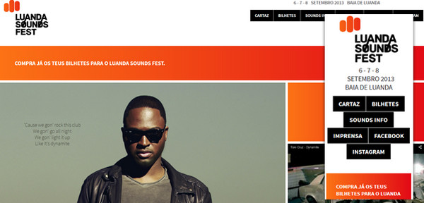
Luanda Sounds Fest is a grid-based website that looks stylish and boxy. The mobile version also has a densely packed together layout.
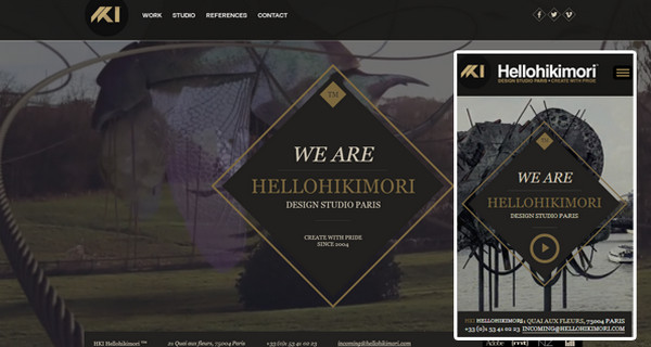
HKI is a sophisticated and truly professional design studio that easily draws users’ attention with its fantastic website. The mobile version includes the same intricate layout that is ably supported by neat dark side menu.
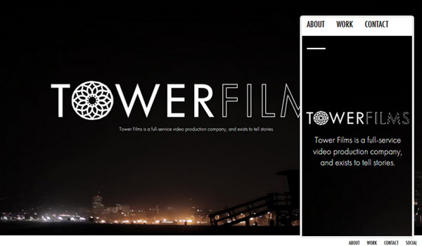
Tower Films is a refined photo-driven website that exhibits a great deal of professional pictures. The dark tone perfectly collaborates with a white font. The mobile version has a standard horizontal stripe layout and is mainly based on a conventional contrast between 2 colors.
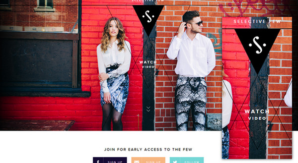
Selective Few. The main feature of this website that instantly strikes the eye is effective utilization of plain triangle shapes. They play a role of decoration via outline triangles and are also used as frames for images. The mobile version, though, doesn’t include such ornaments.
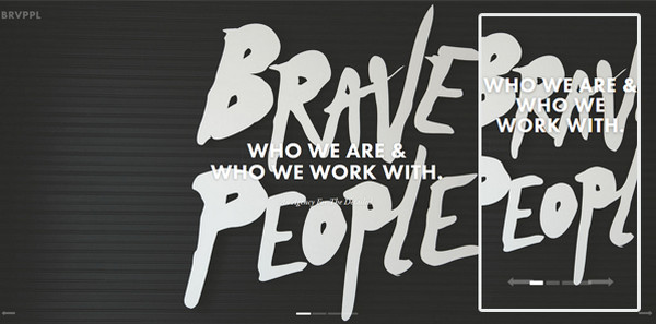
Brave People. The designer skillfully incorporates adaptive image slider that allows holding down onlookers’ attention by means of fantastic images. The captions along with the tagline perfectly adjust to any popular screen sizes.
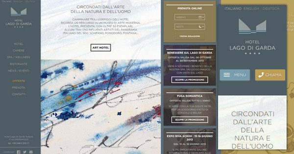
Hotel Lago di Garda. The main website is laid out in a three column grid whereas the smaller version, as it should be, demonstrates data through a singular column. The design includes a bunch of images that are supported by contrasting font and outline graphics.
Reflection
Mobile-ready layouts, adaptive components, flexible sliders, responsive typography are essential and highly-recommended components of any modern website that is intended to survive and occupy a prominent place in this ever-changing world of internet.


 9 Ways to Increase Your ROI in Your Website Design
 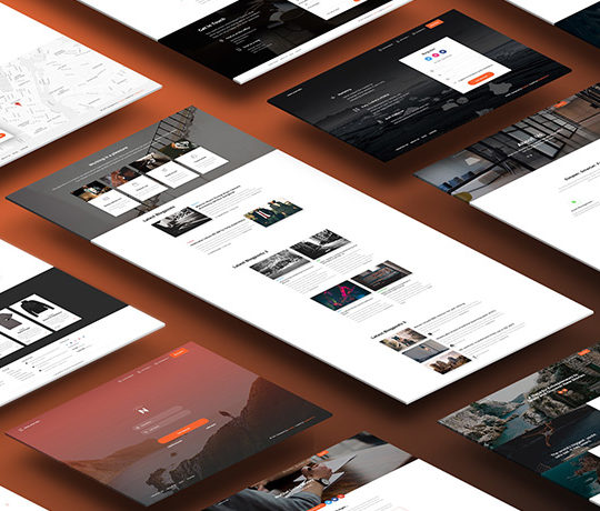 [Review + Giveaway] Now UI Kit PRO – Perhaps the Last UI Kit You’ll Ever Need
  Introducing eWebDesign Version 3!
  [Review + Giveaway] Ultra Theme by Themify – How Powerful and Flexible Is It?
 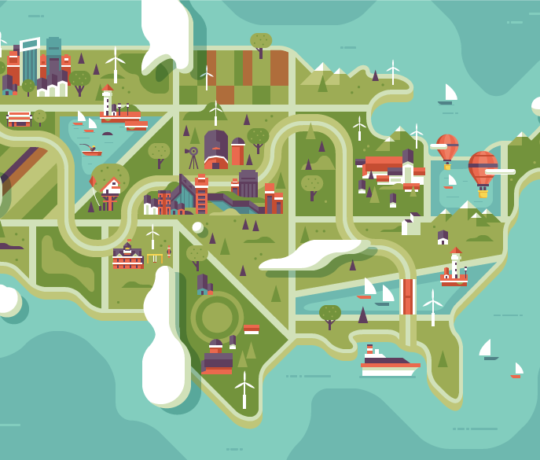 [Review + Giveaway] 5 Developer’s Licenses for Simplemaps.com ($2495 Combined Value)