It might be true that WordPress has the edge over Blogspot (Blogger) for the moment, but many bloggers still use Google’s service because it is reliable, easy to use and looks good if you are willing to spend a few dollars on it. However, we are here to try helping you make sure that your blog will look great even if you don’t want to spend money on a professional template.
Today we will take a look at a set of fifteen free templates for Blogger which are free for download, relatively new, look great and, hopefully, will make your blog more attractive from a design perspective. From now you will only have to worry about writing, because design will not be a problem anymore.
Download Free Blogger Templates
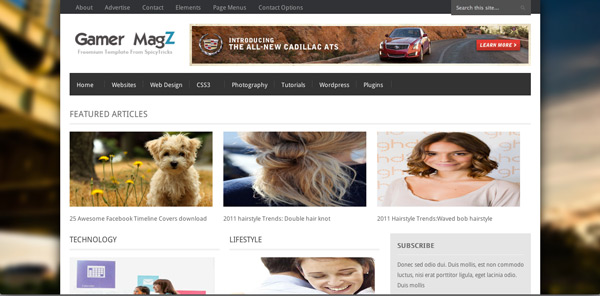
Gamer MagZ
Although the name makes you think this is a template for game addicts, it is not like that at all. This template can be used for many purposes, including newspaper-like blogs and other kinds of online publications where images are important alongside the title.
By using this template you will be able to showcase a large number of articles on your home page, while also showing thumbnails, the author and the number of comments. Moreover, you also have the sidebar, where you can feature social media, an RSS feed subscription and other Blogger widgets.
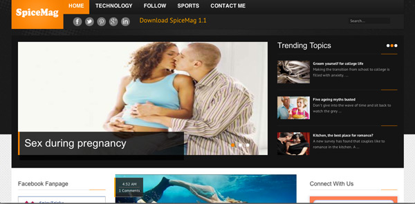
SpiceMag 1.1
Another magazine template from SpicyTricks seems to be very popular lately. This one, although quite similar to the one presented above, seems a bit better because it has a featured articles plugin placed at the top of the page. This theme has only one content column in the middle and one sidebar on both sides, therefore it is not necessarily aimed towards blogs with heavy content, but more for bloggers who want to include some more features and capabilities into their publication.
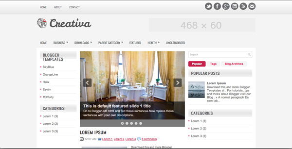
Creativa
Creativa is a very good template for bloggers who are on their own and are not creating heavy content. This is mainly because the amount of posts that can be seen without too much effort is not that big. This would be a good template for a personal blog I believe.
Among some other features, it has a content slider plugin, two sidebars for widgets and has been downloaded more than 23.000 times, which should be a sign of its good design.
The only thing that bothers me a little about it is the fact that the content is spread only on half of the template width. Content is the most important element of a blog, therefore I do feel like this might be a drawback.
Exposure
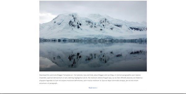
The reason why I feel Exposure should be in this set of templates is because it looks like a very good theme for photography amateurs and even professionals.
I have always been a fan of very simple websites, which reach their purpose right away because of the simple, but not simplistic, design. I feel that Exposure is the perfect example.
It also looks like it would be very easy to style it differently in case you want to dig a little bit deeper into CSS. Without too much to look at (not even a sidebar included), it always keeps the content (which in this case are the images) in focus – this is very, very important and a key concept for photography blogs.
Halifax
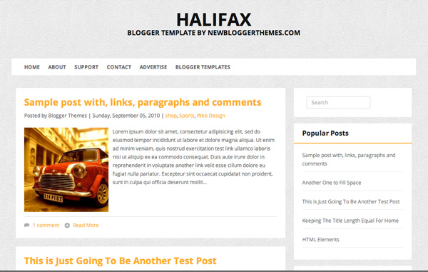
Halifax seems to me like a great template for a personal blog because it simply has everything you might need. Besides the fact that the content area is quite large, there is also a sidebar on the right side. In this one, the footer is quite simple, so everything will have to fit in the sidebar.
The design is very simple, which I like, and the content area offers the option of having posts with or without images, showing the number of comments and other meta data and a read more button. If I were to improve it, I would probably make the read more button more visible and I would probably change its placement, otherwise this theme seems great to me.
The theme is designed under the FabThemes brand (which is always a sign of quality) and although it is published recently, it still enjoys huge success.
Dazzling
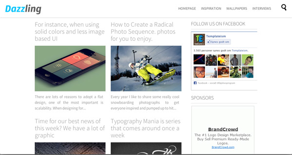
This one is a very cool template because it is very powerful visually. On the home page the posts have title and a large image, and the template also has a sidebar. The menu is at the top and below it there is also a small space for potential advertising.
The template is compatible with all major browsers and what is really nice about it is the sticky floating header, where the navigation is placed. This means that wherever you are on the page, the navigation will always be there with you. This is really one of the templates I would use myself if I would run Blogger.
Pegasus
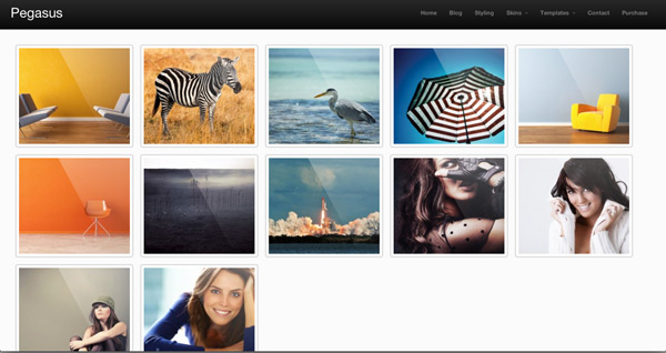
This is not necessarily a very new one either, but it is definitely a spectacular template. This one is probably aimed at photographers and offers a very simple design which allows the eyes to focus on the visual content.
The menu is impressively nice, there is also place for a small logo on the left side of the header, and the dropdown feature is very smooth and good looking.
The featured images have JavaScript transitions on hover and once you click on one of them, you get to a page which can be filled in with a lot of content, or just with lost of pictures – entirely up to you. Moreover, this is also where you have a sidebar, which in my opinion is a positive thing, because you definitely need a place for some widgets and social media integration.
The footer looks the same all over the template and can support several columns, so there will be a lot of space to play with there as well.
Replay
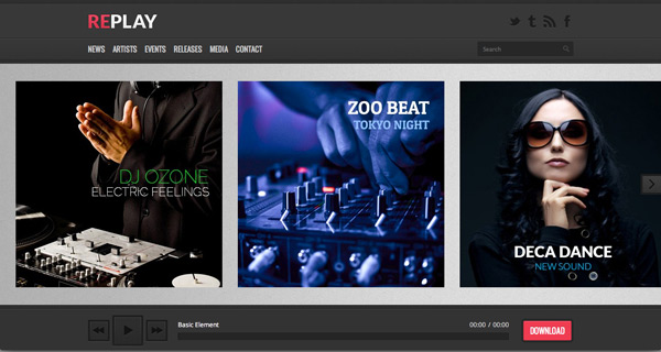
This is also definitely one of my favorites in this whole template showcase. In case you run a music blog, this is the one to go for, because of its amazing design, big visual impact, audio playback options and many other features.
The menu offers dropdown capabilities and is placed alongside the search function, the logo and social media integration in the header.
On the home page there is also an image content slider with some possible effects on it and with a playback capability right beneath it (even with the capability of queuing songs) – this is actually what’s very interesting to me.
Under all these you can find the content area and a sidebar on the right side, all above a very simple footer.
Blogholic
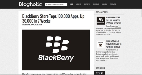
This also looks like a very simple Blogger template, but not simplistic. Although there are not too many rainbows and unicorns on it, it is looking good and does its job.
What I like about it is the default font size, which is big, and the small, but useful sidebar. I like the nice effects on hover in the navigation, however I am not too fond of the placement of that search bar.
The footer is simple and small, but the sidebar offers enough space for widgets and all other kinds of things you could find useful. If you are not sure about it, take a look at the live demo. It will change your opinion.
Elegance
As its name says, Elegance is a very elegant theme for Blogger, which I feel is aimed at photographers. A small title and a large thumbnail represent the articles on the home page, while on the right side there can be found a relatively large sidebar. What I also like at this template is the innovative footer, which can hold up to several columns of content and widgets.
What I don’t like about this one is definitely the navigation. Even on a template which looks a bit childish, the navigation looks way too bad to be taken seriously – at least I would not. I think this is a template you should try, but if you have some design skills, get rid of those ugly buttons and create something more innovative. We’re not in the 90s anymore.
25pixel
I particularly like about this one the fact that it is centered around the very powerful visual impact it creates. With so many big images above and under the fold, expressing emotions and feelings will be the less of the problems for the photography passionate using this template.
All the things that normally are in the sidebar, are placed this time under the content, which is much better than not having a sidebar at all. Actually, because there is no sidebar above the fold, there is nothing to distract the user from looking at the images presented there.
Timeline
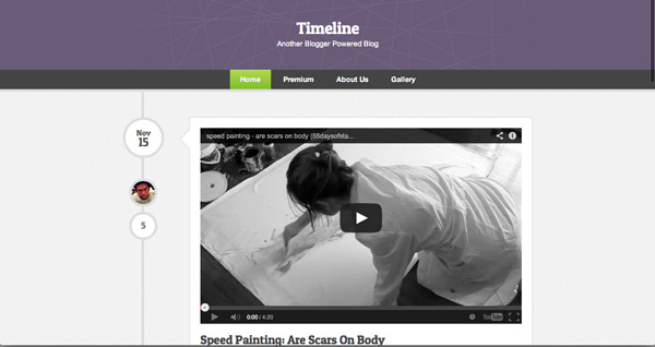
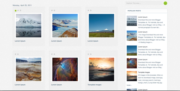
If you want to showcase your blog in a timeline-manner, then this template is definitely going to be right for you. It doesn’t have too many capabilities, but it features a great timeline on the left side of your content, which I quite fancy to be honest and follows Facebook’s example.
There is no sidebar available on it, but the footer shows three different columns you can fill in with whatever you want.
TheStyle
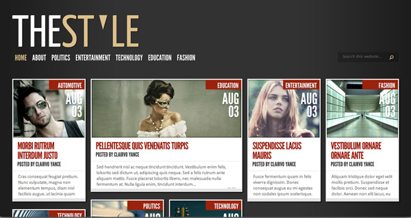
TheStyle is definitely a very good theme for all kinds of purposes and what I like about it is the uniqueness of its design. The posts are featured in a great way on the home page and they also have special effects on hover, the design is extremely simple, the footer can hold really many columns of content and widgets (even stored on several rows) and the posts overview looks good as well. Here is where two sidebars appear, as well as the comment section. Great, great theme. Go for it!
Apollo
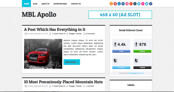
Apollo is today’s last example and also represents a great, useful Blogspot template featuring a content area and a sidebar and a quite large footer. All social media integration happens in the header and footer as well, but it can be moved if you are willing to play a little with the code.
The posts have here a visual break, thanks to the template’s design. The header with the navigation sticks with you and floats over every piece of content, therefore it shouldn’t be a problem for your users to navigate through it.
With this last one we complete today’s showcase, I really hope you found some good theme here and in case you have some others who are looking even better, share them with us in the comment sections. We would love to hear your opinion about the free blogger templates above as well, in case you have used them or are willing to do it in the near future.


 Free Resources for Web Designers and Developers
  11 WordPress Design Trends for 2019
 [Review + Discount] ThemeLooks – A Theme Store for WordPress and WHMCS
  30 Impressive Pixel-Perfect HTML Website Templates for 2016
  [Review] Greedeals – Is It Your Ultimate Source of Design-Related Assets at a Discount?
hat dieu rang muoi Oct 5, 2013, 9:03 pm
thanks alot for the list, many of them have the clean style, just love it
Samer Jan 1, 2014, 11:40 pm
Good collection, i like The Style, thanks Christian for arranging free templates.