Smartphone and tablets applications became very popular since the first release of the iPhone and since a couple of years ago they are taking a whole new direction: they are going flat.
With the release of iOS7, more and more companies are redesigning their user interfaces and choose the flat trend.
In today’s showcase we will take a look at some conceptual flat design apps that you might not have seen until now. We hope you will get inspired by the end of the article and maybe design your own amazing flat app based on the style of these examples below.
Best Examples of Flat Apps Design used for Mobile Applications (iOS and Android)
Musix
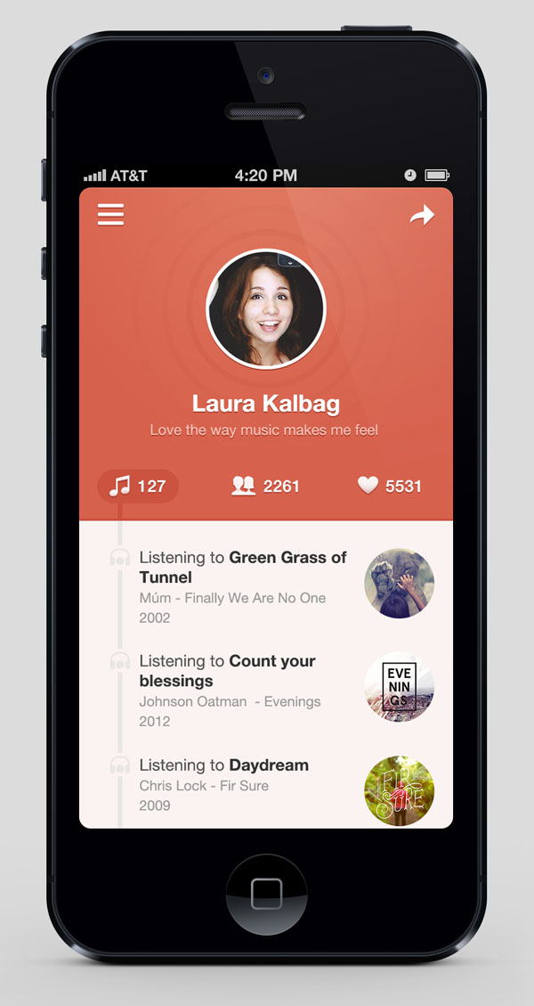
This conceptual app designs is for a social music player, where people can listen to music, like other songs and connect with friends. This platform looks very good, with the profile picture placed at the top, and the songs that are listened to placed underneath it. This is a beautiful combination of colors and typography.
To-do app
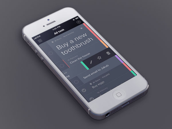
This app is a to-do reminder application that would really look great on smartphones. It seems the style is very similar to the one of the Mail app in iOS 7, with the same gestures available for tasks handling (deleting, editing, adding as favourite).
Adding a task is done very easily by just tapping on the button in the upper right corner and ticking a task is just as simple: you just need to tap on the circle on the left of the task and there it is, a tick appears and the task is marked as done.
Interactive Graph
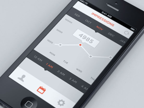
This would most likely be an app that would be based on lots of gestures, such as swiping. It looks very good although basically this is a graph app. We all know how graphs are very boring and not interesting at all, but this app would definitely make viewing these graphs a bit more interesting.
Calendar app
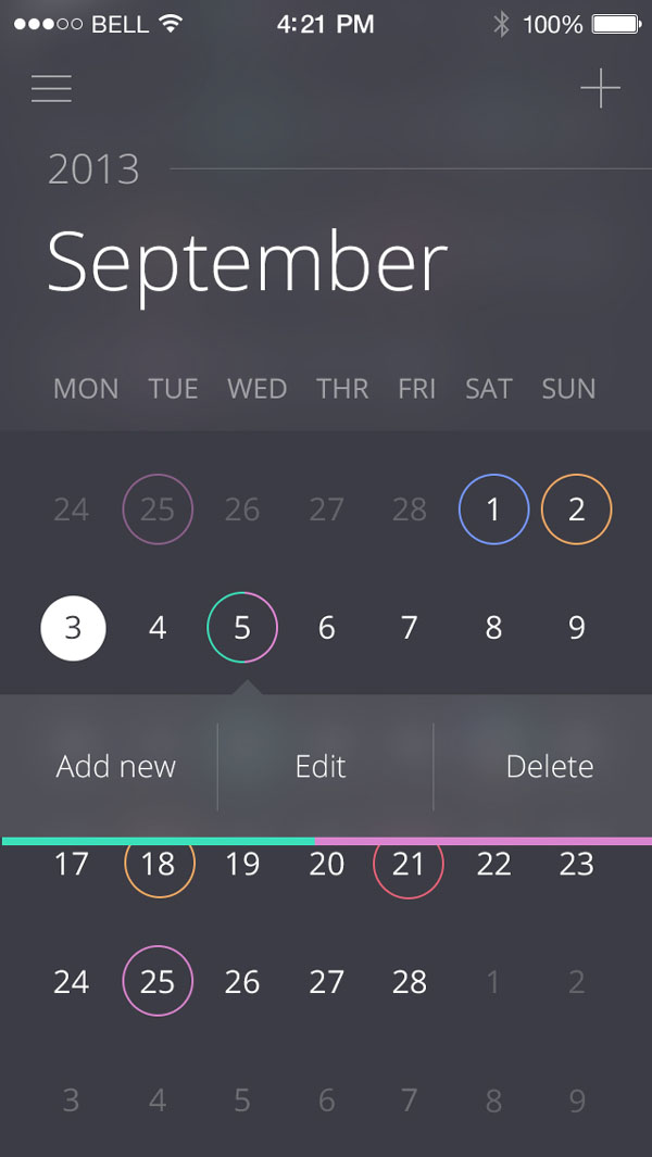
In case your phone’s calendar is not up to your standards, this is how a great calendar app might excite you a bit more. Designed in a flat style, it looks like a great combination between colors, sleek and thin lines and good typography.
Weather app
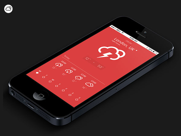
When iOS 7 was announced for the first time, the design community on the internet got crazy and started redesigning every app. The Weather app was one of them and below you can find a good example of a weather app, coming in a bit of a different style than the one Apple released.
Ringtone app
Because Apple doesn’t allow people uploading their own ringtones, several apps have been created to fulfill this need. Below can you find a flat redesign of such an app. This does actually look like iOS 7 and would anytime be considered a great design.
VPS app
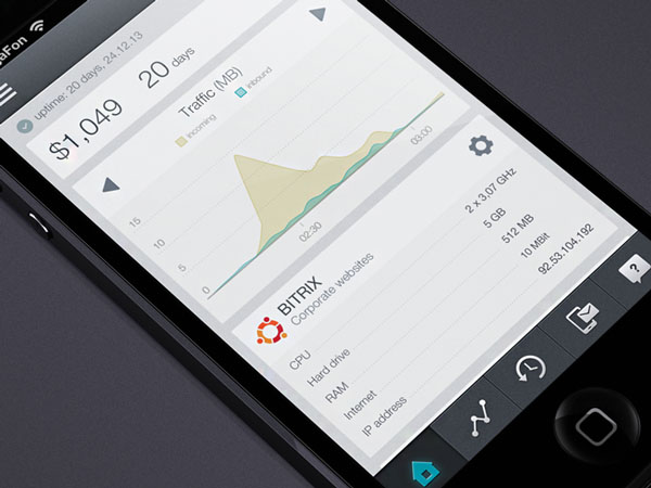
Graphs, dollars, corporate stuff and uptime statistics – totally boring stuff. But this app makes all of them look good and make you want to use it just for its beautiful design.
The only problem that I have with this app is the not-so-flat navigation and I think a plain, simple background would have worked wonders in this case, instead of the grain pattern.
Running app
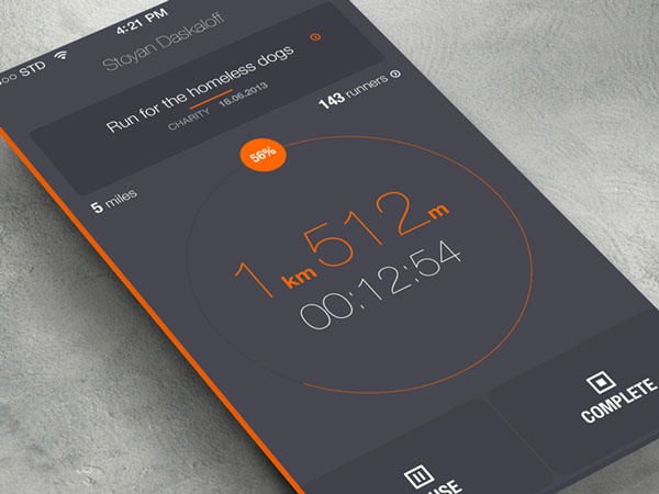
When we’re talking sleek, this kind of design is exactly what we are referring to. The app is for runners and would really be amazing if it would actually be coded and come to the market. People are willing to pay for beautiful design and I think this would be a success.
Mail app
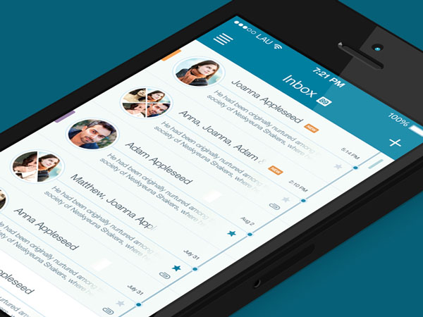
Another redesign of the original iOS 7 apps is this one, which works great as a mail application for a flat operating system. The way the avatars are showed is quite cool, also when there are more recipients. There is a sleek, almost impossible to notice scroll bar on the right side of the screen, as well as (I can image) gestures to handle the data.
Roll Saver App
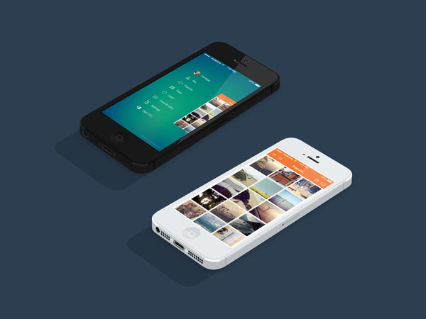
Another amazing conceptual design is this one. Not only it looks as it fits the guidelines of iOS 7 completely, but it also looks very useful and easy to understand and use. I know that I would love to be able to get my hands on an application looking like this one.
Analytics page
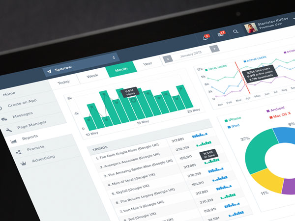
This is a great analytics page and I remember I have used similar elements in my designs as well. I am especially in love with the graph and the general visual impact.
This would be a great design for an iPad or any other tablet application and I believe that it would be a hit if it would be real.
Chat app

If there would be a chat for my phone, I would definitely like it to look like this example. The way the avatars are displayed is really cool and the general design looks amazing. And yes, I would also like to chat with Demi Lovato.
Weather app
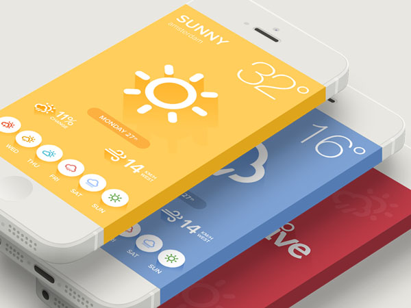
Another weather app conceptual design that I am quite fond of is this one. I might only like it for the fact that is integrated with a conceptual iPhone design, but I doubt it. I am sure I like it because of its awesome design, beautiful effects created by drop shadows and lovely typography.
Usage app
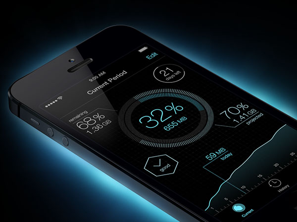
This great design is for a data usage app, another type of application filled with data that might seem uninteresting. But this app makes the whole concept of data previewing interesting, thanks to its amazing design and typography.
Dashboard app
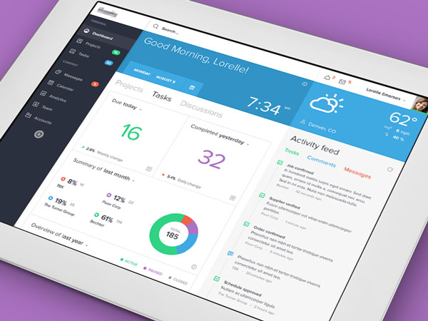
The last example for today is also a conceptual app design for tablets and it includes much more than a graph and a clock. This one also has an activity feed on the right-hand side (showing the colors for tasks, comments and messages), as well as a weather widget. I am sure this app would be very interesting from a design standpoint if it would be implemented.
With this great dashboard app we end today’s showcase hoping that you got some inspiration from it. None of these apps actually exists on the market, at least yet, but all of them are definitely very interesting and I would myself use them just for their beautiful design (yes, I do this from time to time; I am sure you do it too).


 Black Friday 2019, Best Deals for Web Designers and Developers
  [Review + Giveaway] Shards Pro – Perhaps Your Ultimate UI Toolkit
 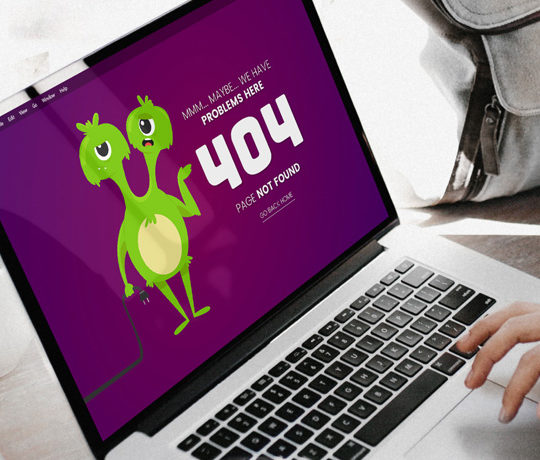 Free Set of 404 Error Screen Templates
 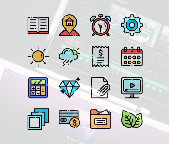 Freebie: 70 User Interface Icons
  [Review] Greedeals – Is It Your Ultimate Source of Design-Related Assets at a Discount?
Andrew Coyle Nov 4, 2013, 12:24 am
These are beautiful examples of Flat design that excels through great typographic hierarchy. Before the flat design movement, typography was often an afterthought. Now that content is the focus of design, instead of aesthetic embellishments like drop shadows and gradients, the principles and elements of design come to the forefront. Finally.