Emotional design aims to invoke actual, positive emotions from a user. These emotions can be anything from happiness and joy to pleasure and delight. When you want your users’ experience to be top notch and just over all fantastic, emotional design is your best bet. However, what does emotional design have to do with eCommerce and product pages? Delightful experiences are another way to increase your conversions. Therefore, using emotional design can be a great way to help you sell that magnificent product of yours. In this post, I’d like to walk you through a product page at Anyi Lu because, in terms of making a delightful product experience, this website has nailed it!
Pictures and emotions
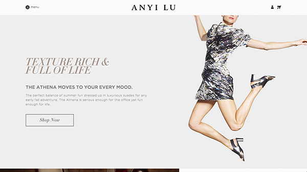
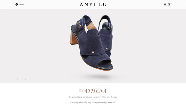
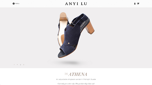
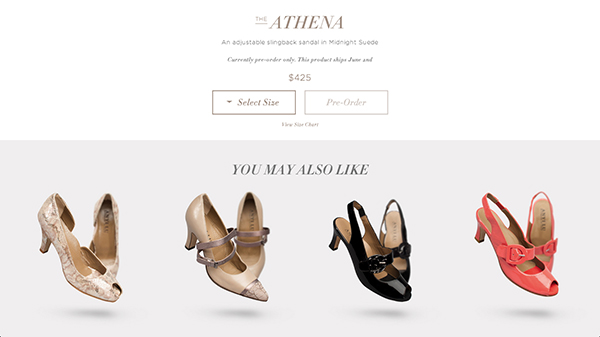
It’s no secret that adding an image to a product description helps tremendously. The higher quality the image, the better the conversions should be. You see, the quality of the photography and the way an image is displayed determines how it connects with a user. Take a look at the product page of Anyi Lu. The first thing you see is the shoe; there is nothing else there to distract you. The quality of photography is phenomenal; the shoes look magnificent. The quality of the display is also great because all you see are the shoes front and center. You are supposed to be wowed by the product, and you are supposed to be looking right at it.
Finally, a call to action
As you were checking out the awesome product pictures, I’m sure you noticed that there was in fact some text below it that was cut off by the fold. That’s when you finally get some product information. It’s seriously very little but this section is to the point – it’s the call to action, the call to buy the shoes. This little text-oriented section has a very elegant essence, actually. The typography and colours evoke the feeling of glamour; naturally, this is a fashion website after all. There isn’t much too it but it cannot be ignored; it’s so simple, you just can’t miss the call to action!
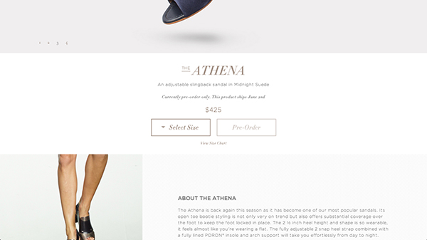
First, you were given the opportunity to fall in love with the item, to see that these are gorgeous shoes and be, in a way, seduced by them. Then, and only then, are you called upon to actually buy it – one thing at a time, no pressure from everything being squeezed onto the screen at once – that makes for a very light, and good, experience.
More and more details
Once you surpass the call to action to buy the shoes, you are presented with a paragraph detailing all about the product. Here we are show another image of the shoes, this time on a model. It’s a nice touch to always remind you about the product and it’s especially nice because it is a new picture, still of the product, of course, but not the same one as atop. We are also presented a short paragraph talking about the collection this shoe is part of.
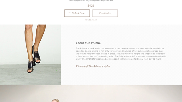
It’s nice to have it down below instead of where you usually have it, atop the page right next to the product image. The typical placement usually means the text is dominating the page. If you are looking for a wow factor, you want the product to be dominant, not text. If someone is truly interested in the product’s description they will look for it. Most people like to see the product, check it out, especially when it comes to fashion item. Placing the description below the fold will let the product enough room to shine.
It’s all a story
I don’t know how often you shop online or deal with product pages but most of them are short. So far, this has been a pretty long product page. I don’t think it’s a bad thing at all because the whole page tells a story. It’s most evident right now in the first three sections. At first you were shown the product, then you were asked to buy it, and then you were provided more information about it for the curious and the uncertain customers. The user flow of this page is good, really good actually. It allows the section to cohesively flow into one another; that’s how you tell stories online.
Icing on the cake
The next section, when it comes to emotional design, this is brilliant. The following section is a big blown up video of a model in the shoes. The video is composed of two types of views, a great close up so you can see the shoes on the model’s feet and the second is a whole body shot of the model just walking around. Here is why I think it’s brilliant, it shows you how the shoes look in a manner that bunch of pictures couldn’t convey.
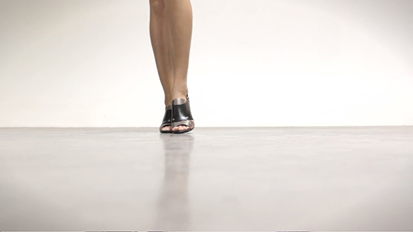
It’s magic because you don’t expect it and, it’s so powerful. This video shows you how the shoes look on someone from so many different angles; pictures can’t do that. It shows you how the model moves in them; pictures can’t do that either. When it comes to evoking emotions this video is perfect in making a customer feel delighted, happy or even excited.
Moving down the page
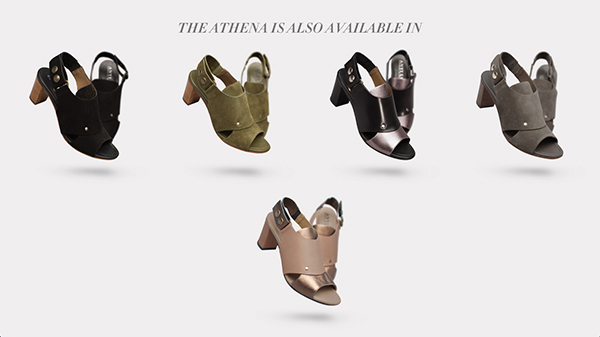
The rest of the page includes a lot more things, still. First, we are presented even more pictures of the shoes. This time around they are great looking close ups. Quickly there after, we have a section showing off other colours and materials the shoe comes in. Here we also have one of the first interaction instances. When you hover over one of the shoe suggestions, there is a subtle animation where the shoes get slightly smaller and a circle fades in with more information. It’s really pleasant actually as the page has little interaction. It’s a nice change.
Quality and comfort – more information
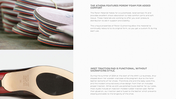
Right before you get to the bottom of the page, you are still shown even more information about the product. Within these two sections you are presented with a lot of content identifying the quality and comfort features of the shoes. As anyone who has ever worn shoes can tell you, comfort is important. Ask any woman and she will tell you that comfort is even more important in heels as, frankly, they are not the most comfortable shoes to begin with. It’s great that this section is towards the bottom of the page as it doesn’t disturb the content atop. If you are someone who cares about these types of details, it’s there for you without being in the way of the rest of the content.
Closing off the page
Before the page comes to an end there is one cleaver thing I would like to point out, which is the second call to action. In longer pages, it’s important to have more than one call to action; the second one is almost always at the bottom of the page. The call to action serves a good propose, to remind the customers to actually purchase the product. Some of them may forget to do that, so call them to it – even if it means calling them again! It’s a very simple but effective method when it comes to improving conversions.
Conclusion
I hope that walking through Anyu Li’s product page helped you understand how emotional design and product pages can mix together to form a quality page. The big take aways are that great images help tremendously with making a connection between the customer and the product, dividing up a page into specific sections can be a good things and lastly, use user flows to your advantage to tell great user stories. What do you do to make for delightful product page?


 The Anatomy of Great Website Design that Google Loves
  11 WordPress Design Trends for 2019
 How You Can Boost Conversions with Minimalist Web Design
  Freebie: 50 Vector Human Resources Icons
  7 Graphic Design Tools for Non-Designers