When I browse Dribbble or Behance, I see shots of dashboards all the time. Whether they are legitimate designs, imaginary concepts like UI kits or unsolicited redesigns, they are all over the place. A lot of them are actually pretty damn good. So, here is a post for your inspiration that has 42, yup 42, shots from Dribbble and Behance of amazing and beautiful dashboard designs. I hope these will inspire you and if they do, shout out in the comments to what you create; I’d love to check out your own work :)
New Profile Concept
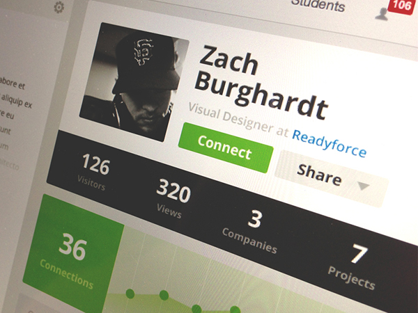
I love the bulky elements of this shot; the spacing within the black and green rectangles is magnificent. I also appreciate that the shot doesn’t use a blue hue; different is good.
PayPal Redesign
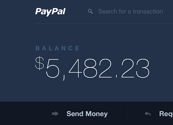
The dark colour scheme of this shot is magnificent. The use of white space, minimalism and lightweight font makes for a beautiful concept design.
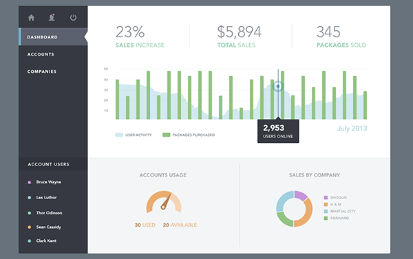
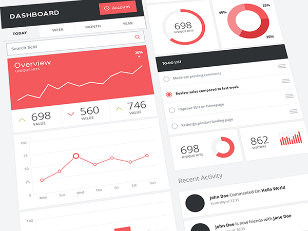
Dashboard User Interface
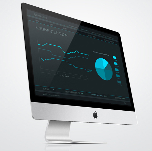
The dark gray with the light use of blue – because let’s face it, there ain’t that much content in this dashboard – look kind of mysterious. I haven’t seen a mysterious dashboard before, have you?
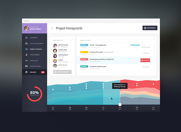
Element Wave Dashboard Update
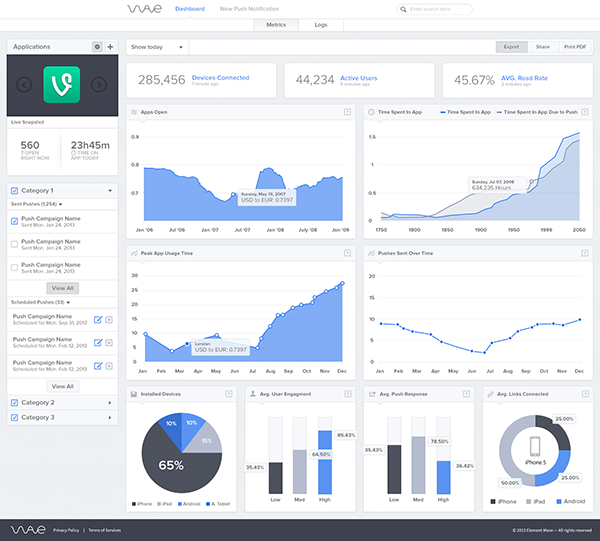
As dashboards go, they provide a lot of information at once. You’ll see this pattern all over these examples. This shot does a very good job of organizing the content.
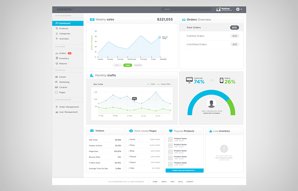
Sales Dashboard
By far, one of the more minimal dashboards. The design is so simple yet does its job of showing of what is important – the graph and numbers atop.
Stats Dashboard
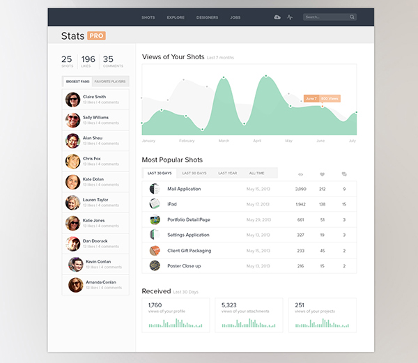
Once again a neat design, I love the way the fans are organized on the left hand side.
App Dashboard
This is a very gorgeous dashboard. The blocked layout is quiet different then a typical dashboard layout; it works very well!
Dashboard Widgets
The red and blue colours are so wonderful; instead of being an accent they are front and center and they look so good.
Statistics
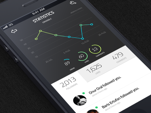
I must say I really enjoy the gradients on the graph, they help emphasize the scale which, in terms of user experience, is a great move.
Control Panel
What a wonderful way to use icons! The darker green shade was a good choice over white or black as the icon colour.
B&I Dashboard
Talk about a fierce colour scheme. The black with the red orange are so powerful.
iOS App Dashboard
I’m a very big fan of dark interfaces and this one is so simple, so lovely.
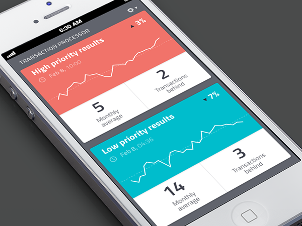
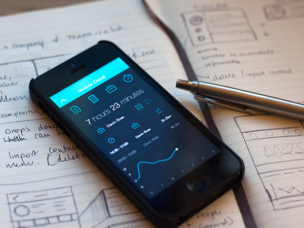
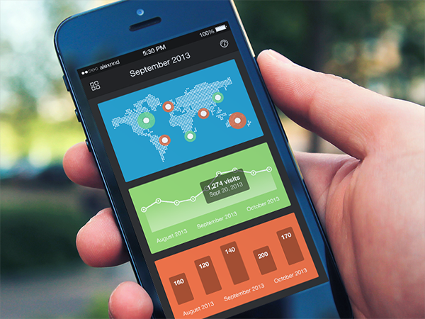
Dashboard iPhone
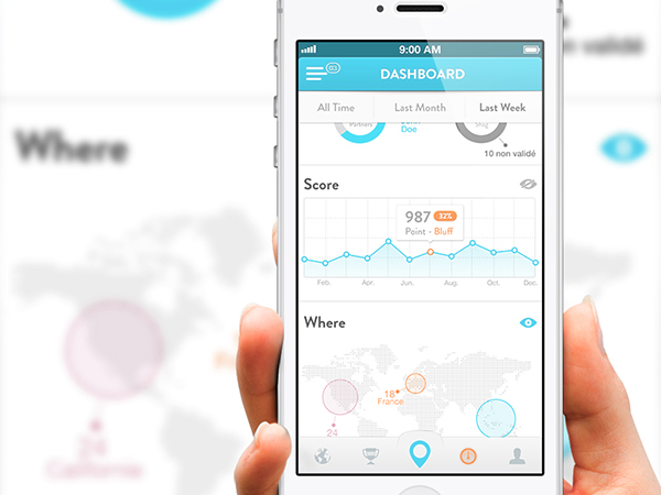
This graph is really amazing; the see-through blue with the orange highlights work really well for this design.
Admin Dashboard
Here we have another extensive dashboard, the white and gray are very light and make the dense design feel very airy – good call on colours here.
WordPress Admin Theme ReDesign
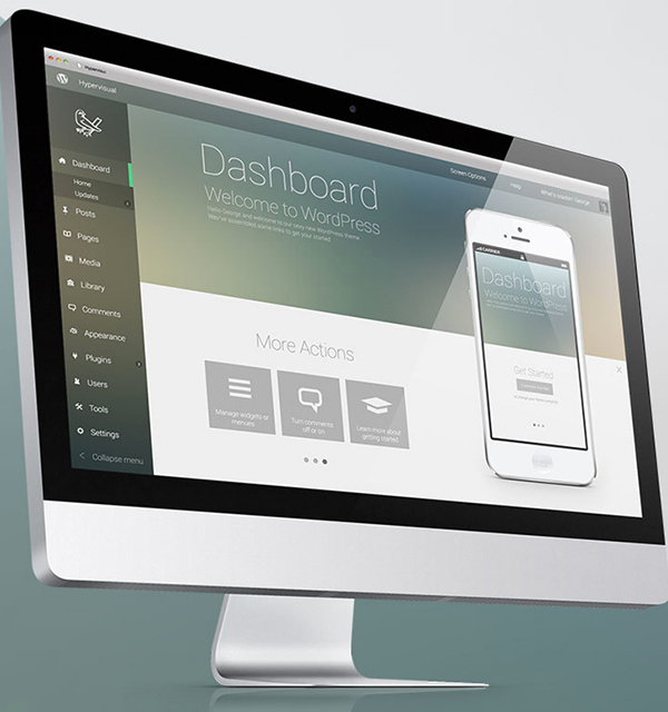
This WordPress admin concept is super sexy; the design is light and modern. It uses white space, simplicity and gradients perfectly. This dashboard is incredibly sleek.
Zendesk Dashboard
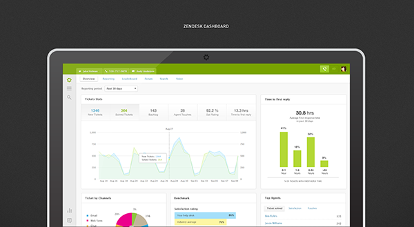
Information architecture and hierarchy were very well thought out in this dashboard; it is clear what’s the important take away form each box because the number is big. It helps that they are the same size across boxes.
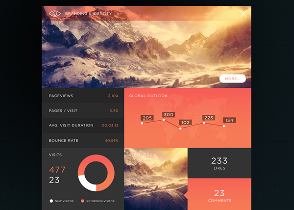
Health Analytics Dashboard
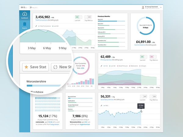
Although there is a good amount of information in this dashboard, it doesn’t feel cluttered. This is a great execution of clean design, for sure.
Up Today Dashboard
You know what, I appreciate that the layout of this dashboard is different. They use blocks, but symmetry is not over killed like in most boxed designs.
Web Service Dashboard
The colours in this design are so cohesive, the green blue and purple work so well together! It’s simply a beautiful interface.
Rolodex Dashboard
The 3D graphs are spectacular, the blocks are amazing, and the colours perfect – this is gorgeous design.
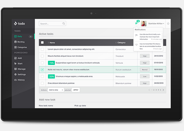
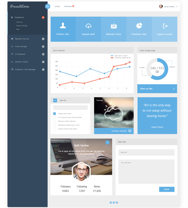
To-Do Dashboard
There is actually a lot going on within this dashboard but thanks to the neatly organized layout it doesn’t feel overwhelming to look at.
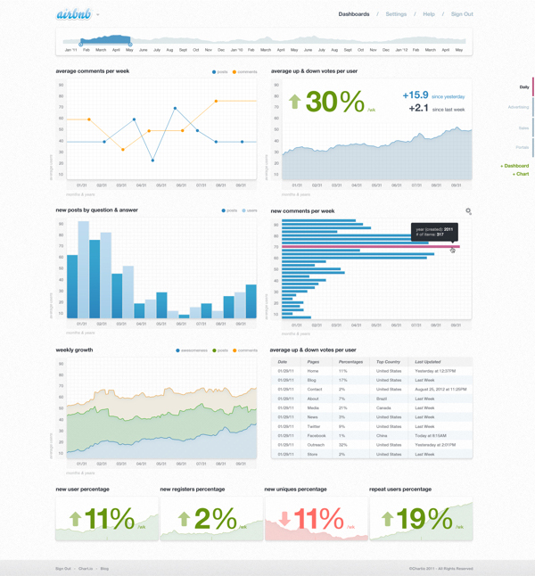
Selling
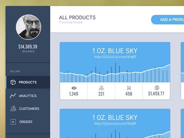
This is a very good execution of flat design in a dashboard, clean minimal and straightforward.
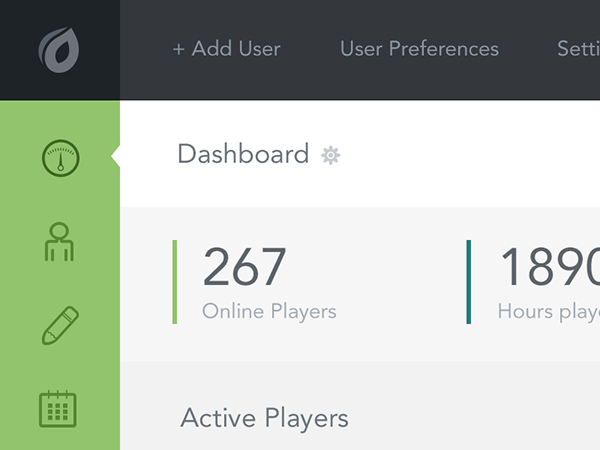
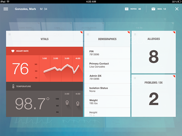
Admin Panel
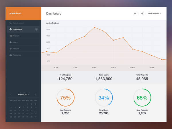
You know, I wish all dashboards were this simple. Give me a summary of the most important information I need, not a summery of everything there is.
Campaigns Dashboard
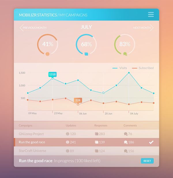
I also wish all dashboards where this fun. Just look at those fantastic vivid hues! They highlight the different sectors so well.
Today Page
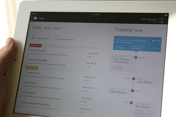
Once again a light design, the combination of task and time line is quiet clever and it works out very well.
Cloud Application
I really dig the highlight effect on hover for the graph points, just a great execution of UI.
Webapp Dashboard
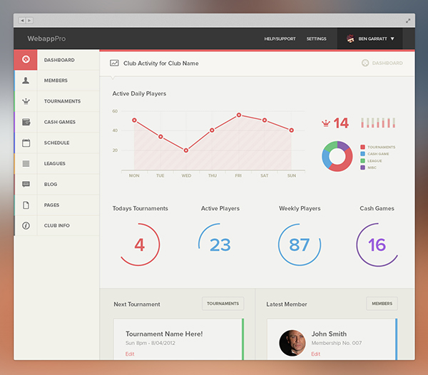
Here is something you don’t see too often, a red hue as the main colour of an interface. I think it works very well actually.
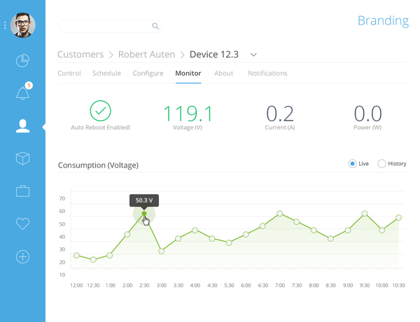
Device Dashboard
A slightly old interface with gradients – yeah, yeah I know – but it still looks so damn good! Who said designs can’t be timeless?!
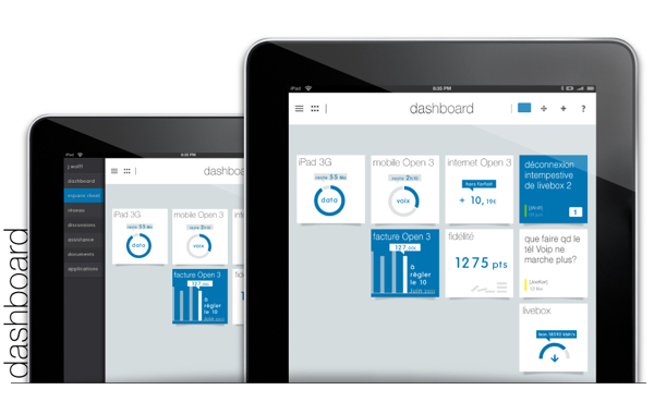
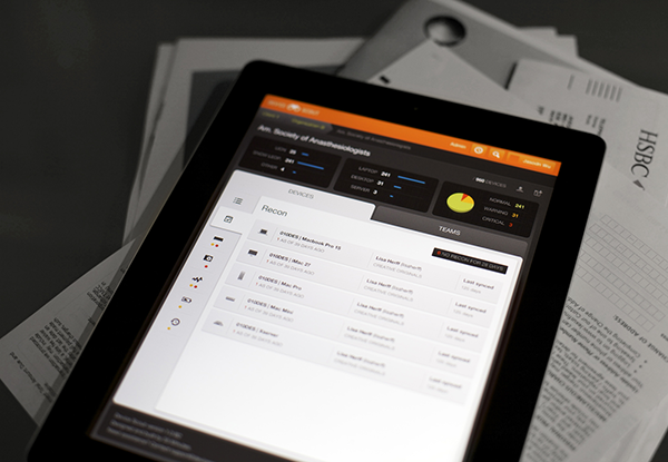
Dashboard Viewer iPad App
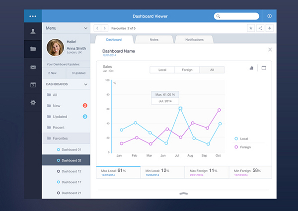
There is a lot of navigation going on in this dashboard. But, hey, it looks well organized and cohesive anyway.
Dashboard Menu Detail
I love designs that use thin fonts; the typography in this shot is amazing!
Productivity Platform
Here we have a productivity app with a clear hierarchy; everything is neatly organized so you know what’s what.
Analytics
I love that each section is a different colour; they stand out very well actually. There is a lot of cohesion among the design even with the varying colours.
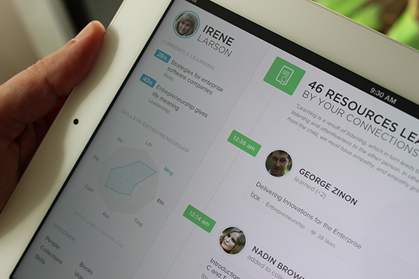
Tutor App UI
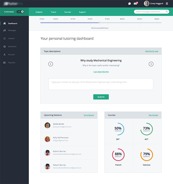
I like the way your various progresses are being mapped out for the tutoring app.
Market Insights
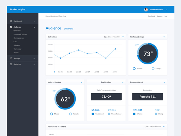
The contrast between the light background and the dark side panel is great. The design is very clean and simple thanks to the use of the off white grays.
Chart Panel
I absolutely love the big numbers. Typography is too often overlooked in crowded spaces, even if they are clean.
Dark Analytics Dashboard
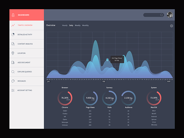
For a change we have a dark interface with percentage graphs that are just amazing. I love the way gradients are used in this design; they are subtle and they work just so damn well!
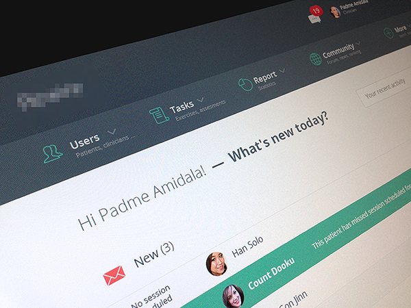
Webapp Dashboard
The very top of this dashboard looks very cohesive and organized; I feel it keeps the page together. It also uses icons very well, as well.
Ultramarine Admin
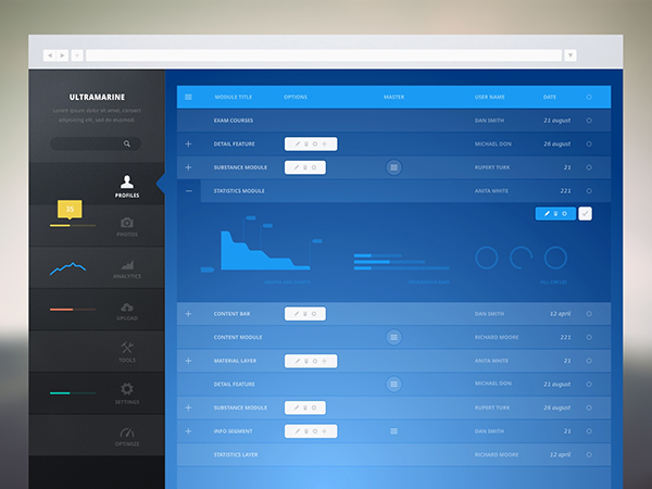
This wireframe is extremely high fidelity when it comes to the colours; but the use of overlays and gradients is exceptionally executed.
Wallet One App
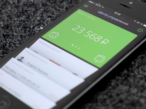
The simplicity of the green square is perfect; the thin lines of the icons and the light font weight make this design.
Sales Vendor Admin
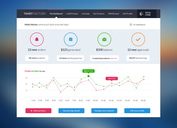
Finally, a design where vibrant colours like deep blues, reds, green and even orange can coexist!
Mobile Admin Dashboard
The design of this dashboard is something else; I love that it is thinking outside the box of a typical and overused design layout. We need more of these!!!


 Black Friday 2019, Best Deals for Web Designers and Developers
  [Review + Giveaway] Shards Pro – Perhaps Your Ultimate UI Toolkit
  Free Set of 404 Error Screen Templates
  Freebie: 70 User Interface Icons
  [Review] Greedeals – Is It Your Ultimate Source of Design-Related Assets at a Discount?
Michael Feb 18, 2015, 10:16 am
Nice collection. Good timing too as I’m just remodelling a dashboard. Of all the designing I find dashboard layout the hardest, so props to these submissions.