Design trends come and go all the time. While using trendy designs can be fun and sometimes easy, they have a finite shelf-life before they become obsolete. Now that 2013 is left in past, we take a look at some design trends you should avoid using in 2014.
Flash Intros
With recent developments in HTML5, CSS and JQuery technology and techniques there is simply no need to use Flash for simple animations and interactions. Not only do Flash intros require specific plugins and resources, they are also really annoying to sit through. While Flash still has its place in design, it is much better to use HTML, CSS and JQuery since it is compatible with all devices (eg. Apple mobile products don’t use Flash).
Sliders
Image by Nivo Slider
Image sliders were great for websites back in 2012 and early 2013, however web design has moved away from sliders and we are now using different methods of displaying a series of images. Sliders were great, but they didn’t provide the best user experience, and now they are rarely seen on any modern website.
Logos in Badges
![]() Image by Caitlin Workman
Image by Caitlin Workman
Encasing a logo inside a circle or badge was trendy in 2013, however it is starting to get tiresome to see the same effect everywhere. The badge emphasized logos which had a strong silhouette by placing a block of color behind the logo, thus making it stand out more. This effect is useful but has been overused in the past year and should be avoided in 2014.
The X Logo
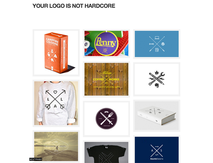
Image by Your Logo is Not Hardcore
The X logo was and still is an incredibly popular logo trend that seemed to appear out of nowhere. The X logo is a simple yet creative concept, but since it has been used so much it now appears lazy. Relying too much on this effect and style has ruined the X logo and it is best avoided especially when developing new branding for 2014.
Sketch Block Fonts
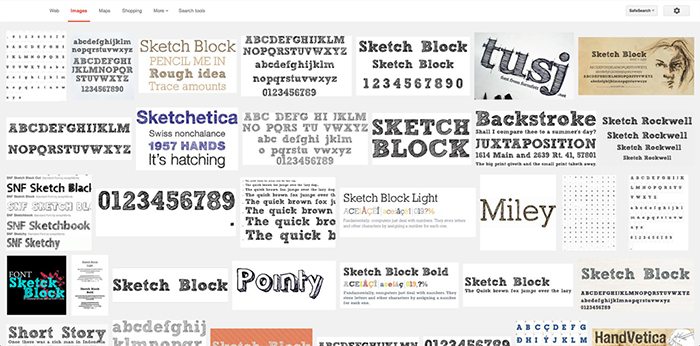
For some reason, there was a time when sketchy block fonts were really trendy to use. Even big corporations and companies were using sketchy block fonts in their ads. Perhaps it created the illusion that they hired someone to handwrite their typography, but any designer could recognize the fonts that they were using. The sketchy block font trend is almost completely phased out and looks quite tacky now, so unless you have a very good reasons to use them, they are best avoided.
Overuse of Stock Photography
Stock photography is a great resource, however when overused it can be seen as lazy and tacky. For example, when you are creating a mockup or draft it can be suitable to use stock photography, but for a finished website it is much more interesting and personal to use your own images. Although you might think otherwise, it isn’t hard to spot stock photography, especially the “fake” business pose photos.
Long Shadow Effect
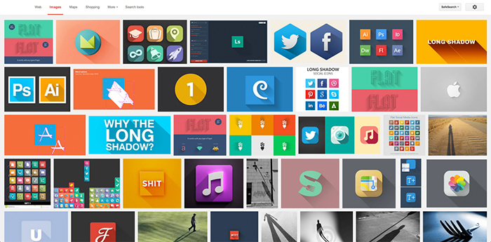
The long shadow was dubbed by multiple big websites and designers as the next movement in the flat web design philosophy. There was a brief period where long shadow designs were really popular, but it never truly caught on and flat web design still reigns supreme on the internet. It seems like the long shadow was another passing trend and it is no longer cool to use this effect.
Bad Use of Script Fonts
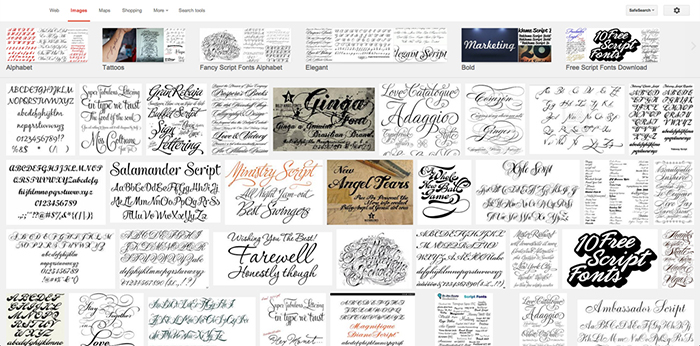
Script fonts have always been popular, but recently more designers have turned to script fonts to replicate the handwritten effect for logos and other designs. When used correctly it can add a new dimension to your design, but most people can’t seem to use them correctly. If you are after the handwritten effect, it might be better to actually handwrite your logo instead of using a digital font.
Typography
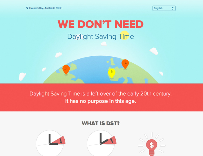
Image by We Don’t Need DST – An Example of Good Usuage of Proxima Nova
In 2013 it was extremely popular to use a font named Promixa Nova for website designs. This wonderfully crafted sans-serif typeface was seen as trendy and you were labeled a cool designer if you were using this font on your website. While there is absolutely nothing wrong with the typeface itself, you should avoid falling into the trap of using a specific typeface simply because it is the new trendy thing to use. It looks great, but it isn’t suitable for everything, just as Helvetica doesn’t bring out the best in every design.
Superfluous Effects
If you take a good look at all the modern websites, you’ll notice that there is an overwhelming emphasis on minimalistic and flat design. Effects such as gradients, embossing, drop shadows and other superfluous effects aren’t seeing much use. Instead we are simplifying web design, with a heavy focus on images, typography and clean design.
Design Trends in 2014
Design trends are always changing and it can be dangerous to follow each and every trend. Not only will be fall into the trap of relying on trends for your designs, but it also inhibits your ability to grow as a designer. Think about some of these trends and how outdated they would look in 6 months time from now. Avoid these trends in 2014 and learn to think outside the box for your future designs.


 10 Latest e-Commerce Trends to Watch Out for in 2020
  The Anatomy of Great Website Design that Google Loves
  11 WordPress Design Trends for 2019
 How You Can Boost Conversions with Minimalist Web Design
  10 Web Development Trends to Pay Attention to in 2019
Emil Jan 13, 2014, 10:50 pm
Hi there, great article however I’m wondering what would you recommend to replace Sliders (since you haven’t mention anything).
Sol Jan 14, 2014, 8:02 pm
yeah I came here to ask the same thing!
Dave Jan 14, 2014, 8:10 pm
Moi aussi.
What’s the point of saying that “sliders are old” if you can’t name what’s new? We’re waiting to find out from you what type of hero unit or slideshow transition you’re referring to.
Max Jan 14, 2014, 11:30 pm
Sliders have been overused for years, one solution is the metro-styled layouts.
e11world Jan 15, 2014, 2:02 am
It’s funny seeing your comment here Dave. Small world!
I agree with you and in my opinion big full width strong images are more of trend last year replacing sliders that fit within the 960 width but that may not work for all sites. Probably is a bit overused by now too.
Dave Jan 15, 2014, 2:18 am
Ha ha, yes funny seeing a comment out here on the Web from a person who (still, I believe?) lives a few blocks away. :)
I’m still using sliders but I’m going full width with them as you say. I run two sets: panoramic for landscape screens, then swap in cropped squarish versions for mobile portrait screens only. I get quite detailed about it but that’s the nutshell.
e11world Jan 15, 2014, 2:52 am
Yes I still live nearby man. I hope you’ve been good (this is turning into our own messaging form lol).
I find making different size images a bit overkill unless it is done dynamically which I’ve seen some do but not so well.
Sarah Jan 14, 2014, 7:47 pm
Decent article, but I think your missing the big picture. Website design is about what a clients wants and needs are. Not about the trends in the industry. If that is the only guide you are following to make a website, then your website will always appear outdated with in a year or two. Most companies keep their websites for 3-5 years before having a site overhaul. Therefore, making sure to address the companies goals, and the users goals is usually your best option.
Even if people use an outdated trend, but successfully accomplish the goals of the site, the site will continue to preform well over time. I’ve seen “web 2.0” styled sites that preform better than minimal sites, because the “web 2.0” site accomplished the users goals better.
Joseph Jan 14, 2014, 9:27 pm
Also interested in alternatives to image slider. Please advise.
Wesley Jan 14, 2014, 11:44 pm
Maybe we can use parallax for the transitions…
triggahippie Jan 14, 2014, 9:32 pm
i’m really hoping that the use of an out-of-date phrase – “learn to think outside the box for your future designs” – in an article about what’s on and off trend is supposed to be ironic.
ddrucker Jan 14, 2014, 9:50 pm
While I’m glad to be alerted to some techniques that some might consider outdated, this whole article smacks of ‘That’s so last year.’ in attitude and level of thought. Yes, some people are ‘misusing’ fonts and effects, but that’s true within a week of when they show up.
Maybe this should just be renamed ‘Design Trends to be Aware of” and point out that some of them may have ‘peaked’.
Mandy Jan 14, 2014, 10:50 pm
Sliders are so 2012 and don’t provide the best user experience? Are you having a laugh? Yes there are other techniques at displaying a series of images but please tell us an alternative that is not a gallery and is suitable for when space is an issue. Surely all great designers know that it is not the technique that is dated but how you design/style it.
Dennis Wehrmann Jan 14, 2014, 11:35 pm
Really, this whole article is superflous. I’m rather disappointed.
To sum it all up, THE Trend to avoid in 2014 is designing for trends.
But then, this has been the case 2013, 2012, 2011 and ever before, because design is not about trends but about finding individual solutions to visual problems – as we all know, don’t we?
After all, I don’t get any creative input because you fail to present any alternative solutions (i.e. sliders).
Emil Jan 15, 2014, 12:25 am
To anyone interested in this article – there’s something else in the subject worth reading: https://uxmag.com/articles/goodbye-to-8-design-elements-whose-time-has-come
Ricky Jan 15, 2014, 1:55 am
Avoid Typography? I’d say the opposite – blindly choosing Proxima Nova isn’t typography – the study of type – its choosing whatever’s on trend to look cool by association.
Typography would be matching up a great typeface selection to the brand and communication being created. This done well has incredibly powerful effects, and I would only want to see more of this in 2014!
Less sheepish font choices, more serious typography!
Zulhilmi Zainudin Jan 15, 2014, 11:34 am
Yes, agree with you. Helvetica is not match for everything.
Petr Chutny Jan 27, 2014, 3:42 pm
Not a bad sumup, thanks!