Building an iOS app design in tools like Photoshop isn’t always that fun.
I mean, sure, you can use various templates, but it always feels like you’re going against the current … like you’re wasting your time on things that aren’t necessarily related to the task at hand.
As it turns out, speed matters more than anything else when you’re working on a new app prototype … or working on any type of design prototype, actually.
Here’s the thing, whatever thing you’re building, is going to go through a couple of iterations before it’s approved by all parties involved (marketing, business dev, product department, etc.). This is why speed plays such a huge role in those situations. If you’re able to produce a quality design quickly then you can get the wheels of the project going at a more rapid pace, and therefore complete it quicker too.
This is where UI kits come into play!
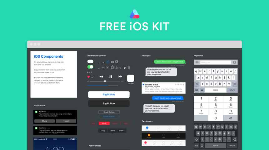
Today, we’re looking at an iOS kit by the guys over at Atomic.
What’s in Atomic iOS UI kit and how it benefits you
So what defines a good UI kit?
Is it the looks? The number of elements? The style?
Sure, all of those matter, but above all else, a good UI kit is one that saves you time and makes your work more efficient.
The kit delivered by Atomic passes this test. Its structure, the elements inside, and the way it’s meant to be used (more on that in a minute), all play a role and allow you to work much faster than you would otherwise.
The time saved with the Atomic kit can be used in other parts of your app development process, like getting feedback, exploring new possibilities/features, sharing your design with the investors, iterating and evolving … also known as the things that actually mater.
What’s inside and how to use the kit
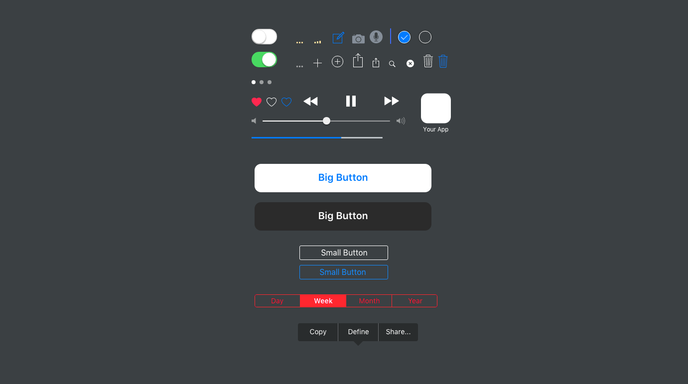
This kit is a free library of iOS9 iPhone UI components. It contains all the standard elements, including things like:
- notification templates (home screen notifications, notification center, pop-ups),
- elements and controls (all sorts of buttons, tabs, action links, trash can, etc.),
- action sheets (e.g. the thing that pops up when you tap the share icon in Safari),
- messages (message bubbles of different colors),
- tab drawers (for your app’s footer),
- status bars,
- app headers,
- keyboards (also including numeric keyboards and date pickers).
The styling? Classic iOS9 flat design.
How to use it?
Atomic iOS kit isn’t a standalone thing. It’s part of (and an addition to) the main Atomic tool – interface design software for professionals.
So in order to use it, you’ll need to sign up for Atomic first (free trial), and then you’ll be able to access the kit from your Samples project. Just duplicate the design and start working on your next app.
The good thing about using the kit this way, through Atomic, is that you get an optimized environment right away, and you don’t have to copy and paste individual icon files between separate Photoshop projects. Basically, Atomic’s is just a more efficient way to go about app design / prototyping, and it multiplies the payback.
What’s great about it – the pros
- The kit is free, which is always a good thing.
- There’s a free trial with Atomic, so you can test everything out before committing.
- You can share your prototypes with teammates. Atomic supports collaborative work, sharing project permissions, and etc.
- It speeds up your app design work considerably. Everything simply snaps into place. You don’t have to spend any more time than necessary to get a working app design – a design that you can show to your team and get feedback.
The limitations
If I really have to point something out, the only thing that comes to mind is that you can’t use this kit outside of Atomic. But it’s hardly a serious downside. To give you a counterexample, PSD files are compatible just with Photoshop and nothing else, but would you consider this being an actual downside of theirs? Not really.
How to get the kit
Just visit Atomic and sign up for their 30-day free trial.
The iOS kit is going to be waiting for you in the Samples project.



 ZeroSSL Review – SSL Protection for All
  RankTrackify- Seamlessly check and track your keyword rankings
  PositionStack API Review
  Aviationstack API Review
  Black Friday 2019, Best Deals for Web Designers and Developers