Many web designers state that one of the main feature of flat design is the special care paid to typography. According to my humble opinion this idea is true, but it’s not a specific element to flat approach. In fact, is there a design trend that neglects the typography? I don’t think so…
No doubt, typography was, is and will be extremely important for any designer. A font has the potential to kill or enhance a project and selecting the proper letters is partially an art. The secret tip is that an awesome font isn’t a guaranty for the success of a design project. The letters are forming words that transmit a message; there must be a match between the style of the fonts used and the message read by the user. Pragmatically speaking, what you read must be in accordance with what you see. This idea is valid no matter the style or context.
Altogether, as soon as responsive design is turned into the common design approach, the typography changes substantially. Until the revolution of handheld devices, the typography was an important aspect of any design project, but there weren’t technical issues regarding this area. The handheld devices represent a cornerstone in web design because these have influenced the rendering of fonts. The size of the fonts must vary depending on the display of the device used.
Flat design is the best approach in order to create responsive websites and this may be the reason why so many designers associate it with the special treatment of typography. In conclusion, types should always be treated carefully.
It seems that flat design will be intensively used in the near future so it’s recommended to study it. We love to play with fonts and we want to share with you 20 beautiful ultra light fonts. This font category is frequently used in flat projects so check it out!
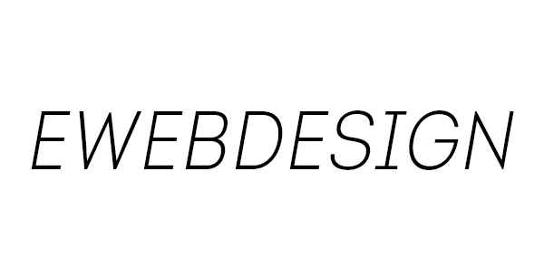
Linotype Univers
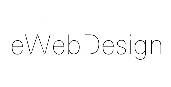
Unfortunately, a good font isn’t free because it requires a huge volume of work from its creator. This font is really stunning, but the price is pretty high, too. In spite of the fine lines, this font is very readable, regardless the size used. I consider that it may be used in almost any type of design project, but it’s perfect for modern websites or mobile applications.
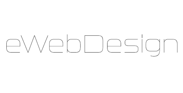
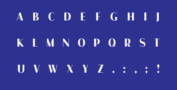
Presa
Presa is a very unusual font, but no doubt it will impress the viewers. I think that it is suitable for very modern or futurist looking websites. The strokes of the letters are thickened and the effect is very cool. Check out the preview to admire this original font!
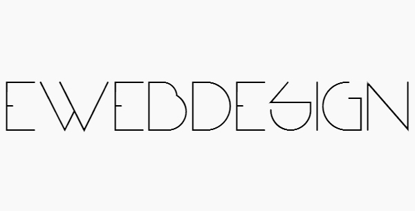
Egg Font
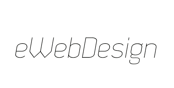
This font was released last year, but it’s still one of the most appreciated Ultra Light Font. It’s very elegant and discrete. Definitely, it may be used for any type of flat project.
Ostrich
Ostrich is a great Ultra Light Font that comes in many versions. All of these are good looking, but more important is the fact it’s free even for commercial use. It’s a “classic” Ultra Light Font and I consider that it shouldn’t be missing from any designer’s arsenal.
Tall Films
Tall films is another “classic” Ultra Light Font. It’s very elegant and may be used for a large variety of projects. Comparing with other similar fonts, the x-height is taller than the average and it makes the font more elegant, therefore it may be used for more official projects.
Dekar
Dekar is a very simple Ultra Light Font that impresses due to the nice curvatures of the types. The rounded curvatures create a special atmosphere but at the same time these make the font extremely readable no matter the context or the font size used.
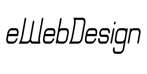
Why Square
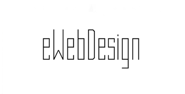
Why Square is a very original font, that may be easily distinguished due to the right angles. This format creates the impression of precision and power. At the same time, it’s elegant and easy to read. Overall, it’s a font that won’t disappoint the viewers!
Palatino
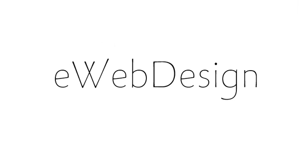
This font is opposite to the previous one, but both of them are satisfying the highest typography standards. Why Square creator was the adept of straight lines and right angles, while Palatino is an informal font that is based on fine curvatures. Without any doubts, this font is suitable for tourism or vacation related websites or for less formal projects.
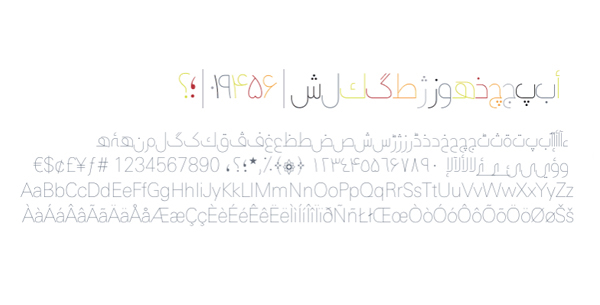
Shilia
Very often we are way too focused on Latin calligraphy and neglect the Arabic one. It’s not the case in this post because Shilia is a good looking Arabic Ultra Light Font. Unfortunately, the price is pretty prohibitive.
Sui Generis
Sui Generis is characterized by the bigger wideness of the letters; these are almost perfect squares. The wide letters are in opposition with the thin strokes, but the result is good looking, isn’t it?
As Vardo
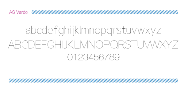
As Vardo is a font that is working for any type of project. It’s a common Ultra Light Font and it impresses due to the simplicity and good aesthetics.
Ambassador Plus
Ambassador Plus is a very elegant font suitable both for flat based websites, but also for magazines and packaging. It looks extremely well when used for headlines. It comes in multiple packages for buying and I believe that this font really deserves its money.
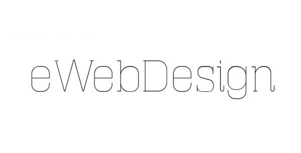
Masherbrum
Masherbrum is an old font, but it still looks modern, elegant and it may be used further without concerns. It’s a slab serif font that looks better in large size and the same as the previous font, it’s suitable for online projects and print, too.
Thinkdust
Many Ultra Light Fonts looks similar, but Vow is 100% an original font. Unfortunately, it’s not very readable and it’s recommended to use for bigger sizes. It’s a Sans Serif Font that will impress due to the perfect lines and angles. Personally, I think that isn’t a solution for website content (I mean don’t ever use it for content!), but it’s a very good option for various graphic design projects.
Aracne
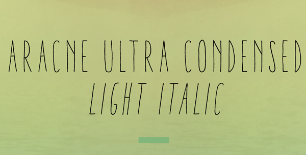
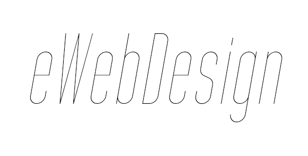
Aracne Ultra Condensed is another very original font. It may be used for less informal projects due to the influence of handwriting style. This font has four versions (Light Ultra-condensed Light, Light Italic Ultra-condensed Light Italic, Regular Ultra-condensed Regular, Regular Italic Ultra-condensed Regular Italic) and of course, all are perfectly crafted.
Haus
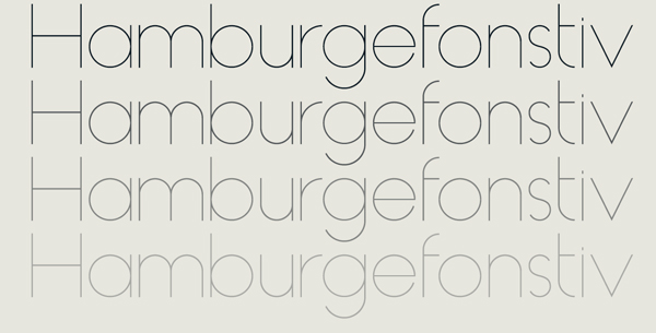
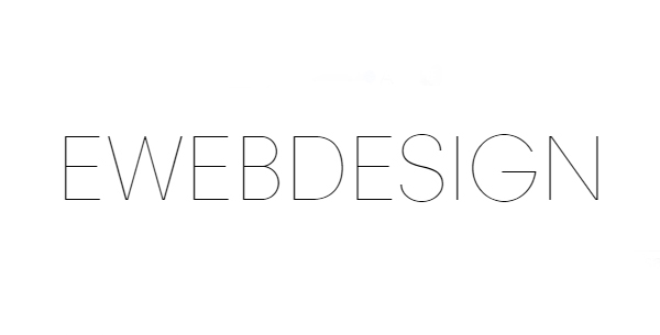
Haus is a very elegant Sans Serif Font. It has six versions, therefore it’s a complete font suitable for any kind of projects. I think that is one of the “purest” Ultra Light Font!
Panneau
Panneau is a totally standing apart font. The letters aren’t a very different from other Ultra Light ones, but there is a special feature that makes them wonderful and special. The strokes and the tails are thinner or thicker, not too much, but enough to create a cool contrast. In this manner, the eyes of the viewer are instantly attracted!
Erinal
Erinal is a font that should be used for headlines, because in small sizes is not very readable. I think that it’s a font that would help a designer to convey a calming and personal message and it will contribute to a pleasant experience. Besides these, the font is free even for commercial use!
Intro
If you are searching for an Ultra Light Font that must express trust, masculinity and power then Intro is for you. The strokes are strong and bold, so this font may be used for both print and online, regardless the font size.
Encode
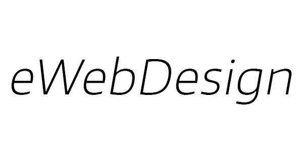
Encode is the last font from this list, but it doesn’t mean it shouldn’t be a priority in your ‘must have’ list of fonts. It’s simple, pleasant and readable – all the ingredients of a good font, isn’t it?
I hope that at least one font from the previous list will be enjoyed by every reader. In the eventuality that I missed your Ultra Light loved font, please let us know and we will add into a future post!




 TheHungryJPEG – A Surprisingly Huge Marketplace for Designers
 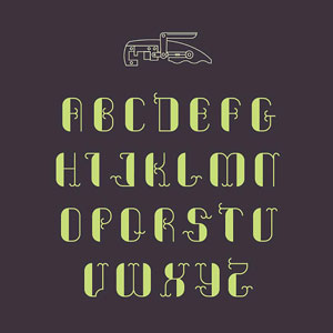 [Download] 17 Awesome Free Fonts From Webdesigner News
  20 Fresh and Beautiful Weather App Concepts
  Collection of Best Web Fonts for Websites
  20 Useful and Free Logo Fonts