Mobile UI designs can exert the same impact on readers as fancy website designs. May be they differ from each other in various aspects, but they can both give its viewers a proper dose of inspiration by demonstrating a powerful combination between creativity and performance.
As far as mobile designing is concerned, the process can be tricky and quite complicated since this sphere implies several basic problems that are jolly well needed to be solved. And primarily the issue relates to rather small screens and popular retina-ready images that require special attention. Moreover, web designer should always remember about readability and usability during prototyping because they play the most significant part.
Today we are going to cast a light on creative mobile UI examples that were able to overcome all difficulties and managed to provide users with exceptional interfaces.
New Mobile UI Design Examples for good User experience and easy to use apps
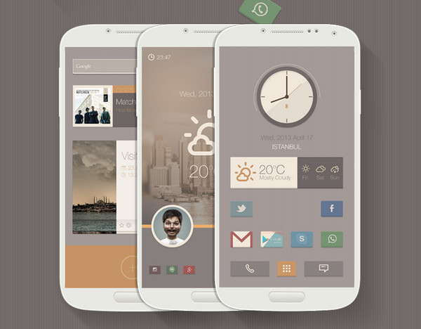
Pure Buzz Launcher Theme by Sencer Bugrahan – The designer skillfully leverages a warm soft coloring in order to nicely decorate the theme. All graphics looks neat and properly-executed.
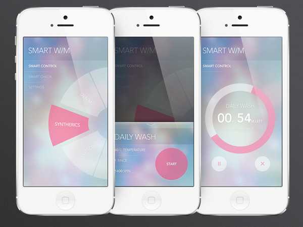
Smart washer app UI by Hyelim Choi – The interface is based on a fantastic vibrant background that has an elegant bokeh touch. The semi-transparent media player and circular menu as well as tiny refined type perfectly collaborate with the backdrop.
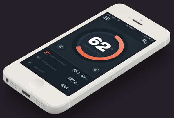
Downloader App by Al Power has a dark nifty interface that is wonderfully diluted by soft orange color. The huge central icon that is aimed to reveal a status of loading process immediately grabs the attention.
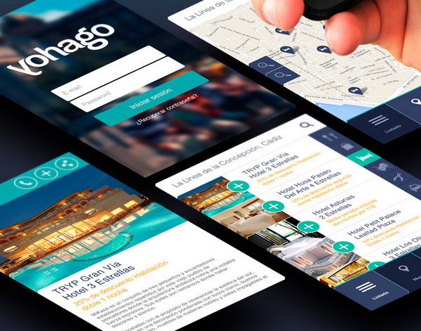
App Yohago Descuentos by Patricia Campuzano – The UI looks modern, sophisticated and urban. The designer ably combines together the blurred background, flat graphics and elegant color palette.
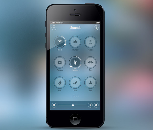
iOS 7 Relax App by Hari Krishnan – The concept is inspired by iOS7 and, of course, flat style. The limpid circular categories perfectly complement the vague bluish backdrop while the minimal media player nicely stands out.
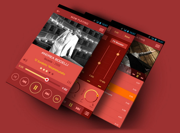
Flat Mobile App by Yasser Achachi has a music-focused interface that comprises everything you need for relaxed listening. Although the design is based on red and yellow color combo – that looks a bit harsh – the elements offer a perfect contrast.
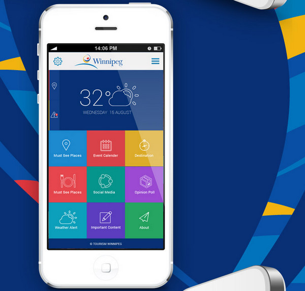
Winnipeg Mobile App Design by UI Kreative – The interface features a colorful grid that strongly resembles a trendy Metro 8 style. The ultra-narrow font and outline icons simply look like a glove.
Homepack Buzz Theme by Sencer Bugrahan screams out a retro style with a fantastic soft coloring. The geometry vibe gives the theme a special eye-catching radiance.
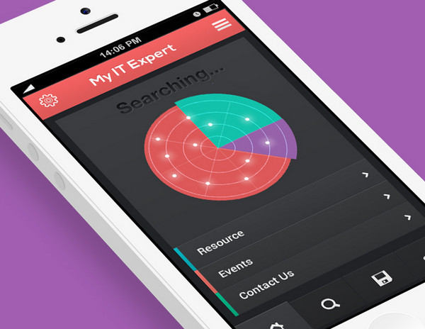
My IT Expert IOS Flat app design by UI Kreative – The app interface looks clean and subtle; the flat style does its job very well. The muted coloring nicely interacts with a solid color dark background.
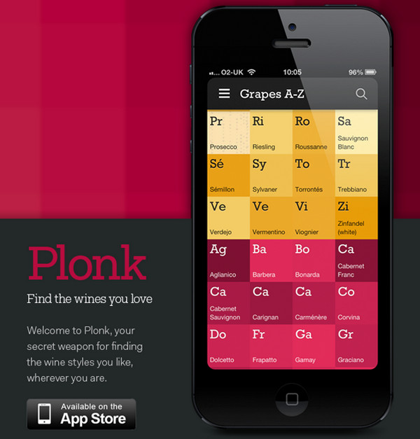
Plonk by Signal Noise provides customers with an offbeat interface that hugely resembles the periodic table. Nice colors, grid-based layout and pleasant font make the whole design to stand out.
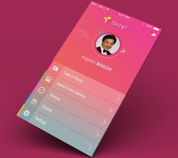
Postcard Iphone app ipost by Yasser Achachi – The UI relies on a gorgeous schmaltzy gradient that beautifully highlights light foreground items. The transparent stripes in tandem with bold icons add a special zest to the theme, making it look simply refined.
MUSIC APP FOR KIDS by Liza – Neat, clean and flat – these words can ably characterize this app interface. All components made in soft calm coloring that don’t irritate the eyes and look trendy.
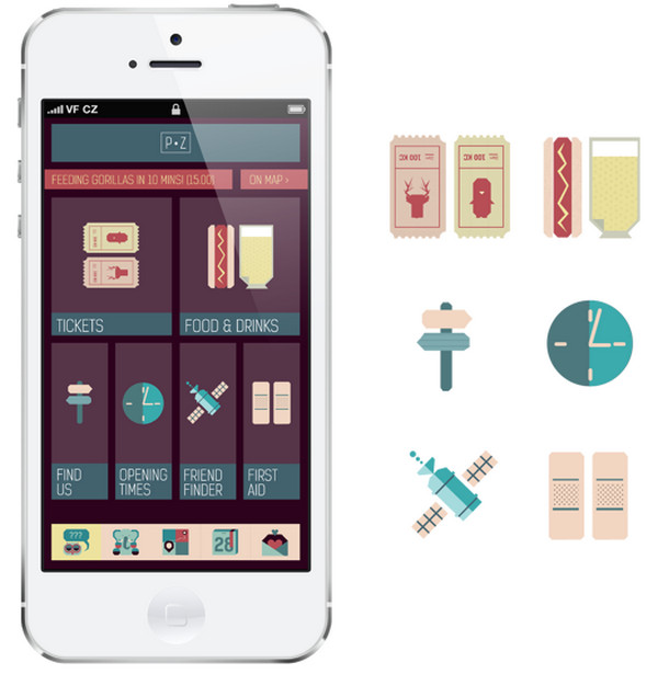
Prague Zoo App by Alina Kotova proudly boasts of its exclusive icons that add to the app a strong childish vibe. The designer employs a retro color palette that effectively complements graphics.
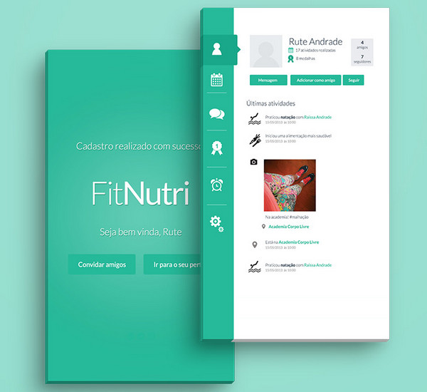
FitNutri by Rute Andrade – The designer capably makes use of three-tone scheme in order to beautifully embellish the interface. Green color evokes quite positive emotions while white and black provide a good readability.
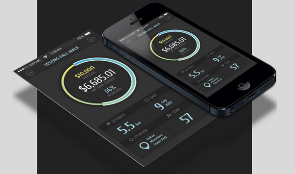
fun-filled charity walk by Boris Ryabinin – This is another magnificent dark interface in our collection that simply fascinates users by its play of colors. The designer unobtrusively demonstrates charts, graphs and statistics.
Reflection
Our collection features common applications that have quite fancy and offbeat designs. Designers utilize different decorative instruments to make a theme look harmonious, perfect and memorable. Small screen is not limitation anymore, and our inspirational list of fresh examples is a clear proof to this.


 Teamstack: Team-as-a-Service Provider with Convenient and Secure Solutions
 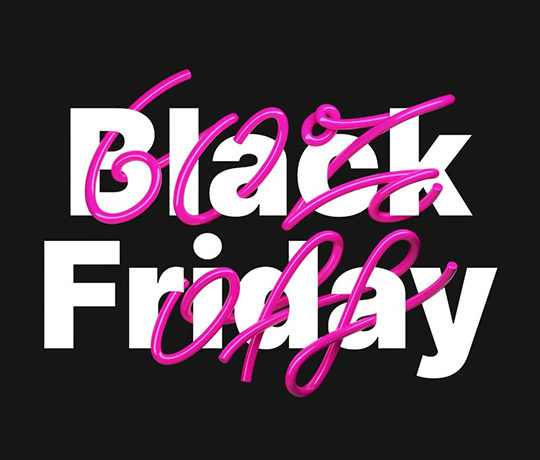 Black Friday 2019, Best Deals for Web Designers and Developers
  The Anatomy of Great Website Design that Google Loves
 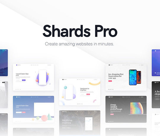 [Review + Giveaway] Shards Pro – Perhaps Your Ultimate UI Toolkit
  11 WordPress Design Trends for 2019