Website builders! There’s a lot of those available on the web. On the one hand, they’re great in the way they democratize web publishing and make it approachable for everyone. However, not all builders are created equal, and many of them don’t offer advanced-enough features for web design pros to consider them “serious” alternatives to manual site building.
But the landscape is changing, and we’ve been seeing a couple of new exciting tools that are truly impressive!
This is where Tilda comes into the picture with its promise to revolutionize site building for both pros and business owners alike.
In this Tilda review, we look into what the platform has in store, what it is, and who should consider using it.
What is Tilda?
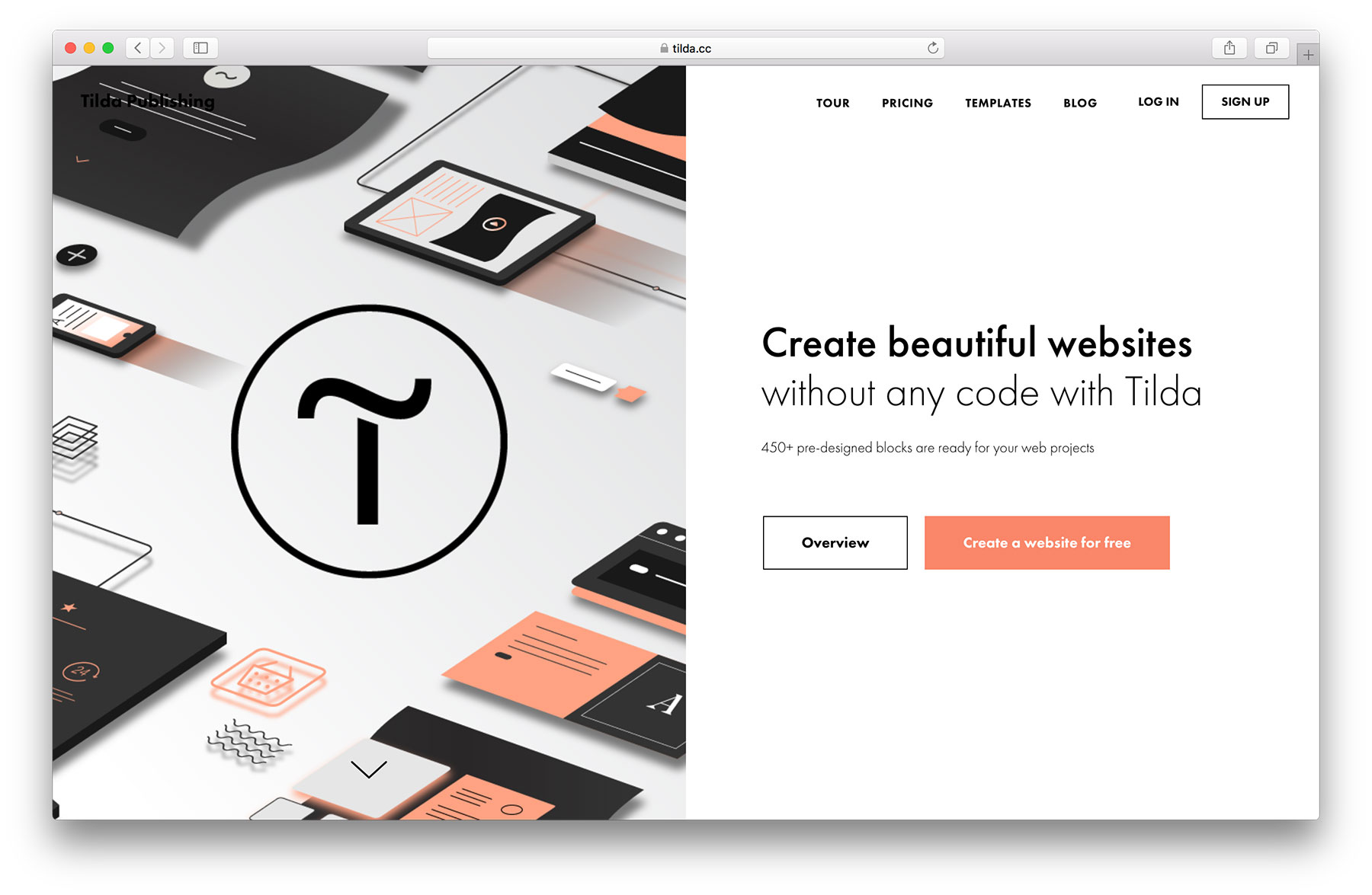
In simple terms, Tilda is a website builder. But it’s a representative of a new breed of builders.
The focus of Tilda’s is perfect balance between simplicity and flexibility. And let me tell you, I’ve tested a lot of different page builders over the years. Squarespaces, Wixs, Weeblys; I’ve worked with them all. And I have to say, Tilda really does stand out.
The features Tilda offers
There is a lot of features inside Tilda.
First of all, Tilda is structured around individual pages. Meaning, you get to crate each page of your site one by one, rather than creating “a website” and having a bunch of out-the-box pages already in it.
This gives you more control and also clarity as to what’s there on your site already.
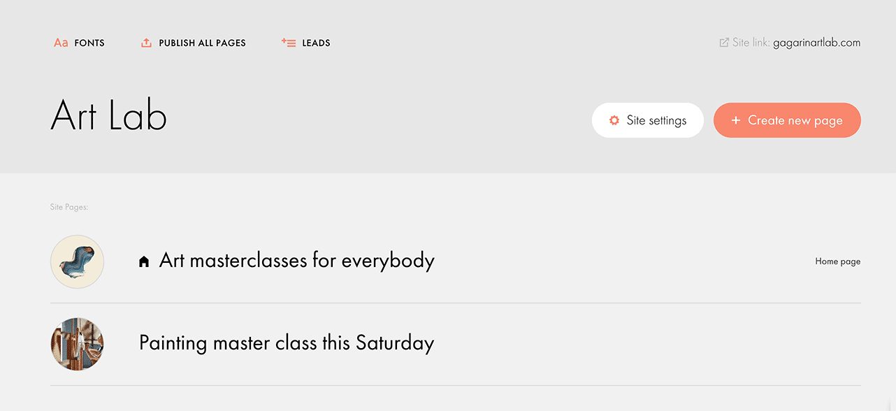
You can create any number of pages, obviously, and pick which one should be your homepage.
When creating each page, you get to choose the URL of the page and also pick from many ready-made templates for a range of possible purposes.
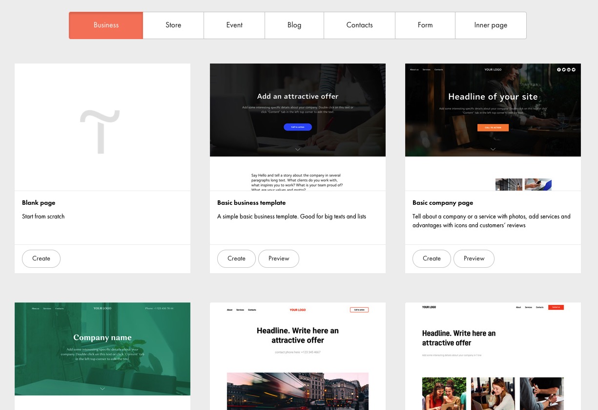
Overall, Tilda is ready to serve business websites, landing pages for products or services, online stores, events, personal websites, corporate blogs, and anything else you might need.
All this is possible thanks to more than 450 pre-designed content blocks that you can use on your pages. Plus, there’s also something called a Zero Block, which is an advanced web design editor for professional designers. It enables more in-depth edits of all the elements present on the page. You can even add some truly impressive animations to your content via the Zero Block.
As for those 450 other blocks, there really is everything there that you might need, all neatly categorized.
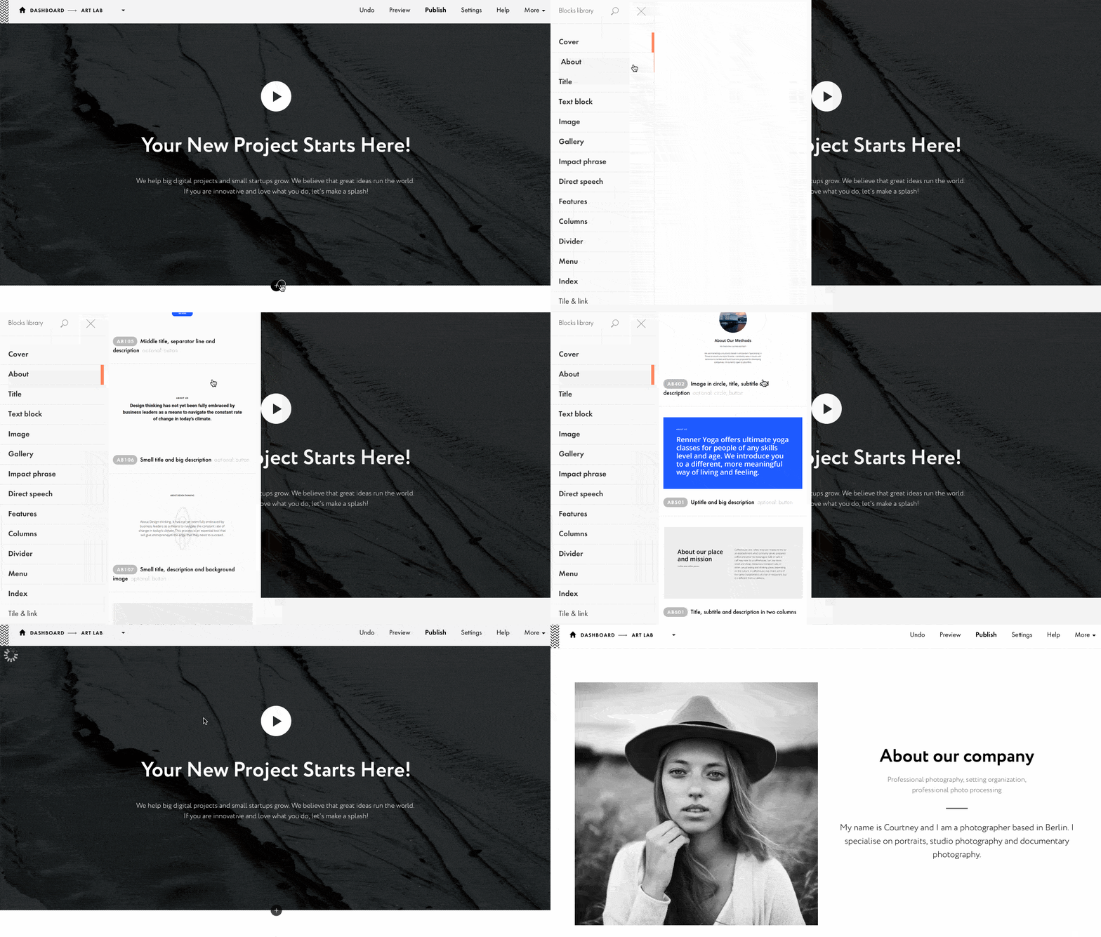
There are blocks for covers, text, images, menus, forms, titles, feature displays, stages, tariffs, team, reviews, video, dividers, links, services, raw HTML, and a lot more.
Adding consecutive blocks to your page is also intuitive, you just put one block after the other and change the block’s settings accordingly.
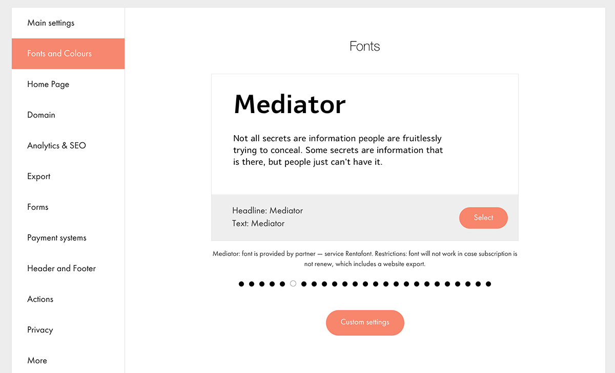
Speaking of settings; a good starting point is to tweak the global settings for your site. Tilda is highly focused on good typography and making sure that your site looks great on all devices, and it shows through how the settings are structured.
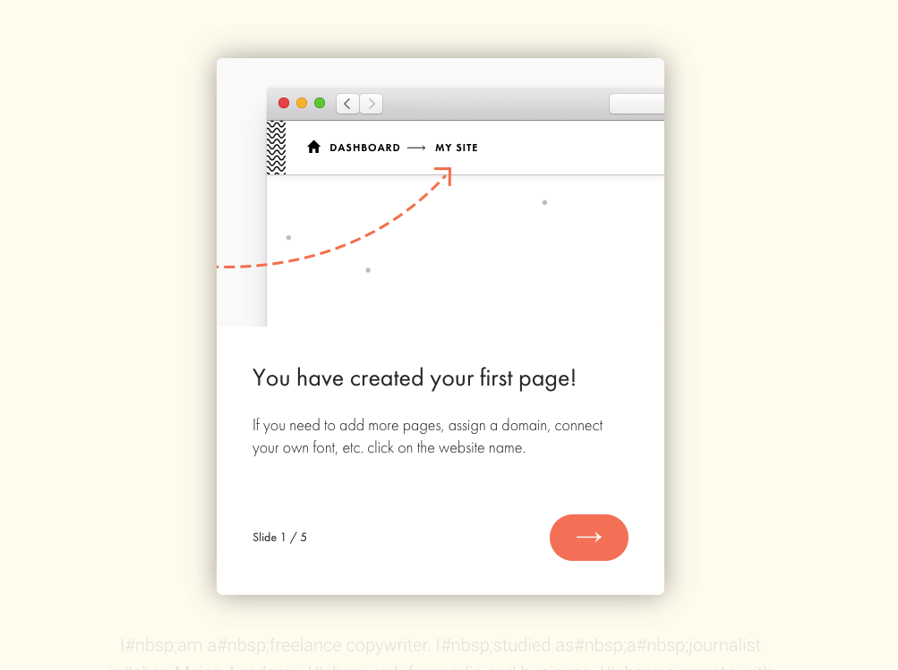
Tilda also offers some great onboarding. Whenever you enter a new screen or are about to interact with a new option, Tilda takes you by the hand and explains what’s up.
Some of the other, notable features of Tilda:
- possibility to connect a custom domain and turn on HTTPS
- out-the-box mobile optimization and responsiveness
- custom font collections, Google Fonts, and downloading fonts from Typekit
- free icon collections and built-in free image library
- support for full-screen photos and ambient background videos
- photo galleries
- built-in enhanced photo editor (to crop your photos, add effects, etc.)
- YouTube and Vimeo embeds + any other third-party code embeds
- form builder, including forms for email marketing + integration with MailChimp, SendGrid, SendinBlue
- integration with Slack, Google Sheets, Trello, Pipedrive, Zapier, and others via WebHook
- email campaign builder – you can design email messages in Tilda and then have them exported to your email platform such as MailChimp
- on-site analytics + Google Analytics and Google Tag Manager support
- online store features (cart, order form, product cards, promo codes, payments, etc.)
- accepting payments with Stripe or PayPal
- A/B testing
- advanced SEO features throughout Tilda – this includes the main SEO panel for the whole site, as well as individual SEO metrics for individual content blocks and pages
- social media share buttons and integration with Facebook Open Graph
- ability to add custom HTML, JS, CSS code for the whole website or an individual page
- full HTML export
- developer API
- plugin for integrating Tilda pages with a WordPress website
There’s surely a lot waiting for you in Tilda, yet it’s all quite easy to use, and you get to discover new content blocks and features as you go along.
When you’re done building your website, you can either have it published on Tilda or export the HTML and use it with an external host.
The cool thing here is that you can host your site on Tilda under a subdomain for free, or upgrade to a paid plan if you prefer to use a custom domain.
You can check out this library of existing sites built by various design studios and app developers to get yourself inspired.
Who should use Tilda
Overall, Tilda seems like an excellent choice both for people who want to build their own website fast (without knowing any code), as well as designers working on sites for clients. It can also be an effective tool in the hands of marketers, marketing departments and small agencies.
The templates in Tilda are fully customizable, so you’re not stuck with a predetermined design. And if you need more, you can always use the Zero Block.
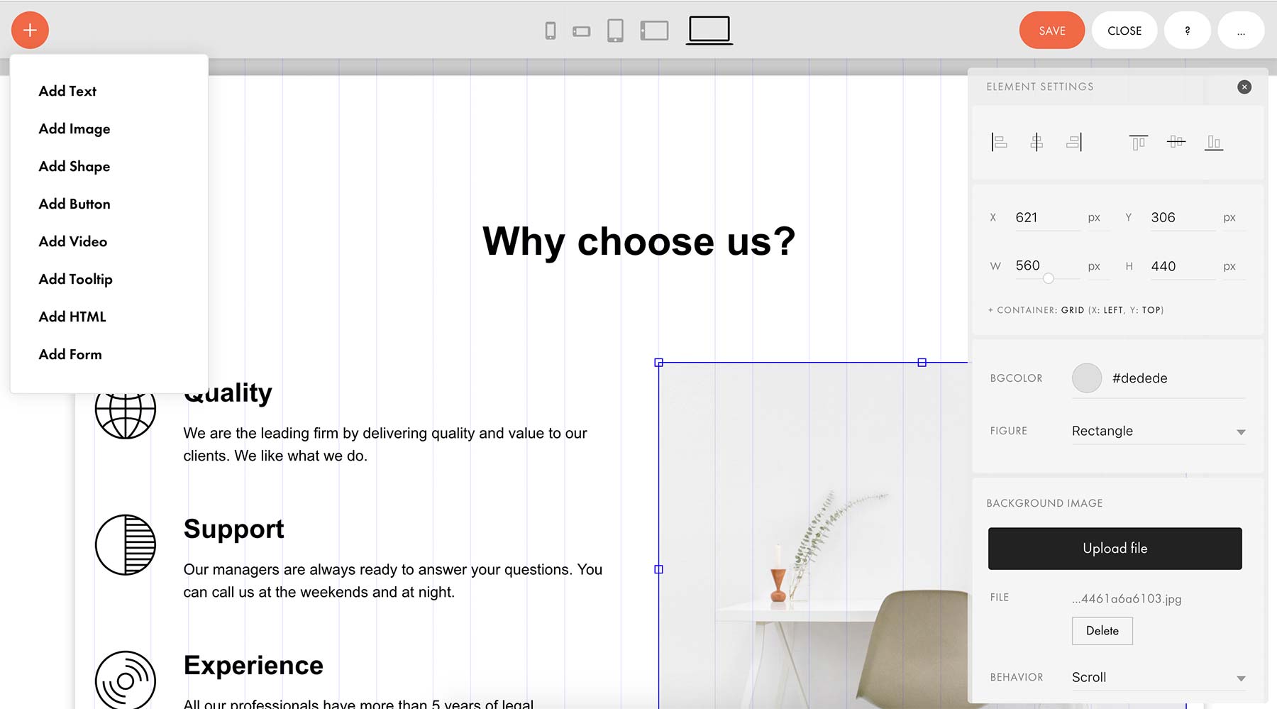
That Zero Block makes it possible to basically fine-tune every little element on the page, so it’s not limiting the designer’s creativity.
For me, the main selling point of Tilda is that you can go from blank canvas to a working site in less than a couple of hours. There’s enormous flexibility in what the tool offers, while not sacrificing ease of use.
All of that you get either for free (if you’re okay with just the basic blocks and subdomain), or for $10 a month when paid annually (for a fully featured Personal license for one site, with a custom domain). The Business license for $20 a month lets you have up to 5 websites + source code exports. If you need more than 5 websites, there are Pro plans for that. And should you need any assistance, there’s support available via online chat, social channels, and email.
Overall, I’m quite impressed with Tilda and what it brings to the table, compared to the other website builders. What do you think of solutions like this? Are you going to give it a shot when working on your website or creating a landing page?



 All Websites Should Feature Videos and Here’s Why
  Designing a Small Business Website: 5 Services to Use
  The Anatomy of Great Website Design that Google Loves
  How Anyone Can Captain Social Media With Zero Experience
  Freebie: Gradient Infographics