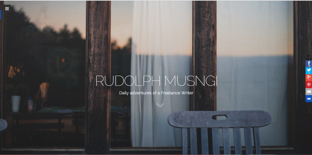
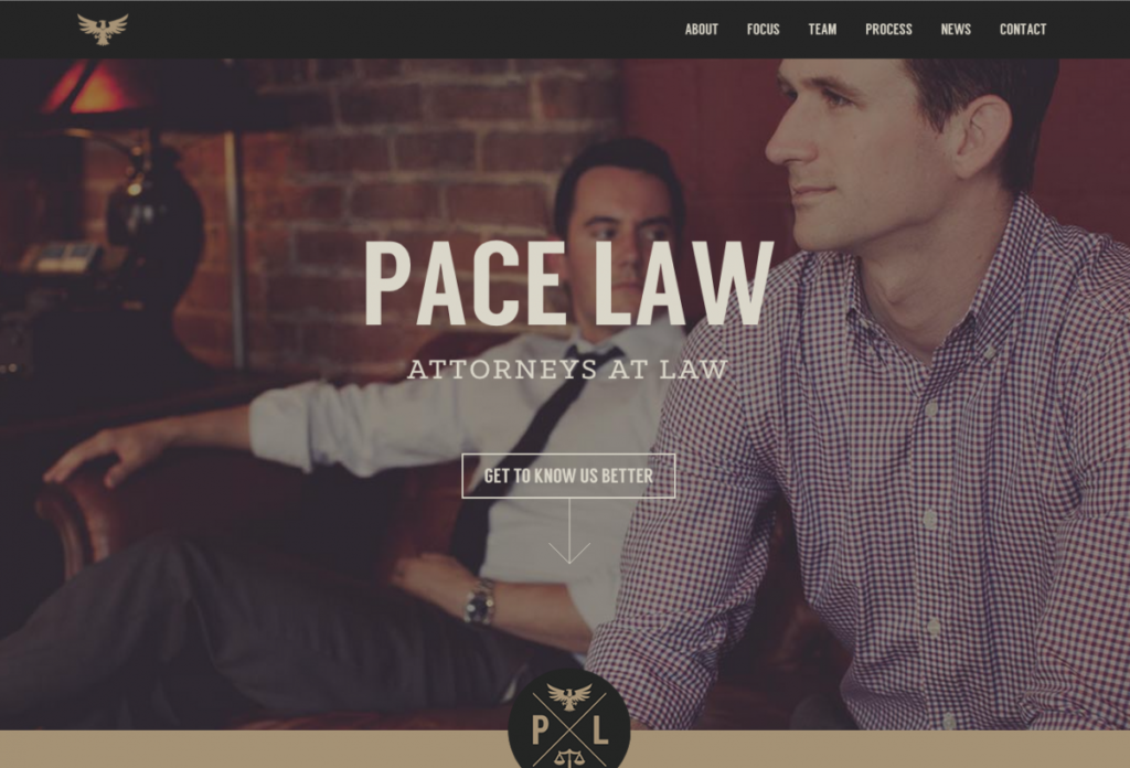
Typography and Photography are great combinations in beautifying design. The use of eye-catching photographs often adds a distinct feel in the website and makes it more professional-looking. This, is of course, reflected by a lot of designs out there. And because big-header designs have become so much popular in the recent times that adding photographs became almost mandatory.
On the other hand, typography works wonders as well. Not only does it provide information, typography also accentuates the design. The use of beautiful fonts, and well-written copies have been a source of preaching for web design pundits these days.
The work of photography, combined with typography, gives off a lot of success for designers, especially if they use these two elements well.
But the only question now is, how?
Beautiful Photos
Photography is always something web designers are not exclusively comfortable with. Perhaps it’s because of the popularization of beautiful stock photos, however, the presence of such image repositories shouldn’t be mean that you wouldn’t take some time to notice good photography practices.
The reasons behind this are many, but basically, you should take note of this because:
- Knowing what photos are good will help you choose really good photos for your design.
- Artistic perception is a conditioning for creativity
- Choosing the best photos will allow you send a better message.
Having said this, as a designer, you have to know what makes a photo good, but the question is, how do you know?
I once wrote a short guide on photography guidelines for the web and here are a few things I discussed:
- Rule of Thirds. This rule means that any photograph is divided into nine equal segments running through two vertical and two horizontal planes and you should place the main subject (or the most important element) along the lines or wherever they intersect.
- Place the subject on the left or right side. Putting them in the center sometimes lessens the power of the photograph.
- The photo segments doesn’t compel you to put the subject exactly in them. You can place it near them, depending on your taste.
- Horizon Line Placement. The horizon line is a horizontal line (obviously, duh) that runs in the background. This line often allows the viewer to identify distance and perspective. Horizon lines should be placed in the center of the image.
- Leading Lines. Leading lines are the ones who send the attention of the user from a certain point in the image to the subject itself. It’s sort of a “Subject-This-Way” line that allows you to easily identify the subject.
- Background is one of the elementary elements in photography, however, it is one of the most forgotten. A few reminders:
- Make the background as less distracting as possible
- Change the angle of the shot if the background becomes too distracting
Beautiful Text
Typography is one of the most discussed topics in web design, and consequently, there are a lot of typography tutorials out there.
But to freshen up your knowledgebase (or maybe if you’re too lazy to type in “Typography Tutorials” on Google), here are a few reminders:
- If the real text is already there, dump Lorem Ipsum. I have nothing against Lorem Ipsum, it’s a great tool, don’t get me wrong. But relying too much on dummy text will often make you miscalculate spacing. So if you’ll be designing text-heavy websites, better ask for the text if it’s already available.
- Give your fonts good relationships. Understanding text hierarchy will make your flow of information run smoothly. Users are able to identify text differences and takes them as signals for importance. So when you design a website, think of different sizes (and possible faces).
- Pick good colors. Colors are essential to design, there is no doubt about that. They give off messages subtle to users. Your colors should reflect the motif of the website and should be used to make the text more readable.
Combining Photos and Text
Now, here comes the fun part. Combining the photos and text will be challenging because unlike graphic illustrations, photographs often are composed in different colored or shaded-backgrounds that can hamper the readability of the text. And of course, if one cannot read the text or make of the background, everything will be all for naught. Here are a few things you can do:
Use Gaussian Blur
One of the simplest techniques you can employ is using Gaussian blur. Using Adobe Photoshop, you can blur out the image so that your text will be more readable and will catch more attention.
Use Boxes
Boxes are often used when backgrounds have varying colors and it will be a little difficult for the text to be read. You can use text boxes (or circles) that will easily separate the text from the image itself.
Be Smart with Backgrounds
Sometimes, the best thing to do is to go simple. Putting the text in the background (or wherever there is a clearer space for the text) will allow you to give more power to the design itself.
Bigger text, Better Colors
One more thing you can do is to make the text bigger, or add a contrasting color. Not only does this separate the image from the text but it also allows you to establish a brand motif, something that you would want to be remembered with.
Screen solid colors
Also a popular method, this one allows you to easily place text but still don’t sacrifice your branding. Overlay a solid color in front of the image and match the text color so that the text will still be visible.
Adjust Contrast
Lastly, you can adjust the contrast of the image and make it lighter or darker and make the text readable. Of course, the amount of contrast you can put depends on how your website looks.
Conclusion
I hope these tips help you. Remember that without one, typography and photography still are effective. But with the way web design is changing, the two becomes more reliant to each other, and mastering how they effectively work with one another will help you produce better designs and more satisfied clients. Good luck!


 The Anatomy of Great Website Design that Google Loves
  11 WordPress Design Trends for 2019
 How You Can Boost Conversions with Minimalist Web Design
  Photo Color Correction Tips + Free Photoshop Actions
  7 Graphic Design Tools for Non-Designers