Once upon a time, infographics were some of the best options for content marketing. That’s because they presented a wealth of information in visual format that could be digested quickly.
As with so many other fads throughout the history of digital marketing, infographics seem to be on their way out. They’re not disappearing completely, but the idea that mass-produced, quickly slapped together graphics coupled with weakly referenced statistics will draw an enormous crowd to a website is being challenged.
There’s good reason for this. People hungry for information aren’t looking for shallow offerings that only scratch the surface of a subject. Instead, the current trend seems to be moving toward more in-depth articles – outstanding content coupled with rich media.
While infographics certainly had their place, it’s time that they evolve into a format more consistent with today’s market and modern technology. The model hasn’t disappeared, it just needs to adapt.
Here are some ways that companies are presenting infographic-inspired content in a way that’s in line with prevailing trends.
Strong Data Visualizations
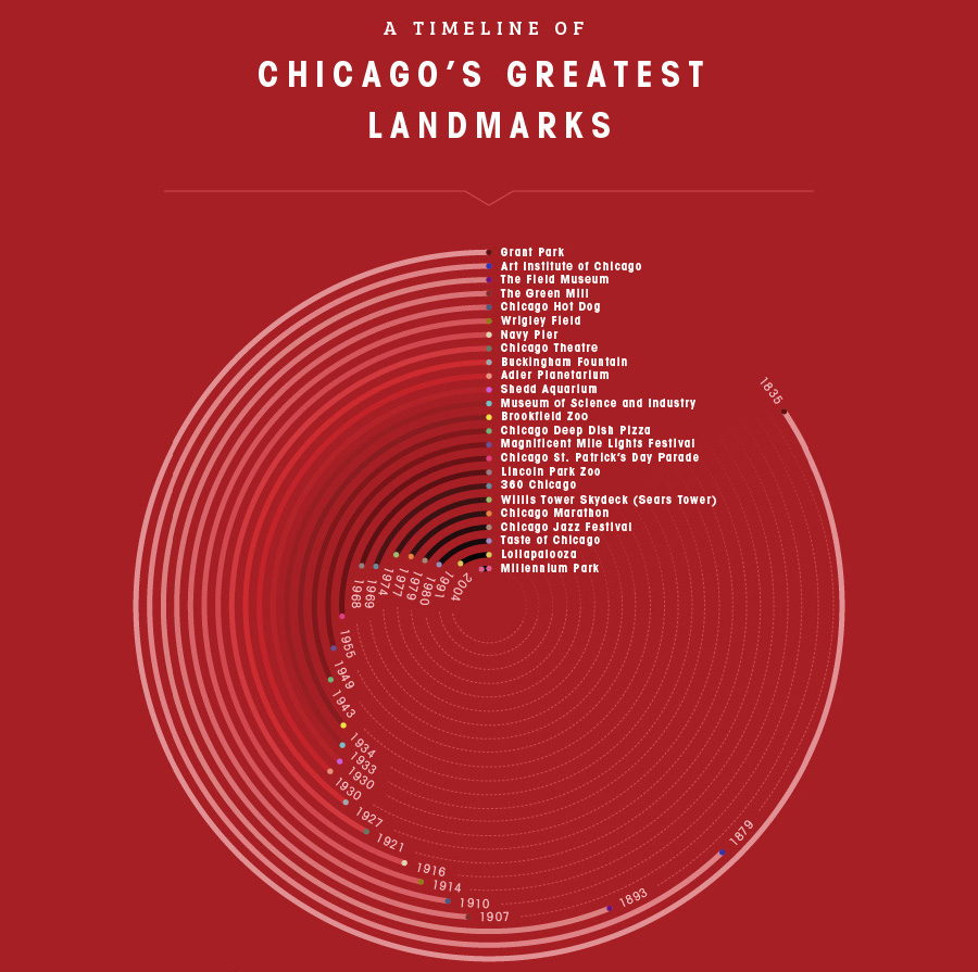
As an example, Giordano’s Pizza created a spiral showing the chronological history of famous Chicago landmarks. It’s used in a marketing effort to link the company’s famous deep-dish pizza to the history of Chicago. It’s a fabulous effort at giving a distinct, regional flavor to the company’s pizza.
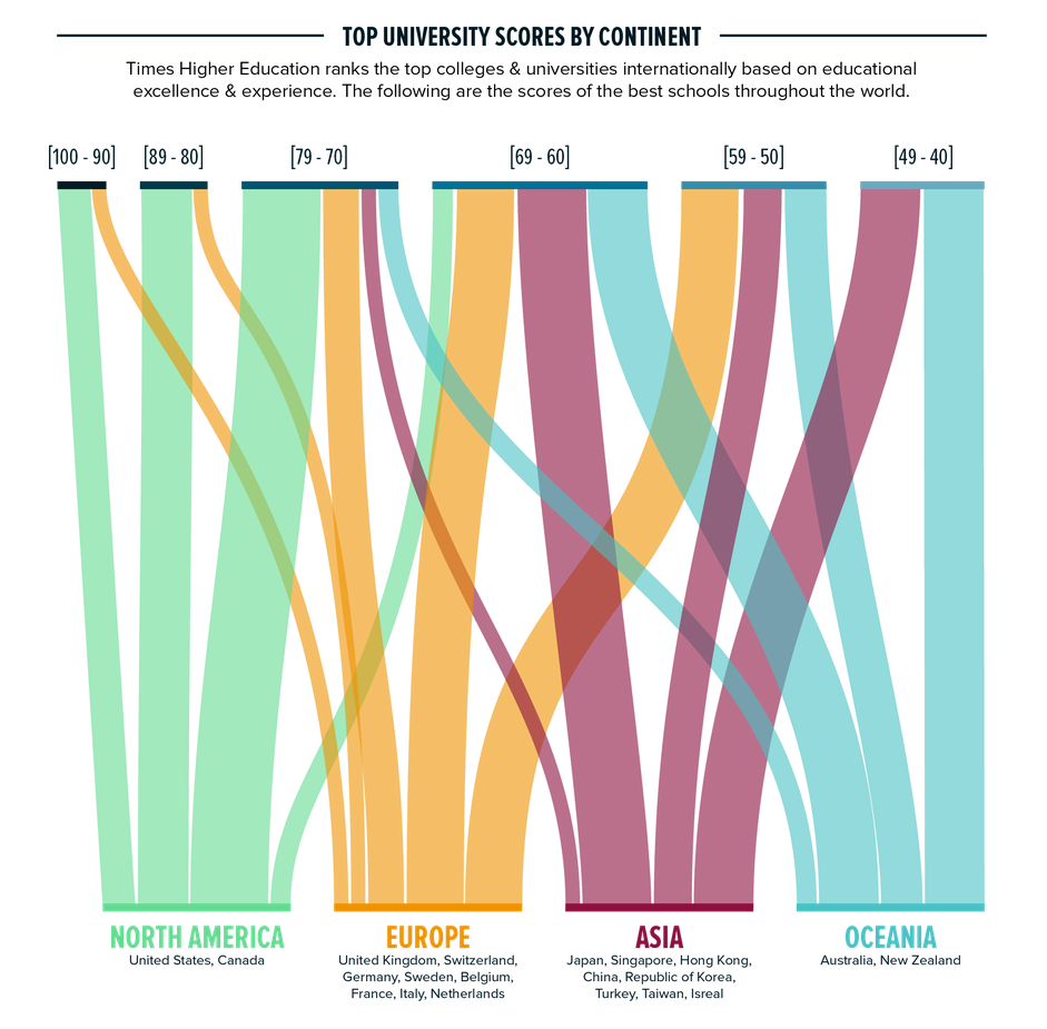
Another adaptation to the infographic model is offered by Aperian Global. That company put together a visual that ranked the best universities across the world based on excellence and experience. The graphic was a creative categorization of the highest scores at the top, geographic regions at the bottom and colored lines connecting the two in between. It gave readers a quick way to find where the best schools in the world are located.
Variations on a Theme
There is nothing new under the sun. Anything you see that claims to be original is probably a variation of something that’s already been done before. That’s true of infographics just as it is for anything else.
Some brands are taking the infographic model and adding their own twist to it. They’re giving the visual a special appeal that’s a pleasant diversion from the usual format that people are accustomed to seeing.
CJ Pony Parts, as an example, created an infographic that uses photographs of vehicles instead of drawings. Although the visual is clearly labeled “infographic” at the top of the Web page, it’s likely that a casual reader might not even realize that it’s an infographic. The use of photography is a clear departure from infographics’ illustrative tradition, so the whole thing is more like a creative effort at marketing than an infographic.
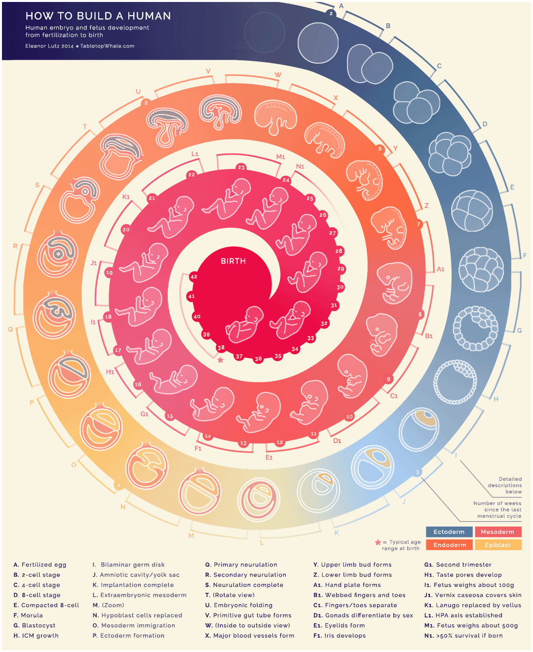
Another great example of a special twist on the infographic model is this “How to Build a Human” visual. It stands apart from the crowd most noticeably because it’s animated. The graphic actually shows fetal development, from conception through birth, in a spiraled timeline. Each significant milestone throughout the spiral is also labeled with a letter and is explained in more detail below the visual.
Parallax Scrolling
One of the more relatively new Web technologies to gain popularity in recent days is parallax scrolling. That’s a Web design technology that moves background images past the viewport more slowly than foreground images. It creates an appearance of depth within a traditional, two-dimensional screen.
Some brands are using parallax scrolling within the infographic model to create eye-popping visuals. It’s an original combination of contemporary Web design with a traditional content marketing technique.
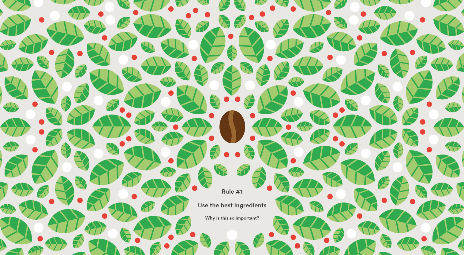
For Better Coffee uses parallax scrolling in its graphic that shows a coffee bean’s journey to becoming a cup of morning brew. It’s a very clever, and quite shareable, depiction of the coffee-making process.
Another infographic-based visual that employs parallax is offered by Cyclemon. That company’s home page features various models of bikes that visitors can view by simply scrolling down. Each model is presented in parallax, giving the page an indisputable wow factor.

Interactive Infographics
Interactive features are quickly becoming more commonplace in content marketing efforts. Why not combine them with traditional infographic visuals?
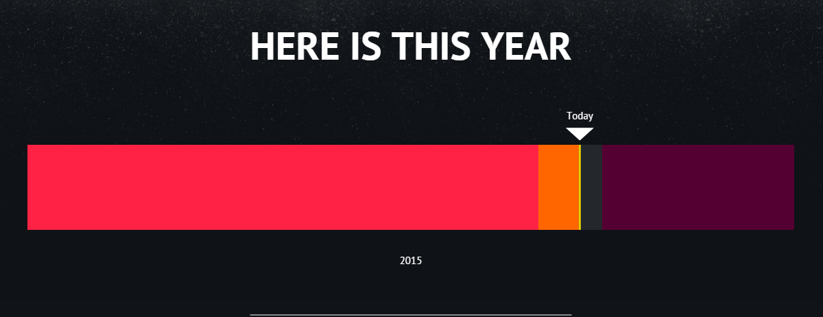
Some websites are already doing that. Take, for example, the Here is Today website. That site’s front page offers a simple box labeled with today’s date. However, the twist is that if you click on it, it turns into a horizontal bar that shows today’s date within the current month. If you click on it again, it shows today’s date within the current year. That process continues every time it’s clicked. It’s a fairly creative way to show today in the backdrop of a historical timeline of varying lengths.
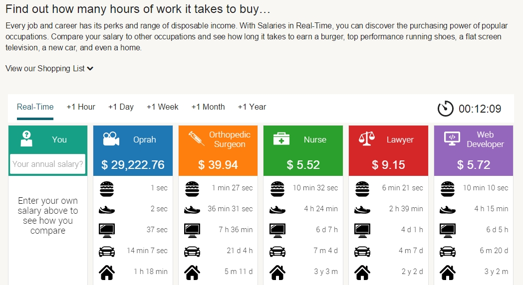
Finally, another great example of an interactive infographic is Retale’s page that shows interactive salaries in real time. You can use that page to plug in your own annual salary and see how much money you’re earning every second. Better yet, you can compare your earnings against those of a Web developer, a nurse or Oprah Winfrey. It’s basically a living infographic that provides you with information about your financial position.
Although infographics seem to be of little use to content marketers anymore, the concept is still valuable. Webmasters who want to draw in an audience should learn from the infographic model and adapt it to a more contemporary audience.


 Aviationstack API Review
  Zenscrape Re-Imagines The Scraping API
  How Will Blockchain Transform Business in 2018?
  [Review] wpDataTables – Your no.1 Solution to Build Functional Tables and Charts in WordPress
  Website Designs Powered by Flat Illustrations Great Examples
Ellie K Jan 12, 2025, 11:18 pm
I would love to see a follow-up on the status of infographics now, 10 years later. I think this post was quite prescient in identifying the diminishing appeal of infographic as novelties! I was captivated by them too for awhile!