Color is no longer associated only with a decorative tool. Nowadays, designers choose color scheme in accordance to app’s audience since it is able to clearly display emotions and stimulate senses, also it recreates special mood, adds extra zest and simply distinguishes design from others. To be aware of the whole power of colors – does mean to win half the battle.
So, well-thought-out color palette, especially one that includes numerous intense shades, is definitely making a huge difference to UI, although employment of bright contrasted colors is rather risky, since you can end up with unpleasant and irritating intensely hued riot. Only cautious and holistic approach helps colorful design reach a high level and make user experience comfy.
Today I have gathered some fresh examples of mobile app interfaces that demonstrate all the beauty of a burst of bold colors.
Cat Music Karaoke App
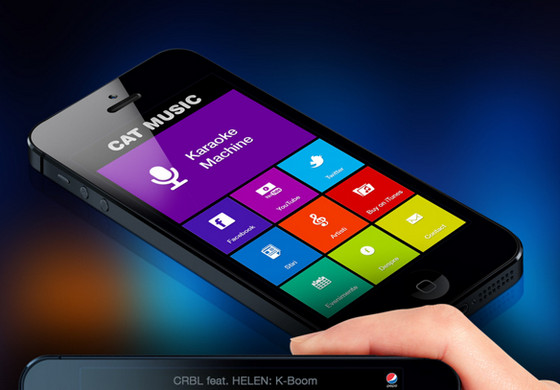
Cat Music Karaoke App by Сristi Hurhui has a vibrant color spectrum design spiced up with a stylish Metro 8 aesthetics. Monochromatic white glyphs along with ultra-narrow small type add to UI balance and harmony.
18 (+)
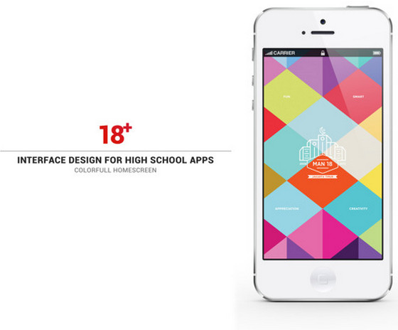
18 (+) by Firman Suci Ananda has a nice geometric vibe that is accomplished by a colorful polygonal welcome screen. Various visual and content boxes come in rhomboid shapes in order to naturally complement the whole design.
Listly
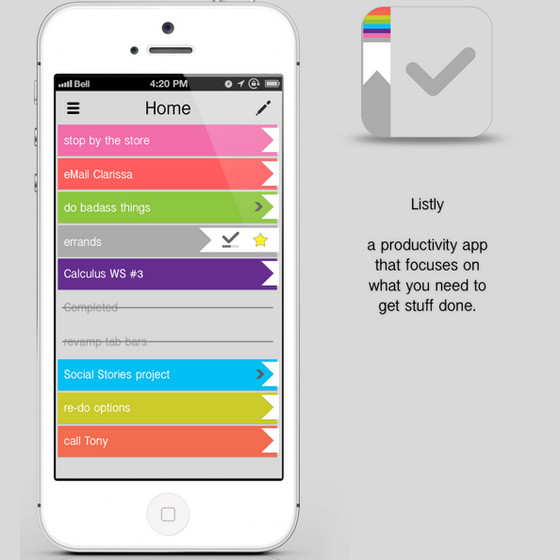
Listly by Megan Holstein is based on an organized stripe layout that helps to distinguish numerous tasks by means of color differentiation. Clean flat graphical components add to UI extra readability.
Park Śląski
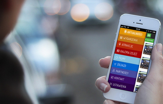
Park Śląski by Maciej Mleczko has a vibrant side menu that definitely stands out by its color scheme. Regular line icons in conjunction with narrow type ably cooperate with rainbow themed background.
Sesaudio
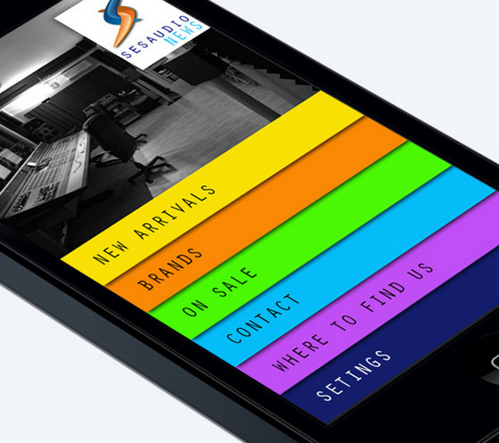
Sesaudio News by Loan Kirilov also features rainbow-inspired menu that occupies most of the screen. Intense colors instantly grab users’ attention.
Interphono
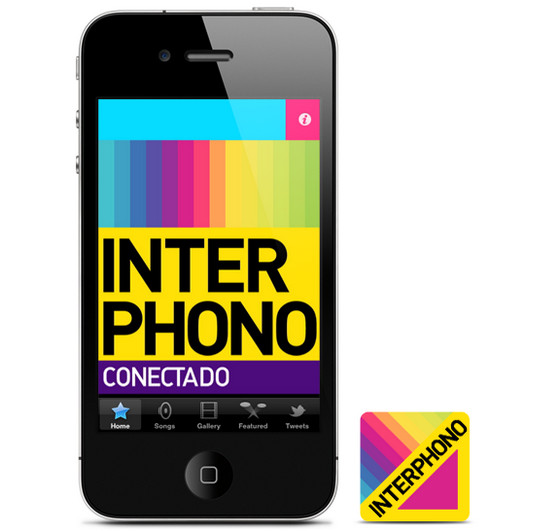
Interphono by Abraham Vivas is a bright app dedicated to music. Blend of bold colors brings the jovial personality to design and makes an UI look unique and dynamic.
Ten Pan
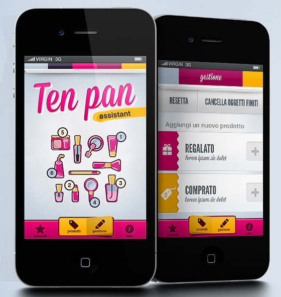
Designer leverages schmaltzy color palette, a lot of glossy elements and smooth polished vector graphics to give an interface a girlish notes.
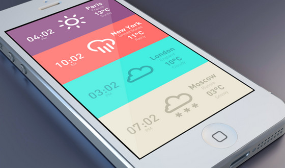
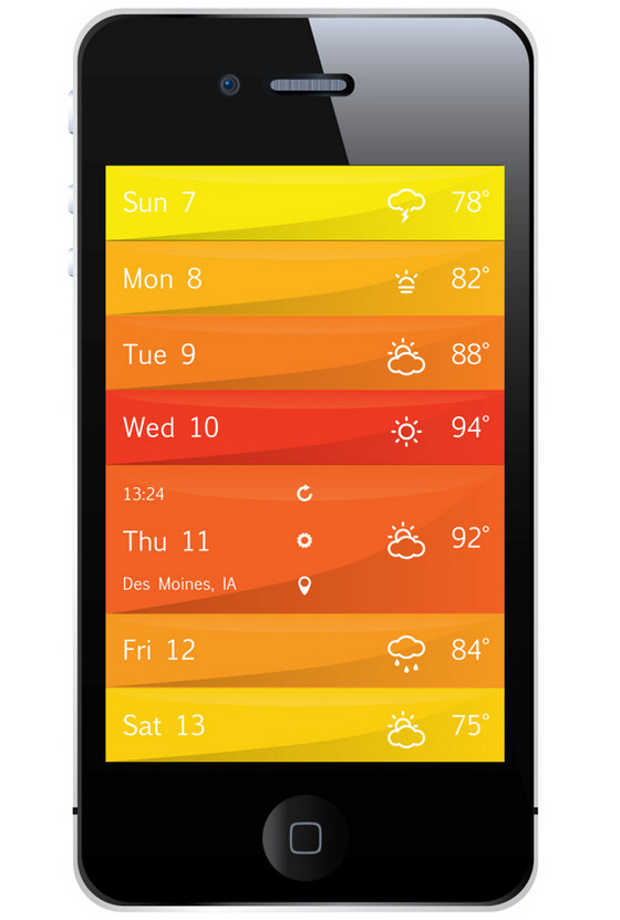
Weather Tile
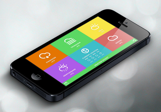
App by Bjonk Design is a helpful weather application that is based on colorful tiles. Its interface is inspired by neatness, spaciousness and coherence of a renewed flat style.
Meteo & Clock
Designer skillfully adopts minimal style, utilizing subdued coloring, bold icons and simple font to recreate a rather sharp and intuitive design.
Fairshare
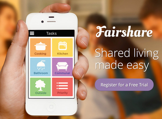
Designer makes user experience more convenient and comprehensive with a help of a full-screen navigation that fascinates onlookers by its pastel color palette and huge clever icons.
Public Transportation App
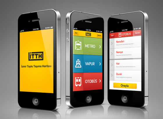
iPhone App by Dogacan Ege Altunsu has a huge quite intelligible vibrant three-color basic menu that includes only 3 essential links. Each menu item is supported by bright sleek gradient background and slightly bulky icons.
DeliXL Food Service
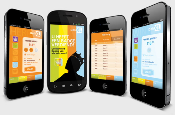
Tim Poot’s App is a small captivating game, whose interface is mainly based on a multiple muted colors that give design a visually pleasing appearance.
Weather App
App by Andrew Fuller is another sightly application dedicated to weather forecast with an impressive outward. The app demonstrates information via stripe layout, where each line has its own bright background with a bit of glossy effect.
Plonk
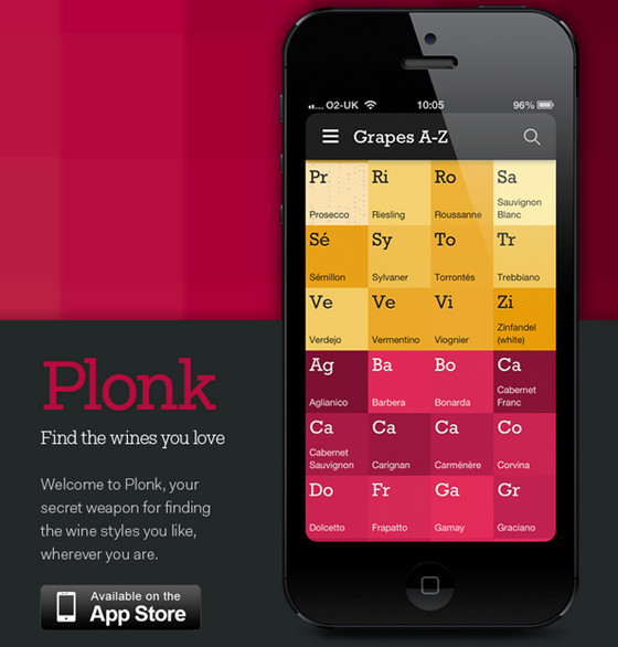
Designer uses unconventional approach to showcase a selection of popular wines. App’s interface closely resembles periodic table that simply attracts users by means of its rich color scheme, and convenient organization.
MYSIC
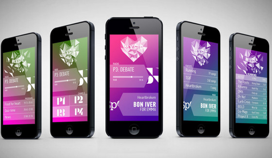
Designer leverages a great deal of semi-transparent blocks and enthralling poly-inspired graphics that go perfectly well with various subtle gradient backgrounds.
Balance
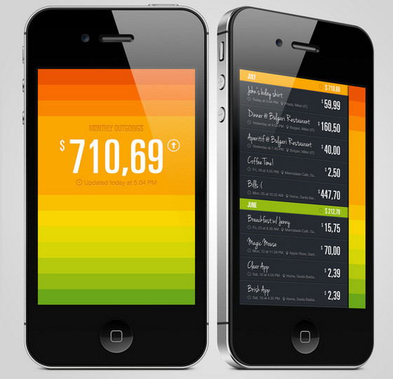
Despite of being a businesslike app, it has a bright and cheerful interface that definitely evokes positive feelings. Ranging from hot alarming red to balanced calm green, info box background is aimed to display your current expenses relative to the limit – very simple and efficient system.
Divvy
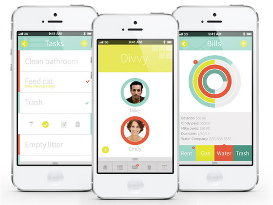
Divvy by Molli Ross is a helpful app for roommates. Interface is mainly based on a clean white background and nice injections of complementary colors.
Go Dutch
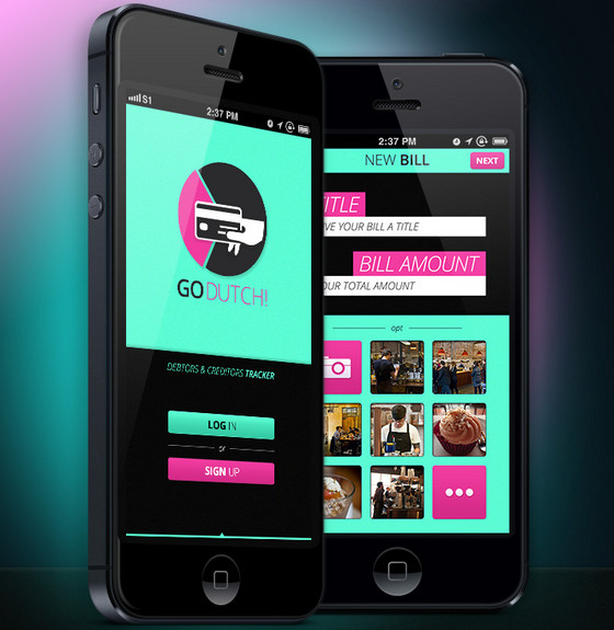
Go Dutch! App by Syn-Ee Wong has an eye-catching and dynamic look created with a dark background that beautifully highlights bright turquoise and fresh crimson content blocks.
Cash Cat
Designer skillfully employs a smooth gradient effect in order to give every menu item a slight 3-dimensional touch.
Synaesthesia App
The concept depicts a stunning explosion of various colors. App features numerous solid color screens that all together creates positive atmosphere.
Chakra Color
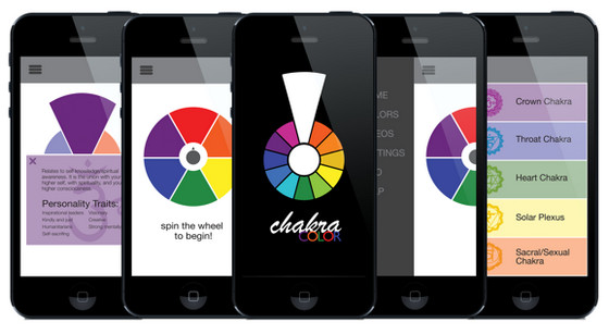
Designer makes use of regular flat graphics, and injects bits of soft and neutral shades in order to add to an UI neatness and serenity.
MetroLite Map
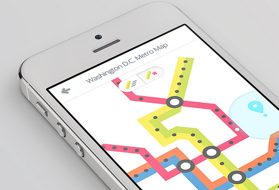
MetroLite Map by Alex S. Lakas looks clean and subtle. Blank white background is beautifully brightened by vibrant plane map elements.
Play It Down
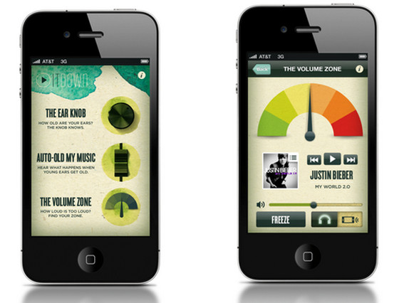
Play It Down by Justin Dobbs represents an artistic interface with an elegant watercolor touch. Textured background beautifully cooperates with realistic controls and rich color palette.
Discover Projects
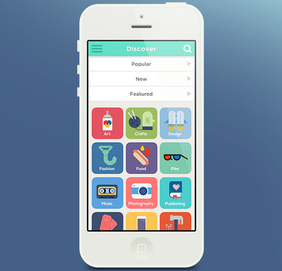
Discover Projects by Fostr is a typical example of interface inspired by new iOS. Flat intricate icons with garish coloring look refined on a simple grey background.
Samsung Smart Home App
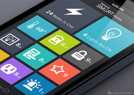
Designer ably utilizes elegant flat style, large icons and grid layout to easily recreate comprehensible and crisp design.
All in Way
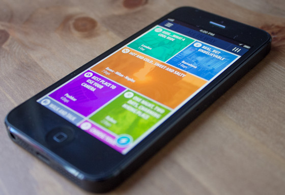
Designer also relies on a tile layout that adds coherence to interface. Colorful superimposed low opacity layers help to distinguish content and make app look visually appealing.
Reflection
Bright color palette instantly forces any interface to look prominent. In order to obtain real benefits of a color spectrum you should maintain a balance between background and decorations, since simultaneous utilization of a numerous saturated colors in the same project can lead to visually overwhelming design with a lack of readability. So, it is fairly essential not to go overboard with colors.
Do you choose vibrant colors or vice versa minimal coloring? What feelings do splashes of bold colors cause in you?
Feel free to share your opinion with us.


 Teamstack: Team-as-a-Service Provider with Convenient and Secure Solutions
  The Anatomy of Great Website Design that Google Loves
  11 WordPress Design Trends for 2019
 10 Web Development Trends to Pay Attention to in 2019
  Freebie: 50 Vector Human Resources Icons