When we design websites or have other graphic tasks, textures come in handy quite often. While some of them look really good, not all of them are in high quality, so today we will showcase 15 interesting and useful free textures in order for you to use whenever you need them.
Most of them are in high resolution, so you will be able to put them on the background of everything you are working on.
Free Textures
Styrofoam Texture
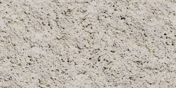
This texture is very good because although it is very rough, it can be displayed with a low opacity, so that it looks very smooth. This one can actually be used for lots of purposes, even if in the preview below it looks very rough.
Blue plastic texture
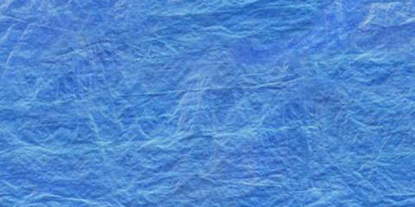
This texture might be blue in the preview below, but changing its color is not a difficult task for a pro designer. Moreover, playing with the contrast, brightness and opacity should make this very easy to customize and make it fit on the background of every of your designs.
Fiberglass
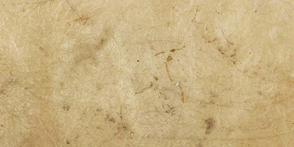
This one I have used myself once, because it was very easy to customize. The color was easy to change and it fits very well on the background of posters, as long as you keep the opacity down.
Blue Fiberglass
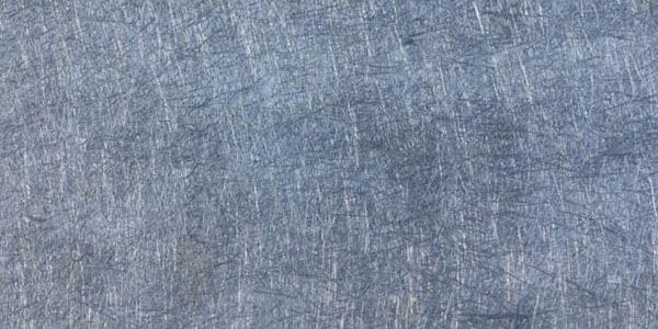
This second fiberglass example is a bit different, but it can be used exactly like the one above, as it is from the same category. The “scratches” on the texture work really well if you desaturate this texture and work a bit with brightness and contrast.
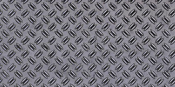
Metal
This is a metallic texture that is also very easy to customize. I think you should try playing with the hues, brightness and contrast and you will definitely love the results. This would also work well on the background of posters, so try it if you are currently working on such projects.
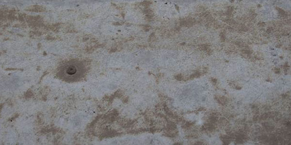
Floor texture
This texture is great for many purposes and it looks exactly like a metal floor. Metal textures are generally very easy to customize because they work well at low opacity and high contrast, so make sure you play with those before you use this texture.
Egyptian Wall
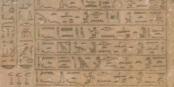
If you like Egyptian caricatures, this one looks exactly like those well-known walls from the pyramids and you will definitely enjoy having this on the background of your posters and even websites. I am actually quite excited to hear how this one would work with websites, but I think you will be pleased with the results.
Wall ornaments
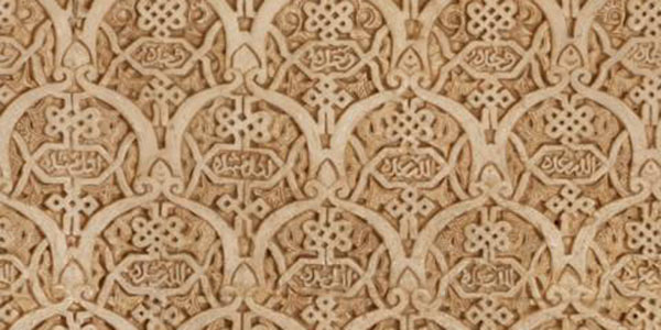
This texture would also work well for more classic styled posters or websites, as these wall ornaments are from a classic building. I don’t know how much you will be able to play with the contrast and brightness, but you definitely have to customize it, so go for hues and opacity if you want to use it.
Glass Texture
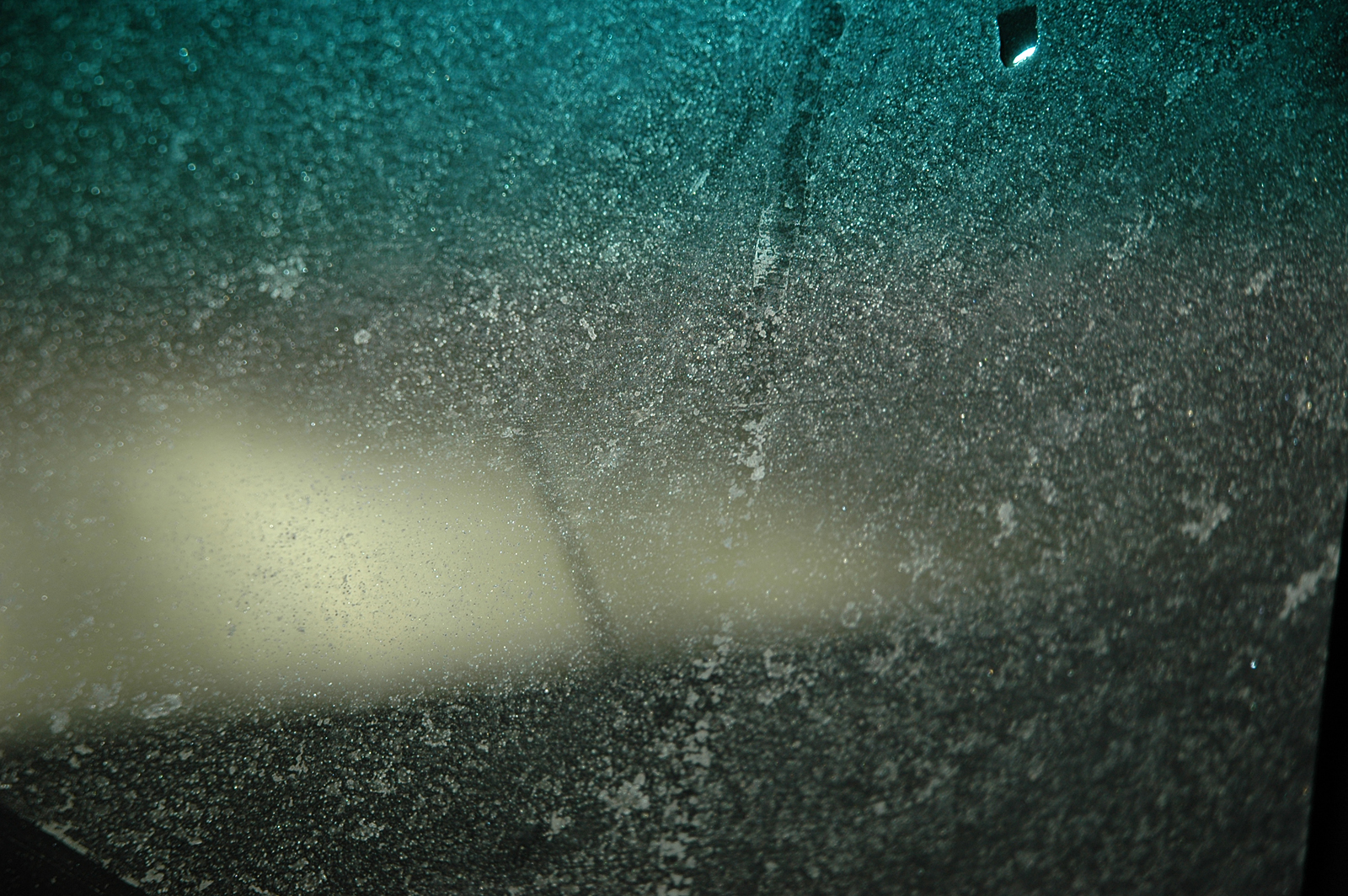
If you are in need of a glass texture, this one should be right. You might not only want to use it as a low-opacity texture, but generally also as a background for graphic work. This texture looks like a picture taken through a glass and with a blurred effect behind the window.
Brick texture
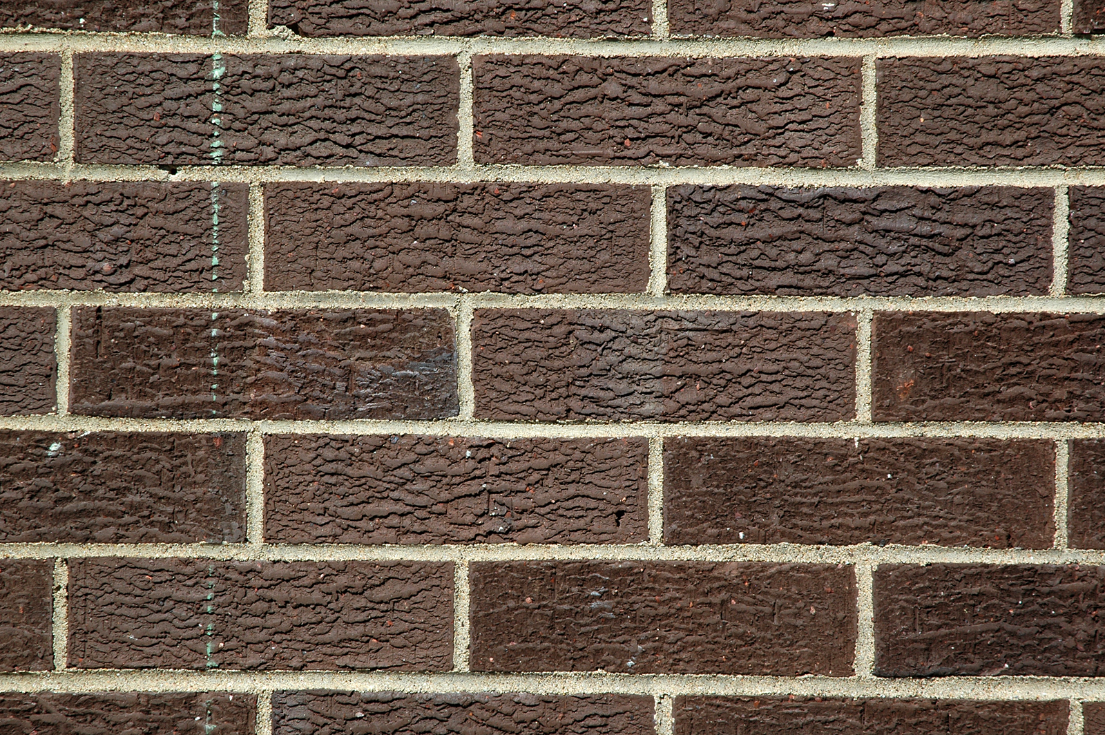
If you want to have these bricks on the background of your graphic work, go for it. I have played with it a bit in Photoshop and you can get some amazing results if you adjust the settings. Moreover, this one looks great on the background of websites as well.
Stone texture
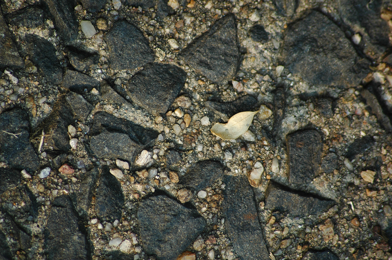
This texture is also made out of a picture taken probably somewhere at the seaside and has lots of big stones and sand into it, so you can adjust the settings as you wish and decide which area you want to use for the background of your graphic work.
Grunge texture
Grunge textures are generally the most popular out there because they are simply so easy to customize and they are not very heavy to the eye on the background of websites, where they are most of the time used at a very low opacity.
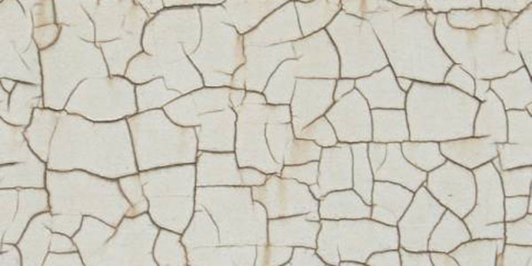
Crackles texture
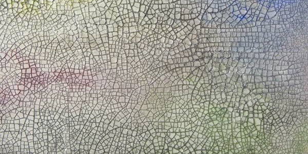
What I like about this one is the fact that the crackles in the texture are of different sizes and shapes and adjusting the settings will make this an amazing texture. You will be able to use this for websites and all other types of graphic work, give it a try!
Scratches texture
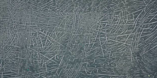
This texture looks like a scratched blackboard and while we all hate that annoying noise, this texture is great when you start adjusting hues, color balance and contrast and can become very smooth if used the right way.
Paint texture
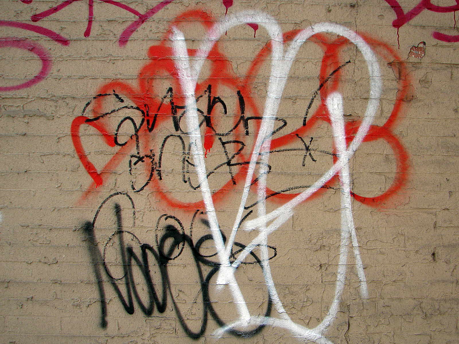
I think the last important kind of texture you can find out there that we didn’t show yet is a paint texture. And I believe this one is the best. It is more of graffiti than paint, but it would work very nice if you start playing with the settings. Give it a try!
All these textures will come in handy for you at some point in time, as textures usually do. The key to adjusting a texture to achieve balance in your design is playing with hues, color balance, brightness, contrast and opacity. Remember that good design is design that is not intrusive, and textures can become intrusive quite quickly, so make sure you don’t make the same mistake as many others did before you.


 TheHungryJPEG – A Surprisingly Huge Marketplace for Designers