The title of our article reads “Meet the Agency – The Cool Way of Establishing Your Company Online”, as you have already understood, today we are going to speculate about the refreshing and classy way of presenting your agency/company online. A choice of topic is not accidental. Nowadays, numerous groups of creative, high-end people, who are eager to work, bless clients and web with incredible, topnotch projects, and contribute to the internet community, try to firmly establish themselves online. This sphere is a fiercely competitive, and declaring yourself in a solemn and emphatic manner won’t do much good for you. Being some kind of a “white crow” that follows current trends, implements new techniques and hits upon a brilliant idea is a viable solution. There are various approaches to achieve a desired result, and today we track down one of it.
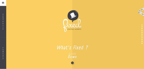
Website of Fixed Digital Agency (http://fixedagency.com/) is going to be our instructive example. Despite of having a bit childish appeal due to fully illustrated design and hand-style typography, in fact, is an extremely professional agency that unobtrusively forces the onlookers to fall sharply under the impact of its design. The team trucks lots of tricks and techniques into their website, making the most of existing opportunities.
The Structure
The website has an interesting, quite unconventional structure that embraces all essential information in a pleasant yet quite uncommon way and creates a truly enjoyable experience. It includes all common pages such as portfolio, contacts, about the team page and career; however everything is not as primitive as it seems. The landing page, here, steals the show. Let’s find out, how is it managed to do.
The Landing Page
The plan of a “clients’ conquest”, in which the landing page takes inalienable part, is a classic marketing ploy. The website can be compared with brand-new merchandise, which has just appeared on the shelves of your local market. It has a perfect, eye-catching packaging design that gently but firmly makes you put the product into your cart.
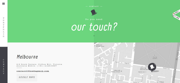
In the case of the agency, the packaging design is the appearance of the landing page, and the cart is a contact page by means of which clients order services. Both elements, by the way, take up a quite conspicuous place in design.
In order to stick to “Making an Impression and Striking while the iron is hot” the team highlights only few key aspects, which in their opinion, should help to win over online audience and convert regular users into customers. The page features 4 essential elements: hidden slide-out navigation, a couple of huge buttons, and a visual presentation.
Navigation
The navigation here does not play “the first violin”. It is wisely hidden from users’ eyes under a small icon that, at the right time, reveals the main menu. Use of implicit slide-out navigation does not mean that the team leaves you no choice but to throw yourself into a presentation; it just wants to give some components a higher priority. Thus, links to portfolio and contact page effectively come to the fore, thanks to its detached, prominent and eye-catching outward, even despite of occupying only an extremely narrow column on the left side. The self-presentation due to such an arrangement becomes an undoubted highlight. So, let’s fall under its powerful influence and find out what’s so special in it.
It is a touch of…
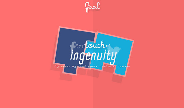
Namely, these several words set the tone of the self-presentation and create an emotional atmosphere in the website; each slide begins with it. 11 separate sections are united under the one catchy phrase that helps to show off the agency with the best hand. Each division is aimed to vividly shed a light upon various important features inherent to the agency covering skills, experience, creativity, professionalism, services and so on. In order to produce a stronger effect each slide is supported by an appropriate, unique illustration that, in addition, is enlivened by simple yet carefully-crafted animation.
A touch of personality
The presentation ends up with this important, quite influential statement. It symbolizes rules and philosophy of the agency that puts soul into every project; and as we all know, a personal approach is more valued than others.
Interactivity in tandem with sounds creates the magic
These constituents play here an important role. The interactivity shifts gears, making every element look alive and dynamic as well as energizing the whole website whereas complementary sounds add to the navigation a little zest. Such powerful combination not only gives an extra flair to the presentation and enriches the design of the home page, but also indicates agency’s awareness of various modern techniques and demonstrates an ability of its skillful utilization.
So, as you can see, the landing page simply speaks for itself. It really has a sense of fun that is often overlooked by others and at the same time, provides online visitors with all necessary stuff. The cool way of establishing your company online begins namely with it, which is a goldmine of fascinating items.
A few words about the overall design…
As mentioned earlier, the website has a fully illustrated design that really stands out from the crowd. The team puts into action a nifty flat style that is bolstered by a gorgeous color palette and impressive typography. It has its own funny mascot that is also the official logo that accompanies every page. Smooth, refined and simply polished, this topnotch design sparks your interest and is definitely calling for you.
The Cool Way
So what about the cool factor? Though the website takes a more traditional route in its design by implementing illustrations everywhere (that some may say is not cool at all nowadays), yet, the team is managed to restyle this classic solution by spicing it up with some super-duper elements, so to speak, presenting a conventional approach in a fresh, brand-new treatment that simply pulls you in.
Everything here is soaked with liveliness: amusing logotype, entertaining self-presentation, complementary sounds and of course, various dynamic effects. The general feeling on the website is really electric and cool.
Conclusion
Whether you are a local company with ambitions or a huge one that already has your own targeted audience, you should always remember that people, who visit your website, should leave it with a distinct impression that will remind them about you. And in the digital world, working an emotional component into your design and taking care about a friendly and even informal atmosphere is one of the proven methods to achieve your goals as well build up healthy and strong relationships. So why not to make your website a cooler place for online crowd, as Fixed Digital Agency did.


 The Best Websites to Start Online Business: Sellfy and Oberlo
  8 Fundamental Tools to Help You Start an Online Business
  10 Tools to Start an Online Business without Breaking the Bank
  [Review] Interaction Design Foundation – Ivy League-Level Education in UX and Design … All Available Online
  Creating an Effective Online Portfolio