Your website’s color scheme says a lot about you and/or your company. Color goes beyond aesthetics and has possible effects on the behaviors of your website’s viewers. Deciding on a color scheme can be a difficult choice, with so many combinations and choices it can be hard to choose something that represents you. However, there is a method to the madness and there are color tools which can help narrow down the search for the perfect color scheme.
The Psychology of Color in Web Design
McDonald’s choice to use yellow and red as their two main colors was a conscious decision made to target their ideal audience. While red is often associated with anger and passion, it also serves as an appetizer since it also gives off the feeling of heat. The same can be said for yellow, which radiates positivity and warmth, making it the ideal color combination for McDonalds.
Here is a brief breakdown of different colors and their psychological effects:
Blue – Blue is the most commonly used color in web design because it matches well with other colors and it evokes feelings of security, and trust. It is also a very calming color so it helps viewers feel relaxed when viewing your webpage.
Green – Green is often associated with nature and tranquility, however darker greens are associated with money.
Brown – Brown gives a very earthy feel to your website, but if used incorrectly it can make your website appear dirty.
Yellow – Yellow is a very energetic color, it gives off positivity and warm.
Red – Red is a color that is closely tied to passion and anger, but as mentioned before it can also be used as an appetizer.
Purple – Purple is a color commonly used to signify royalty or spirituality. It also has a nice tendency of invoking feelings of creativity, making it a popular choice for creative agencies.
Pink – Pink is a very feminine color and depending on the shade of pink you use, it can mean different things. Bright and lighter pinks are exciting and fun while darker shades of pink will be considered more romantic.
Orange – Orange is rarely seen as a website’s main color, but you will often see it used as a secondary color or highlight color. Orange is very playful and fun, and small doses of it can turn a bland webpage into a vibrant and exciting page.
Black – Black conjures a feeling of high class and exudes sophistication. You’ll often see a simple black color theme used for luxury and high-quality products.
White – White represents purity and cleanliness. A white webpage is also very effective for the modern minimalistic look that is very trendy nowadays.
Each color has its own unique connotations that can be used to your advantage for your website design.
There are numerous studies which have documented the effect of each color, and if you would like further information, read these articles by Applied Innovations, Color Matters and Yahoo Weblogs.
Here is an infographic by KISSmetrics which explains how colors can affect the behavior and thinking of buyers.
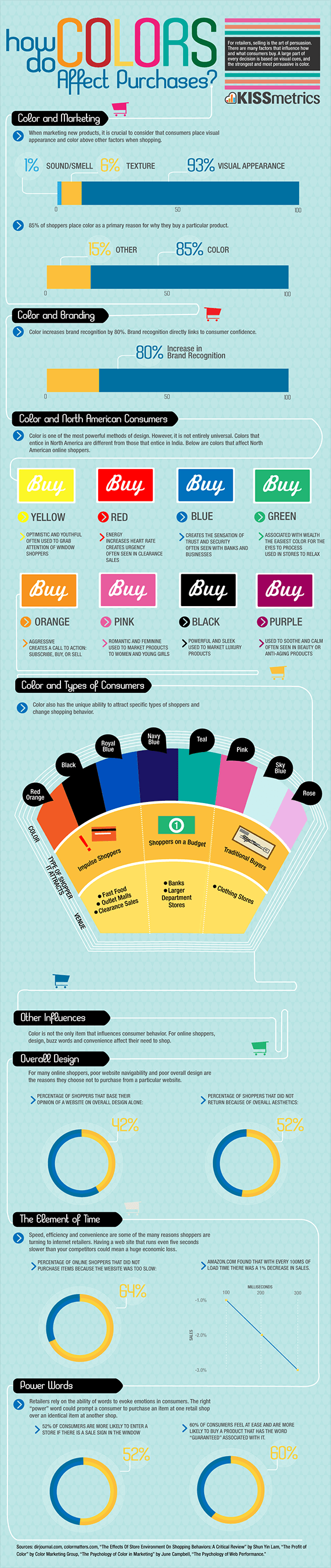
Image by KISSmetrics
Color Theory
Now that we have covered the psychology behind different color schemes, it is now time to figure out how to decide on a color scheme that is aesthetically pleasing. Learning some basic color theory allows you to make much better judgment calls on what colors will and won’t work together. Basic color theory is quite easy to learn and it makes a world of a difference to your designs. Although color theory will always be a great starting point for color schemes, don’t be afraid to experiment and try something completely different. As designers we must make judgments based on what we see and sometimes work outside normal techniques.
For more information and lessons on basic color theory head to Color Matters and I Can Be Creative.
Contrast
Another important thing you need to consider when deciding on a color theme for your web design is whether the colors you are using provide a nice contrast with one another. Even when using a monochromatic (one color) theme, you can still create contrast through the use of light and dark colors. Using complimentary colors (choosing colors from opposite ends of the color wheel) will give the greatest contrast, however not all complimentary color combinations work well for web design.
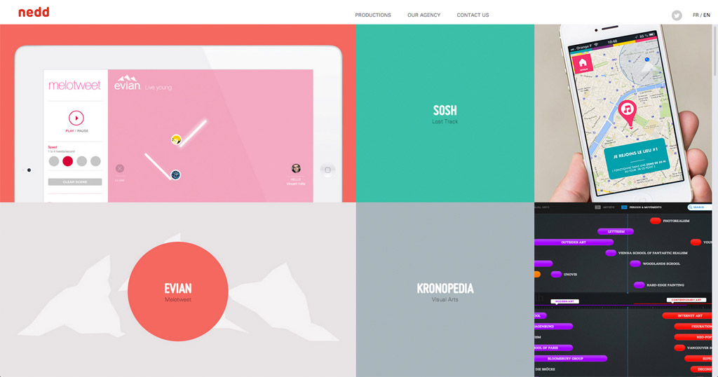
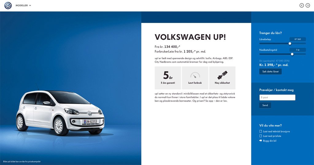
Contrast is important because it creates interest on your page and it also allows you to differentiate all the elements on your page. Here are a few examples of websites that have utilized color contrast well in their web design.
Colors That Complement Each Other
Knowing which colors will complement each other is part color theory and part experience. When you hear people describe a certain design by saying it has a “muted palette” or a “bright palette” it means the designer has chosen colors that are coherent and complement each other. Here are two different color palettes which will hopefully visually demonstrate how different colors interact with one another.


Notice how each color complements one another and forms a coherent color scheme. Learning how to create and use these colors schemes comes from experience and experimentation. Once you develop an eye for color and color schemes, it will become second nature and you’ll instantly know what colors will and won’t work together. Color pickers and color tools can help you find approximate colors and then you can fine-tune the color selection to your own personal preference.
Trends
Trends in web design are quite unpredictable and can either last for years or a single month. This is why it can be dangerous to be overly trendy, but it doesn’t hurt to incorporate some current trendy colors into your designs. Currently, there is a strong tendency to use a lot of muted colors in web design. Pastel colors are also quite popular; however with the introduction of Windows 8 and its “Metro” UI, there has been resurgence in the use of vibrant colors. Follow trends at your own discretion and aim for a timeless design rather than trying to trendy.
Think About Your Company and Your Audience
You never see pink being used for masculine products or websites, since it doesn’t suit the target audience or the brand. When deciding on your final color scheme, you need to think about how it will fit together and how it makes people feel. It’s December right now, so everyone is getting ready for Christmas. By using greens and reds in your design, you can get your users thinking about Christmas and therefore they’ll be in a festive mood. If your target audience is predominantly female than you might be more liberal in your use of brighter colors like pink and purple and shy away from blacks and dark colors.
Using Color Tools
If you are still having trouble trying to decide on a color scheme, you can try using color tools to generate some ideas. Many of these tools generate colors based on basic color theory or use user submissions to help you find the perfect color scheme.
Kuler
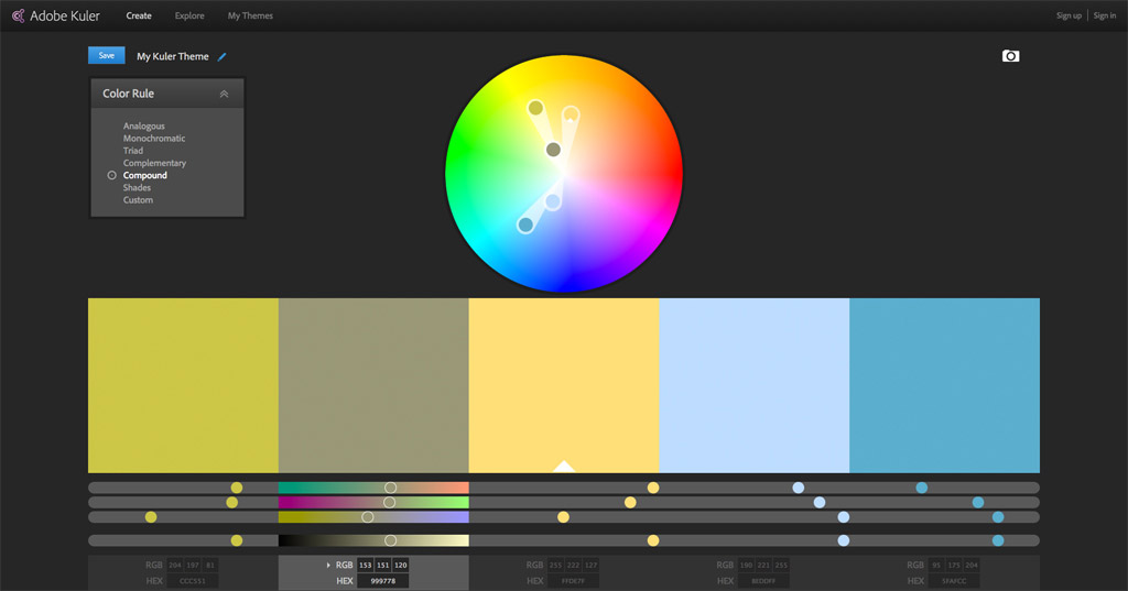
Kuler is the official color tool for the Adobe Suite. Create your very own color scheme or try one of the many palettes uploaded by other users. Kuler’s color wheel can be set to different color rules which follow basic color theory; there is also the option of creating a completely custom color scheme.
Color Scheme Generator
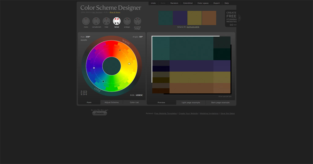
The Color Scheme Generator is a great tool for quickly generating a color scheme. The randomize option is a great and easy way to come up with a few ideas.
ColorLovers
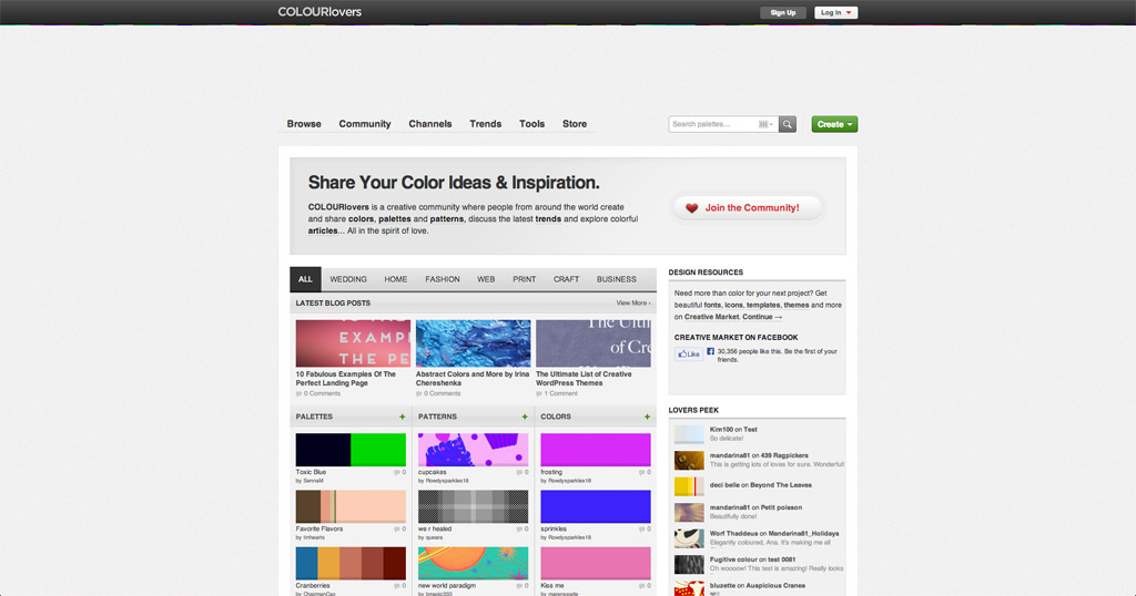
ColorLovers is another user submission site which allows you to browse through millions of color palettes. ColorLovers also offers a professional color matching and generating tool named ColorSchemer 2, however you will need to purchase a license for this tool to be able to use it.
Pictaculous
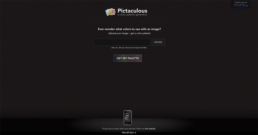
Pictaculous allows you to generate color palettes and schemes from your images. Upload an image to this tool and watch as it picks out a color palette from your image.
Colrd
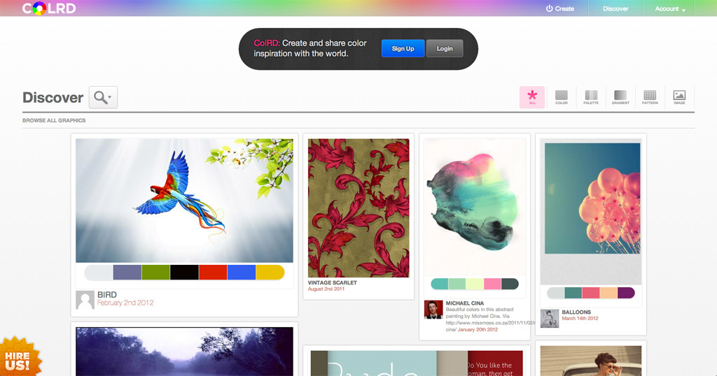
Colrd is a community of color lovers who share their resources and inspiration. There is a myriad of images and color palettes which may spark your own creative color ideas.
Conclusion
Color selection and schemes are incredibly important, especially since current web design favors a minimalistic approach. Color isn’t as complex as rocket science but that doesn’t make it any less difficult to find the perfect combination. Having the right color scheme means you can integrate your branding into your web design, therefore reinforcing the representation of you and/or your company. While color is a huge topic, it doesn’t have to be difficult and much of it is learned through practical use and experience. As you continue to expand your knowledge of color, you will notice that your selection of color themes becomes easier and more effective.


 Photo Color Correction Tips + Free Photoshop Actions
 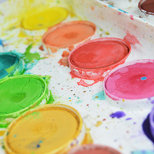 Everything You Need to Know About Choosing Your Color Scheme
 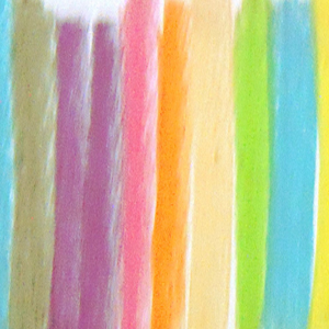 The Code of Color
  New Pantone 2014 Color Websites Examples – Radiant Orchid
Jev Dec 8, 2013, 11:33 am
Great article! There’s a typo though, “Yellow – Yellow is a very energetic color, it gives off positivity and warm (warmth?).”
pascal Dec 10, 2013, 2:38 pm
Well, don’t know what to say…
Ok, thanks for the links to the tools.
Apart of that, the article isn’t up to the title.
Did not learn anything apart the fact that it’s up to you.
The palettes you show as great examples of colors complementing each others are utterly ugly (to my point of view) and I still have to find out how they could (complement each others).
But again, the beauty is in the eyes of the beer-holder, and therefore I should not have been so negative.
Thank you anyway for what you do, I found some good inspiration here.
John Sanford Dec 10, 2013, 6:33 pm
Thanks for the great information. Another site that I like using for getting inspired when creating a new website is: http://colure.me *
It will give you the color value for hex, rgb, hsv, and unity (0-1 value used in the game engine). You can even give it a comma separated list in the URL to see how well they look together or if you just want the calculated values for them.
http://colure.me/19282B,EAFF0C,008DA9,C9C889,383826
Hope you find it useful.
* disclaimer I created this site.
Marco Dec 14, 2013, 6:08 am
There is no cook-book methods to define colors but what I usually do is base them off the logo. Very important. Sometimes there are other guidelines (as said in the article) that have to do with both colors and typography.
But usually, when I have to design a site, I base the colors off the logo. It’s a starting point.