All we are subject to changes and are influenced by environment; and I mean not only natural surroundings, now I’m talking more about web jungles that ropes you in and forces you to exist by their rules. For somebody such restrictions and terms can be irritating and unacceptable, whereas others try to make adjustments, adapt to ever-changing life and work out acceptable compromises. As LATimes (http://www.latimes.com) did. And as it turned out, the second option that implies timeserving is more beneficial, favorable and profitable in our generation.
Being an ordinary news website that as befits covers various spheres of everyday’s life such as sport, business, travel, lifestyle, autos and so on, it is managed to provide regular online readers with a rich, pleasant, comfy and strong experience. Its vivid strong general feeling is gotten from various factors, and we want to underline some key ones so that you can take advantage of them and put into practice.
Design
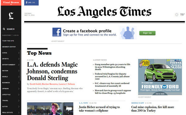
The first thing that we want to draw your attention to is, of course, the design of the front page that is in charge of building a proper first impression and effectively representing information. It leverages a conventional color palette (aka black and white) that offers a stark contrast between foreground and background. The latter is based on a white tone and includes lots of whitespaces that gives online visitors an ample room to breathe that is highly important, and as a rule, is always overlooked by news websites’ owners.
Typography and formatting also enormously reinforce the user experience. Thanks to properly selected type and manipulations with size, weight and line-height, the content as well as excerpts are easy to read; the headlines are clearly perceptible thanks to bold relatively large size of the font, and optional data such as author, date and etc. has its own particular position.
So, you won’t definitely get lost in a bunch of text and images – the well-balanced and properly-structured design will save you from this fate.
Trendy Static Vertical Navigation Bar
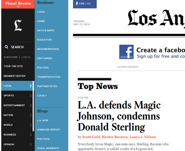
This is a kind of a trend spotter here, so to speak a stylish and fancy feature of the website design. Some might say that it is just a fad; however, in this particular case, the nifty vertical static side bar fits like a glove. The navigation panel that takes up only 10% of the whole space (on standard and huge screens) instantly catches your eye. It embraces all necessary components – logotype, neat search bar, subscription and account buttons, and categories itself. The modern direction effectively co-works with practicality. Nevertheless, to my mind, it has one drawback – the sub menu that slides out when somebody choses one of the main categories. When it opens, it shifts everything to the right side, making the whole content jump to the new position, and this abrupt displacement is really irritating. The smooth overlay would look more pleasant; yet, this issue doesn’t belittle its considerable merits.
Intuitive Information Hierarchy
The way the information is presented to a regular user deserves a special attention. Every section occupies its own place; undoubtedly, the vertical stripe layout does it job very well. The technique of lazy loading that adds news bit by bit in order to smoothly construct the content flow makes the exploration of the website highly intuitive and enjoyable. The seamless scrolling effect is really pleasing to the eye. The brand-new approach of creating neighborhood pages that are responsible for quick providing you with local news is really something. The developers also didn’t forget about the social media – the main driving engine of spreading the news nowadays – and supplied each shareline with an easy way of sharing a story through various popular networks.
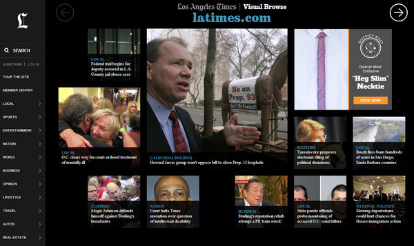
Moreover, except for a commonly-used solution of demonstrating information in a properly-structured, serial manner, the website offers a fresh intuitive visual display that is obviously guided by the phrase that “image worth a thousand words”. Now you get an opportunity to follow your instincts and read a story that literally strikes your eye.
Mobile and Tablet version
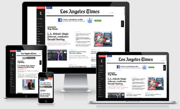
Information overloaded online news magazines and mobile/tablet friendliness for a long time were two separate things that co-existed independently. Though W3C highly recommends meeting this specification, not every content-intensive website can afford to “turn over new leaf” and drastically modify its appearance. Yet, the time has finally come to marry them up; and LATimes shows how to do it properly.
Here, the approach of displaying information on tablets and mobiles is really simple and time-tested: the data is dished up line by line, is served in easily-digestible parts that are bolstered by high-quality eye-catching images. Here is nothing supernatural or out of the common. But, such densely-packed messy websites require namely this type of solution.
In this particular case, not only responsive layout works wonders for the website; a crucial role here is played by a neat, clean and contrasting design, to be more precise, the color scheme, and an ideal formatting, which altogether dramatically increases readability of the content. The side menu, which in every popular dimension stays the same, also does not puzzle users. The information hierarchy doesn’t depend on screen dimension, and this fact helps people do not get confused when they shift from one device to another. Here, the responsive behavior is a complex and advanced phenomenon, behind which stand numerous aspects that actively collaborate with each other.
The overall impression
On the whole, the website leaves you with a firm impression, though there are some shortcomings. Everything looks uncluttered, well arranged and visually pleasing – an appearance that is extremely rare among such sites. Online audience gets exactly what it needs; and that’s just what the doctor ordered.
One more thing…
I must pay a tribute to chief-editor that not only zealously keeps an eye on a quality of data but also is interesting in readers’ opinions concerning the overall appearance of the website. He opens and tries to engage into a two-sided constructive dialogue about changes that happened with website design as many users as possible. It means that the website will continue to improve and this is really vital, since only active and close cooperation between the website’s team and its readers can enrich users’ experience and make it perfect.
Conclusion
When it comes to website design and their ability to effectively dish up data – going against the stream can play havoc; obeying the rules, listening to online audience’s demands, messages and desires, as well as paying a particular attention to web requirements is what can make you a “King of the Hill”. Though it seems that this is a simple truth to which you just must adhere, not everyone is ready for such sacrifices. Unfortunately, conservatism increasingly dominates over better part, making web owners (especially owners of news and online magazines) believe that information is still undividedly run the show.


 [Review + Giveaway] CSS Hero – The Fastest Way to Customize the Design of Your WordPress Site
  Introducing Iubenda’s Privacy and Cookie Policy Generator for Websites and Apps
 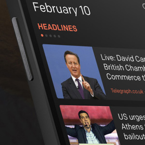 20 Attractive Magazine News App Concepts
  20 Super App-presenting Websites
  Avoid These 7 Usability Mistakes When Designing Websites
Mick Aug 6, 2014, 3:25 am
I look forward to the day that blogs stop using the “one more thing” line.
Pedro Aug 9, 2014, 1:19 pm
I look forward to the day that readers stop leaving mean and irrelevant comments.
Anyway, that was a good review. I’m not sure about the lack of photos on that website, but I do like the clean looks.