If page builder plugins are your thing then the market has been serving you well for the past couple of years. We’ve seen a huge influx of new builders being released, and the big players upping their game as well.
However, if none of the Elementors, Beavers, and so on tickle your fancy, we might have an alternative for you here.
This is where Brizy comes into the picture. It’s one of the most recent entrants into the builder game. In this Brizy review, we look into how good it really is, plus who and why should use it. And, we have a small something for you at the end.
What is Brizy?
In a sentence, Brizy is a page builder plugin for WordPress. What sets it apart from all the other players in the market is the focus on ease of use above all else.
The guys behind Brizy are proud of the fact that no designer or dev skills are required in order to use this plugin effectively.
Brizy makes all of that possible by offering you a unique user interface that only appears when you need it – as you click on different elements on the page. Apart from that, there’s no overpowering massive sidebar with all the features there – like usually the case with other builders.
Interestingly, Brizy’s ease-of-use focus doesn’t seem to have a negative impact on the overall feature set offered by the plugin. Let’s check those out:
How to use Brizy
The installation process itself is the same as with any other WordPress plugin. As in, all you need to do is go to your WordPress dashboard → Plugins → Add New, enter “Brizy” into the search field, and then proceed to click on the “Install” and “Activate” buttons. “Easy Brizy” (excuse the pun).
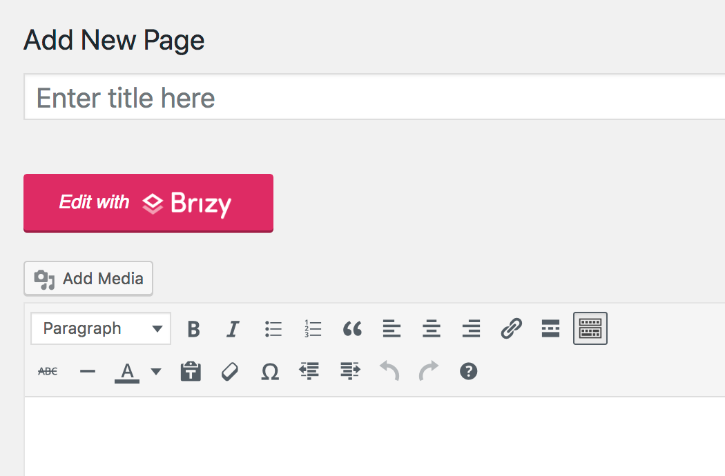
After that, the plugin is 100% ready to be used. Just go to Pages → Add New (Brizy works with posts as well, but let’s stick with pages for this example).
Right out the gate, you’ll see a new button on the page – Edit with Brizy.
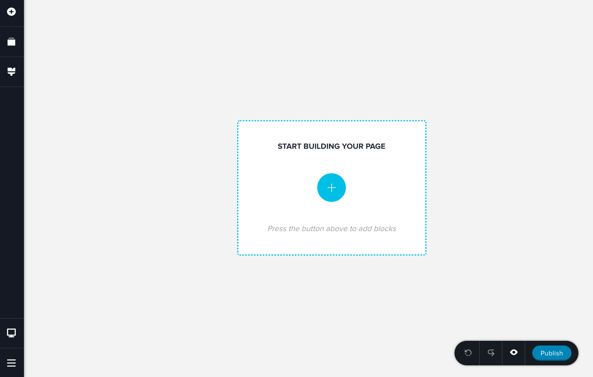
Click on it, and you’re in the Brizy experience, which is an entirely custom look from your standard WordPress interface.
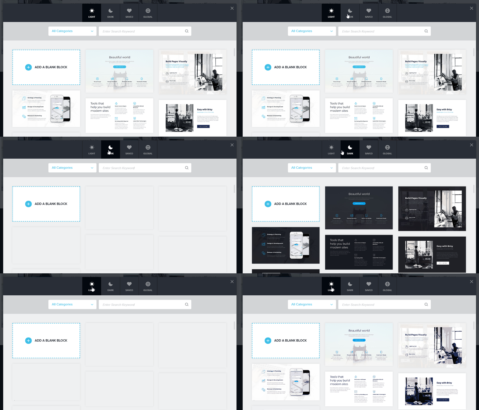
Clicking on the “+” button will show you a list of the available blocks. And this is the first thing that’s different about Brizy in comparison to the other builders:
From a user’s perspective, Brizy is built around “blocks” that you can use to construct your page, as opposed to being built around individual content elements – like “text” or “image.”
Think of it this way – Brizy does part of the “webpage design” job for you by putting together a couple of content elements and combining them into a good-looking block.
Just to give you an idea, here’s a list of the available blocks:
At the time of writing, there are 150 such blocks built in!
Here’s a quick demo; if you want to build a quick landing page, you can do that in what seems like no time:
First, you need a header. The best way to choose one is to narrow down the blocks you see to just “Header”. When you see anything you like, just click on it and it’s going to appear on your page.
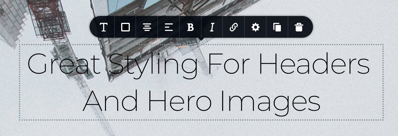
At this point, when you click on any of the page elements – like the headline, for example – you’re going to see a toolbar with the available options.
Depending on the specific element you’re interacting with, that toolbar is going to look different. For text elements, you’ll see the classic font controls, colors, lists, bold/italic, links, and alignment settings. For video elements, on the other hand, you’ll be able to set the video link, display ratio, auto play, etc.
In short, every element offers you the kind of options you’d expect from it, and everything is very intuitive.
And if you require more than the basic settings, you can click on the element’s gear icon and then on More Settings. This will display a new sidebar to the right with even more stuff to adjust.
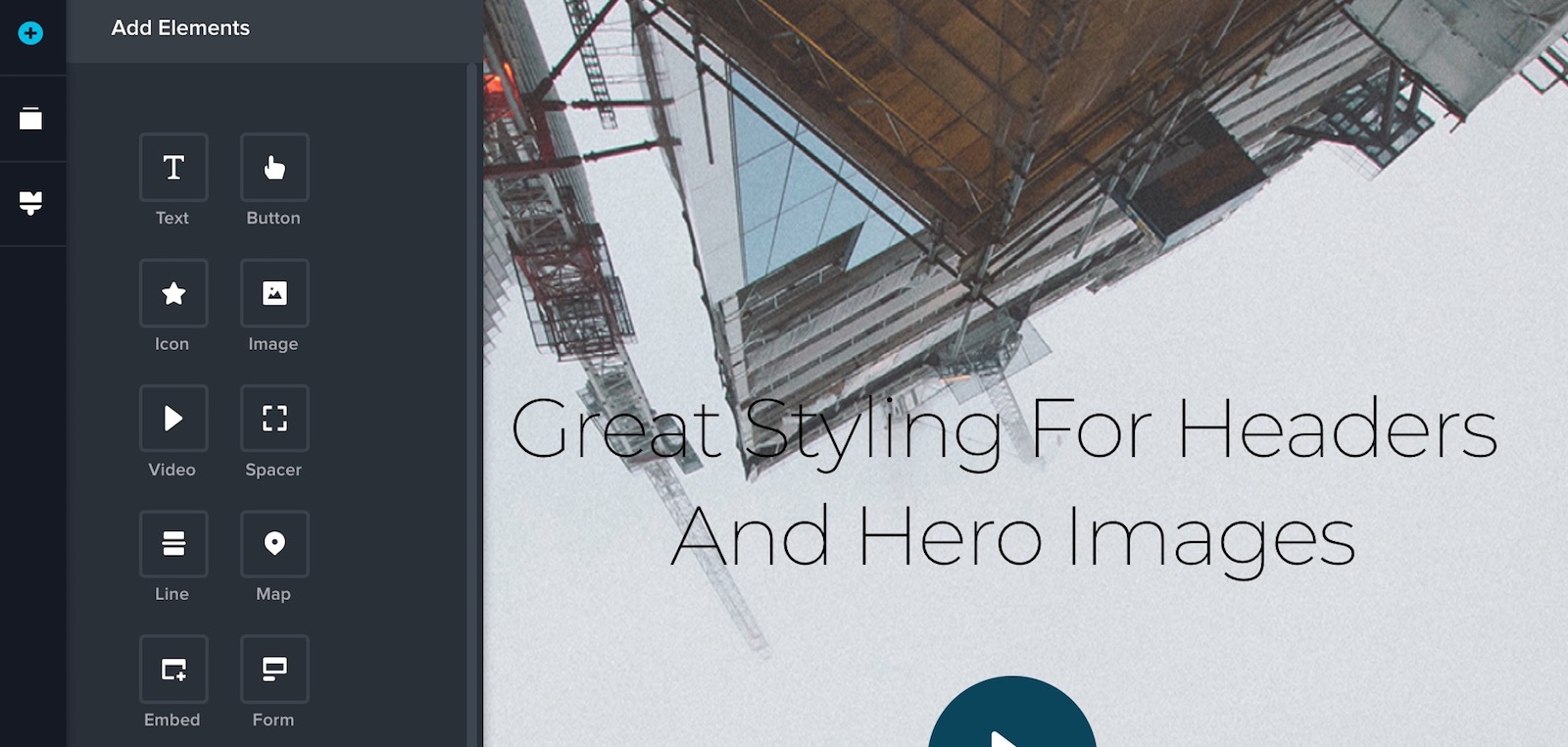
Working with the individual elements within the block is also super easy. You can realign them freely via drag and drop, adjust the specifics of each one through those pop-up toolbars that I mentioned, and you can also add new ones from the primary sidebar on the left.
That left sidebar also lets you adjust the overall styling of the page (things like colors, fonts), reorder the blocks on the page, and switch to mobile view.
With the header out of the way, you can add any number of consecutive blocks until your page looks just right.
Also, as you pick your blocks, you can switch the set from “light” to “dark” which is a great design helper.
After a couple of minutes of clicking, entering text, and adjusting the blocks, you can get a handsome page that’s fully editable and optimized to work on all devices.
Brizy also has a range of under-the-hood features that are somewhat advanced but still easy to use:
- global colors and fonts – you can set a global palette and font settings that are going to propagate all through your pages,
- 4000 icons are included,
- instant sliders – you can transform any of your blocks into a slider, and you can customize the slides just like the other blocks,
- save blocks for later use – useful if you have your favorite page structures that you like to reuse,
- global blocks – save any block as global and use it on multiple pages; when you edit that global block, the changes will propagate through all the instances of that global block in use,
- buttons! – you can create multiple ones in a row, and they won’t impact the main grid of your page,
- image zoom and focus settings – control the way your images appear down to every detail,
- forms – no need for contact form plugins,
- section padding settings,
- and more.
Last but not least, there’s no “save” button. Everything is saved on the fly automatically. If you want to make your page public, click on Publish in the bottom right corner.
Who should use Brizy
Brizy is a very good solution for someone who’s really not interested in learning code or having to design the individual content blocks on their own. With Brizy, everything is already built in, and all the content blocks look great. Literally all you need to do is switch the graphics, text, and adjust the fine details.
The interface is not intimidating – you see only the most basic options in the toolbar, and everything else you can access when need be from the additional sidebars.
With no coding skills required at all, Brizy is a great choice for end users who’d like to build themselves an awesome-looking site without the help of a pro.
Still not convinced? Well:
Brizy is free.
There is a pro plan available as well, in case you need some more advanced features such as editing your site’s dynamic content (the way your posts look, for example), additional premium designs, site headers and footers, role manages, A/B testing and more.
Exclusive discount
The good guys behind Brizy have offered us five discount codes – 10% off Brizy PRO Lifetime.
Brizy PRO Lifetime is $215, which means that you can get it for $193.50.
How to participate
See below for the rules and info on how to get on board:



 6 Must-Follow SEO Tips For Every WordPress Photoblogger
  All Websites Should Feature Videos and Here’s Why
  Designing a Small Business Website: 5 Services to Use
  Top 16 Free WooCommerce Themes
  Top 25 Free WordPress themes from 2020
David Jun 24, 2018, 10:17 am
Brizzy is less clunky that elementor. Love the blocks, and overall, the UI is great.
Fion Jun 24, 2018, 10:55 pm
Love the overall UI of Brizzy and great dark/light blocks, looking forward to dynamic content control and the WooCommerce integration.
Craig Paterson Jun 26, 2018, 2:36 pm
First impressions are Brizy looks great, can’t wait to see what else gets added ready for prime time!
Haytham Jun 26, 2018, 6:51 pm
I’ve actually used the demo. I love the UI/UX. It’s very fast, sleek, and unobtrusive. Also, the inline editor is fantastic. It’s a great start for such a young product. You go, guys!
Frank Mohnhaupt Jun 26, 2018, 9:44 pm
I like the design of Brizy , which I would need additionally I could only tell when I have used it.
Mike Durbin Jun 26, 2018, 10:15 pm
This seems to be exactly what I’m looking for! I’m trying to build a platform for my clients that is simple and easy to understand. Brizy definitely feels less daunting than most page builders.
If I can somehow control the CSS output via a custom plugin, I’d be ecstatic. My biggest complaint with page builders is always their clutter. So many extra elements and haphazard CSS. Or if I am using a framework like Bulma or Foundation, I’d like to keep the CSS as tight as I can and not make new needless classes when I have some available already. Being able to set a framework for it to match would be amazing.
Anyways, great article. I’m going to get a few sites rolled out using this editor as it seems to be inline with what I want.
Thanks!
Jaron de barros Wanderley Jun 27, 2018, 12:54 am
Nice post
Dylan Goh Jun 29, 2018, 5:27 am
Brizy definitely way better… It’s take advantage of all page builder and put it together.
Mark Jonathan Jun 29, 2018, 6:33 pm
Have tested a number of page builder plugins before and so far it looks like Brizy is the most intuitive of the lot. Here’s hoping the PRO version will have the range of functions some of the other builders have while still being almost clutter free.
Jason Nov 2, 2019, 6:22 am
Very functional and easy to use, I really like this plugin