The truth is, most designers use a lot of psychological principles intuitively. But that isn’t, as you might think, because designers intuitively grasp psychology. Instead, it’s more a matter of psychological ideas being taken on board as a set of best practices and then permeating through the community until almost everybody follows them.
The only problem with that is that when you learn about psychology in this way, you’re basically playing an extended game of Chinese whispers or Telephone. For those of you not in the know, that’s the kid’s game where you all sit in a long chain and a phrase or sentence is whispered from one person to the next. Often, what comes out in the end bears little resemblance to what was originally said.
That’s the danger here too. If you don’t understand the psychology, you might end up doing the wrong thing because the information you got has been corrupted through repetition. To help you in that regard, here we’re going to explore some of the most important psychological principles.
Fitt’s law
You know when you’re walking through the park and you seen a path warn into the grass that heads away from the official concrete route? As you probably noticed, those are almost always shortcuts, where people cut a few (or sometimes a lot of) meters off from the officially stipulated route.
The same thing can happen on your websites. If your user’s cursor is on one part of the page, say to control the scroll bar, and the action you want them to take is far away from that cursor, then you’re increasing the chance that the user will not go for your CTA and they’ll go somewhere else instead.
Fitt’s law basically says that the further away your CTA is and the smaller the button is, the less likely they are to press it. Note that this relationship is not linear. At some point you’ll experience diminished returns. Nonetheless, you can gain a lot of benefit from remembering this one.
We like what we know
You know that saying ‘familiarity breeds contempt?’ It sounds so good. Unfortunately, there is no truth to it. It’s quite the opposite, actually. We very much prefer what we know.
One great example from psychology was where psychologists presented a set of people with a range of weird characters they’d never seen before and had them rate them. Then they had those same participants come back a week later and do the same thing with another set of characters. Unbeknownst to the participants, some of the characters had been included in the first set. And though they did not recognize them, the participants rated the ones they’d seen before as nicer than the ones that were new.
This is known as the mere-exposure effect (as in, merely being exposed to something makes us like it). And it matters because it means that people feel at their most comfortable using systems and ideas that they’re already familiar with.
It also means that initially people can be very resistant to something new you want to implement. Don’t take that to mean that your idea will never work, though. You might find that after they’re used to it, they suddenly prefer the new idea you’ve introduced.
The primacy and recency effect
We’ll cover these two together because that’s how they work best, even though they pull in different directions. What are they?
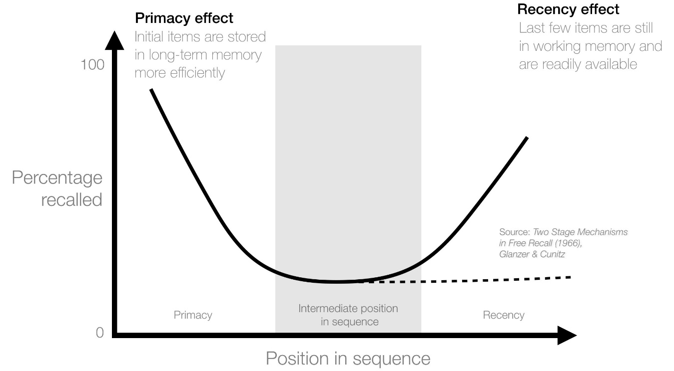
Well, the primacy effect is the one where the first thing presented gets more attention, while the recency effect is the one where the most recent thing that you’ve experienced is going to get the most attention.
Yeah, that does seem like they work against each. That’s not necessarily the case, however. Basically, if you present people with a list of options, the primacy effect will make them pay attention to the beginning of the list while the recency effect will have them pay attention to the end.
What gets left out is the middle.
What this means for you as a designer is that if you have to present a lot of information, you’ll want to present the most important stuff or the strongest argument at the beginning and the end. This can also be effective in hiding something that you don’t really want people to pay attention to. Simply put it in the middle and more people are likely to overlook it. That’s a useful writing trick to remember.

The Von Restorff Effect
Memory is a funny thing. Though you might think it works a lot like a video recording, the truth is anything but. Most of the things we experience we don’t remember. They simply wash away. For something to actually be remembered, it needs to have an impact.
The Von Restorff effect makes use of that by creating something that strongly contrasts with its surroundings. So, you might present a whole page in one color and the element that needs to be noticed in another. Or you might change fonts of something that you want people to notice.
This is why CTAs are often big buttons while nothing else on the page is. The button stands out because there is nothing else like it. And that will make it more likely to be remembered and interacted with as well.

101 psychology
Really, these are just a few examples. The truth is, there are a huge number of psychological principles that can be relevant for design – though they might not be as immediately applicable as the ones I’ve mentioned here.
The best thing to do is simply to pick up an introductory psychology text book and leaf through the different sections. You’ll want to pay specific attention to the findings of social psychology and cognitive psychology, these two fields are going to give the most useful nuggets (by the same token, you can skip the clinical psychology section).
Alternatively, take an introductory psychology class at one of the many online free universities, or simply listen to a bunch of podcasts as you work. You’d be surprised what you can pick up from there which you can immediately apply to your design and thereby make yourself a better designer.


 Teamstack: Team-as-a-Service Provider with Convenient and Secure Solutions
  Aviationstack API Review
  The Anatomy of Great Website Design that Google Loves
  11 WordPress Design Trends for 2019
 How You Can Boost Conversions with Minimalist Web Design
Robin Wirth Apr 10, 2018, 8:18 pm
Very informative and enjoyable post. It sounds like a great idea for something you could make into a whole book if you wanted to
David Apr 11, 2018, 12:38 am
Great article! Any psychology books or courses that you would recommend?