I have often seen web designers complaining about how a project took more time to finish, dozens of edits they had to make, or client changing their mind at the last minute resulting in creating new designs from scratch.
Let’s face it, if like me you provide web design services to your customers, then these issues will continue to exist irrespective of whether you work for individuals, small businesses or multi-national companies.
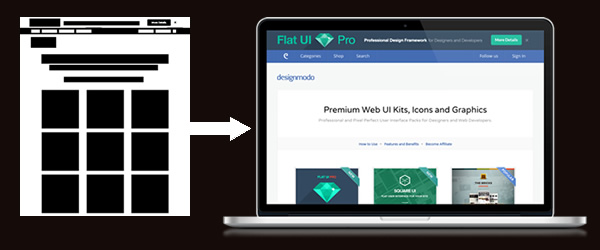
Being a Web Designer
Being a designer is not the same as being an artist. Design is a combination of science and art. Unlike an artist, a designer cannot wait until inspiration hits him. Good designs are not created by chance. Whether it’s a simple website or a web application, every design is created to achieve an objective and not just to to make things pretty.
Design is the creation of a plan or convention for the construction of an object or a system (as in architectural blueprints, engineering drawing, business process, circuit diagrams and sewing patterns). Design has different connotations in different fields. In some cases the direct construction of an object as in graphic design is also considered to be design.
Another definition for design is a roadmap or a strategic approach for someone to achieve a unique expectation. It defines the specifications, plans, parameters, costs, activities, processes and how and what to do within legal, political, social, environmental, safety and economic constraints in achieving that objective.
– http://en.wikipedia.org/wiki/Design
To consistently be able to come up with great results that exceed your clients expectations and make the user experience engaging involves not just good design skills but also a good process.
Why do we need to follow a Web Design Process?
You can never control your clients mind, but you can definitely change the way you work to reduce rework and be able to get to the final designs much faster.
If you do not have a proper web design workflow or process than this would be the right time to start following one. There are no hard and fast rules. What works for one designer might not work for everyone else. The purpose of creating a process is not just to follow the process for the sake of it, but to break the project into different phases that are easier to manage and to be able to get clients input early and avoid having to re-do anything in the final stages.
Web Design Process
Before we discuss a process, lets draw comparision between Web Design & Architecture. Designing a website is much easier than designing a building. However the way planning and design is done in the field of Architecture can be used as a reference to create our web design process.
1. Initial Discussion & Research
Before any design is started, Architects survey the land, research its history and study its surrounding. A wrong assumption can cost millions of dollars. Hence everything is analyzed and discussed with the clients.
In the field of Web Design, clients are more forgiving. You may decide to simply open up your graphics program and start designing the site, but without a detailed initial discussion, no matter how good you are in your craft, the end product will neither make the client happy nor will it serve their pupose.
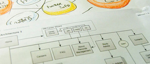
The key here is to gather information about your client’s business, the target audience and write down the list of requirements. Discussing in detail will help you understand the scope better and allow you to quote the cost and time to complete the project more accurately.
This step is intended for:
- Intial meeting and understanding requirements
- Creating a list of Requirements
- Project Scope & Timeline
- User Research
- Contract signing and other formailities such maintenance services.
2. Planning the flow (wireframing)
In Architecture there are patterns in which spaces are arranged. For e.g. a kitchen is always placed near the living room. Bedrooms are placed further away from the living room to create more privacy. These patterns were created based on the movement of people inside their home.
Similarly in Web Design, we all follow certain conventions without or without realizing it. Logo and navigation menu are kept on the top of the page for a reason and not just randomly. Before we focus on colors and textures, we need to identity the end user for whom we are making the site. We need to do user research, understand how they could complete the desired task on the website whether its buying a product or making an inquiry in the fastest possible way.
Creating a sitemap and planning the connection between different pages and the flow of user between them will save you lot of time in later stages. This step also ensures your client can get content ready for each page before you go to the next step in design.
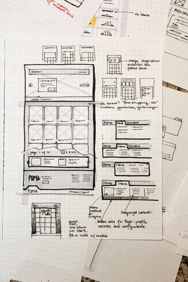
The objective of this phase is to create:
- Sitemap
- Wireframes
- And plan content placement and their relation to each other
Before moving to the next phase or step of the workflow it’s important to finalize ideas / work created in the previous step.
3. Planning & Design (The Basics)
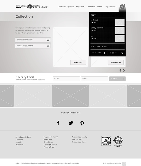
In this phase the research done earlier and the selected wireframes are used to create low-fideilty designs to further refine how the content is arranged. To point out again, this is not a rule. More details should only be added after receving feedback for the work done in previous step. This results in less work if you realize that the design path is not correct, or if the client changes requirements.
For my client projects, I always create greyscale designs with actual content but placeholder images to give the client a better feel of the design. Different shades of grey can be used to highlight different sections of a content and to indicate their visual hierarchy.
As we move towards responsive design, you may also chose to develop working prototypes using HTML, CSS & JavaScript. These could be developed using Frontend CSS frameworks to speed up the process. If you choose to built a detailed prototype using a CSS Framework, then you would also save considerable amout of time when completing your website, as this work could serve as a base.
4. Creating High-Fidelity designs
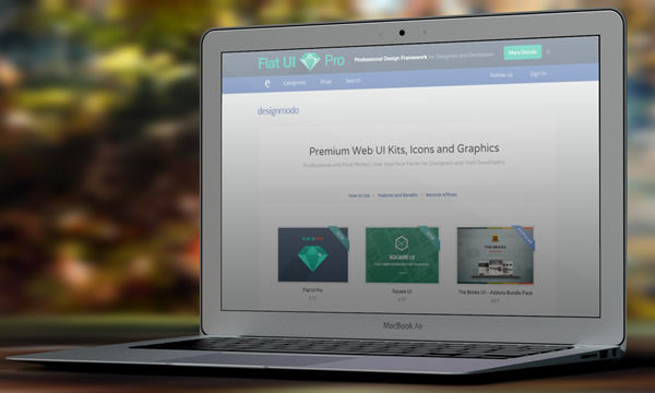
This is the step where you create final designs based on all the research, wireframes and client feedback received. As this design is result of all the client feedback and approvals received in previous steps, the chance of having to redoing everything from scratch is considerably reduced if not completely.
This may or may not be the final step in your workflow depending on whether you are also responsible for converting the final designs into HTML.
5. Final Steps
If your involvement in the project is limited to design, then your final step might either involve sending sliced images or some documentation that includes design usage guidelines, list of fonts used, etc.
Conclusion:
It might sound a task in itself, but having a design process and following has more pros than cons. The process you follow also needs to be flexible. Below is a bullet point list of a basic process/steps involved in completing a project from design to development.
- Research & Planning
- Content Planning
- Sketching / Wireframing
- Greyscale Designs / HTML prototypes
- Final Designs (ready for conversion)
- Slicing
- Development (HTML / CSS)
- Testing
- Documentation
- Launch
Feel free to share in the comments your approach to web design.



 Teamstack: Team-as-a-Service Provider with Convenient and Secure Solutions
  Aviationstack API Review
  The Anatomy of Great Website Design that Google Loves
  11 WordPress Design Trends for 2019
 How You Can Boost Conversions with Minimalist Web Design
Edward Theodore Feb 25, 2014, 10:11 pm
I enjoyed this article so much Harish, top of the line stuff.
One thing though, I would ad as a UX, UI Designer myself is, I cant stress enough how much i think modern day designers seem to down play branding. Now natural for many to say its understood that a client might most times have that some what down pack but from my own professional experiences with teams and clients oh boy how many times that wasn’t so and the brain pain it caused.
So I think you should stick BRANDING in, making sure designers either get the branding right or understood or in many cases, help clients to recognize, optimize and define what that brand is: as a step in the process.
Many designers go mental at the final stages because clients can’t determine which color button they like more even among st themselves and as simple as that might sound, can cause days, weeks and even months of undecided back and forth iterations of a design all because the branding was never defined or included to begin with.
I hope I made some sort of sense., would be happy to hear anyone’s thoughts on that as well.
Cheers
Edward
UX Designer London
Paige Feb 27, 2014, 4:07 pm
Edward, I face this as well. I prefer to design sites with brand identities I’m creating, created, redeveloping, or established. There’s tons of options and directions with styling and functionality. The brand is like the multi- genre communication map. How do you handle projects where the client has no brand identity /no visual guidelines, no solid display type or logo, color palette, fonts, etc.? Company, campaign, org, etc.
I’ve seen articles talking about web designers doing this, but depending on the scale of company and program, it shouldn’t be merged, and def. shouldn’t be a 2 day / “get it done” process. Brand identity design needs good energy & skill to master plan a great transferable interface strategy (that’s what it is). To me, if it’s absent, it’s not fit to be a part of collateral creation like a site. The site should be expressing the brand created. I understand every case is different. When should the line be drawn? Thoughts?
Edward Theodore Feb 28, 2014, 3:28 am
Hi Paige,
Please see my response to yours below, my bad i should of replied to yours. My weird style of multitasking I was in the middle of doing a Framework tutorial. smiles.
Edward
Edward Theodore Feb 25, 2014, 10:19 pm
By the Way I am a Fireworks man myself not in the i don’t like Photoshop vs fireworks arguments but genuinely love the work flow for web in Fireworks.
I still do lots of my wire framing and prototyping in fireworks and now added the new cousins like Re-flow and muse and all the other Adobe goodies and others.
Good to see another Fireworks man on a mission.
My Fav Things to say
“Design Is a Lifestyle”
“Experience the User, Use the Experience”
Edward Theodore
Zak Feb 26, 2014, 3:37 am
A bunch of tl;dr that may be helpful…
You get examples of static text and recurring blocks of text, sites exist for giving customers what they need not what clients and designers want.
– I have been blindsided with walls of text and had to tell them multiple times to pair it down, split it up (usually with images) or categorize it (like expanders in FAQ). They could blame the design and want free fixes. If the walls-of-text are necessary, it may change your layout entirely to reduce the bounce rate. If you are up front about it you will run into less of the Wall-o-text issues and multiple client-contact over the same thing which just annoys the client. I have gotten an angry “just post it” and when they saw it (a board of directors) they wanted it fixed for free. Thankfully I knew the board president and got paid for it while the director got taken off the web decisions entirely. Keep in mind they may want to assign others to the project.
If you are doing a redesign, see which pages are popular first and see if they want to keep the current information on it.
– You may want to get them to update the outdated text or graphics first or they will ignore it preferring their never viewed pet-project page; if they want it redone tell them up front to make this a priority, I have told a customer for 2 years to make a page a priority and still don’t have an update or images to add even though the information is slowly coming out as “interesting facts about […]” in their newsletters.
See if they are _really_ that interested in “social” or if they just heard it as a buzzword.
– You could end up making a page and designing the site around it but they never update forcing a redesign of a site (too much outdated information displayed). This is fine if you are getting paid for it (vs wanting a cheap update instead) and have time but if not this could lose you considerable time you could spend with another client for higher pay.
Zak Feb 26, 2014, 3:41 am
@Edward Theodore
I miss and can’t stand fireworks because it si so outdated any more. Adobe implemented so much of it into Ps and Ai (ignoring the most important parts of course) that they had so many people give up on it and therefore so did Adobe. I really want an update for CC to make it useful again.
Edward Theodore Feb 27, 2014, 4:13 am
@Zak, My friend, times have changed. I always thought id be working with Fireworks way into the future. Although i still cant put it down, i have learn to embrace whats out here, some of the new tools are disjointed and still stuck at Preview which means surely that they too might become failed projects not saying FIrworks was because itw as a hybrid software cut down not failed but Abandoned.
Well we wont turn this article into a rant for what we loved but lets try to embrace the new times as certainly The authors of Fireworks would of never envisioned its slaughter and i do mean slaughter.
As for your other comments, i fully understand I think its important for Designers to research clients properly always be professional and know your skill like a doctor and champion and own it like a professional all while being very professionally courteous of course but never bamboozled. I think this is why this article came about, having the advantage of a good work process. It can be a tough industry, especially when quite a lot of our clients are simply oblivious to what the web process is all about and how they play into the mix.
Cheers
Zak Feb 27, 2014, 2:21 pm
As for the second part of your response. Hopefully someone, without experience like us, will have read the recommendations I gave. I learned all of what I said the hard way. My design is usually well executed, depends on if I was hindered in some way by their preferences, like green background and yellow text for the whole site… no I am not kidding. It is the content that usually becomes the sticking point and wouldn’t have been if I asked the simple questions above that didn’t cross my mind at the time.
For Adobe in general: Sadly it is from the same Adobe that, when I contacted them about Ai about it still saying “CC Tryout” after paying, said: “Don’t worry, it won’t hinder the functionality”. I hung up on them before they could finish saying “is there anything else I can help you with today?”. I would prefer to take any ranting over their products to them instead of rehashing it out in forums like these that they never and never could read because there are just too many.
Edward Theodore Feb 28, 2014, 2:58 am
@Zak I hear you my friend loud and clear on that Adobe.
Re: your design comments all very good points indeed.
A lot of the problems we face comes from the fact that clients really are not sure what they really want which again why this article was good and developing an effective web work flow as a designer is key.
Edward Theodore Feb 28, 2014, 3:18 am
@Paige Hi Paige , well i am ecstatic to see there is one more person on the planet with this same conviction.
I once did some work for a Government council and wow they didn’t even have any provision made in the marketing branding guidelines for Web. It was unbelievable because on my arrival my sole task was to set up a blueprint for what would or can be the future of their new web offerings geared towards accessibility and various platforms. It then became my first task to establish a Web style guide although my ambition was great and i worked closely with members of the marketing team to accomplish this, it became very difficult because clearly this was not my job but i knew with out some thing established the Team that would be responsible for Project managing the new web project was butting around blindly. It was a bit of a nightmare in fact it was haha. Im getting jitters just remembering.
So yes, I see it as almost impossible to work outside this, my days of designing a web site to put on a portfolio is gone. My interest lies in Users and real working thing,s not just pretty, pretty can always come but with out some guidelines, where do we get our tone of voice? where do we get our style of communications.
All this is way to important for accessibility issues, whats the style of getting the web message across not to forget building a much important thing for any user, Trust. It’s over looked this branding thing i don’t thing its not our job to get it right but sometimes we can be involved in helping to define it for Clients if they would let us, pass the guise of “there’s not enough money in the budget to establish such”.
I can go on yip the horror stories and many Design M.D. embarrassments i have seen from senior members of design companies all because they thought Branding wasn’t that important. Hope i made sense. hahah.
Cheers
Jacob Mar 5, 2014, 4:28 pm
Hi, Harish!
As the one, who deals with both – UI/UX & graphic designers as well as with clients, who seek for good design (and design process), I find your article interesting.
Please, pay attention to several typos I’ve found (ALL IN CAPS):
Similarly in Web Design, we all follow certain conventions WITHOUT or WITHOUT realizing it. …Before we focus on colors and textures, we need to IDENTITY the end user for whom we are making the site.
Thanks,
Jacob
MobiDev corporation.