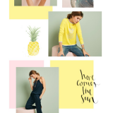
There are different ways to master your skills; scrutinizing artworks and designs of others is one of such unique, free of charge and truly inspirational methods. Sometimes it is quite enough to take a glance at small part of a design and derive all the necessary data (color selection, mix of types and graphics choice), however if you want to fully understand how the selected theme will run through other functional screens and what imprint will it leave on each interface then you should examine the whole concept, which is able to clearly demonstrate the beauty of holistic design and at the same time showcase a charm of each layout taken separately.
It is extremely important to identify patterns and binding elements that are responsible for giving the design a harmonious and visually pleasing appearance. So today we are going to get acquainted with splendid mobile app designs that are presented as the fully elaborated concepts.
Nike App Design by Kenil Bhavsar
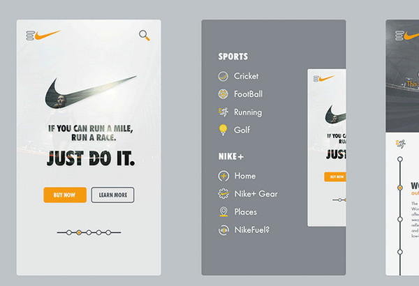
The designer presents several functional screens including a home screen, side menu and some other. The interfaces look absolutely refined, clean and delicate mainly due to soft, slightly somber color palette, sharp type, neat bright icons and lots of whitespace.
My Friend Does That by John Zmuda
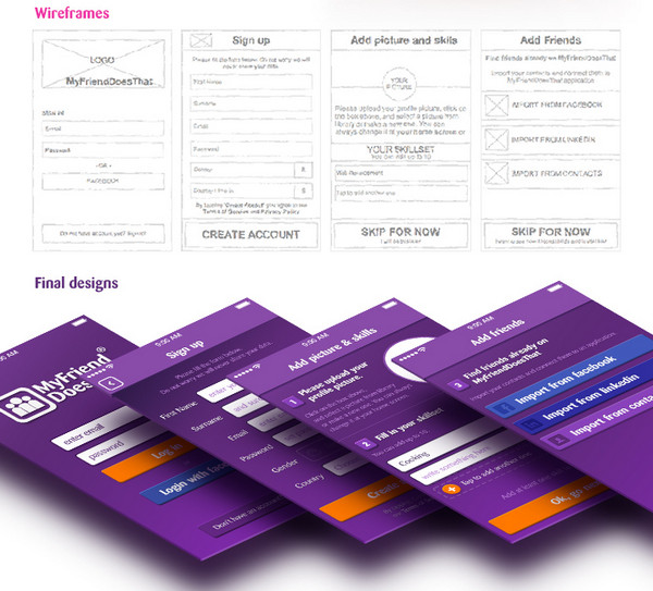
Though at first sight violet coloring looks a bit annoying and overwhelming, the designer is managed to create a really sleek and harmonious design. White color that is used for typography along with several secondary colors (dark orange and medium blue) effectively stand out from a backdrop.
Weather App
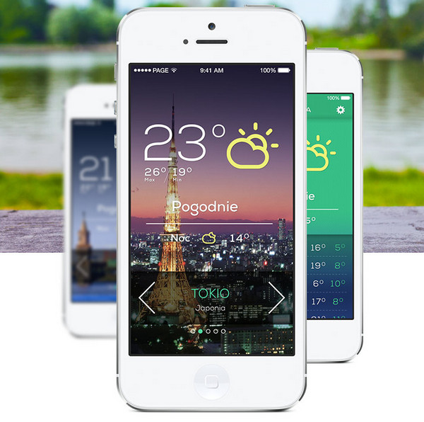
The app design utilizes both image and solid color backgrounds that equally help the foreground elements: subtle ultra-narrow type, slick contour style icons and graphics – to take the center stage on the screen. The idea of using magnificent photos relevant to presented cities is not new, but it definitely gives the interface a truly eye-catching look.
MTV Mobile & App concepts by Andrew Couldwell
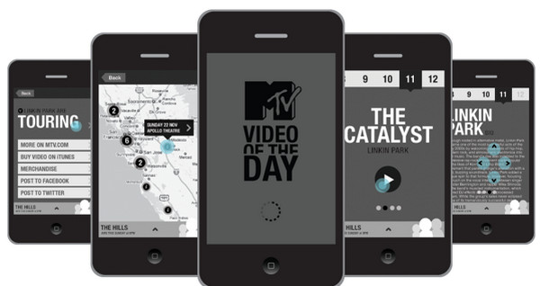
The first thing that catches the eyes is how skillfully designer is managed to utilize simple and ordinary monochrome color scheme. Thanks to this color solution and bold, quite prominent, expressive typography the interface has got a clean and structured personality.
SnapEat by Luke Davies
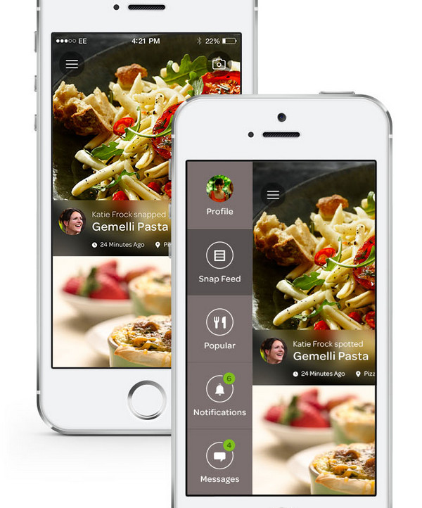
The app is dedicated to food industry, so it’s not surprising that almost every screen is based on a mouth-watering photo background. However, heavily blurred and solid color backdrops that are used for option panels and side menus don’t detract from readability.
Volkswagen Eco by Frank Alexander Szyperrek
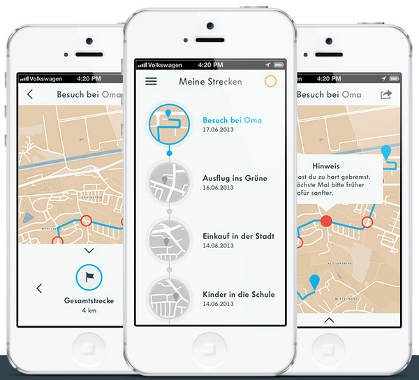
The app design has a quite formal tone that is produced by neatly-organized plane graphics. The flat style in conjunction with muted color palette is able to create a right feel for the app that offers drivers various helpful services.
MoneyFarm by Gershom Charig
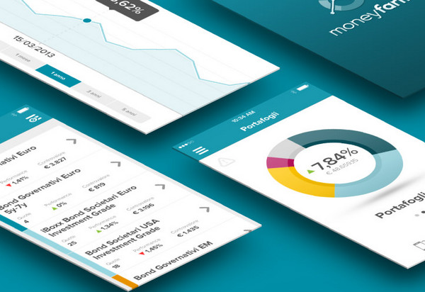
The app needs to pleasantly demonstrate different types of data, including statistics and charts, so that calm and moderate bluish coloring along with regular bold type and clean light backdrops is a perfect choice in this case.
DPSDE by John Noussis
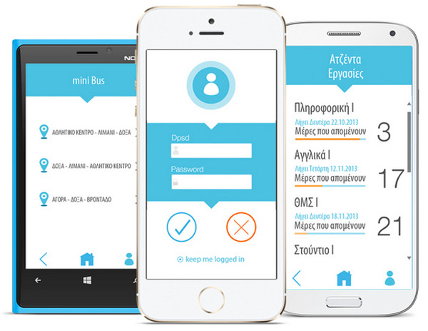
Here the app design has definitely a businesslike appearance that enormously contributes to the concept. The designer adheres to one stylistic line in every aspect. Thus everything including icons, optional graphics, typography, background and color selection is simply impregnated by serenity and thoroughness.
AlloCine by Caroline Varina Sourivong
Since the app was created with an iOS7 style in mind, it includes lots of neat outline icons, elegant graphics, bright simple colors and refined eye-catching typography. The designer also resorts to grid-style layouts in order to pleasantly dish up all the multimedia content.
Social Student App by Yasser Achachi
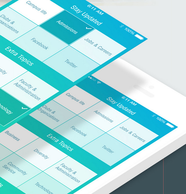
The app is aimed to cope with lots of data both textual and visual. The designer has chosen a simple color scheme that is quite pleasing to the eye, and of course, has given preferences to a well-balanced tile-style layout, clean backdrops, flat graphics and a whole slew of whitespace.
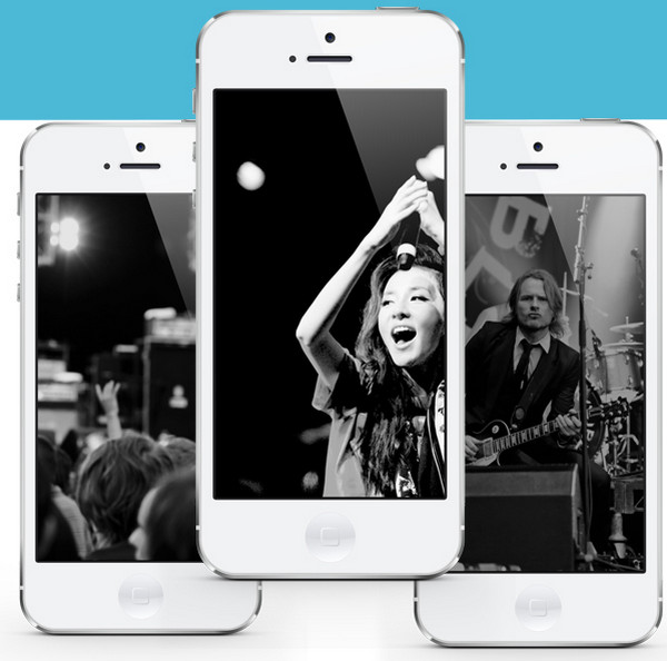
Mobile App Music Player by Yasser Achachi
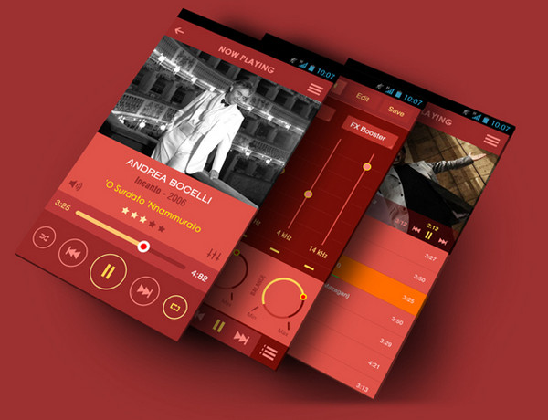
This intricate app design evokes quite controversial feelings. All we know that using red as a primary color can be very-very tricky yet the designer has capably handled this issue by diluting the main hue with other warm tones. The legible regular type and relatively huge contour graphics effectively contribute to user experience.
EDM by Leonardo Zem
Much like examples 8 and 10, the designer strongly relies on a simple yet effective coloring that harmoniously combines blue and light grey. The interface with its accurate and balanced appearance greatly reinforces the content.
Pay & Charge by Rafael Persa
Here of course, the bright and at the same time moderate color palette is worth mentioning. It easily keeps up spirits, sets the rhythm for the interface and unfortunately entices all the attention on itself.
Book flights by Mattia Bericchia
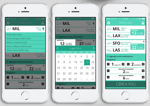
The app is certainly has a content intensive layout that features lots of data. Each screen is populated with perfectly-formatted content. Every integral element of the design whether it is a type, coloring, or graphics is designed to enhance the readability.
Gender Predictor by Dianna Su

Gender Predictor by Dianna Su has a lovely positive vibe. The designer has realized a quite interesting and alluring idea that in fact is a simple poll. The fantastic vibrant illustrations in tandem with pleasant graphics nicely support the concept.
Siasto update by Ghani Pradita
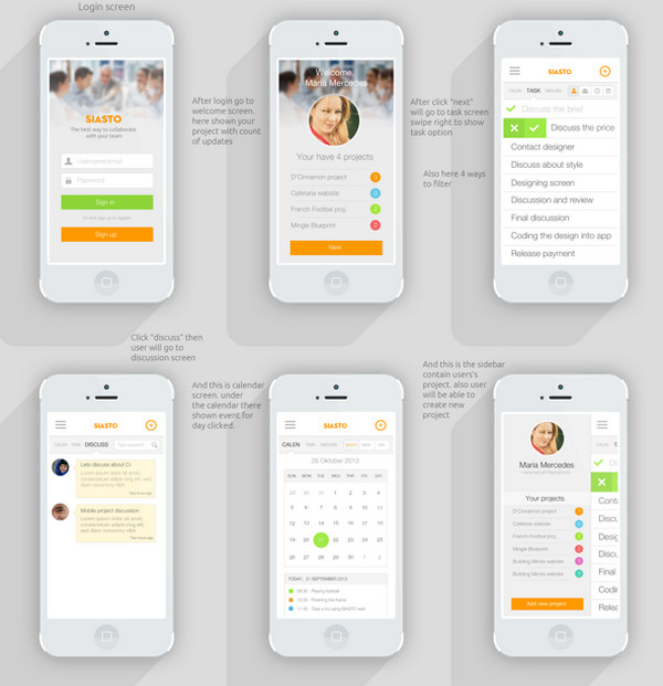
The app design is primary based on a light coloring that is contrasted by set of bright complementary hues. Various functional screens look harmonious and well-tied together.
Semerkand Takvim UI/UX by Zülkarneyn Özsaray
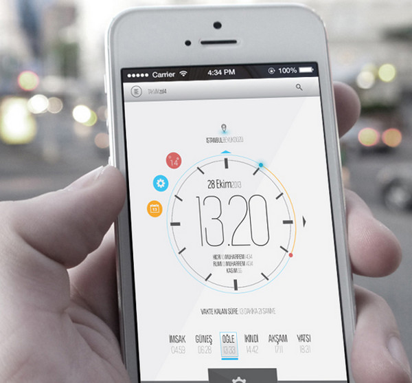
This is really a nice piece of work. The app design looks well-crafted and easy-to-use. Slightly elongated ultra-narrow type capably displays a whole bunch of numeric data.
AiREAS by Martin Boerma
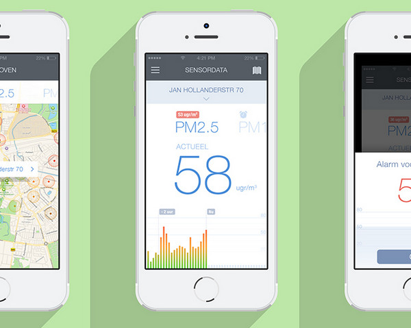
Much like the previous example, this app also deals with lots of numeric data that need to be demonstrated in non-intrusive manner. The designer ably injects bits of bright colors into a light design and supplies it with a strong solid type.
Event booking app by Chintan Pokiya
Event booking app implies an excellent combination of visual content and regular text that need to be dished up properly. So the flat style here looks like an opportune.
Turkish Airlines by Umut Isbilir
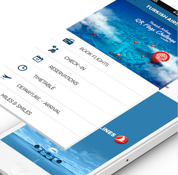
This is a business app that as befits has a well-balanced interface and simple yet stable structure. Everything is in its place and delivers a perfect user experience.
Mobile App by Andrew Youk
The designer is managed to find a perfect balance between numerous photos, text and graphics, providing users with an exceptional crisp design and an ideal UX.
Conclusion
The whole concept allows taking a closer look at how properly a designer has dealt with task, realized the chosen theme line and tied all functional screens together.


 Teamstack: Team-as-a-Service Provider with Convenient and Secure Solutions
  The Anatomy of Great Website Design that Google Loves
  11 WordPress Design Trends for 2019
 10 Web Development Trends to Pay Attention to in 2019
  Freebie: 50 Vector Human Resources Icons