Now, in the footer (bottom of page) of most web sites, the following information can be seen: date of creation, resource name or copyright information. Some sites place in the “basement” navigation links to pages like “About the Site” or “Contact Us”, or list the most visited categories. Our blog can be attributed precisely to such sites, and so we can say with confidence that these links are not interesting to anyone, and the percentage of users who click on them is close to zero.
It is much more efficient to make the footer more “visible” and beautiful, saturating it with useful information. Unfortunately, the design of each site is individual, and such footer may just not fit the appearance of the resource. Therefore, the implementation of an extended footer in design is best done at the stage of creation of prototype or drafts of the future web project.
It is also very important to choose specific units to saturate the footer with. Here, the main choice is to be done based on the topics of the site and the tasks assigned to the resource. Below, we will explain what elements exist and what kinds of sites these elements fit.
What elements should be added to site basement?
Among the whole variety, I mark out three groups of elements. Those are navigation, contact information and social data. It is these elements that affect the search for materials, communication and further actions of users on the site. All other blocks are different variations of these elements that perform similar functions.
Site navigation
Repetition of navigation is very useful, if the page is long and you need to perform a set of actions to search for the same unit. With a large number of pages or categories, it is desirable to make a drop-down menu, which will help improve the search for the appropriate section. If the drop-down menu does not fit, you should select the most useful pages for your audience and show only them.
On most blogs, this group is represented by units with the list of categories, list of new and most interesting articles, list of recent comments, etc. The main task of all these links is to leave the visitor on the site, making finding information faster and easier.
Moreover, this task is performed not only in the classic version, but also on the sites where the menu is decorated outside the box.
Contact information
Adding contact information to the footer is often practiced in resources that provide paid services. Placing these data on each page allows the user finding the phone of the office more quickly and going directly to the purchase or order of items he likes.
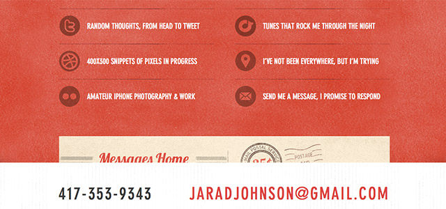
In design, as a rule, the elements are limited to the following points: address of store or organization, phones, e-mail address, location map (or a link with an icon, or a complete map, with the possibility of view without going to another site) or feedback form.
Also, you can often see a combined variant, when the “basement” contains links to important pages of the resource and brief contact information (with no map or contact form).
In terms of design, large fonts are often used.
Social data
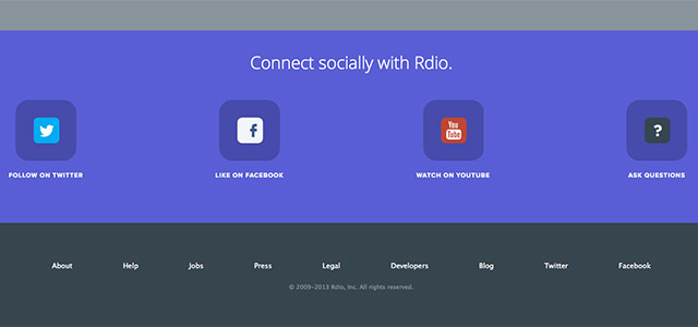
If your site is related to social medias, or you actively communicate with the audience of the resource through social networks, you should consider posting links to the relevant sites. Just as with the navigation group, you should only provide links to the most popular networks, if you are registered on more than 5 sites.
Social networks are popular tools for acquiring information, so it is important that the visitor is able to find out what networks have a particular resource. Support links with icons, add feeds of recent tweets or replies. If you have a blog, be sure to install buttons, such as “Like” and “Tweet”.
Nowadays, the addition of social data is very important for any resource, and you shouldn’t miss this group in the design of the footer or the site in general.
Effective Footer Examples
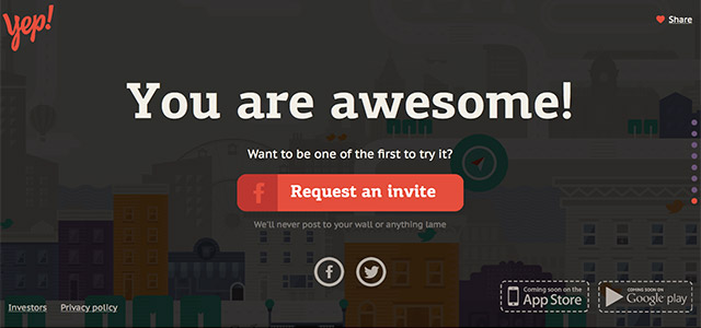
Lets Yep!
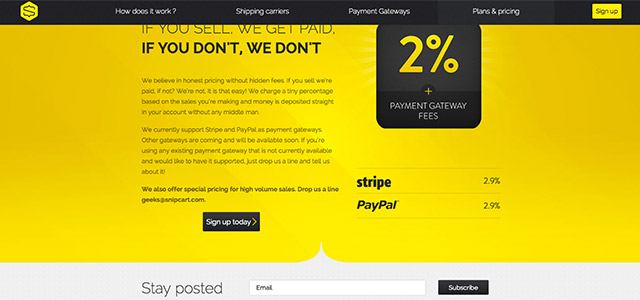
Snipcart
Mixd
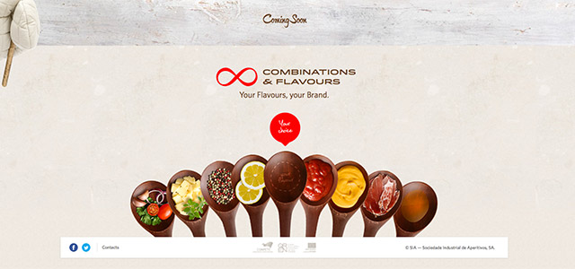
SIA Aperitivos
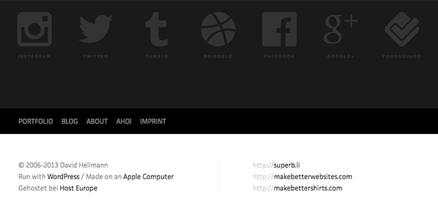
David Hellmann
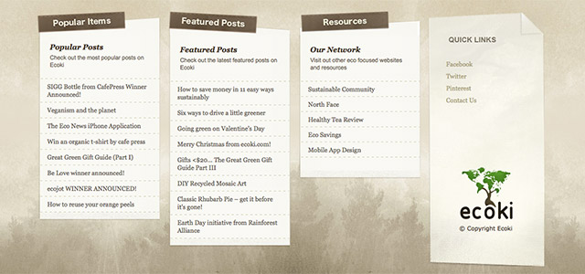
Ecoki
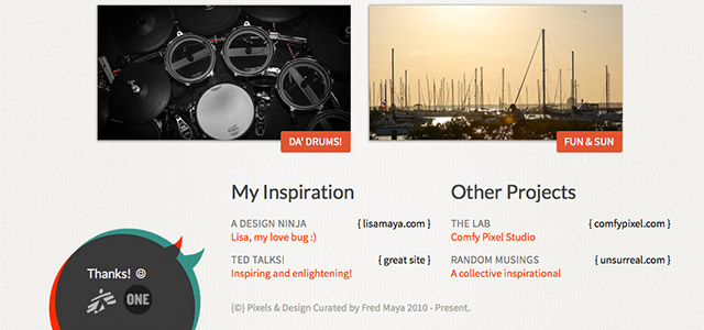
Fred Maya
Jarad Johnson
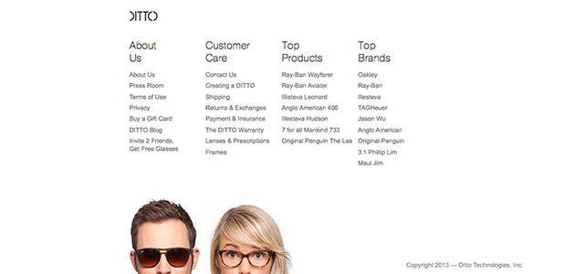
DITTO
Rdio
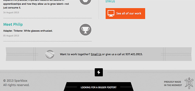
Sparkbox
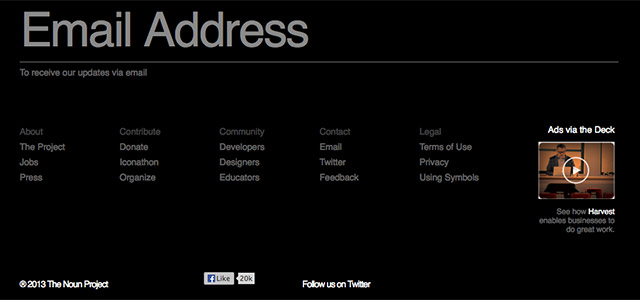
The Noun Project
X-PRIME GROUPE
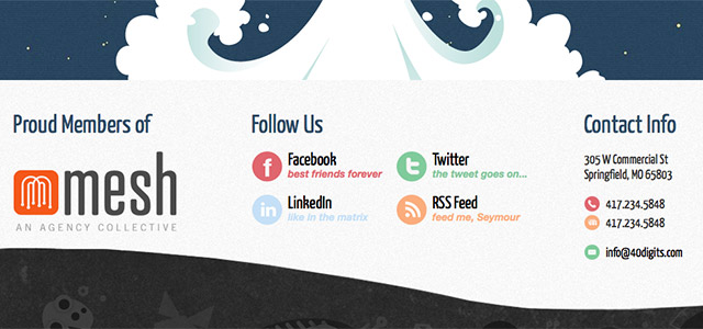
40Digits
Leaderbe Consulting




 [Review + Giveaway] CSS Hero – The Fastest Way to Customize the Design of Your WordPress Site
  Introducing Iubenda’s Privacy and Cookie Policy Generator for Websites and Apps
  20 Super App-presenting Websites
  Avoid These 7 Usability Mistakes When Designing Websites
  Clean and Uncluttered News Websites are a Reality Nowadays
Mathew Porter Aug 28, 2013, 11:45 am
Some gorgeous examples in the post, great roundup.