It’s worldwide accepted that a good image is worth one hundred words; I think that another thing that is equally famous is the dilemma about how many words a good video is worth. If you are searching for this answer, then I must disappoint you: I don’t have one!
On the other hand, I strongly recommend enjoying this post because it will reveal the importance and the beauty of videos in the art of crafting websites. The main problem related to video format integration into a website is that it requires the use of a performant computer and a medium to strong Internet connection. Fortunately, it seems that these issues are step by step resolved. As a result, we have a relatively new web design trend, the video backgrounds.
A video background brings the dynamism of a website to a whole new level and the Internet users are fascinated with the idea. Another strong point of these websites is the modern atmosphere that is created. In order to have a clearer idea about the potential of websites having video backgrounds, I have collected 20 simply amazing examples. Of course, the Internet is full of other similar masterworks; if I missed your favorite please let me know and I will gladly add it into a future post.
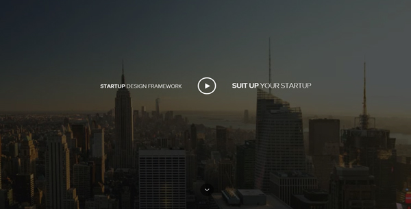
Startup Design Framework
Startup Framework is a great tool for making awesome flat websites; both the framework and the presentation of the website will totally blow your mind. The background is in fact a video presenting in a very interesting way the story and the people behind this framework. The nice jQuery effects and the parallax technique complement the modern touch of this website. No matter if you are interested or not in purchasing the Startup Framework, I bet that it will be a nice experience to visit the website.
Défi Ingénieurs
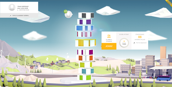
Personally, I think that this website is a step further compared to the rest of the Internet. The team that created it is formed only by top designers. Everything is at the superlative level and any word is useless. Both the video and the website are stunning. So, I am quite interested in finding out if I was the only one who fell in love with this website?
Electrik Company
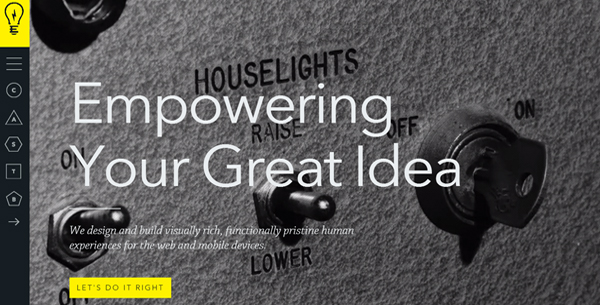
The creators of this website preferred to design the image of a serious and tech related brand. They used a simple, but powerful color combination- black and yellow. The video is black and white and it perfectly integrates with this chromatic approach. The bold and good looking typography is another wise choice.
Nod
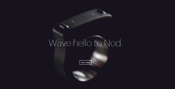
Nod is a promising device that will probably replace the mice, at least for some activities. The video background showcases this device by spinning around. The website is avant-gardist, clean and pleasant so it fully deserves its position in this list.
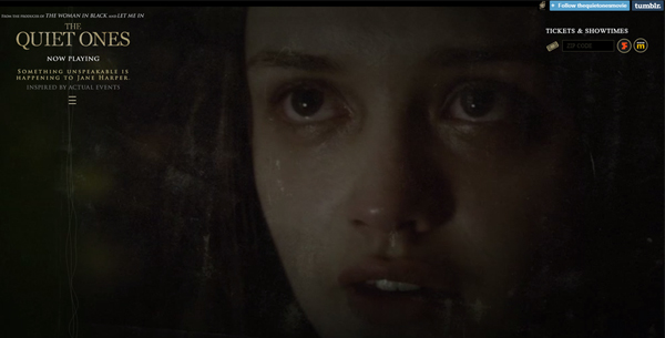
The Quiet Ones
This is the official website of the horror movie The Quiet Ones. I couldn’t say that I am a fan of this type of films but this website convinced me to watch it. It’s impressive how the designers managed to create such a depressing and bloodcurdling atmosphere with the help of a video background.
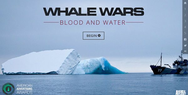
Whale Wars
I must warn you that this website may shock you. The video background of the homepage presents the whales’ splendor and most probably you will love these sequences. Unfortunately, if you visit the rest of the webpage, the situation will be totally different. These exhibit various cases concerning the slaughter of whales. Altogether, I think that you should check these out, in order to see for yourselves how cruel some people may be.
Céline Bonin
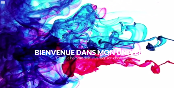
The designers preferred to add video backgrounds with the purpose of better explaining some facts and states, as they did in the previous example. This website is different because the video added is abstract, but undoubtedly, fascinating. Do you like it?
SCI.2
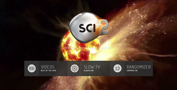
If you are passionate about science and aesthetics, then this website is for you. It presents various videos about science topics and the homepage video background works as a magnet. Definitely, this website makes the science more attractive!
Brindisa Tapas Kitchens
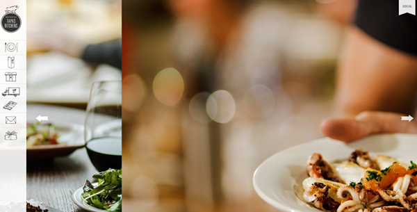
The images of appetizing dishes are worldwide used into the layout of a restaurant website. In this case, the website’s creators didn’t use only images to captivate the viewers, but they have also used a video background. It reveals some wonderful dishes and the pleasant atmosphere of the local, therefore you have all the reasons to pay a visit!
Nokia Transitions
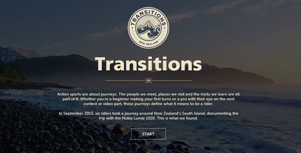
The background video is rather expressive and not informative. It’s a risky way, but the author managed this situation very well. The website is about making trips and admiring wonderful landscapes which is in accordance with the video.
Storq
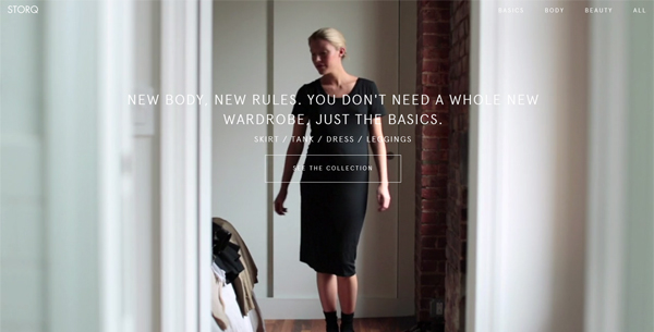
Store Q is an online store for pregnant women. Selecting the best clothes is a challenging fact for women and making a video showing that simple clothes can make them look better will definitely attract their attention. A simple realization, but a big idea!
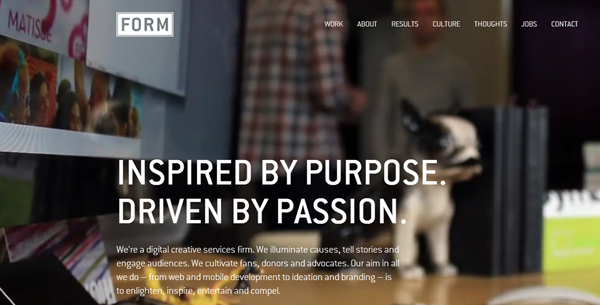
FORM
The portfolio of a creative agency must be creative, mustn’t it? The Form Group website is creative and well designed. In this case, the video background has two roles: to add a modern and dynamic touch and to let people know the members of the agency and their manner of work.
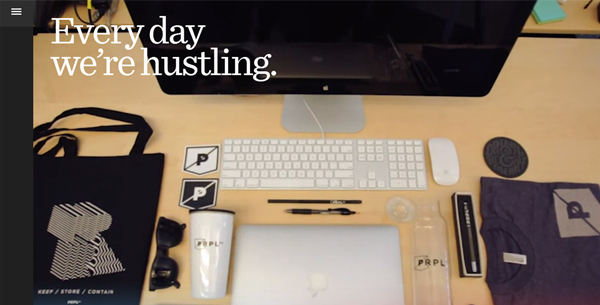
Purple, Rock, Scissors
Purple Rock Scissors is the website of another creative agency and they use the same idea mentioned in the previous example. Altogether, the realization is different while the quality is the same.
WiFi-DENTI-FIER
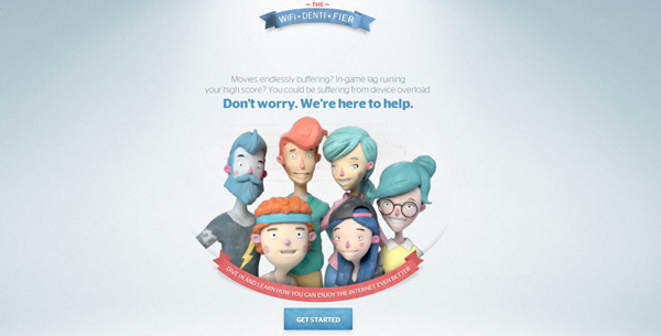
I don’t want to promote the services of this Internet provider, but their website is a masterwork. It’s a mixture of animation, illustration and fun and I think that it’s very relaxing to check their mechanism of determining the Internet needs of the clients.
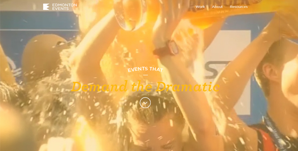
Edmonton Events
Events in Edmonton is a great flat based website destined to attract in Edmonton various sportive and cultural events. It is the result of the Edmonton Tourism and Edmonton City partnership. The vintage video background is awesome and I think that it attracts tons of visitors.
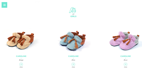
Melanie F.
I never thought that baby shoes may look so interesting until someone created a wonderful online store to sell this kind of products. Melanie F is an awesome online store that will impress with its intimate atmosphere and good aesthetics. The video background shows how the shoes are made and it’s no surprise that the visitors will spend some seconds just to see the video (I was one of them!!!)
Women’s Fitness
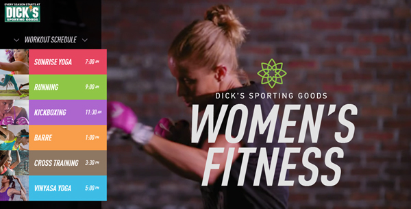
Dick’s Sporting Goods is a very innovative concept. The navigational menu of each online store is created to offer to the user the desired product, as soon as possible. It’s a good idea, but this website seems to offer a whole new concept. Instead of mentioning the items for sale, the navigational menu is formed from various sport activities. By selecting a submenu, the user watches a video and here she (the store is women related) may select the products for sale. Well, I guess that it is way better to visit it yourself!
Joe San Clothing
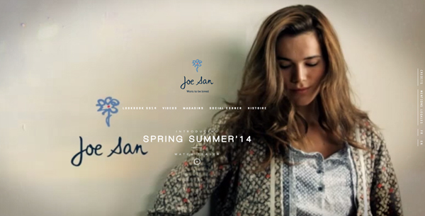
Joe San is another original store. Designers are aware of the fact that the potential clients, who would like to purchase clothes, are very reticent because they can’t touch these to test the condition of the fabric used. Altogether the quality of the material may be noticed even from the HD video. This idea is wonderfully applied in practice by this store.
Sortie en mer
Many people enjoy sailing but only a part of them wear a life jacket and respect other sailing rules. On sea everything is unpredictable and a single moment of absence of mind is enough for a catastrophe. This website provides a good situation which will make you realize that wearing a life jacket is very important.
Calm
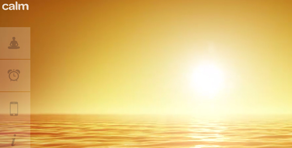
Every one of us has less inspired moments. It’s impossible not to have difficult situations; what really matters is to overcome these. Calm is a web and iPhone app whose main purpose is to help the users regain the calm and inspiration in order to work. Try it, Calm worked for me!
I hope that these wonderful websites inspired you and maybe your next project will be a website having a video background. These websites have a very modern design and are eye catching so you should consider this idea from now one.



 All Websites Should Feature Videos and Here’s Why
  10 Latest e-Commerce Trends to Watch Out for in 2020
  SERPStack Review
  Freebie: Gradient Infographics
  [Review + Giveaway] CSS Hero – The Fastest Way to Customize the Design of Your WordPress Site