Introduction
Most of the WordPress themes come with a sidebar. The sidebar mostly contains a Widgetize area from which one can go and add widgets to your WordPress theme. The sidebar in your responsive WordPress theme brings about new type of challenges and design consideration which you will have to do. If you keep a fixed size sidebar in your theme as the screen gets smaller and smaller the proportion of the main content to the sidebar will get smaller and the site might not look good on such screens.If that is a case you might want to decrease the sidebar size as the screen size decreases so that the main content and the sidebar is in proportion.You might also want to shift the position of the sidebar based on various screen sizes or even might decide to show the sidebar only on larger screens.In this article we are going to make our sidebar responsive and see how can we achieve some of these techniques.
Create a child theme
To try out having a different menu for your WordPress theme we are first going to create a child theme of twentytwelve. To create a child theme of twentytwelve create a folder wp-content\themes\twentytwelvechild and in that add a style.css with the following text
/*
Theme Name:     Twenty twelve for responsive sidebar
Theme URI:
Description:    Child theme to demo responsive sidebar
Author:         Abbas S
Template:       twentytwelve
Version:        1.0
*/

@import url("../twentytwelve/style.css");
In the above code you have just specified the meta data for you theme like its name version etc. The template field specifies that is is the child theme and the parent theme is twentytwelve. Then we just import the twentytwelve style.css in this style.css so that we get all the styles of the parent theme. If you are new to creating child themes of WordPress please refer to this link for more details http://codex.wordpress.org/Child_Themes.
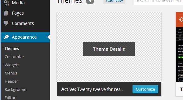
Once you have added the style.css you will see the child theme in your admin section as seen below. You can now activate it.
Making the sidebar of variable width
As the size of the screen decreases, we might want to decrease the size of the sidebar in proportion so that the content and sidebar remain proportional on all screens.To do this we will define the width of the sidebar as the percentage of the full screen rather than just a fixed width.This will have an effect that the sidebar width will become smaller once the screen size also becomes smaller.
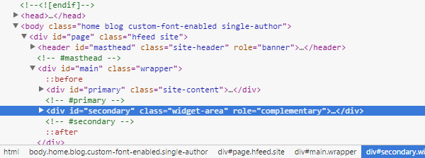
The first thing we need to do is detect which CSS element is governing the width of the sidebar.This you can do by inspecting the sidebar in Chrome or Firefox and the check the element.As our theme is a child theme of twentytwelve the element governing the sidebar width is widget-area. This might change based on the parent theme you are using.
Now we can override the style for widget-area to make the width as variable percentage as shown in the code below in your style.css of the child theme.
.widget-area {
	float: right;
	width: 20%;
}
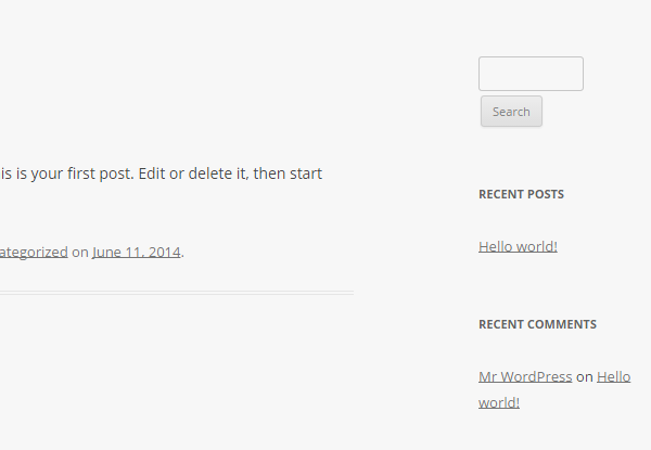
Here we are making the size of the sidebar as 20% of the full screen size. So as the size of the screen decreases the size of the sidebar will also decrease as shown below.
Handling the sidebar to move at the bottom on smaller screens
Making the sidebar of variable length helps the sidebar to be proportional.But once the size of the screen decreases below a specified level, it might make the sidebar too small to be practically visible or usable.Hence, once the screen size becomes smaller than a specified level it might make sense to move the sidebar from the side to the bottom of the page. Then the user will be able to access the sidebar by scrolling to the bottom of the page. We are going to use media queries to do this.Add the following code to the style.css of your child theme
/* Mobiles in Potrait mode */
@media only screen
and (max-width : 320px) {
	.widget-area {
		float: left;
		width: 100%;
		background: #E3E3E3;
	}
}

/* Mobiles in landscape mode */
@media only screen
and (min-width : 321px)
and (max-width : 480px) {
	.widget-area {
			float: left;
			width: 100%;
			background: #E3E3E3;
	}
}
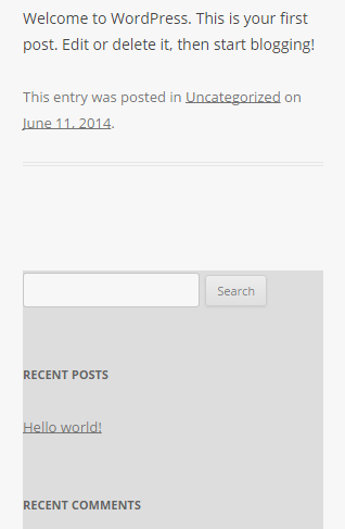
Here in the above code using media queries we detect smaller screens and override the styles for widget-area. We make it float to the left instead of the right and make its width as 100% so that the width spans to 100% of the screen size.Now once you the screen size decreases you will not see the sidebar at the side but will see it at the bottom of the page spanning 100% width as shown below.
Hiding the sidebar on the small screen
Putting the sidebar at the bottom might make your site to have a long scroll on smaller devices.This will depend on the amount of content you put in your sidebar and might not be the best user experience.Another approach you can take is to hide the sidebar if the screen size goes below a specified level. To hide the sidebar on smaller screen add the following code to the style.css of your chile theme.
/* Mobiles in Potrait mode */
@media only screen
and (max-width : 320px) {
	.widget-area {
		display: none;
	}
}


/* Mobiles in landscape mode */
@media only screen
and (min-width : 321px)
and (max-width : 480px) {
	.widget-area {
		display: none;
	}
}
In the above code we are just hiding the sidebar on smaller screens.One important thing to note here is the content is still transferred to the devices. It is just not visible on smaller screens.
Conclusion
Sidebars in your WordPress themes are very integral part and most of the themes have one or more sidebars.The sidebars might have to be treated in different manners based on the screen size of the device displaying the theme.You might want to opt for a fixed width or a variable width sidebar and might have to take a decision on where to put the sidebar on smaller screens which do not have the place to show a sidebar on the side.Some approaches are discussed in the article to put it at the bottom or hide it completely.Based on the content you put in the sidebar you might want to display the sidebar at some other place.You can achieve that using the media queries.So have fun while building your responsive WordPress theme.


 6 Must-Follow SEO Tips For Every WordPress Photoblogger
  All Websites Should Feature Videos and Here’s Why
  Top 16 Free WooCommerce Themes
  Top 25 Free WordPress themes from 2020
  Black Friday 2019, Best Deals for Web Designers and Developers