Any web designer should stay updated with the latest news and techniques used by other peers. Who neglects this aspect will have a certain faith: the clients will renounce his or her services. Everyone involved in the design industry is aware of the fact that a portfolio is the “identity card” of a designer. Also, it’s unnecessary to mention how important a good-looking portfolio is.
Unfortunately, many people forget another aspect related to the portfolios: regardless how well-designed are the items exposes, once these are outdated the potential clients will prefer to search for other solutions. The potential clients are looking for designers that are able to create modern works. Yeah, you may say that good design is timeless! But a potential client doesn’t judge the value of the portfolio. He or she is looking for a designer that offers good and relevant services. In other words, try to imagine yourself visiting a great portfolio where various screenshots of the created websites are showcased. They look great, but all the websites are created under the influence of skeuomorphic design. No flat design, no material design!!! I am sure that you won’t hire the owner of the portfolio, would you?
Most designers know this and act consequently. As a result, nowadays we have tons of app concepts. You can’t call yourself a designer if you don’t have an app concept uploaded on Behance or Dribble! Paradoxically, even though these concepts are just for fun, some of them are really impressive. Of course, these are presented on portfolios, too. This way, the designers are training their skills and clients have the possibility of making a better judgement on designers.
If so far you haven’t created such a project, then it’s time to reevaluate your position. If you lack the inspiration, don’t worry! We have collected 20 amazing magazine news app concepts to bring you inspiration. Enjoy them and get your daily dose of inspiration!
NewsMaker
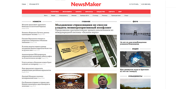
An important part of the Behance or Dribble projects are made just for fun, but some are designed for clients. It’s the case of NewsMaker, a news magazine. It’s a very simple design that has the role of providing the users a great reading environment. It is distraction free and the red based menu is specially created to help the user have a good experience.
Forbes
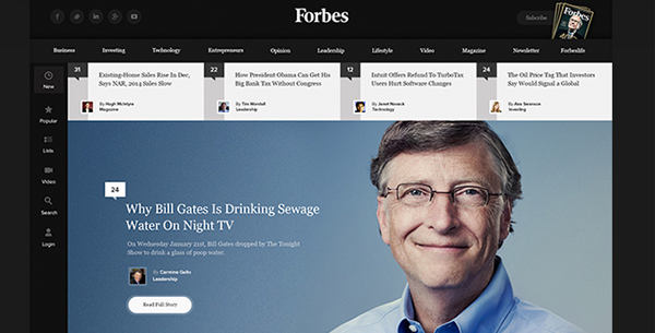
Another designer common practice is to redesign some famous websites or mobile apps. Ruslan Siiz is a talented designer that redesigned the Forbes website. It’s not a whole new idea, but he managed to bring small improvements and overall, his project is really interesting.
BBC
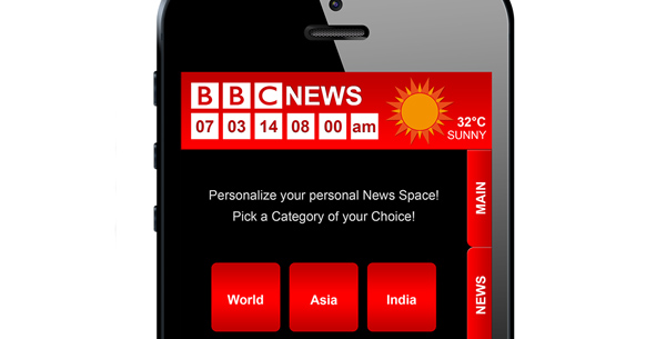
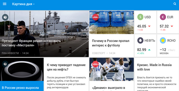
BBC is another huge mass-media brand and it attracts designers to create new redesigns of its mobile app. Here is a very simple design of the BBC application, but still I think that users will appreciate it. The profile of the average user of the BBC app is a mature and serious individual who is perfectly fit to the style of this redesign.
Yahoo News
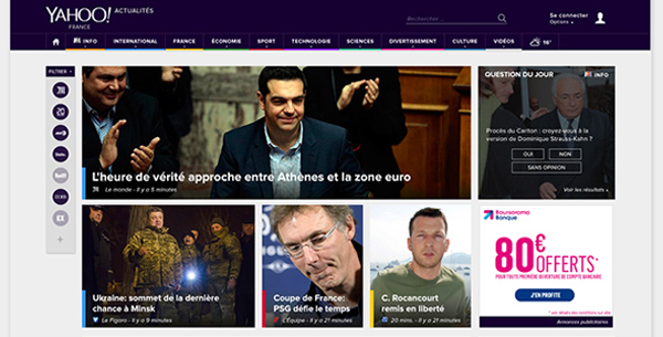
I must recognize that this redesign made me say “wow”, I really like it. Firstly, I like the color scheme, it’s different from what people expect from a news app. Secondly, even though many articles are concentrated into it, the layout is clean. Do you like this redesign?
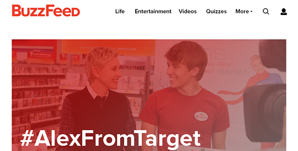
BuzzFeed
This work is the last redesign from this list, but it’s not the last in terms of quality. BuzzFeed redesign keeps many elements from the current design, but it brings a younger approach. The colorful gradients and the uncommon shapes used are two items that sustain my statement.
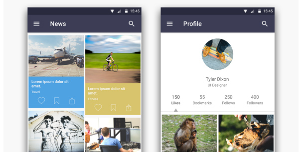
News App
If you want to see good design in action, then you may check this concept of news apps. Every detail is carefully planned; every pixel is here in order to let the user focus on the article content. I believe that using such an app is a real pleasure.
Newsio
Newsio is another top quality news concept. It comes in two versions, black and white, both looking great. It is material design inspired, therefore it’s a very dynamic app and I guess that use of it will assure a great user experience. The author presents the concept in a very interesting manner and I believe that you won’t waste your time if you visit the presentation page.
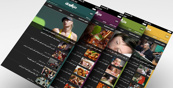
Donia Al-Watan
Donia Al-Watan is a special news app that was recently released. Its originality consists in the design adapted for Arabic writing. The style is pretty official, but the color scheme manages to make the app attractive.
The Collage
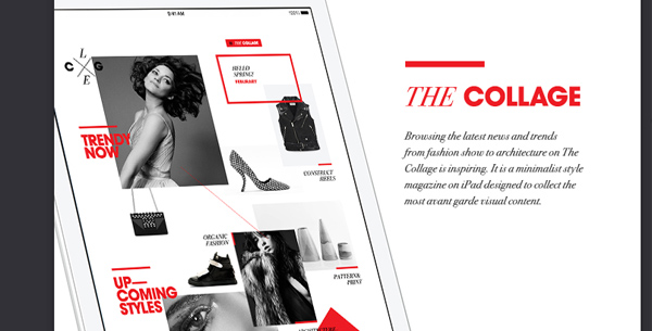
The Collage is a very elegant app concept that is destined for providing the latest information in fashion. The design is almost minimalist and the red and white color combination, in addition to the black and white images emphasizes the simplicity and the elegance of the app.
Newstone
Newstone is mostly destined for blogging, but it’s suitable for news magazine, too. It’s a very clean structure that respects the basic principle of designing such an app. The app concept receives the highest mark for the color combination originality. It’s based on a brown and white combination and surely users will notice this aspect.
Branding Watch News App
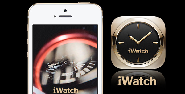
No doubt, this app is the most elegant from this list. It’s an app aiming to offer the latest news from the field of luxury watches. Many good looking images and other interesting items are added in the layout and use the Chinese language.
News Mail
News Mail is a great news app concept. The designer offers versions for iPad and iPhone. Both are looking very well and are based on Material Design. In other words, the app will work fine regardless of the devices being used and the users will be delighted by the smooth transitions of the pages and other interesting sliding effects.
Copa America
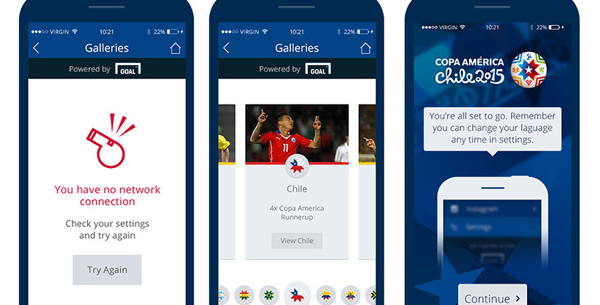
This app concept is superb and it deserves your full attention. This app is made especially for the Copa America, a football competition. The design is based on a blue background while the colorful icons complement the cool appearance of the app. Fortunately this project came into life at the end of April, so it’s a brand new app, both for Android and iOS users.
Hollywood News
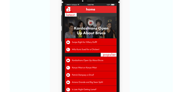
Gossip is a part of our lives and some people are addicted to knowing the latest news about their actors. This concept reveals “the prototype” of an app designed for finding out the latest gossips from Hollywood. I very much appreciate the smartly designed red headlines that influence the readers to take actions and read the news.
Breaking News
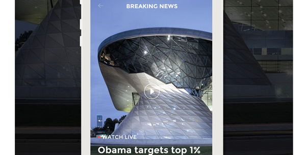
Unlike the previous app concepts, the creator of this one wants to let the content be the main attraction. This is a “breaking news” app and I think that it’s a very good idea. This way, the user focuses on the titles and it’s not disturbed by the design.
My News
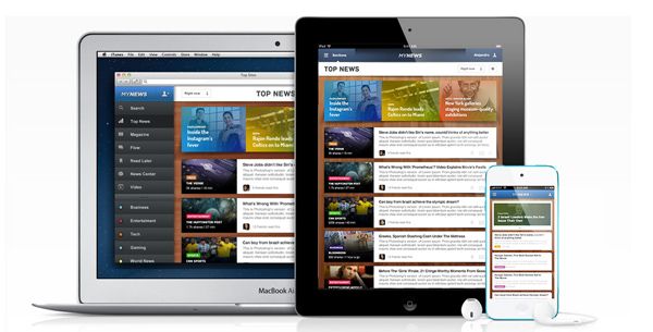
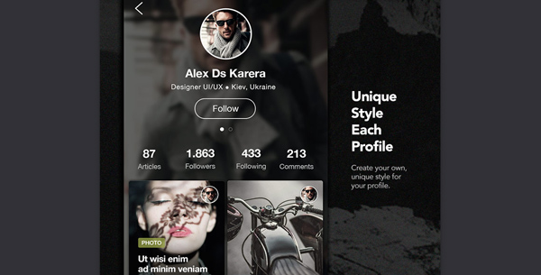
I like this app concept very much because it’s different from other news app concepts. The layout remains very similar to all news apps, but the colors used make the difference. Besides, the creator gives an important role to the images and the overall design is really pleasant.
Context
The use of this app will be a real delight for the reader. The screen is managed to assure the best user experience; it’s the “classic” format of a serious news magazine– much, but well segmented written content, quality and suggestive images and readable typography.
Designer News
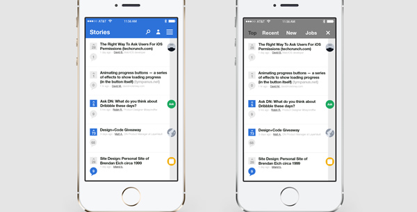
Bold, big and readable typography, white background and quality content is the basic recipe of a great news application. Well, here is such a prototype and it looks promising.
Stock Market News
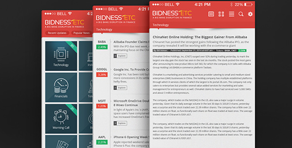
This concept is destined for stock market news. It looks interesting, but at the same time it respects the patterns required by such a project: seriousness, professional look, cleanliness, and shortness.
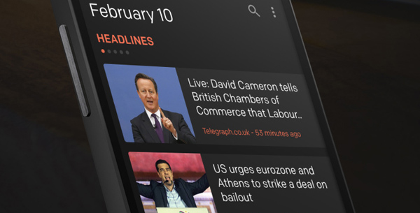
Spot
Spot has a very modern design that will captivate the eyes of the viewers. I am wondering if the black background isn’t negatively influencing the user experience. Apart from this, everything is well done and I hope that it will be brought to life by some developers.
Wrapping things up, the news app can’t be extremely eye catching as other types – free time, weather, music or travel apps. These must be more rigorous and must allow the user enjoy the content. There are some specific limitations, but it doesn’t mean that these apps should look ugly. The above app concepts demonstrate the idea, don’t they? Please let us know about your opinion on these news app concepts!



 Teamstack: Team-as-a-Service Provider with Convenient and Secure Solutions
  10 Web Development Trends to Pay Attention to in 2019
  Freebie: 50 Vector Human Resources Icons
  [Review + Discount] Timing App – How to Track Everything You’re Doing on Your Mac, on Autopilot
  [Review + Giveaway] Sympli – Design Handoff for iOS, Android, and Web Made Simple