No matter how deep we dive into flat style and Google material concept, there is always place for graphics with 3d dimension. We just cannot get away from it. Though we have successfully abandoned skeuomorphic designs, yet objects with depth and volume will stay in our hearts forever.
Moreover, there are so many solutions and methods how to achieve this effect, and it is not necessary to equip yourself with mighty and expensive professional software like 3DS Max. The job can be done in other less sophisticated image editors or applications. Key factor lies in the method. For example, you can go for isometric projections that let you build three-dimensional objects and stay inside a two dimension world. This is quite nifty, elegant, lightweight and refreshing. What’s more it has a retro and techno nature that comes from video games of the 80s and early 90s. Surely, it is a limited effect, yet it proves to be competent and efficient.
Our today’s collection tries to demonstrate this with the help of 20 isometric icon sets that are examples of how to handle this technique in practice.
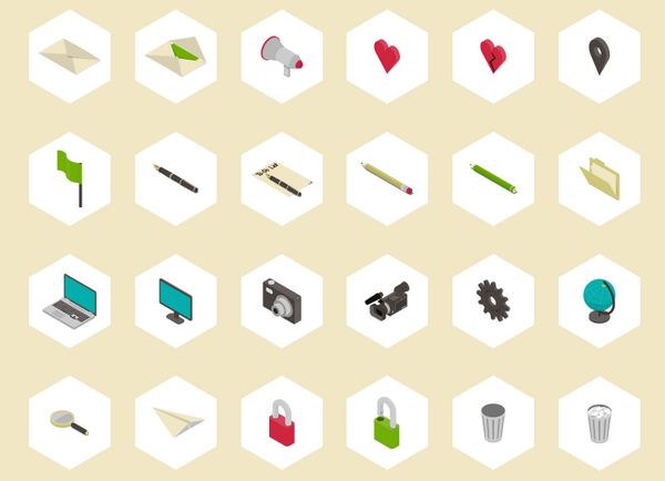
Isometric Icon Pack by Beresnev
![]()
This pack includes almost one hundred items that fall into different categories starting from traditional ones such as business and ending with narrowly targeted ones such as vehicles. Some icons feel boxy other spherical, yet all of them have a sense of 3d dimension. What’s more, each one can be considered as a thorough microscopic illustration.
Studio Icons by Jonathan Ball
![]()
It is here where isometry meets line style to produce an outstanding result. The set is exclusive and visually-appealing. Each item has a subtle and refined appearance with a plenty of fresh air in it. It can be used as a base for creating a solid version, or just like that.
Orange – Isometric Icons by Rod Hunt

This icons break the monotony of conventional business icon designs and deliver fantastic general impression. Each item clearly portrays an idea. It looks nifty, glossy and dimensional. Orange color adds spice to every object.
Isometric Icon Set by ADIDAG
![]()
A bit cartoonish and unrealistic, yet it can become an ideal pair for illustrated interfaces. Soft pleasant coloring and flat style play here an important role.
PC Evolution Icons by Slava Okhranchuk
![]()
The artist showcases two highly detailed and semi-realistic icons that point out the striking difference between one of the first PC and modern one. An angled view lets embrace lots of integral elements to convey a proper experience.
Isometric Sushi by Irina Mir
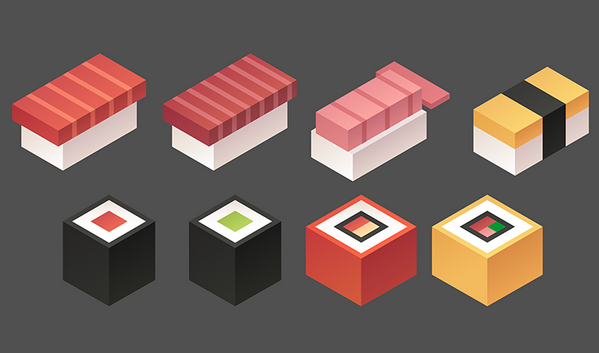
An inventive and original take on representing the beloved food of Japanese. Boxy, restrained and schematic, they slightly remind objects from Minecraft. However, they have this subtle touch of tastiness.
Golf Game Icons by Pavel Novák
![]()
Isometry is an excellent way to make objects look even more realistic and vivid. Paired with skeuomorphism it can open its full potential. The set breathes with naturalness and life.
Cats and Film by Olivia Truong
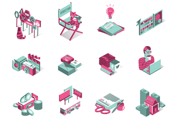
The artist has done a great job. Each icon is a tiny composition that consists of lots of elements that are laid out in such a way that every detail has its place. While vector realization forms structure and shape, soft pastel coloring brings energy and playfulness.
Isometric Icons by Joanna Ngai
![]()
Yet this time the artist opts in favor of schematic display rather than detailed. Nevertheless, this fact does not diminish its beauty and usefulness. The pack is marked by a strong boxy appeal.
Icons – Before and After by Chris Inclenrock
![]()
The designer shows two types of icons made with the help of isometric rules. The first one is a clean, polished line style variant with solid areas and coordinate axes that serves as a foundation. The second one is a bright and energetic final version where transparency adds an eye-catching twist to several objects.
Housing Project by Stef Hamerlinck
![]()
When it comes to display objects that are based on either rectangular or square shape, an isometry is the best choice to make them look even more structured, crisp and complex. Everything seems to be harmonious and natural.
Isometric Planes by Eden Weingart
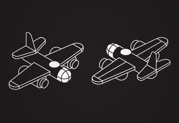
The shot features only one airplane model yet in two different views. The artist makes use of line style and white space to make each object look sleek and visually interesting. Isometry strengthens the general effect.
Building Realistic Icon by Arvind Kumar
![]()
This is only one icon, yet it is worth your attention. Here geometry runs the show: every integral part is made of either square or rectangle. Angled view adds depth and enables the artist to demonstrate various sides of the object.
Library Icon by Fernanda Parisi
![]()
This icon is composed of 2 books, isometry helps to display two main facets: cover and book’s spine in non-intrusive manner. It is all you need to best convey the meaning.
Landing Page Icons by Byron Corrales
![]()
This icons ignite interest from the first seconds. Although they are made with isometry in mind, yet at some view angles the subtle touch of 3d dimension is wearing off.
Fenerbahce Isometric Sport Icons by Ertekin
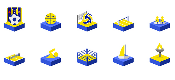
Bright energetic coloring, vector realization, masterful performance, and of course, isometric projection make this set exceptional and attention-grabbing. This is a fresh solution to display popular types of sport.
Simple 3D – Free Icon Set by Balázs-Hegedüs József
If you already have an irresistible desire to enrich your project with math-produced 3d dimension feeling, then you can download this fantastic package and add some fancy twists to your interface. Each icon is a schematic vector illustration that is made in a soft coloring and flat style.
Isometric Icons by Jo show
![]()
Until now we have considered icons that are displayed at 3/4 view, Isometric Icons by Jo show another way to use isometry. The icons break away from its conventional brethren. Though they still look flat, yet such approach makes them feel more lifelike.
La Poste by Guillaume Kurkdjian

The set includes four massive icons. Isometry in tandem with some design tricks such as faked shadow gives each item a distinctive 3d dimension nature.
Odyssey Translator Icon by Alexandr Nohrin
![]()
This icon features a perspective display of icon and crafty layering. Each element has a volume that contributes to depth. Bright coloring, glossy touches, and sleek shadow provide the graphics with a skeuomorphic charm.
Conclusion
Isometry always has its followers and fans. Of course, in the era when you can quickly add volume to an object with the help of basic instruments in Illustrator or just create a highly realistic 3d model in Cinema 4D, it seems a bit obsolete. However, components created in accordance with its rules have its beauty and allure. They are not overpowering. They are smooth, elegant, a bit boxy and enhanced with a complexity.


 Freebie: Diwali – Creative Kit
  Free Resources for Web Designers and Developers
  Top 16 Free WooCommerce Themes
  Top 25 Free WordPress themes from 2020
  ZeroSSL Review – SSL Protection for All