Interactive infographic is a pure godsend for those who deal with bulks of data that need to be sorted and effectively presented. For a long time displaying statistics was considered to be a boring and tedious process that unfortunately not everyone was able to appreciate properly; however times change and tools for showcasing official figures have evolved and matured, having made statistics to look more intriguing and attractive to us.
Today we have picked up several viable solutions that will allow enhancing your data presentation by means of dynamic charts and graphs. We have included not only copy-paste snippets but also some powerful javascript libraries and plugins.
CSSPlot
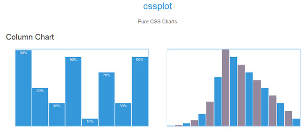
This tiny but pretty helpful library includes CSS descriptions of several types of charts: column charts, bar charts and scatter plot. Each component is made in a pleasant coloring and in a flat style and is suitable for various modern projects.
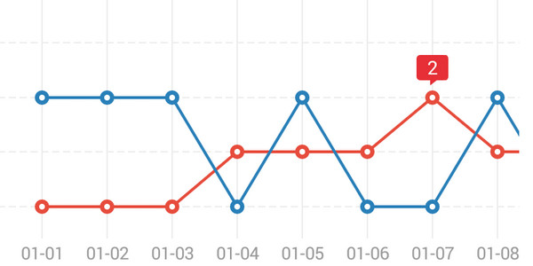
Ishtar Interactive Line Chart
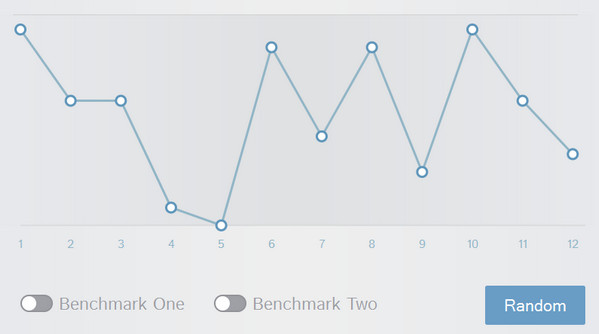
This line chart lets you vividly demonstrate several graphs on a one playground that can be turned on/off in a manual mode via switches placed on the bottom of the widget. You are also able to assign each dot, giving it a specific description. Though the original design looks a bit pale, yet if you have some basic CSS knowledge you can easily change main colors to more striking ones.
CSS 3D Animated Chart
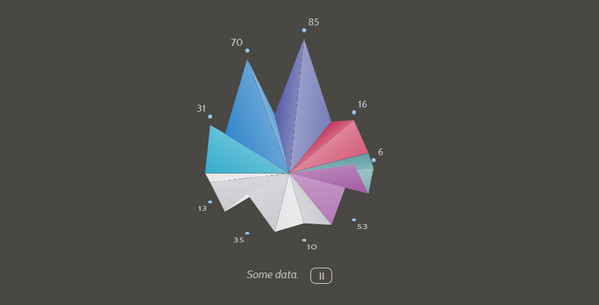
Presentation in 3D always has some perks and advantages over flat ones. Not only can it instantly draw attention to your stats but also make your data look engaging and interesting. Here, the vibrant color scheme gives the presentation a startling effect.
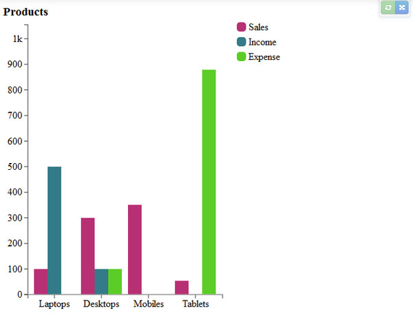
Dynamically Generated Css Animated Bar Chart
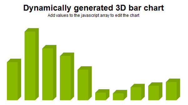
Though the project does not imply any coordinate axes and markers with extra data, however such realization makes it appropriate for other various purposes, for example you can showily display your skills and sphere of expertise in the online portfolio. All you have to do is just modify the JavaScript file by adding your own values.
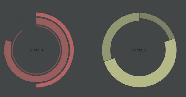
Adjustable Pie Chart
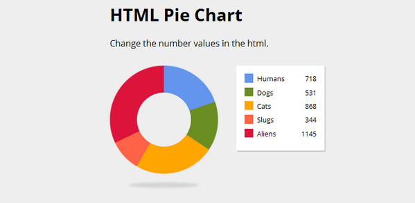
The artist offers a classic variation of the “doughnut” pie chart that is vibrantly colorized. As befits, it is bolstered by a right-sided informative panel. The component is made in a flat style and can be easily customized through HTML file, where you can set your values, and CSS file, where you can change color options.
FlotCharts
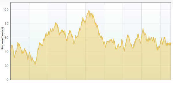
If you are up to revealing a great deal of data then utilization of FlotCharts is the best choice. This advanced, pure JavaScript library is aimed to provide you with numerous instruments for building dynamic charts that will be compatible with IE6+, Firefox2+, Safari3+, Opera9.5+ and of course, Chrome.
rCharts
Coming with support for various multiple JavaScript charting libraries it covers numerous instruments that will make the visualization of your stats a piece of cake. This plugin is created for sophisticated users that need to demonstrate various types of data neatly and cleanly. Each chart has several customization options for online viewers.
Ember Charts
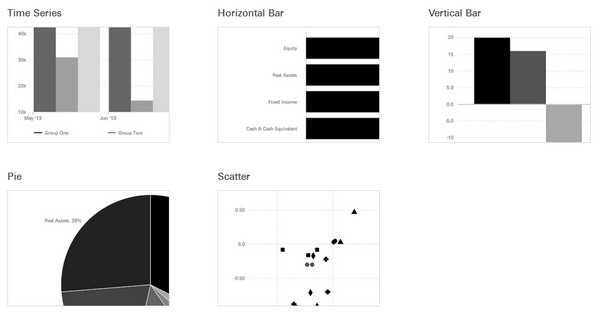
Ember Charts features a contrasty monochrome design. The range includes time series, horizontal bar charts, vertical bar charts, pie charts and scatter plot. Built with the Ember.js and d3.js frameworks, the library is ideal for collaborating with the components based on them.
Android Charts
Android Charts is a simple yet effective library that allows building clean, flat and colorful line charts, bar charts, pie charts and clock pie charts. You will get an opportunity to enrich your Android-powered projects with some beautifully-displayed statistics.
ECharts
With this smart and easy-to-use library you can easily “bring your data to life”. ECharts 2.0 comprises various carefully-crafted flat interactive charts that are intended to enrich your commercial projects with unobtrusively-displayed stats.
n3 charts
Need to create charts for Angular.js applications, there are no problems at all; just put this small yet powerful library that is built on top of D3.js (another powerful JavaScript library for manipulating data more effectively) into a work and you will get sleek and visually-appealing splashy line charts for showcasing data.
Pie Chart
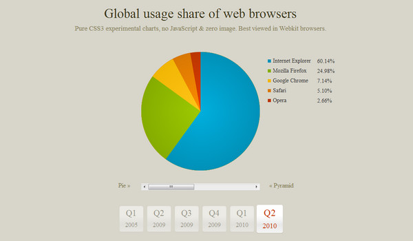
The web developer shares with the online audience 2 experimental charts: the vibrant classic pie chart and the pyramid-style graph. Both of them are supported by extra info panel, and a small control center that allows exploring various ranges of data. Unfortunately, the component works correctly only in browsers that support WebKit features.
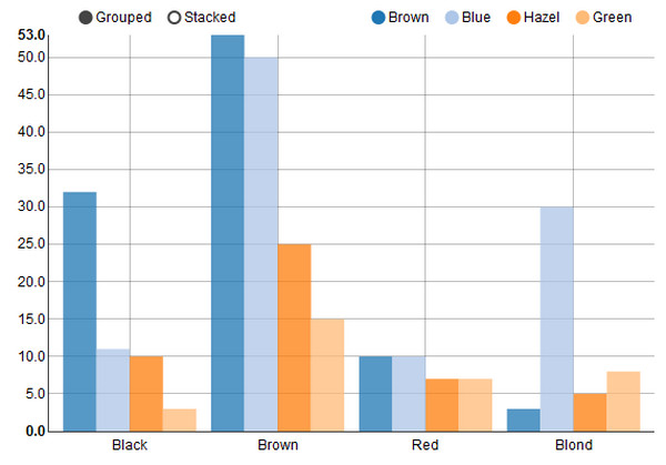
Angular Charts
Angular Charts is a minified Jquery plugin that offers such helpful features as:
- auto tooltips;
- callback events;
- fancy animations;
- one click chart change;
- auto resizing.
And on top of that, it perfectly collaborates with angular.js apps.
Experiments with chart.js by Arlekino
The artist presents 2 versions of a pie chart that are powered by chart.js and are enlivened with some fancy animations. The snippet can serve as a perfect finishing touch to any interactive infographic.
Animated 3D Bar Charts
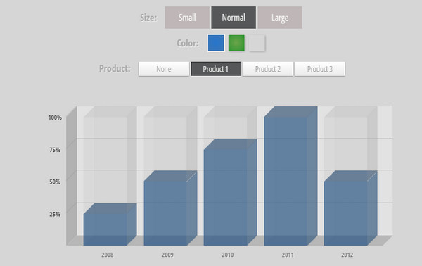
There is a whole control panel that lets users adjust data presentation by setting size, color and choosing the category. As usual, 3d solution gives the visualization a pretty engaging and interesting appearance.
Conclusion
Displaying statistics is no longer a “thankless job” that was in former times. Thanks to various interactive solutions your charts will look absolutely compelling, entertaining and even thought-provoking.


 Freebie: Diwali – Creative Kit
  Top 16 Free WooCommerce Themes
  Top 25 Free WordPress themes from 2020
  ZeroSSL Review – SSL Protection for All
  Black Friday 2019, Best Deals for Web Designers and Developers