Color theory is a respected discipline dating back to the Middle Ages and responsible for the greatest works of art mankind has ever produced — so let’s cram it all into a quick blog post!
Short of more involved learning, it’s hard to gain a complete mastery of using colors in web design. But we know you’re busy, so we distilled all the essential concepts into this quick-reference article. Of course, it’s not the full treatment, but it’ll give you a practical guide that’ll start you off right.

Source: Miguel Á. Padriñán via Pexels
Here’s everything you need to know about choosing your colors, organized into our 5 steps.
1. Choose Your Primary Color
Your first step is the most important. Your primary color will make the first impression on your audience and they’ll develop a strong association between your brand and the “emotional attitude” of your chosen color. It becomes your identity, so choose wisely.

Source: BBC News
Of course, if your brand is already strongly linked to a color, this step is easy.
First, you need to know that different colors elicit different emotions when viewed. This has been scientifically proven, and even different shades of the same color produce different emotions. There’s a degree of uncertainty, depending on the user’s personal and experiential associations, but in general the same colors can predictably cause the same responses in different people.
- Red: passion, urgency, aggression
- Orange: playfulness, energy, affordable
- Yellow: enthusiasm, happiness, attention (think “warning” signs)
- Green: growth, stability, nature
- Light Blue: serenity, inviting, open
- Dark Blue: security, trust, professionalism
- Purple: luxury, mystery, romance (lighter shades)
- White: cleanliness, virtue, health
- Black: power, sophistication, edginess
- Pink: femininity, youth, innocence
- Brown: homeliness, sturdiness, “home-grown”
- Gray: formality, neutrality, gloom
It’s no coincidence that many banks choose a blue-based color scheme.

Remember that you’re designing for a target group of users, who may desire a different emotional experience than you think. Colors can be fickle, so take a quick look at this Kissmetrics infographic for some interesting results on how the different genders perceive color.
If this all seems overwhelming, start by eliminating your competitor’s colors to narrow down the list. Once that’s out of the way, first decide the mood you’re going for, and then see if the corresponding color feels right.
2. Pinpoint the Primary Color’s Value and Saturation
Once you’ve selected the general color, you’ll need to pin down the value and saturation of that color. As mentioned above, a color’s value (how light or dark it is) and its saturation (how intense the color is) changes the meaning ever so slightly. For example, darker shades of yellow, i.e. gold, create a feeling of antiquity and tradition that lighter shades of yellow can’t accomplish.
While each color is different, a general rule is that colors with a higher value (lighter) are more energetic, fresh, and fun, while colors with a lower value (darker) side more with stability and professionalism. Lighter colors often work better for flourishes and attracting attention, as with calls-to-action, while darker shades can help create more comforting and immersive effects as a background.
On a more practical level, it’s useful to have on hand the exact number values of RGB, CMYK, HEX and Pantone for all your colors. Now is the time to determine them accurately so you have them for all stages moving forward.
If you’re stuck, try browsing Dribbble for inspiration, or any of your favorite sites for that matter. Chances are that, if you like a site, they’re doing something right with colors.
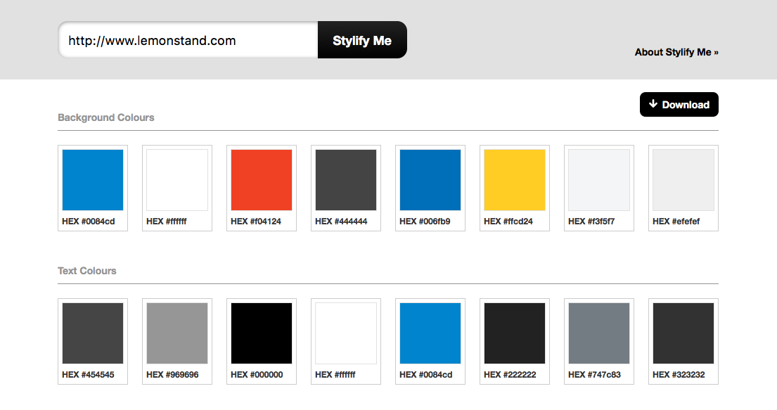
Source: Stylify Me
Once you find a color you like on someone else’s (it doesn’t have to be their primary), type the URL in Stylify Me. This reverse-engineering design tool displays the values for all the colors on whatever page you enter.
3. Choose Type of Color Scheme
Before you choose all the other colors, you need to decide how they’ll interact. Do you want a more stimulating contrast scheme, or a more relaxing gradient effect?
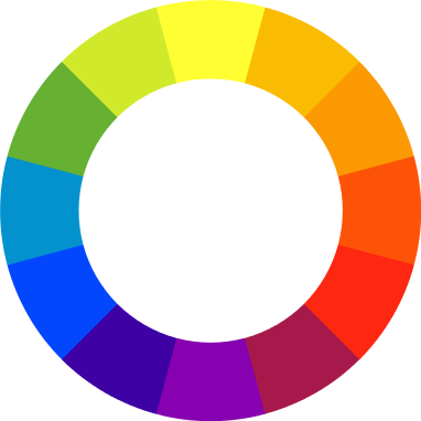
Source: Ray Trygstad. Wikimedia Commons. GNU Free Documentation License.
You can mix and match your colors any way that works best for you, but here we’ve listed the most common approaches, and why they’re popular.
Monochromatic
Different values of the primary color. Monochromatic schemes intensify the emotional properties of the original color, and work perfectly with minimalist styles. However, the lack of diversity can be limiting, and even boring unless handled with care, plus it’s harder to differentiate elements.
Analogous
Similar colors next to each other on the color wheel. Analogous schemes feature a lot of the benefits of monochromatic schemes — such as simplicity and a visual unification — but circumvent a lot of the drawbacks by adding a bit of variety.
Gradient
Gradually shifting from color to color. More of a trend, the gradience color scheme brings a bit of the visual flair from fashion to web design. This creates visually interesting eye candy, but perhaps too much, because gradience can be distracting from other elements.
Contrast
Two opposite colors. If you look at a color wheel, the colors directly across from each other are contrasts — red and green, yellow and purples, etc. Using a contrasting pair accents both, and create a dynamic visual effect that seems to give the image movement and life.
Contrasts are perfect for manipulating your user’s attention, such as placing a call-to-action in a contrasting color than the background. They can, however, be a bit too active, and are not recommended for sites encouraging relaxation or security.
Duotone
Recreating images using only two colors. Duotone isn’t so much as scheme as an effect — it can be used with contrasting colors, complementary colors, or even different shades of the same color.
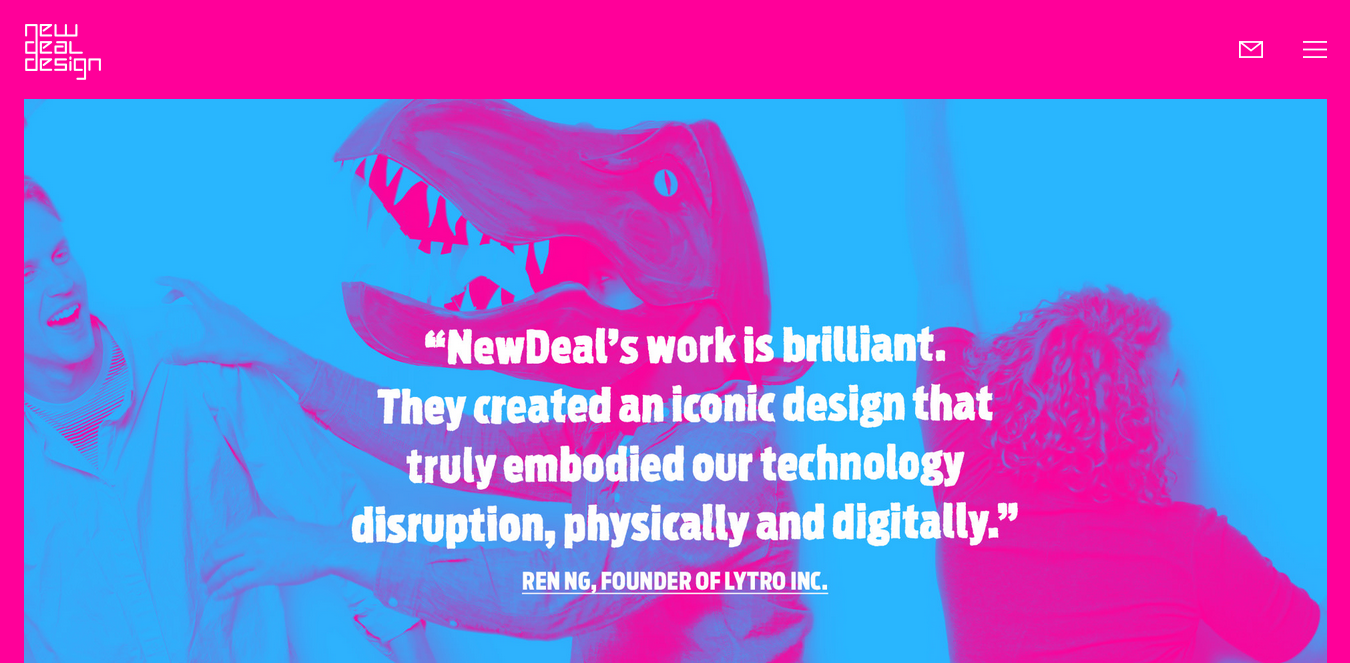
Source: New Deal Design
Simply put, duotone just looks cool — it’s a dynamic visual effect that engages users, though in time it might come to look dated.
Triadic
Three colors equal distance from each other on the color wheel. One of the safest, most stable, and most used color schemes, triadic is a reliable standard. It’s hard to do these scheme wrong — just draw an equilateral triangle on the color wheel starting with your primary color.
As you might expect, the drawback is the safety. With no risk, there’s no reward, and so this safe bet might get forgotten quickly because it’s too bland.
Split Contrast
Using a third accent color in addition to a contrasting pair. Split contrast retains the benefits of contrasting colors, such as controlling attention, but with some extra perks. Because there are more colors to look at, split contrast is a lot more grounded than single contrast. Also, the third color opens a lot of doors, especially for accents.
4. Choose Your Secondary Colors
Deciding the color scheme will do most of the work in narrowing down your secondary colors, but you still need to choose their exact shades, as you did with primary colors.
An easy shortcut is to use Paletton, a tool that creates color schemes automatically after you input a primary color. You can select the type of color scheme you want and Paletton lists out the best color choices, variations, and different shades, all with precise numeric values.
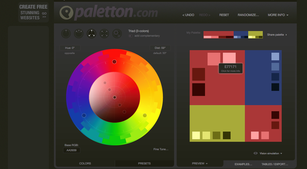
Source: Paletton
There’s a lot you can do with Paletton, such as alter shades and customize certain schemes. For a basic and free tool, it’s quick involved.
When choosing your text color, there’s more than just aesthetic concerns. There are concrete guidelines to which color combinations create the most legible text, and considering the number of users with visibility handicaps (like color blindness), it’s best not to take chances.
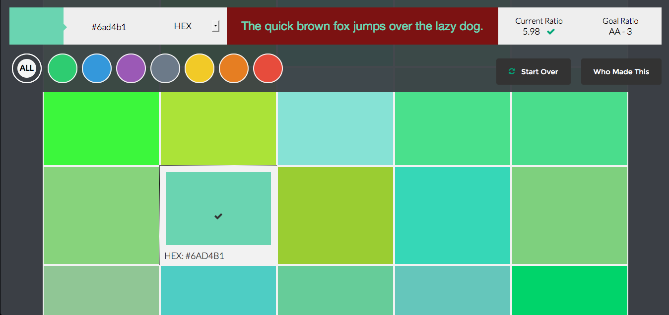
Source: Color Safe
We think Color Safe is perfect for this. Like Paletton, you input a background color and it automatically generates over a hundred options, all of which are verified WCAG compliant.
5. Make the Most out of Where You Place Each Color
You have a wonderful palette of the best colors for your project… now what should you do with them? Applying the colors to your site is where the art and skill come in, the design equivalent of handling a paintbrush and knowing what goes where.
Here’s a list of some best practices and specific tips to help you fit your individual colors together into a unified mosaic.
- Accents don’t just have to be for calls-to-action or important buttons. You can stylize your site by accenting quirky elements, such as the company logo. Another popular trend is accenting specific words within text to make them stand out. Adding your primary color to words like “love” or “free” within big blocks of text bolsters positive associations.
- Design your site completely devoid of color, using a gray scale first. Determine your visual hierarchy, even listing out the elements from most to least important. With these criteria organized plainly and the grayscale sample right in front of you, allocating the right colors to the right places is a lot easier.
- Chances are you’ll end up using white somewhere, typically as a background filler. If you find a pure white is too stark or sterile, try using a softer variant, such as ivory, pearl, or cream. Nuances like this can make the difference between success and failure.
- Experiment. Colors appeal to feelings more than logic, and for this may be harder to decide objectively. Sometimes you have to see all the colors together before you know if it works. Don’t be afraid to experiment and try new things.
Colors in Practice: GoTags, a Case Study
Finally, let’s take a look at a site that does color schemes right, GoTags. The site sells pet collar and name tag gear, not the kind of subject matter that makes you think about color. That’s what makes their subtle and carefully crafted color choices so effective.

Source: GoTags
Let’s analyze their home page, to start.
The primary color is a soft red. Red is a difficult primary color: it’s forceful in getting attention, which is good, but can easily go awry as being too aggressive. GoTags handles the dilemma smartly by diluting the red, opting for a weaker shade that still grabs attention, but doesn’t overwhelm.
The color scheme is mostly monochromatic, with varying shades of red to create a hierarchy and differentiate elements. Elements with the lighter shades of red are given more priority, for example, the “Your Bag” option in the top horizontal menu.
The white background draws focus to the primary elements, especially the hero photograph, with the puppy doing a lot of the work in enticing users to browse the site.
Notice the gray header at the top. This section uses a different color scheme to separate itself from the rest of the site. Here you have more bland options, such as a login or free shipping advertisement, that are important enough to mention, but still minor enough to be put in the background. Gray is the right choice for such elements.
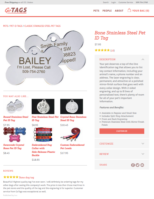
Source: GoTags
The color scheme also remains consistent on the product page. The primary red is used for all major textual elements, such as titles, section headers, product names, and even the navigation breadcrumb trail. For extra emphasis, the “Customize” call-to-action is inverted: a giant red block background, with white text.
Lesser elements, such as text descriptions and the price, are in a less noticeable gray, bringing attention back to the soft red highlights.
Takeaways
Here are the key takeaway points worth remembering:
- Choose a primary color reflective of the site or brand’s identity. See our list for each color’s corresponding emotions.
- If you’re stuck with designer’s block, try browsing Dribbble or your favorite sites. Pay attention to their use of colors, even in the less important areas.
- Choosing the right colors is only half the battle. The style of the color scheme also needs to suit your needs. Experiment with the styles we mentioned above.
- Tools like Coolors, Stylify Me, Paletton, and Color Safe can help with the technical parts.
Now go paint the town red! Or blue, or gold…you get the point.


 The Anatomy of Great Website Design that Google Loves
  Freebie: Gradient Infographics
  11 WordPress Design Trends for 2019
 How You Can Boost Conversions with Minimalist Web Design
  Photo Color Correction Tips + Free Photoshop Actions