In recent years we have had an opportunity to contemplate various types of alignment starting from habitual fixed left-sided layouts and ending up with offbeat right-sided interfaces. However, nowadays the centered alignment holds the reins. It has become really popular among developers. Majority of them clearly understands that our first focal point on the screen lies in the heart of a browser window, so such an arrangement is extremely beneficial, especially when it comes to covering important things that immediately need to catch the eye of the user and shouldn’t go unnoticed.
Though such interfaces lost their sense of pleasing symmetry, yet they are still managed to look absolutely harmonious, well-balanced and aesthetically agreeable. In addition, such approach effectively creates distinct eye tracks that don’t allow dissipating readers’ attention, keeping their eyes on selected areas and holding their focus. Besides, as a rule such websites are based on compactly-arranged layouts which capably display a bunch of data that can be quickly and easily scanned. In order to prove these points we have compiled a collection that includes fresh examples of website designs with centered elements.
Prov min hybrid
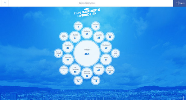
Prov min hybrid has an elegant, businesslike appeal with an unobtrusive circular vibe. The designer has compactly placed navigation through cities and owners of hybrid cars in the center.
Mooncamp
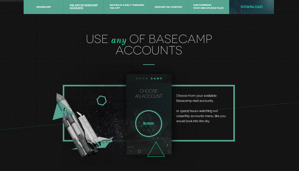
Mooncamp has a refined interactive website with lots of small animations that utilizes an eye-catching 2-tone color palette. All visual data and content are set on the center of a page in order to produce a greater visual impact.
Pons Creative
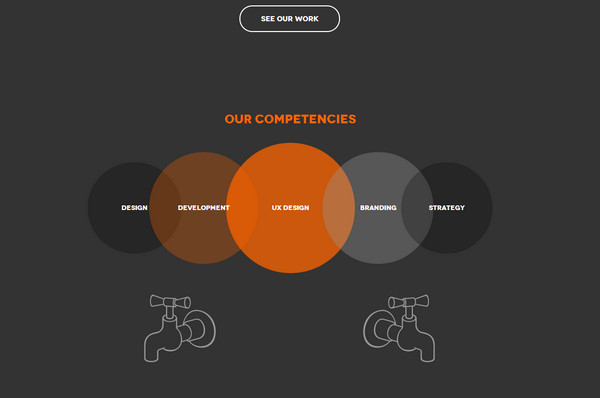
The developer has adopted a trendy approach of scroll activated animations that helps to effectively reveal subpages full of graphical data. The whole performance takes place in the heart of a page. Thus, an online portfolio of creative agency has received a modern appearance and sophisticated feel.
Annual Report
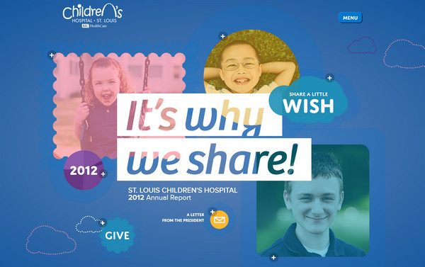
Annual Report has a pleasant non-static landing page that radiates childish appeal and joy. Although all components are tightly concentrated in the center, yet you can still freely explore various stories since the designer ably manipulates with different shapes and colors.
BTL Brands
BTL Brands has a quite small yet refined online portfolio that includes only couple of pages. The front page charms with its picturesque natural scene that is wonderfully bolstered by fantastic typography and ornamental elements, which are placed on the center.
Eugene Onegin
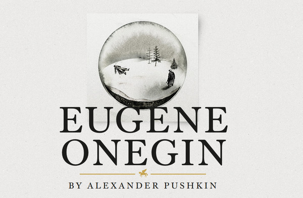
The website leans more toward minimal design and is aimed to promote the audio book by effectively focusing users’ attention on its description. The content occupies only one ultra-narrow column that is placed on the center.
Anchor Travel
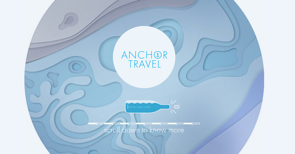
Anchor Travel is a light one-page promotional website that briefly familiarizes visitors with its activity. The circular graphics effectively complement the content and as befits takes a middle of an interface.
Marcello Pisano’s
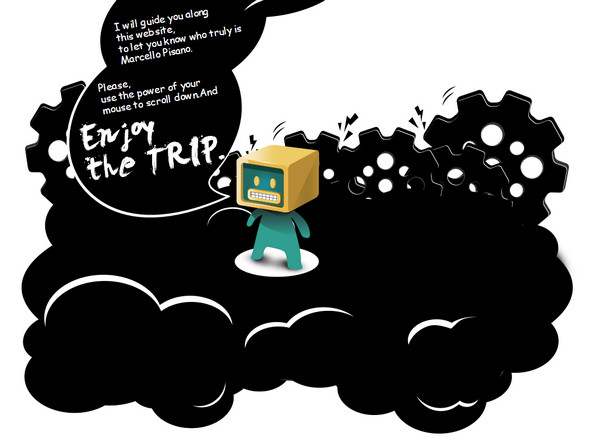
Marcello Pisano’s online portfolio is capable of catalyzing creativity. The website is driven by fancy illustrations that are compactly arranged on the center and occupies quite a small area.
Soyuz Coffee Roasting
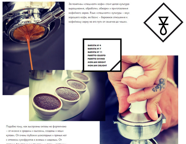
The designer does a great job of effectively presenting an information overloaded layout. The designer mainly leverages rectangular shapes, boxes and plain graphics that give the interface a nice geometric vibe. The floating content and images are neatly intertwined together in order to don’t allow users to miss important things.
Eone
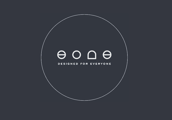
Eone has a quite open and spacious website design. The creative team displays quite a bit of information, which is divided into several sections, so it’s rather predictable that the content has occupied the most viewed place in the interface – the central part.
Joy Division
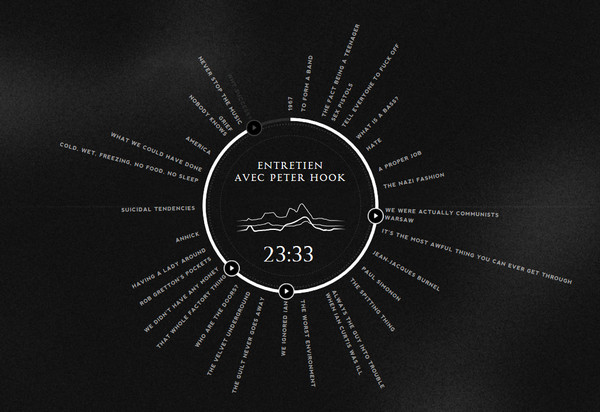
Joy Division is another flawless interactive website in our collection that charms with its magnificent use of classic color combination. The developer has creatively showed off the author’s track list by creating an elegant and truly original circular audio player that is placed in the middle of the screen.
Coffee Cava
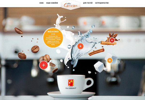
The website is aimed to involve users’ attention to the central point of its layout. The developer skillfully utilizes a scrolling technique, and of course, a proper arrangement of graphics and content.
GCM
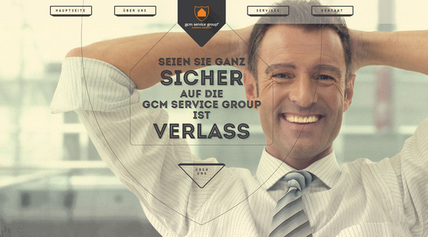
GCM exudes an image of professionalism and refinement. The content, visual data and animations are skillfully pulled to the center – the main focal point.
Guts and Glory
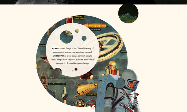
Much like the previous example, this amazing illustration-driven website with a lovely circular vibe and a gorgeous retro appeal mainly employs only a narrow central part of a layout that is packed with the content.
Koko Digital
The designer has taken a creative approach of visual storytelling. There are numerous animated illustrations and graphics. The “spectacle” takes up the heart of the layout and easily grabs attention.
Vertty
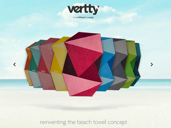
Vertty is a vibrant and truly cheerful website that effectively leverages a kaleidoscope of bright colors and natural textures. All the promoted stuff is placed on the center in order to do not confuse regular users.
Exsus
The website creates a distinct eye track from the top to the bottom that naturally contributes to storytelling. The whole performance takes place in the middle of a screen and produces a strong visual impact.
Uppercup
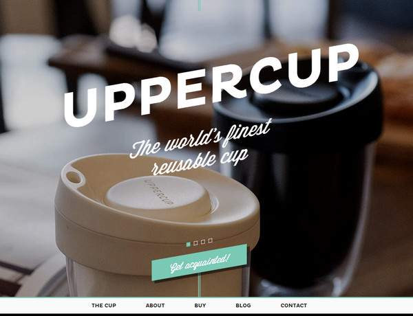
Uppercup considers people’s focal points and effectively employs the central part of the interface as a main area for placing content.
Seattle Urban Honey
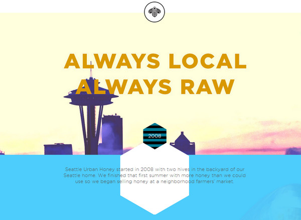
The designer makes use of numerous flat graphics and plain illustrations that visually support a story. As always, the designer has decided to give the content a more dominant position by placing it on the center.
Rezon
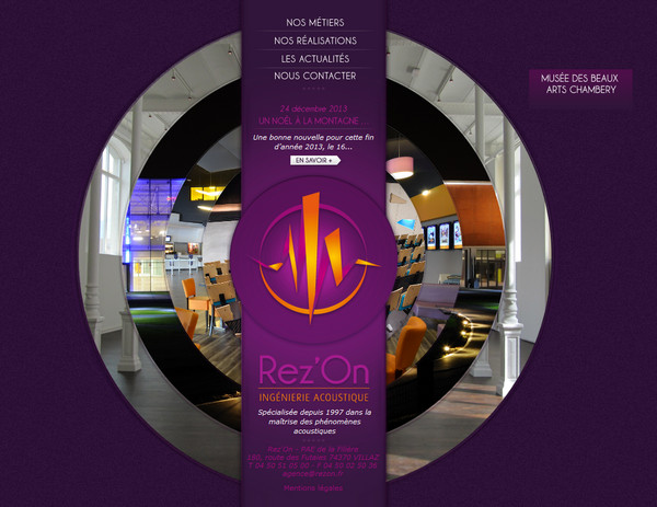
The website has a sense of compositional harmony that is mainly achieved with a help of a densely-packed image-based circular navigation. The whole composition occupies the central part of the design and easily engages the users.
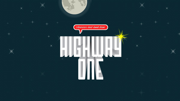
The Flutenizer
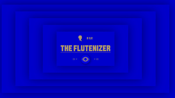
The Flutenizer employs an approach of sprawling graphics from a central point and creating some kind of visual paths that easily pushes the eye towards the content in the center.
Conclusion
The central part is one of the most viewed one; it is a focal point for every user. We are accustomed to starting our journey through the website from this point, so it’s not surprising that developers turn this knowledge to advantage and try to fully occupy this area.
What kind of arrangement do you prefer more? Do websites with centered elements look harmonious? Share your opinion.


 [Review + Giveaway] Elementor – Drag-and-Drop Page Builder for WordPress – 100% Free, but Is It Also 100% Awesome?
  [Download] Free Ribbon Pack – 100% Vectors
  [Download] Free Infographic Elements – 100% Vectors
  Key Elements to Design a Compelling Website