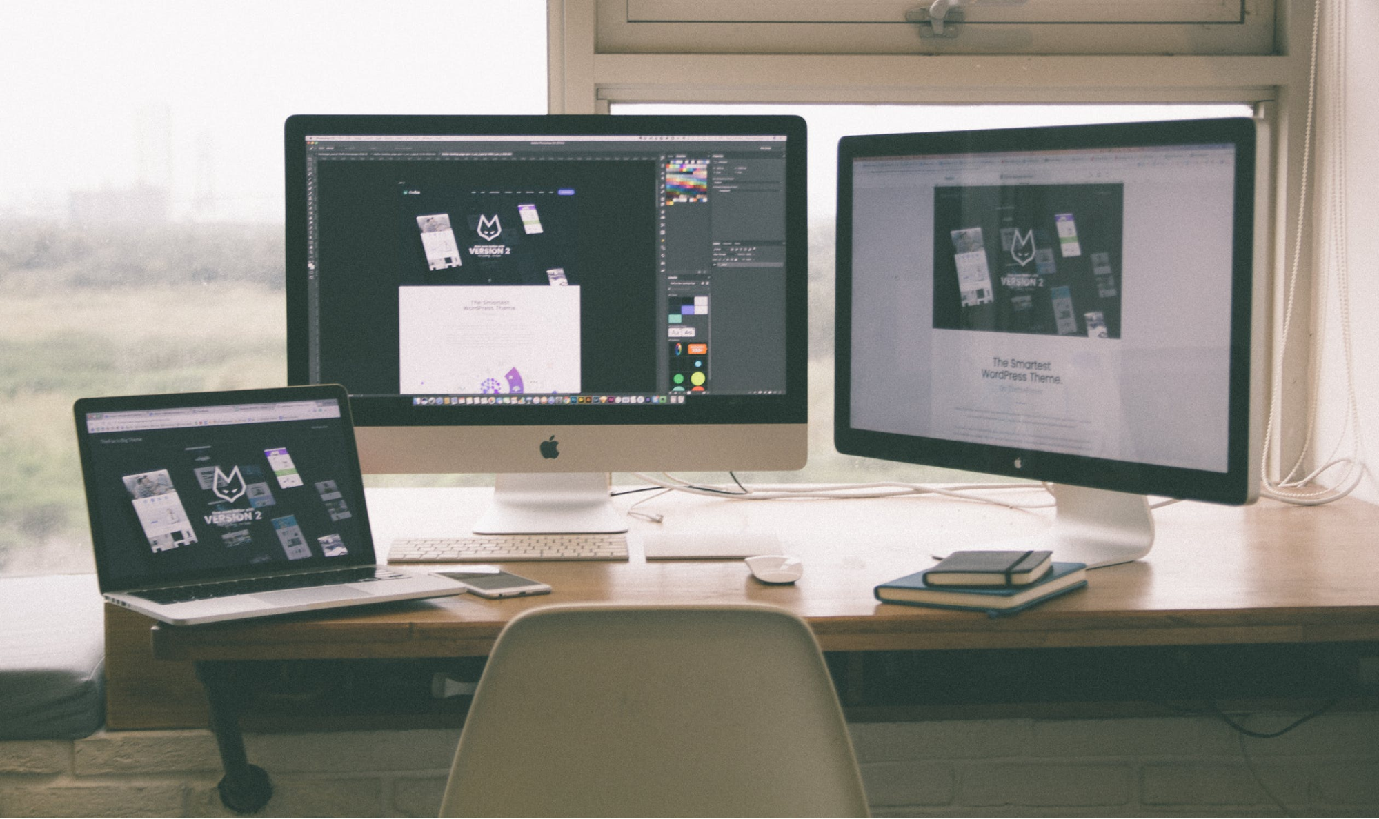
Minimalism continues to rule the web – and rightfully so. Also referred to as “the art of less”, minimalism is far from a modern-day trend. It’s a philosophy that values simplicity above all, and you’d be surprised to realize how much mastery it actually takes to achieve just the right kind of simplicity in any creative field.
In web design, minimalism refers to the practice of simplifying the user interface by eliminating the superfluous elements which burden the user experience. That being said, it comes as no surprise that we’re seeing all these business websites and e-commerce stores designed in a clean, minimalist fashion. Minimalism helps lay the groundwork to a seamless customer experience, and here’s how you can apply it to your website to boost conversions.
Put your brand’s value front and center
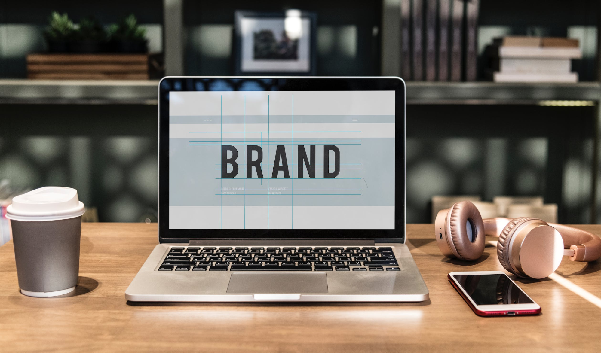
When a visitor lands on your site, you have only a few seconds to capture their attention. The fewer distractions there are, the better off you are. Every page of your site, your home page especially, needs to be captivating and inviting. By removing all that’s excess and using all that empty space to provide the necessary contrast, you’ll bring the focus straight to what’s important – your brand message.
Essentially, that’s how you create an emotional connection between your brand and the potential customer. Leave out all the unnecessary noise – the CTA’s that are irrelevant to the page, pop-ups, glaring images, verbose explanations of what your website is about. Have a clear value proposition and use a powerful, short slogan that pulls the visitor in. Stick to the “Less is more” philosophy and use a clean, crisp layout as the canvas to a powerful brand image.
Make it easy for visitors to find what they are looking for
Minimalism is not only about clean-cut visuals and crispy aesthetics – far from it. It’s all about improving usability, and in order to do that, you’ll have to remove a lot of unnecessary visual clutter. In other words, minimalism emphasizes that usability is the priority in website design, and the visuals need to work in its favor.
According to Hubspot’s survey, 76% of consumers claim that the most important factor in how a website is designed is how easy it makes it for them to find what they want. Use the principles of minimalism to make it easy for your visitors to find what they are looking for from the moment they land on your site. This is the crucial part, and it’s best left to professionals, so use online directories to find reliable web design agencies who can optimize your website’s usability. A website with optimal usability has a clear visual hierarchy and a simple, intuitive navigation system with clearly organized categories.
Choose your images carefully
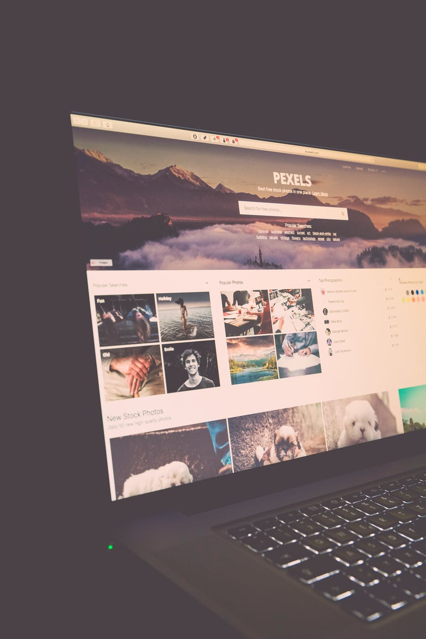
Research has shown that using fewer but larger images is one of the best web design tactics for boosting conversions. Once again, less is more.
Use large, high-quality images to build your brand image and enunciate the emotions you want visitors to associate with it. This means that first and foremost, you’ll need to go on a journey of self-discovery and establish a very clear definition of your brand personality. Once you have that, you’ll be able to pick the images that don’t only complement the content perfectly, but truly speak a thousand words and together form a cohesive whole. After all, that’s what minimalism is about – searching for the essence and removing all the obstacles that hinder it.
Imprint your message with bold typography
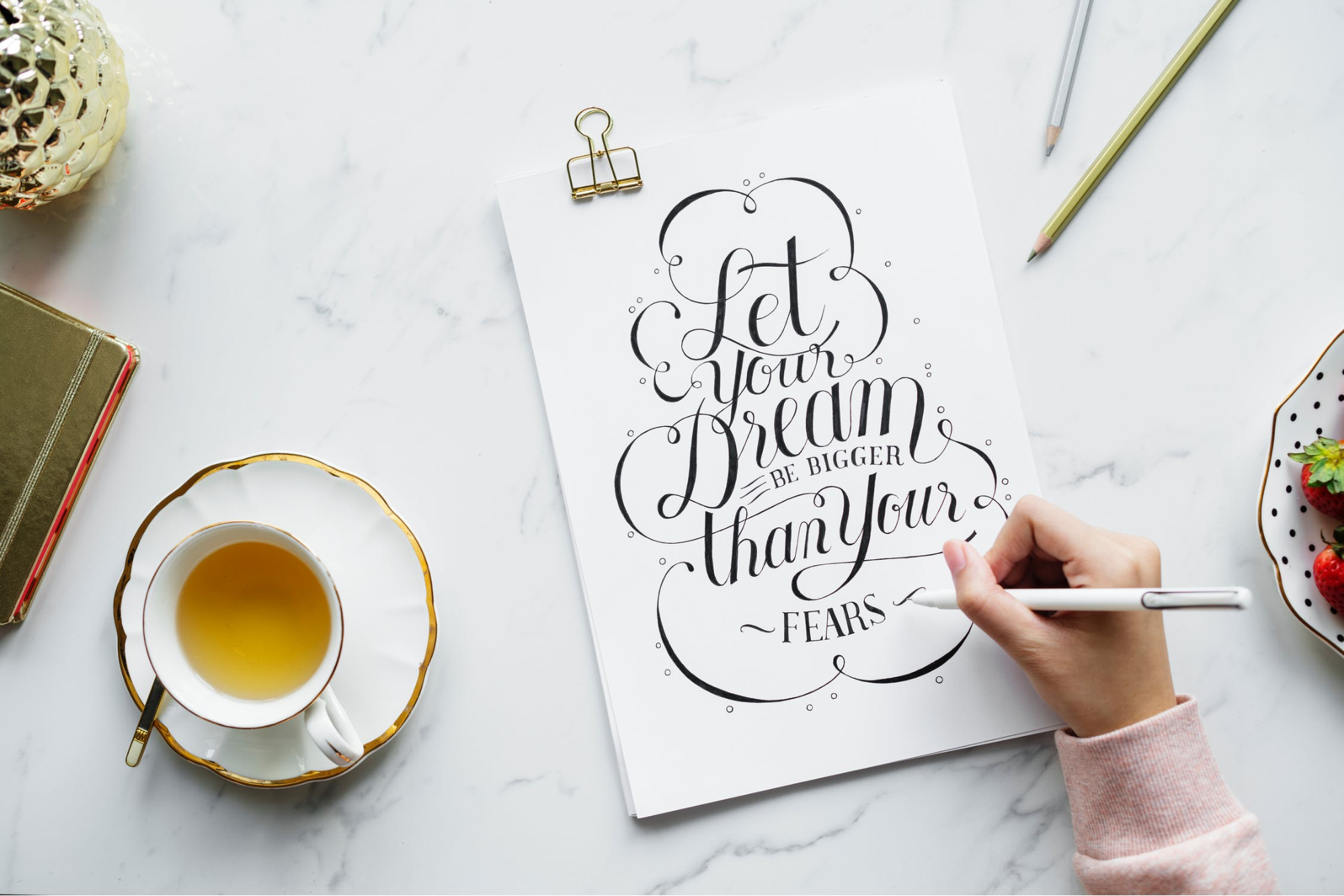
One of the most important things that minimalism teaches us about web design is that the most basic elements are powerful visual tools. Pay attention to all the details – that’s where the devil lies. The shape of buttons, the overall color scheme, and the fonts you feature should all be regarded as key visual tools that will help you create a resounding and persuasive brand message.
It’s especially interesting to see how minimalist designers treat typography both as a key visual element and fertile ground for creative exploration. That’s why we’re seeing all these websites with funky, impressive fonts that are as visually captivating as the images that they complement. In 2018, big and bold fonts were all the rage on minimalist websites, and even serif fonts, which typically weren’t used on minimalist websites, made a comeback.
We have yet to see what novelty this year will bring, but all in all, don’t hesitate to experiment with these trends on your website. Whatever you do, don’t go overboard with the fonts – go for two styles that are consistent with your brand style and complement each other well.
The takeaway: aesthetics and practicality
At the end of the day, you may or may not like the way most minimalist websites look. Aesthetic preferences aside, there’s a reason that minimalism has become much more than a trend in web design, and that reason lies in speed and accessibility. Because they are uncluttered and simplified, minimalist websites are not only significantly easier to navigate, but also easier to maintain. Moreover, they are highly flexible for responsive design and crucial to improving website performance because simplified layouts ensure fast loading speed. And when the design is done right, as we’ve discussed in this article, minimalism helps evoke emotions and create a persuasive brand image. Altogether, these are the factors that are the most important for website conversions.



 All Websites Should Feature Videos and Here’s Why
  The Anatomy of Great Website Design that Google Loves
  11 WordPress Design Trends for 2019
 [Review + Discount] ThemeLooks – A Theme Store for WordPress and WHMCS
  7 Graphic Design Tools for Non-Designers