Content sliders can come in very handy on all kinds of webpages with blogs, news websites, personal pages, and corporate layouts being on the list among others – you can find place for a content slider in all of them.
With jQuery emerging as the most popular content slider programming language, today we showcase some of the best examples of free jQuery content sliders we could find around the web.
Free Collection of jQuery Content Sliders for Websites
This first example is a great start, because it kind of comes with everything a content slider needs to come with. You can create several content slides and they will automatically play when you will load the page. When clicking on a specific slide, the auto play function will stop, allowing visitors to read the content without interruptions.
Our second example works as best as the first one, only I personally believe the design is much better. The slider uses the auto play function to show featured content – it saves space, keeping lots of content in the same place, and it makes it easier to use. And there’s some eye candy there as well on top of all the rest.

This one is much simpler than the rest and it actually also looks like a very easy-to-use design. It is not complicated at all, it doesn’t fill the screen with unnecessary elements and does its job perfectly. To the right of the featured picture you can write text, which will appear on each slide just as the images do. This slider comes with two different slide in-slide out effects.

LiquidSlider is another great content slider based on tabs. What I like about this one is the fact that it is responsive, so it will work perfectly on all your devices – and trust me, there are not many content sliders out there with support for all screen sizes, especially because jQuery is quite difficult to handle for mobile phones. But this one seems very easy to install and use, so give it a try.
DualSlider is another content slider you might want to give a try if you are currently searching for such a tool. Although this one is not responsive (told you it’s difficult to find them), it allows you to add both text and images on each of the slides, which will offer you more choices.
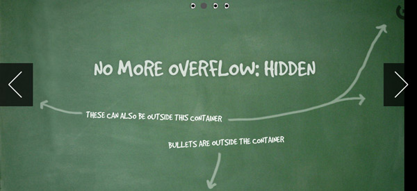
Most designers will be able to add text on image sliders anyway, thanks to the overflow: hidden property in CSS, but Orbit will help you get rid of that. You will both be able to add images and text and you will also be able to add both at the same time. Although some elements are responsive, I don’t recommend trusting too much into this; it seems it works quite poorly.
However, if you want to use Orbit only for desktop purposes, then it will definitely be a great choice.
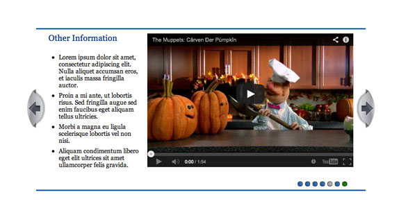
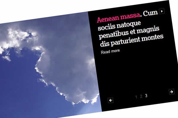
Slidorion is definitely one of my favorite sliders because it allows both image and text, but not flowing over each other like the others do. This one has a CSS3 accordion slider for content, connected with an image slider on the left side. There is no auto play function on this one, but I don’t even think it needs one – its purpose is a total other one. Give it a try!
As the name says, AnythingSlider allows users to add anything on the tabs of this tool. This works great with images and text, but you can even add video on it in case that’s what you need. Another good part is that the text will not flow over the image or video, as it has its own placeholder.
The next example, Multi-Item Slider, is something that you won’t find so easily on the internet – especially for free, so make use of it now if you find it useful. In case you have an e-shop, this is the content slider you need to have, as it is made precisely for this purpose.
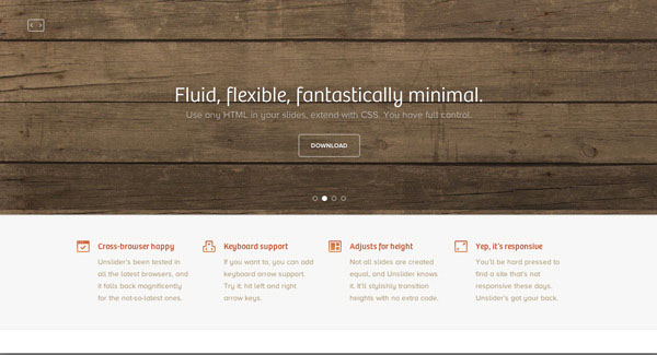
Unslider is probably the lightest content slider out of all the ones presented above. It is very simple, doesn’t have any fancy effects, but it works fantastic with both images and text flowing over. It has two small navigation arrows on top and small round thumbnails for each slide at the bottom. I would personally use this one quite often, especially because it looks like a content slider that would fit very well with WordPress as well.
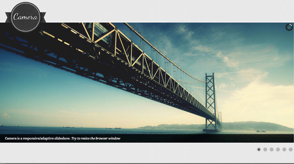
Although it is called Camera, this content slider is not only for images, but for text as well. It is true that images are in focus with this plugin, but there is a lot of space for text at the bottom (which can actually be moved other places as well if you wish to). And it is responsive as well, so what are you waiting for?
Our next example is also a high-quality tool that you can use as eye candy or simply as something you need in order to make some space for something else. This content slider allows overflowing text and images, so it’s pretty standard. It comes with cool 3D effects, so you can make your users love your website; why not download it and give it a try?
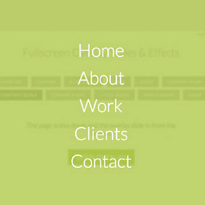
We can’t stop at 13, so we continue with another amazing example. This one is something that you won’t see much of on the web either. It is a free fullscreen jQuery content slider with a lot of focus on visual, while not ignoring text. It comes with thumbnail preview, keyboard navigation and it is somehow responsive, so it might work on tablets; no mobile devices though. The reason behind it is probably the fact that it is quite a heavy JavaScript behind it, so smartphone browsers might not be able to handle it without crashing.
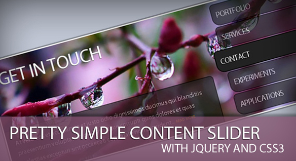
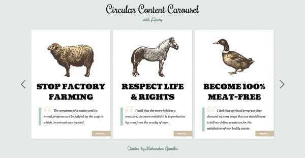
Our last example is a circular content slider coming as the only example of its kind in this showcase. This one is quite unique and allows users to slide content boxes infinitely. There is also a more link in every box, clicking on it will take the user to the page of the product (or whatever you decide to showcase through this slider).
With this last example we end today’s showcase hoping that you enjoyed these tools and that you will at least try some of them, if not maybe make them a definite part of your web product. Until next time, we would love to hear how did you find these free sliders and if you are planning to use some of them?










 Overshadow Everything – Collection of Free Overlay Effects
  Codepad Review – Share Code Snippets and Get/Give Feedback
  Unheap – Free Repository of jQuery Plugins
  Visualization of the Progression List of Free Vibrant Progress Bars
  Free Animated Buttons Metamorphoses Powered by HTML,CSS and jQuery