Believe it or not but in order to improve your sign up conversions you need to forgo improving the actual sign up form. We can talk all day about how to improve your forms from text alignment, to proper usability; it’s what we typically talk about when we talk conversion improvements. I’ve gathered five tips for you to think over to help improve your conversion that don’t mention the most effective CTA colour but instead help you improve the actual funnel flow.
Most of these tips deal with getting people into your sign up funnel. Online forms aren’t hard; they may not be fun but they are not difficult. Therefore, your biggest challenge is getting users motivated enough to actually start filing out your form. The reason I’m bringing this up is simple – it’s often over looked. One way to increase conversions is to increase the overall size of your funnel flow. So let me share with you some tips to help get you started.
Copywriting, for the win
The copy on your website is powerful. Use it to your advantage. I want you to test the poop out of your pages, including, but not being limited to, headings and button copy. Make sure your results are significant of course, and don’t try to test too many things at once. But, testing copy can go a long way. Copy is what gets people to click the sign up button in the first place. What you say to your users matter.
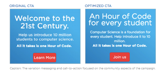
Code.org is a wonderful example of how AB testing with Optimizley helped their campaign to reach more students and teachers. You can read the full report if you’d like but let me summarize it for you too. Code.org wanted to increase sign up for their Hour of Code campaign. They tested copy of different CTAs and heading messages. Above you can see a sample of the original copy and their winner which helped them increase conversions 29%; the 29% translated to 8 million more sign ups.
Always mention the benefit
People don’t actually come to a product or service website and think that it is a godsend to their lives. Nope, sorry. Instead they often wander what is the point, and why they should even bother. It is your job to tell them. When a user comes to your landing page you should always provide more and more information – in increasing depth that is – to help convince the more skeptical users.
You can think of it as a hierarchy of product description your landing page should have. First, you have the very basic introductory level where every visitor should get a whim of what the product is about. This would be thanks to your headline/tagline, logo, and any picture you may include of the product. The message those elements should send it “Hey, I’m [this awesome product]. I do [this awesome thing]” – more or less. Second, you have a level of information that’s equivalent to learning more about the product or service. Product tours, free trials, videos/images, and other spelled out benefits are here to further convince a skeptical user. They work great if a user is not yet convinced. The last level can be said to be an in depth showcase of benefits and features. Hey, some people are seriously skeptical. Use feature and benefit descriptions, case studies, product tutorials or premium feature trials to help move these users along.
Of course, all of this doesn’t have to be fully spelled out on every single landing page. But if you provide links to the supporting information it at least lets users know that the information is there for them.
Use social media to your advantage
The most powerful factor you can present your potential users is testimonies. This can be achieved in a verity of ways like the typical and classic testimonies where you provide quotes. You can embed tweets praising your product or share quotes from publications like Mashable or CNN. This is to help further convince people to sign up. It also shows off they are kind of missing out too – this can be a powerful psychological move as people don’t like to be out of the loop.
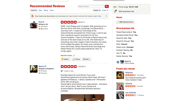
Yelp wouldn’t be what it is today if people didn’t comments on their experiences at establishments. The fact it was someone who had their own genuine experience, good or bad, can profoundly influence a potential customers. (Of courts, a good review will have a better effect than a negative one.) Airbnb falls under the same boat. We like to know what other people think.
Make the sing up process painless
To be fair I do have to mention that you should always make the sign up process as easy as possible. Even if forms are not rocket science to fill out, they are still annoying to do. There are a variety of posts out there about how to improve usability of forms like optimizing the usability of online forms. There is bigger advice I can give you, make the overall sign up experience delightful; this will ensure higher completion rates for sure.
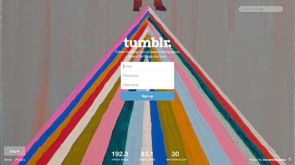
Take a look at the sign up process of Tumblr. They start you off with only three input fields to enter your email, user name and password. You don’t have to duplicate your email or password. They also ensure you that you can change the username later, making sure you don’t waste time on that field and potentially leave. If there is an error, it animates – floats – into the form. The sign up experience is light, nice and delightful all over.
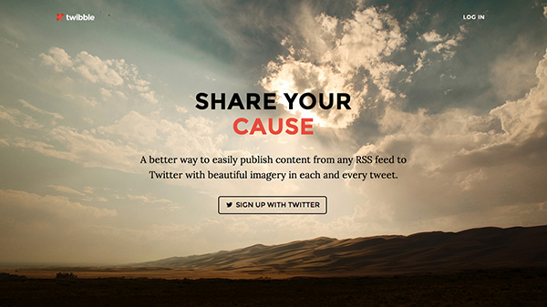
Or, if you can, take it a step further and forgo the whole sign up process all together. If you use a social media log in it won’t put as much strain for your users to fill out a form. Instead, all they have to do is click a button to give your app some permission. That’s exactly what Twibble does. It’s a Twitter sharing tool that lets you feed content from RSS feed sand into your Twitter stream. They allow you to log in with your Twitter account. It’s brilliant on so many levels; there is no need for a separate sign up and it provides them with your Twitter account which they would need from you anyway.
Allow immediate product use
It is absolutely the worst thing you can do to block your newly signed up users from using your product. Let them play with it, fiddle and wonder around without having to verify their email first. If you eliminate the steps from the sign up process itself you need to eliminate them after too. It can be a death trap for you; what’s the point of having a successful sign up and not have the user actually well, use your product? Engagement conversions will improve as well and so will user satisfaction.
Don’t bother with asking them to complete their profile – unless having a profile picture is somehow crucial to using your product. Don’t bother asking them to invite friends – how can I invite someone to use your product if I haven’t yet? Those things can be figured out but first make sure the new user is actually a user and enjoys your product. If they want to continue to use it, they will fill out their profile and they will share it with others.
Conclusion
Improving the sign up flow is more about improving the overall experience of onboarding than it is just improving the sign up form itself. Think about the big picture: are users motivated at actually sign up?


 Advantage of a Web Design Process
Kate Oct 8, 2014, 10:17 am
I think that’s “Make the sign up process painless” rather than “Make the sing up process painless.”
I absolutely loathe being pestered to invite people to a service I’ve yet to try. I was recently sent an email [again] to review a product I hadn’t even received by mail. I obviously didn’t review the product but I did send them a email telling them they were shooting themselves in the foot.