More than a year has passed from the moment when we were brainstorming utilization of flat illustrations in website design, citing impressive examples of that time. As it turned out, nothing has changed dramatically and is unlikely to change in the near future: flat illustrations still rule the roost, stealing the show.
To be honest, some metamorphoses have occurred. Flat illustrations have matured, having become more sophisticated, refined and dynamic. Teamed up with subtle motion or gorgeous coloring, they have carved out a niche for themselves, becoming an integral medium for building outstanding storytelling experiences. Of course, not only does this type of web projects benefit from the solution, but also personal portfolios, interactive infographics, browser games, event- and holiday-related websites, all of them shamelessly take the full advantage of it.
What’s more, the solution is adopted in fresh and exciting ways that enliven single pages, individual sections, and widgets. Although today we focus on website designs powered by flat illustrations that undoubtedly sparkle the interest; however, out there there are dozens of excellent examples of minor use of flat graphics that undoubtedly indicate the popularity of the approach.
You can also take a look at our last year collection presented in Websites Featuring Flat Illustrations – Best Examples to compare and contrast.
Christmas Heroes
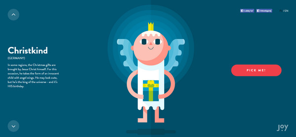
Although the magical Christmas time has passed, yet sometimes it is delightful to find yourself in this beloved, carefree time even when the spring is already looming on the horizon.
Christmas Heroes is a matchless website created specially for matching celebratory mood. The whole design is constructed by means of superb flat illustrations that keep up spirits and encourage users to explore the project.
Classic Cars on the Big Screens
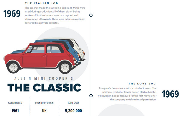
Informative websites, thanks to well-thought-out carefully executed visual storytelling experience, take an entirely different look and feeling that kindles thirst for knowledge and greatly intrigues online visitors.
Classic cars on the big screens showcases this in practice. Vibrant flat illustrations show attitude and subtly reflect spirit of each car, whereas accompanying statistics dished up in small digestible portions contribute to the overall impression.
Diagnosite
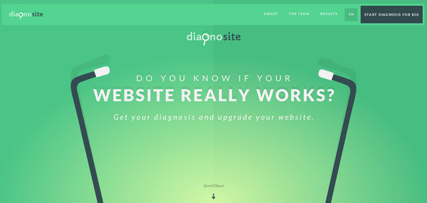
Here flat style brings energy to the website, charges it up with positive emotions and separates from others. The team of Diagnosite vividly demonstrates how to convert a website that offers boring services into an enjoyable and appealing project that effortlessly encourages users to scroll down and become a client.
Kevin Tresor
Kevin Tresor has a first-rate personal portfolio, where flat illustrations play first fiddle. They depict a bold and strong personality of the artist in non-intrusive manner, and at the same time, clearly display its enormous creative potential.
CanalTP
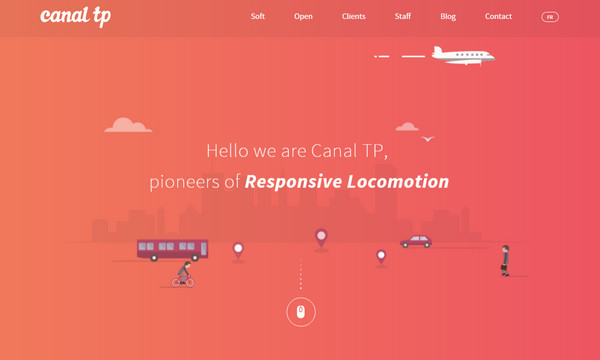
CanalTP creates a visual path for online visitors in order to naturally lead them from the starting point to the end. Here, flat illustrations shape the whole design, form the aesthetics and add a visual dynamic. The white plane that follows users along their journey is a lovely touch.
Polish Christmas Guide

This is another Christmas-inspired project on our list that owes its engrossing and splendid appearance to flawlessly crafted flat illustrations that breathe with winter motifs and joyful pastime. It familiarizes regular users with traditions of Polish Christmas through an interactive guide that holds the attention until the very end.
Liquid Interactive

Liquid Interactive is an interactive infographic that raises questions about widespread of the mobile industry and its role in our lives. Here interpretive soft yet vivid illustrations mark each section and naturally liven up the content by that making the statistics look more exciting.
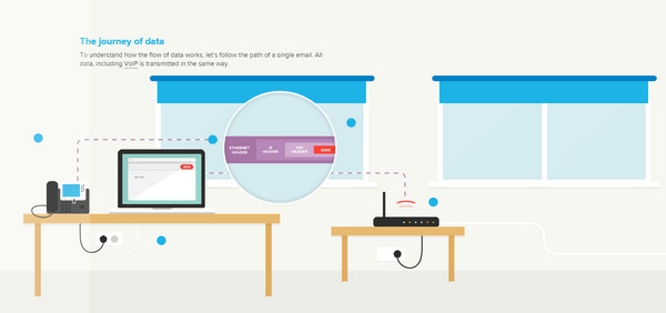
Movement of Data
The team has skillfully described the journey of data through bright and visually stimulating flat illustrations. They help to reference the key point across the website and make the whole process look straightforward and natural, so as to say, explaining difficult things in simple terms, in this case in simple and intelligible pictures.
Dropbox Guide

Dropbox Guide comprises 2 guides that comply with demands of users and admins. Each section needs to clarify lots of issues and provide readers with a bulk of information, so here, brilliant flat illustrations that assist explanations allow tackling this task without a hitch.
Game Changers
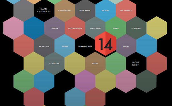
Game Changers capably tells a story, drawing the online audience in. The flat illustrations reflect the idea in a way, which is easily perceived by the regular online visitors. What’s more, they add a charm and set the personality of the project.
Air Social
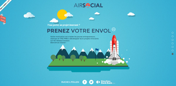
Explore agency’s possibilities together with a character that guides you from the first section to the final point. Vibrant flat environment teamed up with fancy animations inspires users to interact with the project and at the same time represents data in an appealing way.
Wander World

Here flat illustrations effectively communicate the concept without overpowering users with visuals. Thanks to lovely, consistent transitions and a perfectly executed storytelling experience, users can comfortably read and navigate the website as well as enjoy the scenes.
Live to Change
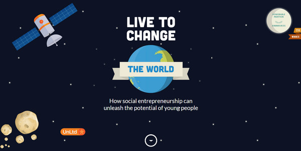
Driven by subtle motion, this fascinating, fully illustrated website stimulates online readers to delve deep, to say nothing about its key role in creating a fantastic user experience. Here an online visitor is not bombarded by lush decorations or excessive graphics, the designer strikes an optimal balance, crafting an eye-pleasing theme.
Unisend
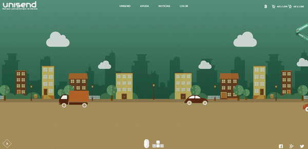
Unisend is another informative website, whose spectacular appearance is achieved through able utilization of flat illustrations. As befits such projects, it is also charged with subtle motion and has a strong personality.
The Journey

The Journey is an interactive tour through artist’s portfolio section. The designer opts in favor of visual storytelling that is skillfully executed with the help of intricate flat illustrations where a funny bee is a character that shows the way.
Interior Design
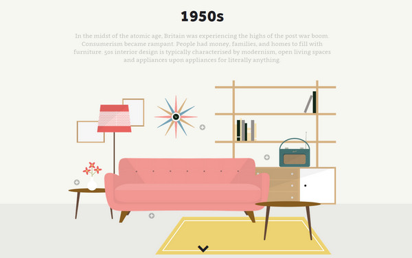
Delve into history of interior designs together with Harvey water softeners. The team has created an amusing and entertaining parallax-powered website that exhibits typical interiors of various decades. The scrolling mechanism excellently collaborates with flat illustrations allowing communicating the idea properly.
Pixity Land
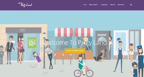
The website greets online audience with a detailed cartoonish image that plays a role of a scrollable background. The consistent flat style paired with smooth, beautiful color palette adds to the project a friendly atmosphere.
Fresh Mail
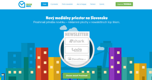
Unlike the previous example, here the team relies on a powerful impact produced by vibrant coloring that certainly brightens the whole appearance and makes the website sparkle with freshness and individuality. The landing page instantly entices you in.
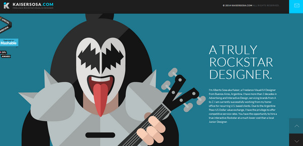
Kaiser Sosa
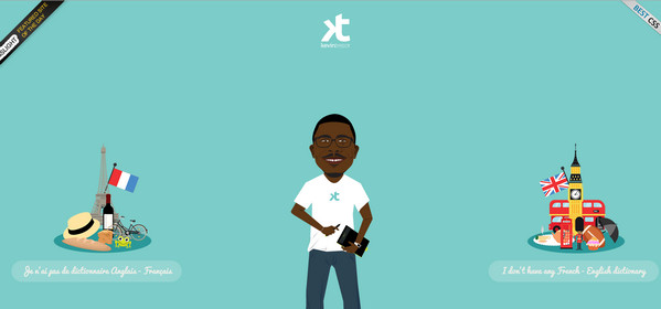
Kaiser Sosa has taken his personal portfolio above and beyond with mind-blowing, nifty flat illustrations. They easily maintain the user’s focus at each section and speak louder than words.
Conclusion
Flat illustrations, when used wisely and appropriately, create friendly and powerful aesthetics that does not overpower users. Like any cartoon with fancy characters and vibrant environment from our childhood, they seize our attention and prompt us to move forward in order to find out what awaits us on the next page/section.



 All Websites Should Feature Videos and Here’s Why
  Designing a Small Business Website: 5 Services to Use
  The Anatomy of Great Website Design that Google Loves
  Freebie: Gradient Infographics
  11 WordPress Design Trends for 2019