Whether your website has huge complex information architecture, or it just includes 5 simple pages, you certainly won’t do without a navigation menu. Being created for effectively guiding users across your project and helping them to avoid confusing issues while they are surfing through, it always deserves a special attention.
Menu should be functional, straightforward and of course, visually-appealing, and today we are going to offer you some fine alternatives for improving the latter aspect.
Menu Exploration – Dashboard by Vadzim
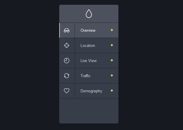
This sleek dark navigation menu was created with a dashboard’s functionality in mind. Initially, it is presented as a small button that morphs into a relatively wide panel, though occupying not so much space thanks to its well-organized stripe style layout; this a great alternative for compact and minimal designs.
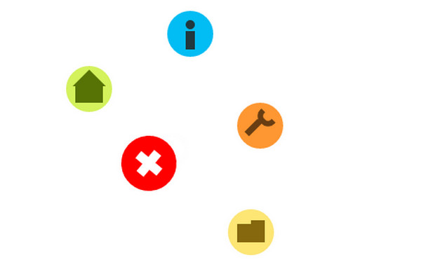
CSS3 3D Transitions Menu by NeatNait
![]()
The author has developed several 3d style animations that accompany hover and clicked events. Each link flips and reveals the alternative title. Since the design is made according to flat principles, the menu can ideally blend into both non- skeuomorphic and realistic interfaces.
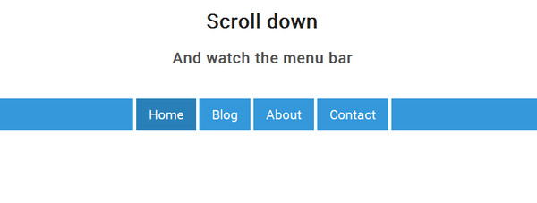
CSS Menu From Side by Zach Saucier

The developer has reproduced a quite popular solution that implies a simple slide out navigation. As befits, it transforms from a regular “hamburger” icon into a wide-screen solid color panel populated with links and a primitive “close” button.
CSS3 Morph Menu by Mohsen-Khakbiz
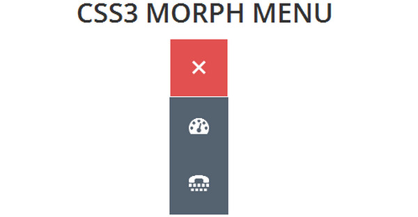
Here you can grab a clean LESS-powered script that offers a dynamic “hamburger” button with a hidden functionality. The component includes several animations: the first one is assigned for hover effect that turns an icon into a text (to be more precise, into the word “menu”), and the second one transforms the text into a narrow yet visually distinguishable icon-based navigation aid.
Css-only Lavalamp-like Fancy Menu Effect
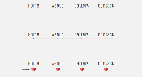
Being inspired by Lavalamp’s menu, the author offers several animated alternatives that are suitable for those who want just slightly brighten their navigation and do not overwhelm users with heavy interactivity. The script describes 3 animations that are able to delicately highlight the selected option either with a help of a line, a dot or an arrow.
Responsive Menu by Arjun Amgain
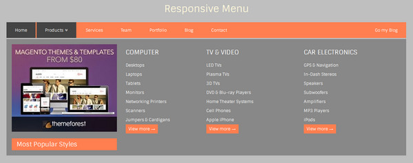
Every content-intensive project implies a reliable solution for neatly and effectively demonstrating the data structure to online audience, so it is pretty obvious that without an all-embracing yet compact drop-down menu you simply can’t survive. This menu was created exactly for such purposes. Not only will it skillfully cover and neatly display all categories, extra links and even images or ad blocks but also correctly and quickly react on changes in screen sizes.
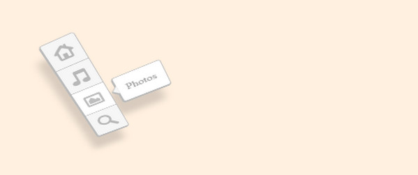
Fly Menu by Victor knust
Fly Menu by Victor knust has a circular vibe that goes perfectly well with numerous projects. Though the design of the component slightly disappoints due to its negligent execution, oversized icons in tandem with primitive color matching ruins the whole design aesthetics, however the animation, on the contrary, is immaculately performed.
Animated menu by Creative Punch
The script features a basic sticky top bar with a navigation aid that is a key and integral element of any project driven by vertical parallax technique. While this flat, carefully-crafted menu bar will improve user experience in your online portfolio, the CSS3-based animation that accompanies its metamorphosis will add a specific zest.
Habrahabr Side Panel Menu by Andrii Korzh
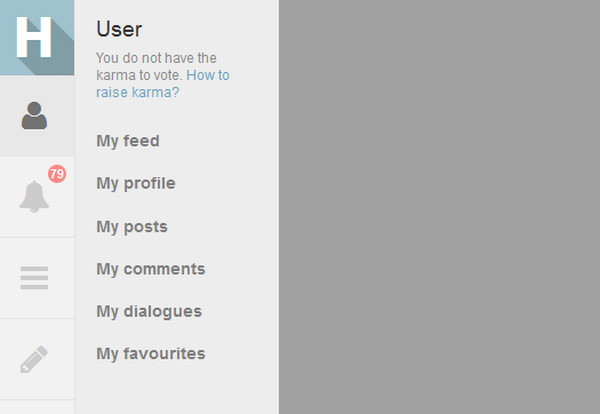
This icon-based ultra-narrow vertical side menu fits perfectly for light user interfaces that are guided by conservative principles of free space usage. The menu includes an extra sliding panel for navigation and a room for the logotype. On the whole, component has a pleasant and exquisite appearance.
Responsive Slide Toggle Menu by Philippe Fercha
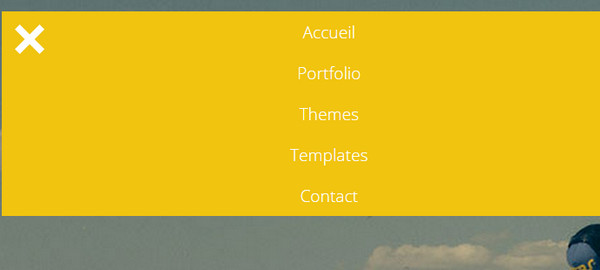
This is another professionally-created, modern, quite popular option for navigation menu, the component that marks numerous online portfolios and creative agencies’ websites nowadays. Being originally a minimalistic “hamburger” icon, which usually occupies the upper right corner, it capably transforms into a compact but wide-screen monochromatic panel that has a remarkable ability to correctly respond to current browser screen dimensions.
Dropdown Menu UI by Jeplaa
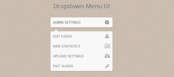
The developer shares a hassle-free CSS/JS drop-down menu that gracefully falls downwards. Not only does the transition effect leave positive impression but also the design evokes pleasant feelings thanks to its refined execution and meticulous attention to the smallest details.
Panel Menu by bery54
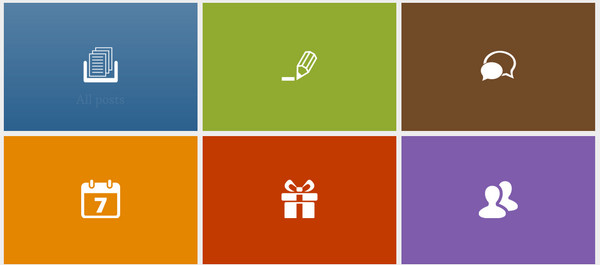
If you want to put a particular emphasis on your main navigation, there is no better way as to provide it with a full-screen area and make it a highlight of the design. This colorful tile-style icon-based menu with an option of displaying an overlay screen with the content is a perfect solution for you.
Dropdown Menu
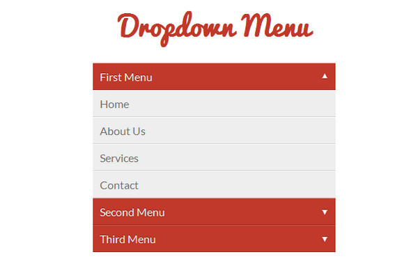
The key feature of this clean, vertical drop-down menu supplied with a charming “bouncing” effect is that it is built only via CSS3 possibilities; though, of course, this is also a flaw since only modern browsers are capable of correctly displaying it.
Responsive Menu by Lisandro Eijo
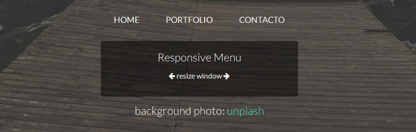
You won’t find anything special in design or interactivity in this menu: it is just a super simple text-based yet subtle navigation that looks great on photo backdrops and dark backgrounds. However, there is one thing that makes it a highly desirable, and it is its ability to quickly adapt to changing browser window sizes.
CSS3 Exploding Menu by Taufik Nurrohman
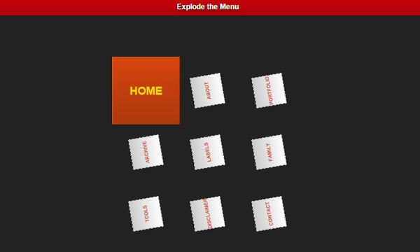
Want to add some fun to your project then give this CSS3-based exploding menu a shot. Of course, it is not suitable for daily projects; however there are certainly some cases where it finds its right place.
Perspective Menu by Joshua Hibbert
Seek some eye-catching elements for your projects; try out this unique solution that makes your users to take a look at navigation menu from an unusual perspective.
Conclusion
Though it is believed that a main navigation should look clean and be as simple as possible, yet it does not mean that it should be boring. Sometimes a small nice dynamic transition or pleasant 3d animation not only can add a bit fun to your project but also make the menu look even better.


 Freebie: Diwali – Creative Kit
  All Websites Should Feature Videos and Here’s Why
  Designing a Small Business Website: 5 Services to Use
 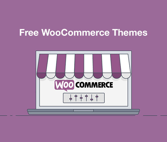 Top 16 Free WooCommerce Themes
  Top 25 Free WordPress themes from 2020