The latest operating system from Apple came with a total redesign, with the American giant moving to the flat trend and breaking all things we knew about them. But flat has been around for quite some time already and designers get more and more familiar with it, so they start spending their free time on designing resources for iOS 7.
Icons are some of the most popular resources designers create and this is also what we are going to look over today. Not any types of icons though, but redesigns of iOS 7 icons.
Here are nice examples of iOS 7 Flat Icons
Mail icons





We start with different mail icons redesign. Some of them are designed in the same style, while others are a bit more original, but they are all easy to understand and would work well at small sizes if they would have to be used at the actual iOS icon size.
The fifth example is my favorite one, because it is extremely simple, just like iOS 7 is supposed to be, while some of the other ones would not really work well without a colored background.
Safari icons
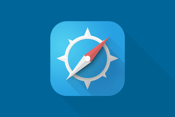
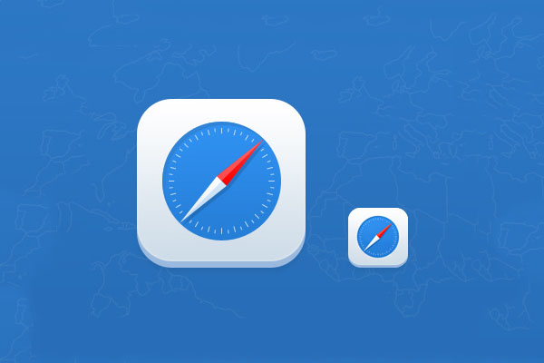
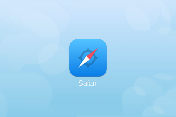
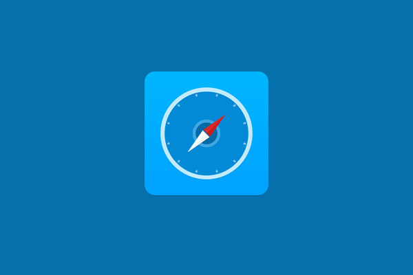
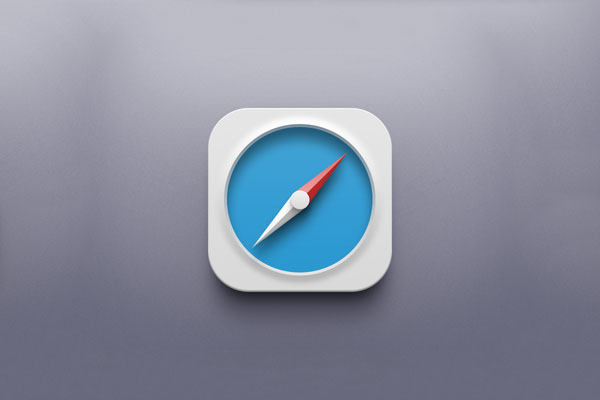
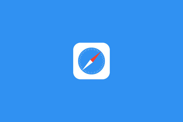
Some of the most popular icons redesign for iOS 7 is the one for Safari, because not many thought the original design was good enough. So below you can see some amazing examples of Safari flat icon redesign. If we look at all of them, some are “more flat” than others, but they would all look very good on my iPhone.
FaceTime


I don’t see FaceTime as a very useful app on my phone, therefore it is hidden somewhere in a folder on the last screen. But I am sure many people use it. It seems, however, that it was not the most popular icon to redesign, therefore I have only few examples of it. I particularly like the one with the green background, but the other one is not that bad either.
Messages icons

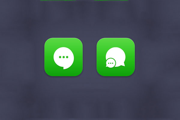
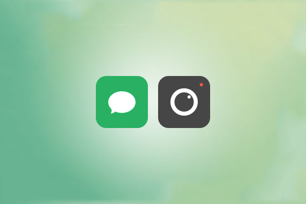
Unlike FaceTime, Messages is one of the most important functionality of iOS and there are some good icon redesigns here below. All of them are very simple and would most likely work well in small sizes. They all come in pretty much the same color scheme, which is also normal, considering Messages has always been a “green icon”.
Camera icons
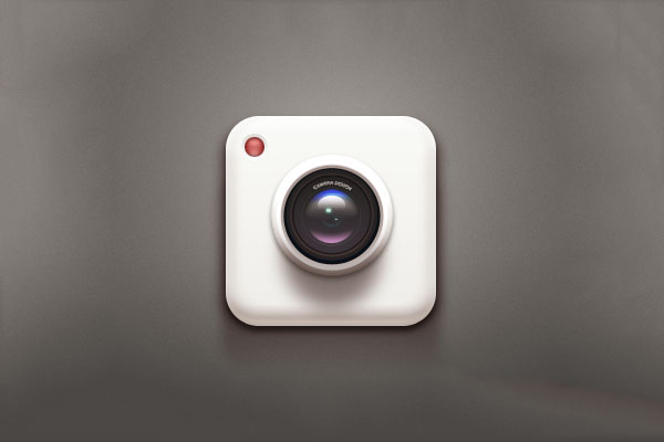
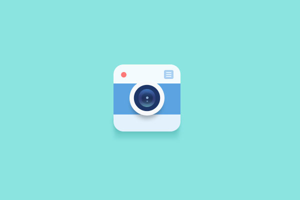
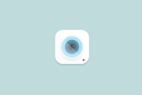
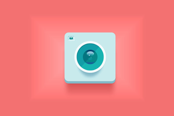
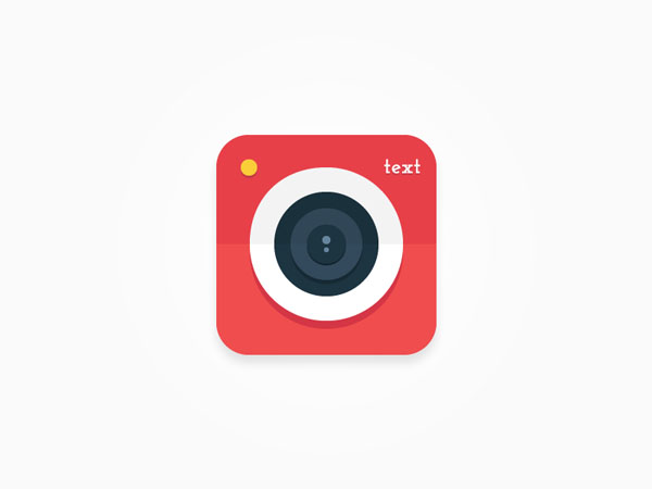
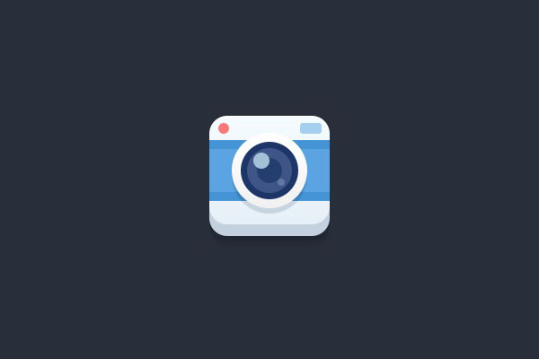
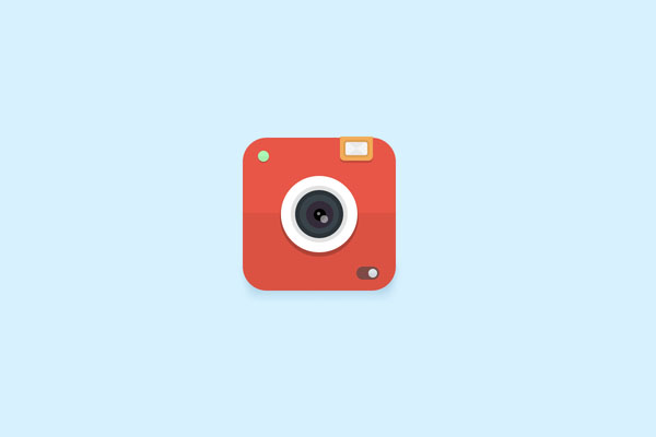
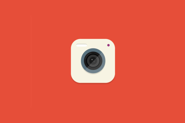
You can see above a camera icon alongside the Messages icon, therefore now we move onto another important functionality of the iPhone, the camera. Most of them are designed in the same style and even have some of the same color shades, but they all have something special of its own, so it’s worth mentioning either one of them.
Settings icons
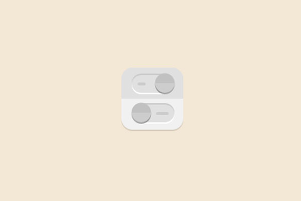
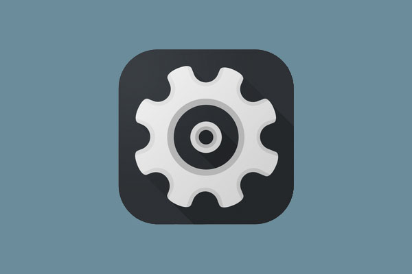

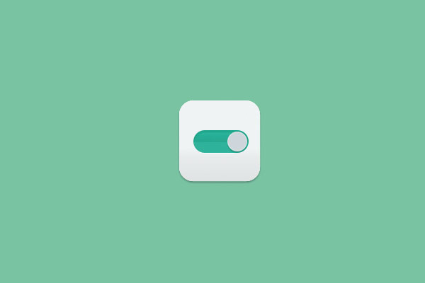
There are not lots of redesigns for the settings iOS 7 icon, but the ones that are available are actually quite good looking, so let’s take a look at them together.
Music icons
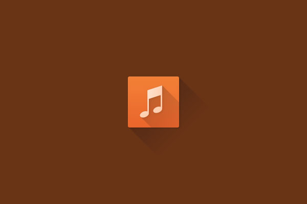
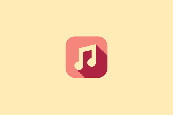
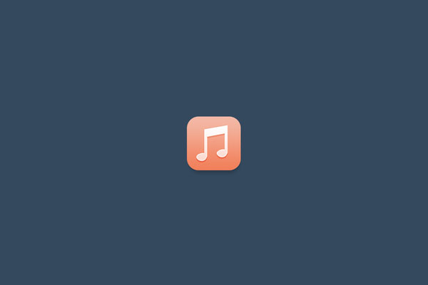

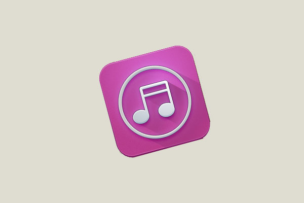
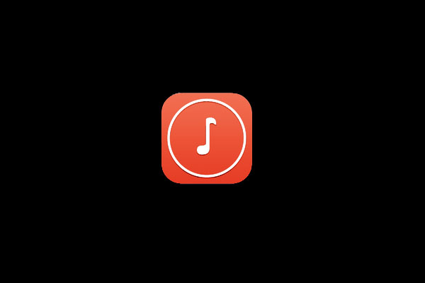
If there is something all of us do on our iPhones that is listening to music, so it was obvious people would start playing with the icon sooner or later. Below can you find some great examples of redesigns for the app icon.
iTunes Store
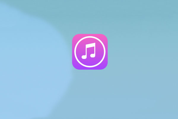
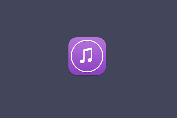
If music is important, the iTunes Store is where we actually buy our music (hopefully all of us do). Not many redesigns of this one, but you can still find some nice ones here below.
App Store
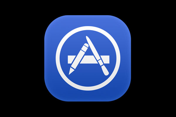
The only decent icon redesigned for the App Store is the one below. Not many redesigns considering the App Store is where we always go for updates and to purchase apps.
Calendar icons
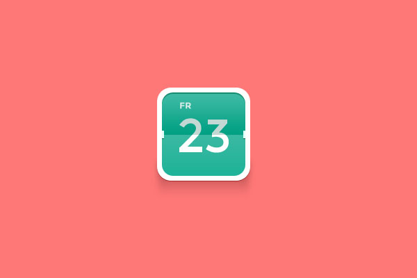


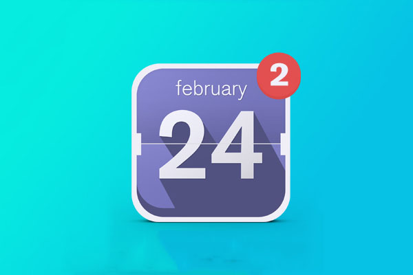
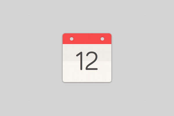
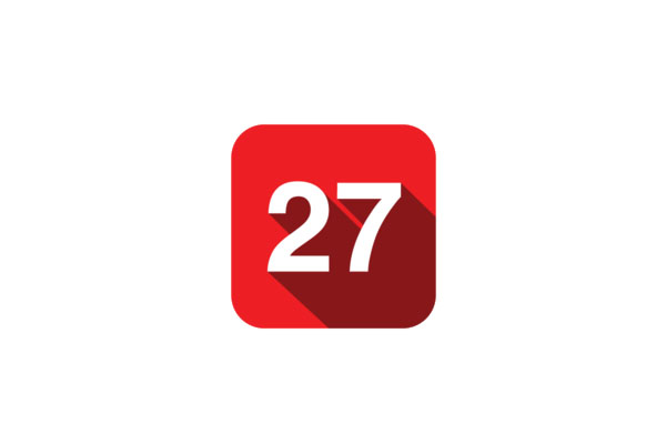
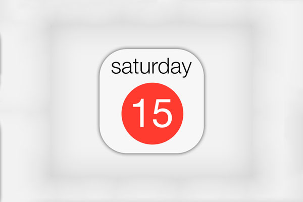
If there is an application lots of designers jumped onto redesigning, then that is the Calendar app. You can see below some very original examples, as well as some ones that copy the original iOS flat style, only with other small elements that make a difference.
Clock app
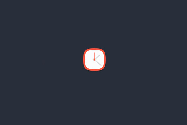

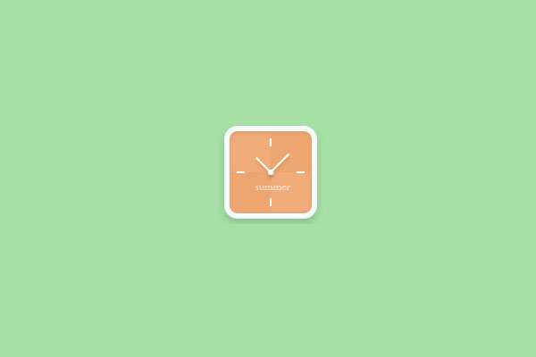

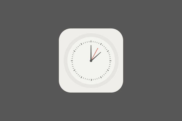

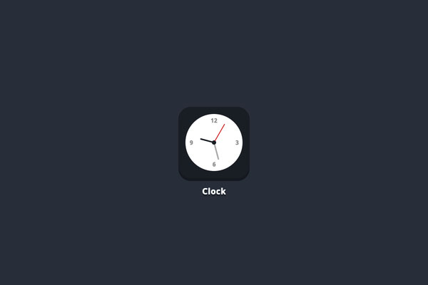
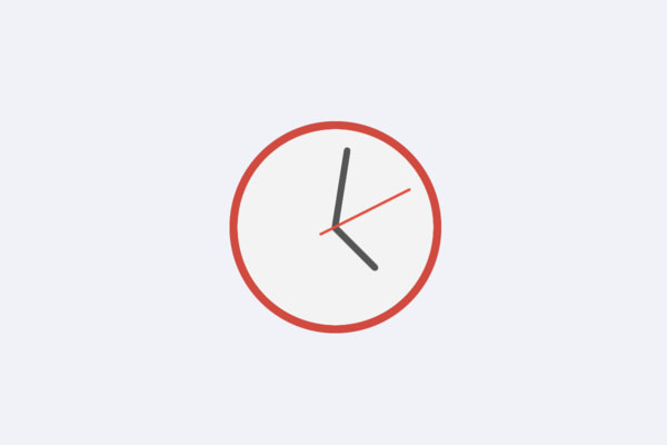
The Clock app is also one of the most redesigned ones, so you will be able to see below lots of good examples of redesigns that you might even use for inspiration in your own projects.
My favourite is the last one, with the sleek, red round border, although if it were me, I would definitely make a bigger difference between the indicators and emphasize which is which.
Weather app

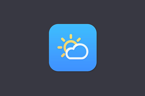



The icon for the weather app has also been redesigned many times, although the feedback for the original iOS 7 icons has not been negative at all, compared to other apps. I believe some of the designs below are good, but not much better than the original one, which I am quite a big fan of.
Stocks icons

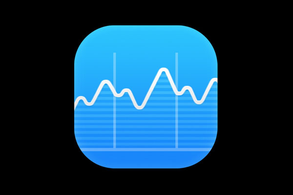

Although not something I use a lot, I believe the Stocks app icon looks quite good in the original iOS 7, but this doesn’t mean I can’t show you some good redesigns too.
Passbook icons

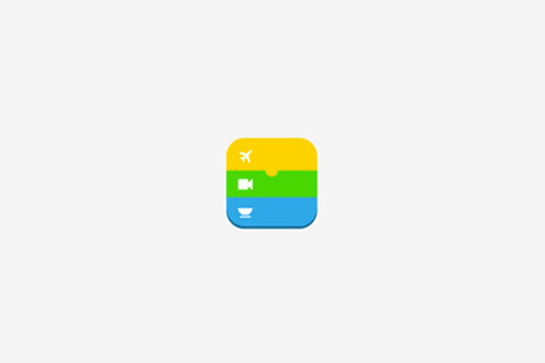
Another icon that seems to have gotten good feedback is Passbook, therefore not many redesigns of it can be found on the web. The two decent ones that I found, though, can be seen right below.
Phone icons
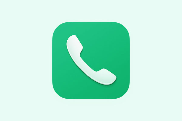
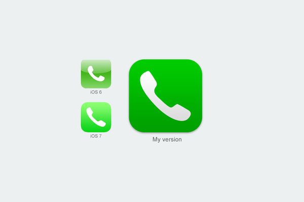


Another app icon that has been quite popular within the design community is the iOS 7 Phone app, which has been redesigned quite a few times. Some of the best examples can be seen below.
That’s it for today folks, I hope you got some inspiration from these resources and that you will maybe create your own redesigns. If you will do it, we would love to promote your work if it is high quality, so don’t forget to write to us.



 Free Resources for Web Designers and Developers
  Freebie: 50 Vector Christmas Icons
  Freebie: Set of 50 Vector Security Icons
  Freebie: Set of 50 Marketing Content Colorful Icons
  Freebie – 50 Teamwork Icons to Make Your Dreams Work Better
David Oct 25, 2013, 6:55 pm
There are some very nice designs in this post, can we use them or are they just for displaying only?
Zulhilmi Zainudin Oct 30, 2013, 4:01 am
Very nice collections! I think Apple should reconsider their iOS7 looks.
François Nov 5, 2013, 9:12 pm
Very beautiful and nice work :)
It’s possible to download this ? (.psd if it’s possible)