Business cards have been around for a long time and they always seems to be in fashion, even if now we have so much more technology than back when they hit the market. Designers have generally been very good at keeping business cards popular because they have been spending time creating unique, good-looking ones.
This is today’s focus, inspiring business cards. You might think there is no use for them, but it is – or at least there will be when you will have a serious job. Or maybe you will have to design some at some point in time.
Bookmark this and always come back to it whenever you feel you need some inspirations. The examples below are really special.
Business Cards Examples for your Design Inspiration
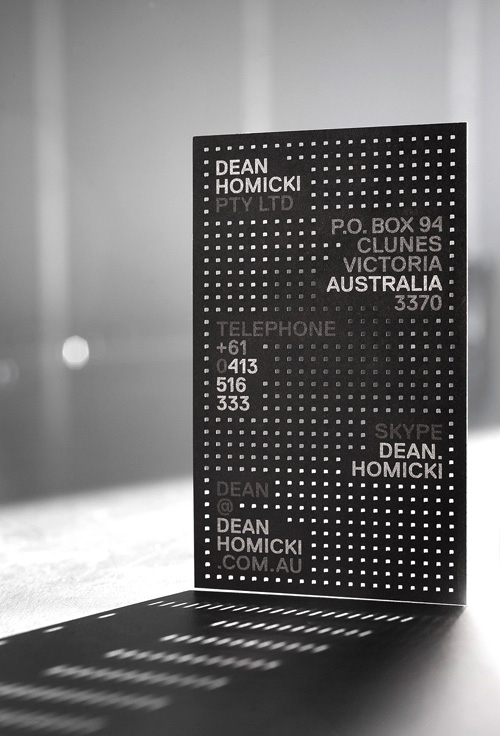
Dean Homicki
Dean Homicki is an architectural designer who specializes in designing architectural details, systems, fittings and fixtures. It seems that his work is amazing and shows balance and form through precision engineering. His business card, which you can see here, shows exactly the things he shows in his work.
The business card is made out of dotted elements that fit his contact information. It all looks like a whole, although there are two different types of elements and different colors combined.
SNAP
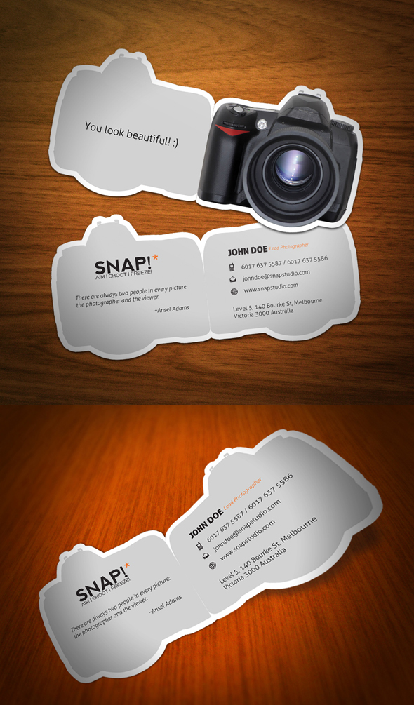
This is not made for somebody, but it is definitely great inspiration for photographers who want to have an amazing business card to give people.
We usually expect photographers to be creative and therefore receiving such a business card from one would make total sense.
Moreover, it is quite impossible to forget whom this business card is from, even when you stack 30 of them from different contacts at home or in your wallet. It has definitely something to do with a photographer, you can’t mistake it for someone else’s.
Appware
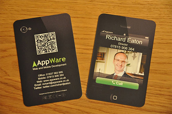
Appware is a real company and what I love about their business card is the fact that it brings a known dimension (an iPad, technology) to paper (reality). Everybody knows the interface of an iPad and nobody will mistaken who this business card is from, because there is a picture of the person on it as well.
When you turn it around, it even looks like the back of an iPad, where there is enough space for more information and a QR code. Business cards are rarely so creative that there is so much space on them, but this one is.
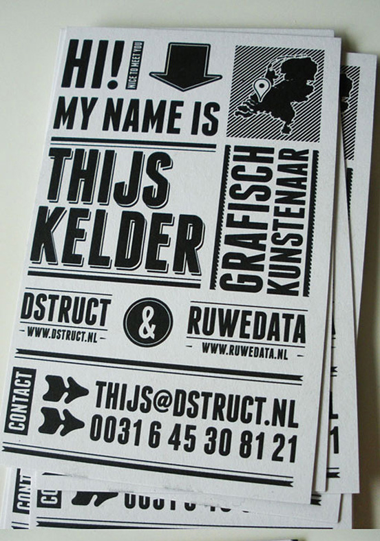
Black White
Maybe this example is not one of the most creative ones, everybody can do that, but what amazes me about it is how it actually represents the artist and its company.
If you check their portfolio, they do a lot of black & white graphic work that looks exactly like their business card. Now this is powerful and intelligent branding.
Moreover, as he is a graphic designer, looking at his card will make you feel that your project is in good hands. I mean, if he was that creative and willing to break guidelines, it must be something special to him in the end.
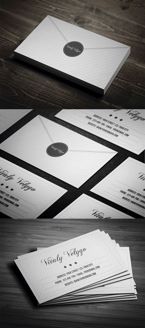
Vitaly Velygo
What I personally like about this one is the fact that it looks very fancy. The only thing I do not understand is why there is no “job description” of this person. People will look at this business card and ask themselves “who are you?”. If your business card can’t answer this simple question, it is useless.
However, I have decided to showcase this piece here because I strongly believe its design is very valuable and people could use it, while also keeping in mind my comment above.
The card is fancy and looks like an envelope thanks to its back design. On the front the text is written with upper case, which should be easier to read, and there is also a lot of space for the logo.
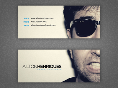
Ailton Henriques
This one is also very creative because the designer thought of adding a personal touch to it. Generally people are more willing to work with companies whom they are familiar with, than with companies behind which there can be literarily anybody.
Therefore having your own identity on a business card is a good way to ensure not only that people will not forget where the card is from, but also that they will psychologically feel a more personal relationship to you. In the end, you put your face there. This means you kind of guarantee quality work, because otherwise you wouldn’t have done this.
Wired Tree
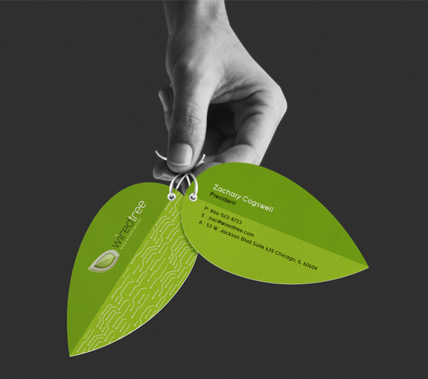
This is also a design for a real company in Chicago doing network design, server support and customer support. I do understand they want to appear environmental-friendly, I personally don’t think this is a good match for them.
Nevertheless, this is a great example of a creative business card you can get inspiration from. And if you do something with nature, whatever that is, then this would be a hit for you and your clients.
Close
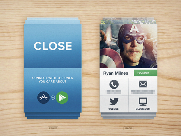
Close is a start-up that hasn’t yet released its product, but it looks like something very exciting. The product will be available in the App Store and Google Play, so it is something for mobile.
The idea is great because the card looks for sure very similar to how the app will look, and this is, again, very intelligent branding. This will make people aware of whom the card is from and will make them familiar with the interface – easy to do that when you have it in your wallet.
Also, spreading this kind of business card before releasing the actual product is a good way to create some buzz and hype about it, because it really looks creative. If they were that good when creating a business card in few hours, their product (which they have worked on for a very long time) must be amazing too.
Accountant card
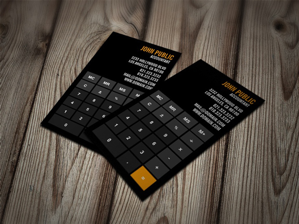
Who said that being an accountant is boring? Just look at this amazing business card and tell me, don’t you just want to be one of them only for the sake of having one of these?
I think this example is actually one of the most creative, because it shows one of the tool accountants work with. It shows a small piece of an accountant’s world and working life. I think it is just so cool, definitely one of my favourites.
Beer Table
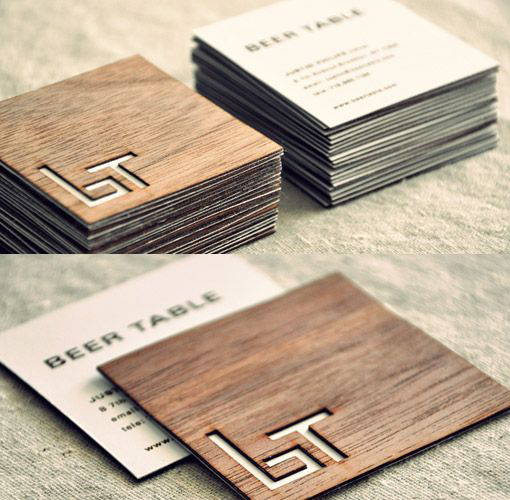
When you own a high-end pub in Brooklyn, you need to make everything around look good. In this case, the designer did an amazing job with the business cards, as they also have a hidden meaning.
The name of the pub is Beer Table, with the initials “b” and “t”. By putting together a lowercase “b” and an uppercase “t”, it looks like a bench and a table – which is exactly what a bar normally looks like. Also, the background of the card is designed with an oak wood feel, so that it alludes to the wooden benches inside.
Moreover, this business card can be used as a coaster and people can take it home if they want to. This is really an inspiring example.
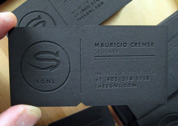
Mauricio Cremer
This business card, although it is made out of leather, feels like paper. Everything made out of a different material than paper, but used as something normally printed on paper is interesting and exciting. This is probably why I’ve chosen this business card in the first place. But not only because of that. With some help from a laser cut, the letters and numbers were engraved in the leather so that it gives an even better feeling to the ones holding it.
I am sure printing such a business card would not be cheap, but in case you can afford it, it will definitely offer you the edge over the normal 9-to-17-director-business-card.
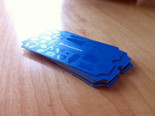
Pivotshare
Pivotshare is an online video streaming platform and you can see this on their business cards, where all kinds of media are showcased in their own way. Now this is a business card designed with the brand in mind.
It is actually too bad that we can’t see how it looks on the other side, but when it is such an amazing piece of art on the back, I assume the front must be great as well.
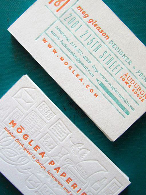
Moglea
What I like about this one are the 3D effects on its back, but also how the typeface and general feel look like the actual website and brand identity. Again, this is a very good example of how the web identity can be brought into reality, and more precise to paper.
You can notice many elements showcased on the website which are presented on the business card as well and this can only be a positive thing. This is another great example of how to think when creating a business card for your company when you already have an identity.
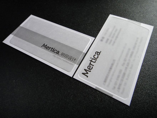
Mertica
This one also has something special that I have never seen before, and I am referring here to the plastic protection around the actual business card. This will ensure that the card will not get dirty, especially when it is white or any other bright color, and it also looks cool and innovative.
I do not know if this is a real company or not, but this concept is definitely something you might want to think of using.
Radity
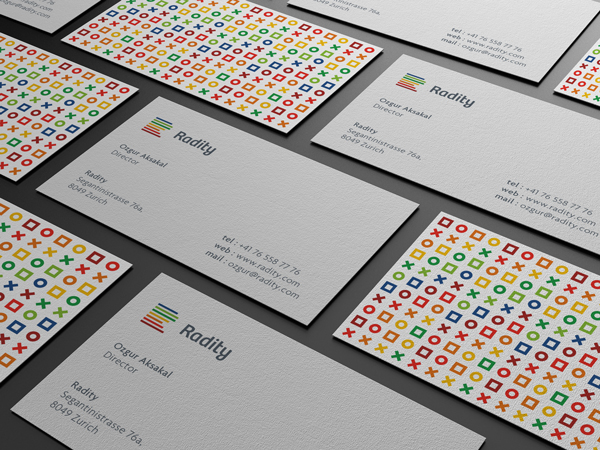
Although not necessarily very innovative, I want to use this example, as I did with some other ones, to show how well a business card can fit the web identity of a company.
Radity is a development company in Switzerland that created this business card by using only elements they use on their website. The logo is there, the back is very attractive visually and might even make people think of 1s and 0s, and the texture is really, really fine as well.
This is as simple as a business card can get, but not simplistic. One of my favourite examples from today, no doubt about this.
Bottom line
With so many examples you can get inspiration from, creating your own business card should not be an issue anymore. By using the examples above you can most likely create your own version, which can even be better if you put a bit of soul and hard work into it.
I am really looking forward to see your creations and hear your comments about the business cards above.
