In continuation of one of our previous article about looped videos, we are going to take a glance at another type of refined and delicate dynamic touch in website design that is capable of enlivening any static element without overwhelming online visitors – subtle motion. Although such popular features as cinemagraph and animated gifs are constructed on the basis of it, however, code versions offer an extensive range of possibilities that can affect any detail of the website, from graphics to typography, thereby revamping the whole appearance.
Below, there are fresh and impressive examples of subtle motion skillfully implemented in website design.
Drupal 8
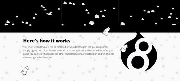
Drupal 8 Release is filled with plenty of dynamic elements that laconically diversify the whole appearance. Contrasting black and white color scheme in collaboration with funny and bizarre sketchy drawings that are carefully animated give a particular charm to the project.
Canal TP
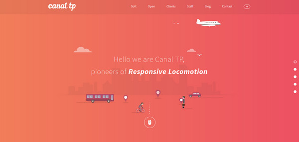
Canal TP has a full of live front page that conveys positive emotions and establishes magnificent general feeling. Vibrant, almost radiant gradient background, detailed, colorful flat illustrations, animated characters and pixel-perfect graphic manage to keep the template alive, reinforcing visual experience enormously.
Nikola Tesla
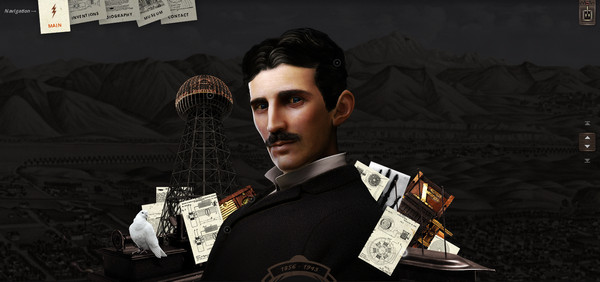
The website affords a unique, sophisticated and certainly unforgettable appearance that gets its mind-blowing look from a flawlessly executed digital scrapbooking style. It is charged with energy and electricity. Here fake flashes of lighting in pair with subtle motion unobtrusively communicate the meaning of the project, making it easily stand out from the crowd.
Eleks
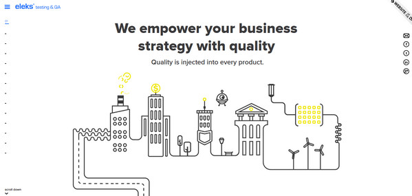
Eleks depicts a fantastic animated nifty contour drawing that breaks the usual content flow. Not only does subtle motion intensify the “welcome” screen, significantly supporting the concept and improving hand-drawn composition, but also it is used to express movement throughout the whole project.
However, unfortunately, owners of smaller screens such as tablets and mobiles cannot enjoy the whole magic.
Dot Info
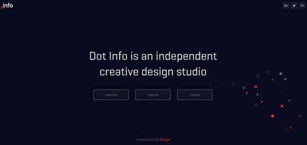
Dot Info leverages subtle motion in order to liven up the background that is based on a solid dark color. Moving particles, which unobtrusively create a distinctive eye track from right corner to left side thereby helping to draw attention towards the tagline and CTA buttons, add more personality to the front page.
Code_n Connect
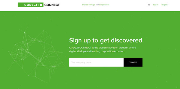
Code_n Connect radiates authority and creates a profound impression thanks to gorgeous coloring, strong typography, and consistent layout. Here small interactive element with an exquisite geometry nature engages users, giving the home page a beautiful trace of elegance as well as enriching it significantly.
Carbure Digital Workshop
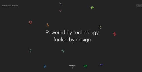
Carbure Digital Workshop employs dark clean monochrome backdrop that neatly accentuates attention on the main tagline through achieving an optimal balance. Here a beautiful crop of chaotically moving tiny radiant graphical elements enables to brighten the whole design and add a unique charisma.
Always Awake
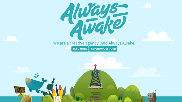
Always Awake is a creative agency that greets online audience with a splendid, highly detailed, fully illustrated portfolio. The website looks fantastic not only due to startling drawings, visually-pleasing coloring, and a smooth typography, but also thanks to components with subtle motion that spin the project creatively, conveying a casual amusement.
Air Social
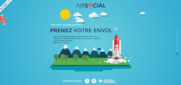
Air Social offers an incredible storytelling experience. Each subpage includes refined, professionally executed flat illustrations charged with motion. Thanks to this combination, the website looks very enticing and intriguing.
Grand Hotel a Villa Feltrinelli
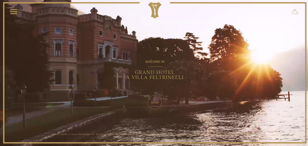
Pair up a spectacular cinemagraph backdrop with the elegant, animated button and you end up with a memorable, awe-inspiring and matchless front page that certainly catches attention. What is more, add to this refined graphics, exclusive typography, and golden coloring and your website will transform into an overwhelming nonverbal tool for communication.
DreamPlus
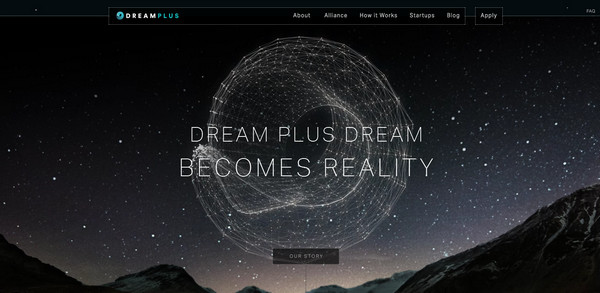
DreamPlus demonstrates a win-win combination of picturesque background and delicate, stylish outlined centerpiece jazzed up with subtle motion. Such approach effectively spreads the idea, creates the right feel for the website and improves an esthetics. Although the tablet version includes only a static variation, yet the page still looks amazing.
Mujkaktus
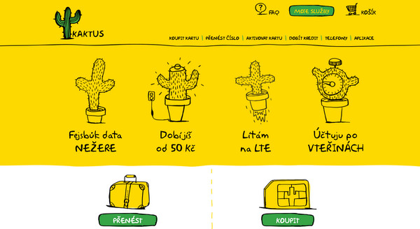
Mujkaktus shows everyone that tandem between quirky hand-drawn elements and animations can bring spectacular results. Although the website is highly populated with fancy doodles, yet it has a sense of compositional harmony enriched with interactivity.
Radium Labs
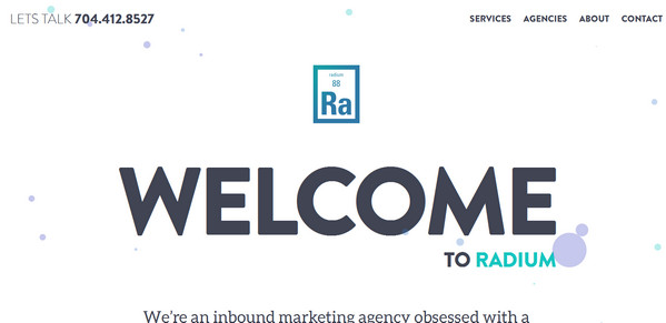
Radium Labs has a sleek portfolio that meets modern trends. Ios8-inspired color scheme, flat graphics, startling typography, plenty of room for breathing, gradient backdrops and of course subtle motion make the whole design.
Limoncello Studio
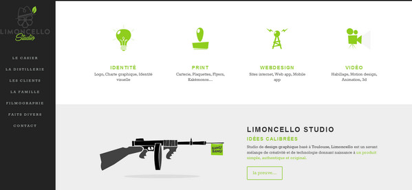
Limoncello Studio takes small steps towards interactivity, populating its website with some small dynamic effects that slightly enliven icons and accompanying images. Such solution helps to diversify the clean and solid portfolio elegantly, giving it a lovely dynamic appeal.
Gerber Ramonage
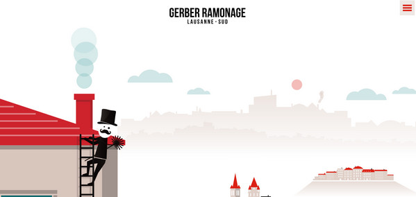
Gerber Ramonage presents the whole story that is not only professionally illustrated but also brought to life with the help of subtle motion. There are numerous visual anchors that hide interesting facts, stats, and images. Thanks to carefully executed interactivity, the project is interesting to study.
Alphabreast
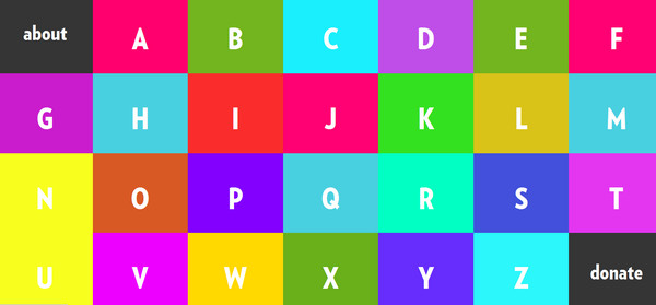
Alphabreast is aimed to fill in the gaps in your knowledge about an invasive breast cancer in a creative and amusing way and encourage people to support sufferers.
The project is based on an original approach that implies the utilization of bright coloring and fantastic vector drawings. Moreover, in order to defuse the general feeling on the website and make it more pleasant, comforting and even cheerful, each item is brightened by a delightful animation.
Hermes
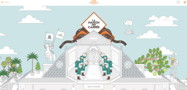
Here subtle motion is used to place extra emphasis on luxury and exclusivity inherent to the brand. The secret of the classy appearance and overwhelming impression lies in the attention to details: pixel-perfect, meticulously crafted illustrations, which you can scrutinize for hours, supported by tiny effects simply knock your socks off.
South East Water Education
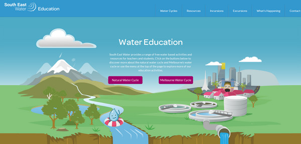
Track the flow of the water together with a funny mascot that tells you a story and tries to raise public awareness about nature water cycle and Melbourne’s water cycle. In order to achieve a more dramatic and far-reaching effect, the story is enhanced by matching animations that pull everything together.
Merlin’s Mustache Lab
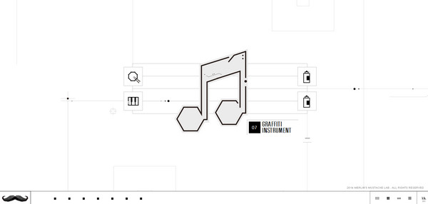
Merlin’s Mustache Lab is a first-rate website that has plenty of stuff to admire. The developer is managed to combine together harmoniously solid contour graphics and animations, demonstrating its skills and professionalism on the top level.
Mint Design Company
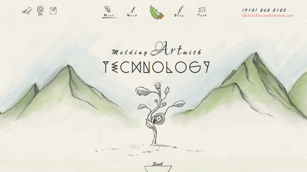
Mint Design Company successfully adds emotions to communication through supplying juicy, crisp and elaborate doodles with small, accompanying effects. As a result, the online portfolio has a unique appearance and clever design traits, inspiring people to delve deep into the project.
Conclusion
The sphere of influence of subtle motion expands; it certainly becomes a common element across various types of websites. Together with cinemagraph, looped 5/6-seconds long videos, gif animations, css- and javascript-based effects it helps the project to excel with interactivity and take online users on a memorable experience.


 All Websites Should Feature Videos and Here’s Why
  Designing a Small Business Website: 5 Services to Use
  The Anatomy of Great Website Design that Google Loves
  Freebie: Gradient Infographics
  11 WordPress Design Trends for 2019