All professional website builders are chasing after an opportunity to create not only a splendid visually-appealing outer shell of the project but also an excellent user experience. If the first one is not so difficult to achieve with a talented designer standing right by your side, but when it comes to creating good user experience everything is not so “rosy”, smooth and simple even with a skilled developer that is at your service. Great user experience demands numerous factors to be taken into consideration, and extremely tiny details here play first fiddle. Enriching as well as enhancing your project with almost imperceptible, sometimes fleeting, sometimes informative effects and animations is a remedy to a problem.
We have already showcased some excellent examples of how a simple page preloading animation can change the general impression for the better in the first seconds, as well as providing you with free professionally-executed scripts and plugins that let you supply your own project with this type of effects. It is time to move on and tool up your project with some more effective and eye-catching animations that will maximize a positive impact produced by your website on your online readers.
Ready to reinvent your project through equipping it with tiny nicely animated details that will take your website to the whole new level then explore our list of hassle-free scripts and tutorials that uncover simple yet charming transition effects that were created for giving the page shifting a pleasant view.
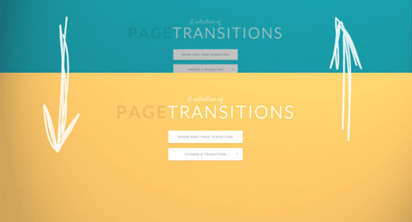
Collection of Page Transitions
The website is a fount of a truly helpful articles, tutorials and components. It focuses on modern approaches and techniques, so it is not surprising that the team did not miss a chance to create a range of page transition effects with a help of CSS animations, which are very much in demand nowadays. The demo serves as a perfect source of inspiration and an ideal starting point.
Medium-Style Page Transition
Inspired by an elegance of Medium’s interface, the author is managed to build an exact replica of the subtle transition effect that accompanies every page’s metamorphoses there.
Fullscreen Layout with Page Transitions

This is a well-crafted solution that can be beneficially adapted for projects made with minimalism principles in mind. It will enrich your navigation or portfolio section with this small, adorable effect. The author offers to break up the screen into 4 equal parts, where each one will expand to the full screen size after clicking on it.
Page Transition in Backbone

Page Transition in Backbone is based on a quite simple sliding effect that numerous developers prefer to use in their projects because of its sleekness, prettiness and easiness. Though the script includes only 2 sample pages but this is more than enough to understand the technique.
3D Page Flip

The name of the effect speaks for itself: the script includes a clear code of a page flip effect with 3d feeling that gives the page shifting a realistic and catchy appearance. Though in the era of flat style such type of effects may look a bit irrelevant, yet there are still projects in which such animation fits like a glove.
Page Transition Based on a Folding Effect

Page Transition is based on a folding effect. The author’s experiment is a complete success. The page opens through an eye-catching animation that naturally blends into any website with a geometry theme.
Page Transition by Scott
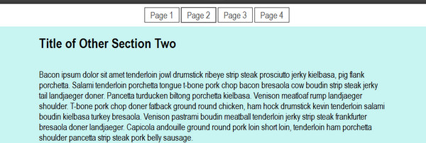
The script includes 4 basic page transitions: just pick one and improve your project; only be careful with cross browser compatibility since old versions have some problems with a correct displaying.
Fullscreen Layout with Columns

The effect presented below is much similar to the animation presented in the third example. Here each menu item after being activated smoothly takes up the full screen, providing an owner with a huge area for the content and other manipulations.
jQuery Mobile Transition Effect

jQuery Mobile Transition Effect includes an animation that is inherent to majority of mobile apps. The web developer has successfully simulated it with a help of jQuery possibilities.
Squish Transition
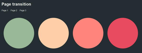
The developer skillfully reconstructed a “blink”-like effect that is aimed to accompany every page shifting. Moreover, this smooth squish transition can be also improved with a help of timing functions and target classes.
Pure CSS Page Transitions

Those who prefer clean and pure CSS-based components to more complex yet more reliable animations based on a mix of CSS and jQuery, will find this effect quite useful. As usual, before implementing it you should take into account browsers that do not support new CSS features and build up your own fallback.
Animated Page Transitions

Here, the author offers you 4 options of the same animation, giving you an opportunity to choose the direction. You can easily diversify as well as beautify the look of your project through implementing all 4 variants only in different areas.
Page Transition Mockup

Here the developer has realized a simple yet pleasant switching between two pages that to be honest, hardly takes the shine out of several highly impressive effects listed above. However, it is able to leave a favorable impression, and this is a really important.
Project by Ali Raza
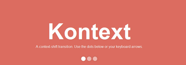
Here the effect accompanies the content while it is shifting away from users’ eyes. You can trigger the effect by means of dots-style navigation or via traditional keyboard arrows.
Page Transition Testcase

The developer describes the principles of page transition through a simple cube in order to clarify the technique. Though this is just a concept, yet in the capable hands it can transform any project into an online masterpiece with a flawless 3d vibe.
Conclusion
Animated transitions between pages are not something new, sophisticated or extraordinary; they are just simple effects that escort changes. However they are able to give the project a really delightful user experience and that is just what the doctor ordered.


 Freebie: Diwali – Creative Kit
  All Websites Should Feature Videos and Here’s Why
  Top 16 Free WooCommerce Themes
  Top 25 Free WordPress themes from 2020
  ZeroSSL Review – SSL Protection for All