Submitting forms, loading content, displaying gallery with high-quality images – all these processes take some time for operation, of course, this is not something new, every other website is packed with heavy or dynamic elements that need resources to function properly, including time, so that making your users wait is a usual thing on the website, but that does not mean that you should leave everything as it is. The common problem of idleness in fact has various practical solutions, though may be not all of them will be productive and successful, however there is one thing that is able to slightly brighten up and warm up a waiting atmosphere and it is a progress button – a fresh concept, the beneficial union between buttons and progress bars that provides users with an instant, relevant and favorable feedback.
Although the approach has recently become popular, the web community has already produced dozens of solutions, implementations and variations. You can go for a jQuery plugin that will quickly add a component to your project, make use of bootstrap-based kits, stick to a time-tested way of adapting a simple code snippet to your needs or even follow DIY instructions. As for styling, you will be simply delighted with a diversity that the web has prepared for you; the developers never miss the chance of getting the most out of new CSS features thereby giving progress buttons ultra-modern appearances and refined effects.
Our collection is just a small fraction of what you can find on the vastness of the Internet, we hope that this will be enough for you to get started with this small yet constructive and essential concept.
Progress Buttons Styles
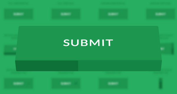
The team has created almost 30 buttons with in-built progress indicator. Each item features a pleasant 3d transformation that accompanies an appearance of the loading bar. The selection varies: buttons rotate in different directions, flip, move up and down and even shrink.
How to Create a Circular Progress Button
The article shows an interesting technique that clarifies how to transform a simple button into a circular progress bar without writing lots of fuzzy code. The solution features a flat style implementation, so it will go perfectly well with any website design that meets current web trends.
Heart Progress Button

This dark neon style button that is a perfect decorative complement to any dark design has a charming animation that features a small vibrant pulsating heart. However, nothing happens with the button, only the title is replaced with the dynamic icon that elegantly displays a busyness of the process.
Progress Button by JoeBoo

Here, button is an actual progress bar that begins to fill with other color after you click on it. The main disadvantage is that if you want to stretch loading indicator across the entire screen width, the button will also take the similar large size.
Circular Progress Button

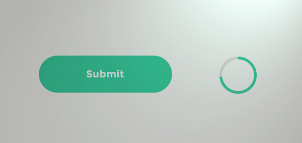
David Kerns has created 2 sleek contour buttons that showcase a loading process through basic flat style circular indicator and turn into a much smaller round buttons, where the first one symbolizes a “success”, and the second one an “error”.
Buttons with Built-in Progress Meters
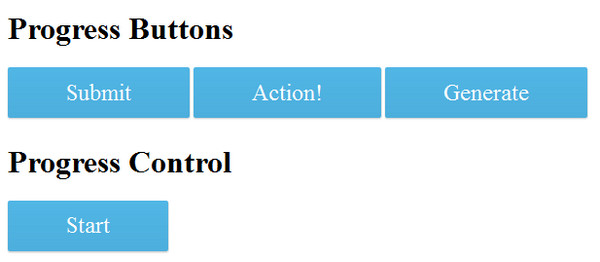
The developer shares with the community a code snippet that includes several subtle flat buttons, each of which has a simple yet eye-catching built-in progress indicator. Thus, the first button fills with another color from left to right, the second one from top to bottom, and the third one displays an ultra-narrow bar in the lower part of it. As usual, you can easily change colors or add another pleasant CSS3 effects and animations.
Button by Mike Hickman

The project has a regular “send” button supplied with a bright progress bar that takes up the whole area. The animation involves filling the box with another color and changing “send” into “sending” thereby notifying users not only through graphics but also through text.
3D Download Button
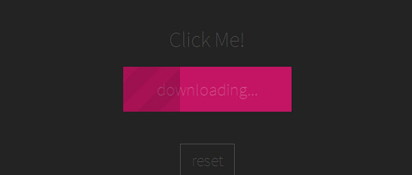
Here, you will find a flat dynamic button with a couple of implementations. While the default status includes a bouncing icon that encourages users to hit the button, the “pressed” status has a pinkish striped progress meter, the emergence of which is accompanied by a charming 3d effect.
Progress Bar Button V2
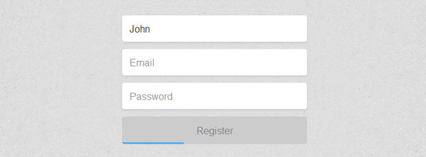
The code features a really practical solution that tries to enhance user experience. The progress bar is aimed to demonstrate the degree of completion.
Ladda Bootstrap 3
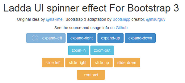
Ladda Bootstrap 3 was one of the first jQuery plugins that is succeeded in combining together button and progress bar thereby providing developers with a really helpful instrument that is fully compatible with Bootstrap 3. Each item includes a basic spinner and pleasant transition effects.
Animations by bwgoad

The developer demonstrates several animated components that can serve as a basis for creating progress buttons. Moreover, the demo has several sample realizations.
Submit Button by Colin Garvens

The demo allows you to choose the final outcome for the animation, so that this gorgeous contour-style button will transform either into a “success” button or into an “error” button.
Button by Luca Malattia

Button by Luca Malattia has a neat, linear flat meter that is placed at the top of the button. The color differentiation between the backdrop and filling is not very contrasting; however such solution gives the effect a touch of subtlety.
Progress Button by Intuitive Company

The developer was inspired by solutions that are featured in the first example. Here, you will find an alternative interpretation of the button with the thin progress bar that appears at the bottom of the button.
Conclusion
When it comes to optimization and minimization, web developers always seek solutions that let them kill two birds with one stone; and the progress button that is equipped with fantastic animation and eye-catching indicator is a real gem among them.




 Freebie: Diwali – Creative Kit
  Top 16 Free WooCommerce Themes
  Top 25 Free WordPress themes from 2020
  ZeroSSL Review – SSL Protection for All
  Black Friday 2019, Best Deals for Web Designers and Developers