There are numerous approaches and means how to effectively grab users’ attention and become “white crow” – in a good sense – among a bulk of websites. Every professional agency as well as talented designer/developer tries to make their online presence memorable and unique, coming up with incredible ideas and ingenious solutions. Along with standard methods there are several psychological tricks that help to unobtrusively and almost imperceptibly make a substantial impact on visitors. Adding an emotional component to your web design as a well-thought-out choice of color palette is an ace in the hole.
Emotional design is truly beneficial; these interfaces easily evoke positive emotions such as pleasure, joy, humor etc. that leave a good long lasting impression. And today we are going to take a look at ingenious website designs that capably utilize humor by incorporating various funny components and offering entertaining solutions.
AGL
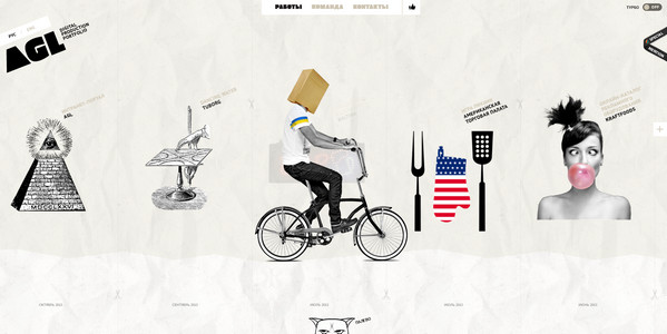
AGL is a fantastic online portfolio that instantly engages users into exploring the website. The team effectively employs a scrapbook style in tandem with hand-drawing illustrations that capably reinforce the theme.
Get Response
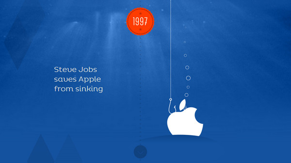
Get Response skillfully takes up an approach of storytelling, revealing the fifteen-year history by means of a set of amusing scenes. Every section has its own memorable event that is bolstered by original image.
Appfly
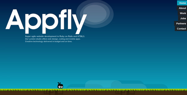
Appfly has a lovely fully illustrated website design with a small funny character that accompanies every subpage. It constantly tries to escape from cursor, moving from one block to another, as well play the ape in order to get the readers’ attention.
Marc-Andre Boivin
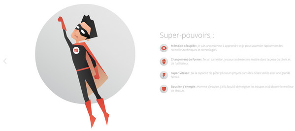
Marc-Andre Boivin has a classy online portfolio inspired by super heroes. The developer quite creatively describes its skills and possibilities, supplying each slide with a fantastic full of extraterrestrial possibilities illustration.
Barcamp Omaha
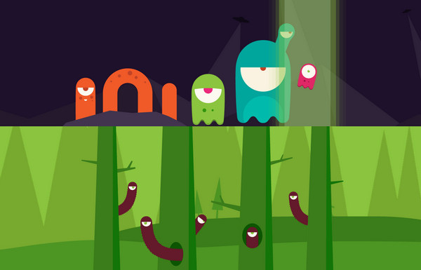
Barcamp Omaha is another first-rate fully illustrated website design in our collection that can boasts of its whimsical characters that try to set off laughing.
The Rate Suckers
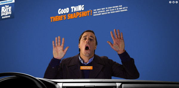
The Rate Suckers has a silly playful landing page that allows punching a person that is stuck to the windshield. There are also other interactive images made in the same manner.
Tria
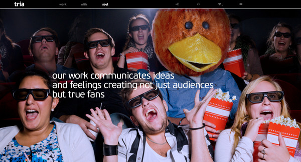
Tria is a one-page parallax-based online portfolio that welcomes its visitors with a set of funny images. The latter supports slogans and tries to bring a smile.
Paka Dla Bezdomniaka
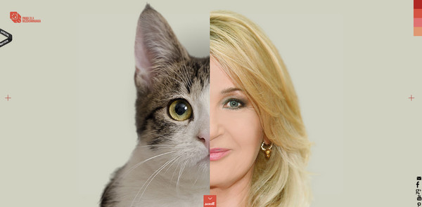
The website offers a small amusing game that forces you to scroll down in order to find out all possible combinations. You can easily extend one or another part to discover person or animal that is hidden.
Wake Solutions
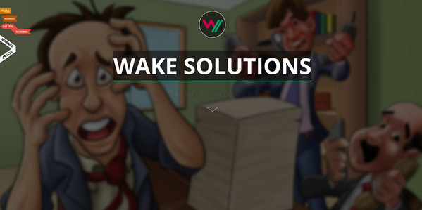
Wake Solutions has equipped its landing page with a couple of humorous fully illustrated cartoonish backgrounds that simply bring the eye to the design. Furthermore, there are several cheerful characters that accompany sections.
Milk Every Moment
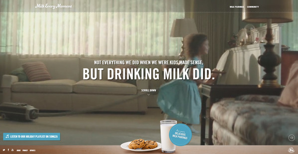
The website capably promotes its goods using a set of small hilarious videos with comical kids. And as all we know, leveraging images or videos with children is like funny pictures with cats that are always beneficial since they naturally get the readers’ attention and set a positive mood.
Santa-o-mat
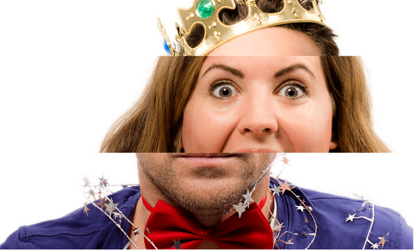
Since the website is dedicated to application that is intended to help you to create entertaining Xmas greeting cards by combining different noses, mouths and hairstyles, the team has decided to vividly demonstrate its possibilities by showcasing its own festive mix of facial parts.
Pinkanova
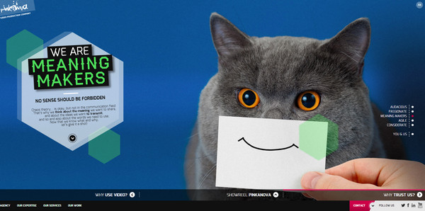
Pinkanova looks like a first-rate interactive online portfolio that leverages small dynamic components and numerous funny pictures that impress on its readers a sense of amicableness.
Whaternet
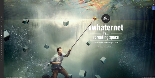
Whaternet sets the tone to an innovative concept by presenting a bunch of mind-blowing surreal photo manipulations that actively enhance various watchwords. Almost every image has its own funny touch.
Marketingz
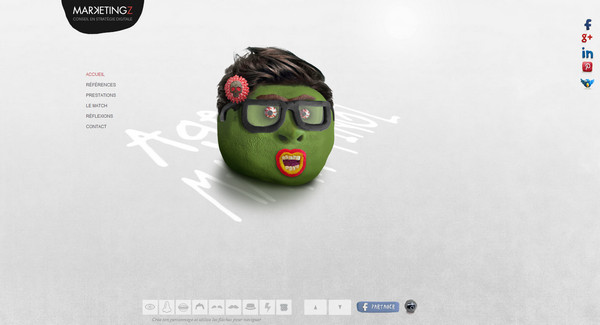
Much like the example number 8, the agency tries to engage users by means of a small funny game that allows you to build your own character by choosing various parts of a face. You can quickly construct any funny facial expression.
Nebo Studio
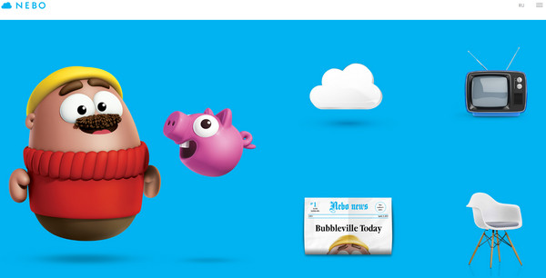
The designer makes use of hilarious digital characters that unwittingly put a smile on your face. Moreover, characters establish a positive childish mood since they are easily associated with famous toys.
49th Floor
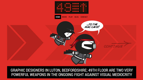
49th Floor welcomes its users with funny ninja illustrations. Every slide is made in a comic style and is a part of a small story where super ninjas managed to build a truly topnotch design.
Le Manoir Magique
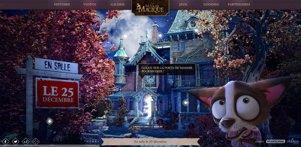
Le Manoir Magique is a promotional fully interactive website that shed a light upon a brand-new French film. The website includes main characters and some funny videos.
Santa or Scrooge
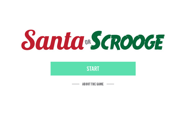
Santa or Scrooge is a small website that is aimed to put you into festive mood by presenting a set of questions that help to find out whether you are a Santa or Scrooge. This is a quite amusing solution that definitely forces you to stay.
The Future of Mobile Phones
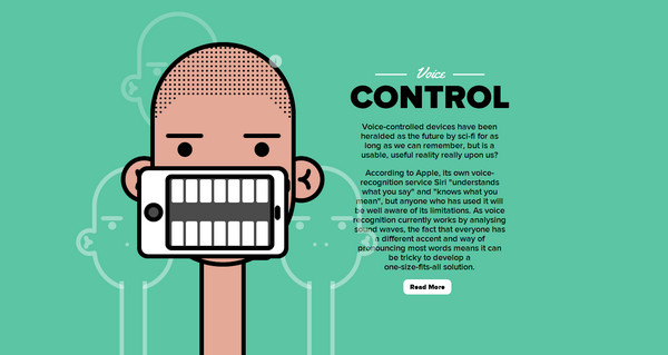
The Future of Mobile Phones is a fully illustrated bright infographic that includes several funny drawings that effectively complement the content.
Catmas
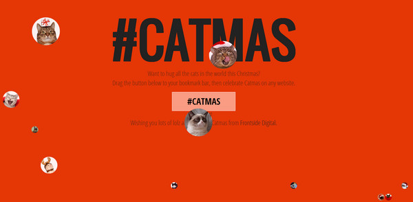
Without doubts we couldn’t miss the website that is dedicated to cats. It’s not a secret that the videos, images and memes with cats are the most popular and the funniest ones. The website includes several thumbnails with such masterpieces.
Why GDC?
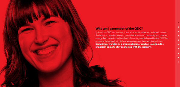
Human nature is also a key element of emotional design that easily evokes positive feelings, especially when it comes to picture of a person with a broad smile or laughing facial expression.
Conclusion
There are lots of websites that strongly rely on emotional design and successfully incorporate various spectrums of positive emotions. Humor is one of the most powerful tools in this sphere that not only produces a quite impressive result but also leave a good impression that can last quite for a long time. All the more so, you don’t have to transform your website into circus, you can work several funny characters into design, showcase some cheerful videos or just choose one page (for example, 404 error page) and make it look amusing. Several entertaining components will be quite sufficiently.
Feel free to share your thoughts about such designs. Do you like websites with humorous elements? Why or Why not?



 All Websites Should Feature Videos and Here’s Why
  Designing a Small Business Website: 5 Services to Use
  The Anatomy of Great Website Design that Google Loves
  Freebie: Gradient Infographics
  11 WordPress Design Trends for 2019