Each of us, at least once, has ended up in website’s error page: either the link was broken or as often happens, the search went wrong – situation varies, however, here all we see eye to eye that a standard, default, white page with a short description of an error provided by a server, as a rule, turns us away, whereas the pages built on individual approaches, albeit with nothing extraordinary, those that just feature funny images, dynamic solutions or at least several helpful buttons or links that are displayed correctly on mobile screens forces us to stay for a while and turns us into “second chance believers”.
So why not to exploit this fact and improve our upcoming projects with unique and engaging error pages, for example, let’s start with spicing up 404 error pages with some interesting ideas. Need some suggestions? We will offer you a dozen of pre-made solutions that can be quickly adapted to your projects.
No Vacancy 404 by Riley Shaw
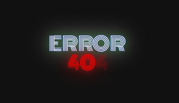
The theme evokes feelings that are reminiscent of cabaret or night clubs. This subtle eye-catching page will certainly become a perfect finishing touch to your restaurant-themed website. Made with meticulous attention to details and supplied with proper dynamic effects it will add a zest to your project.
Glitchy 404 Page by Kay Pooma
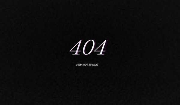
Glitch effect is just ideal for such kind of purposes. It is able to add its own powerful charisma that can transform any regularly-looking 404 page without any embellishments at all into an attention-grabbing page. Such solution will showily convey an error message.
404 No signal by Adem ilter

This is a quite interesting way of demonstrating that something went wrong. Coming from the old times of the bad tv receivers, this 404 page will immediately make everything plain in a pleasant, slightly old-fashioned manner. Although such realization may startle users a bit, yet it is certainly highly effective in displaying errors.
404 Page by Saransh Sinha
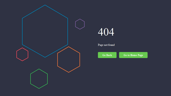
The developer goes for a more sophisticated realization that involves marrying up geometry vibe and flat style. As a result, page with smoothly-floating, sleek, line style hexagons and several integral buttons looks subtle and informative and ideally suitable for modern web-based projects.
Sovog 404 page by Marco Barría
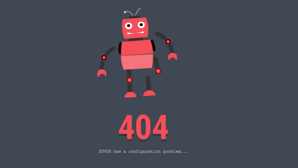
The artist is intended to add a bit fun to error pages by producing a clean and neat web page with a charming dancing robot. This solution will look extremely good in tech-oriented websites; however, other types of websites won’t certainly suffer from such an amusing animation.
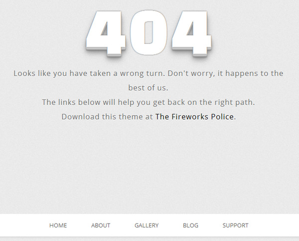
Simply 404 by Sazzad Hossain
Looking for a quite straightforward and well-crafted solution with a unique touch then this light, clean and minimal 404 page just will do. It is supplied with a lovely 3d typography and nice complementary effect that instantly strikes the eye. What’s more, there is a distinctive place for displaying a piece of information with extra links and buttons.
Flickering 404 Error Page by Spiderone
Want to add a specific vibe from old-timey retro games to your website? Then, why not to put into action this bright flickering 404 error page that easily creates such kind of atmosphere. The page also radiates of serenity as well as catalyzes positive emotions.
Simple Pure CSS3 404 Error Page by Enrico Chiaromonte
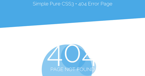
Seek a quick, simple yet elegant solution that won’t overload your project with excessive graphics and images? Then this pure CSS3 404 error page with a distinctive businesslike feeling will meet your needs. Not only has the author reproduced a quite delicate and subtle design but also enriched the page with a pleasant floating animation.
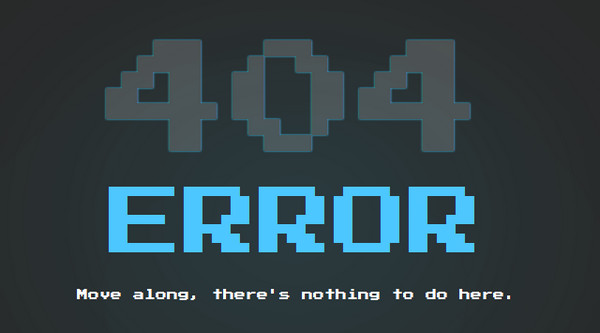
My Error 404 Page by Taufik Nurrohman

Do you have a website dedicated to club or to some entertainment events? If yes, then this flickering, bright, pixelated 404 error page not only will make it look absolutely complete but also maximize the whole impact. Moreover, the author has equipped the page with a lovely intro animation thereby having added to it a charming touch of interactivity.
404 error page by Raphaël Parent
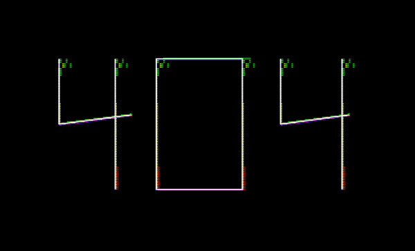
This is another example in our collection of professionally-executed glitch effect that fits here like a glove. The implementation also amazes by its accuracy and subtlety. The ultra-thin lettering placed on a solid dark background harmoniously co-works with this kind of effect.
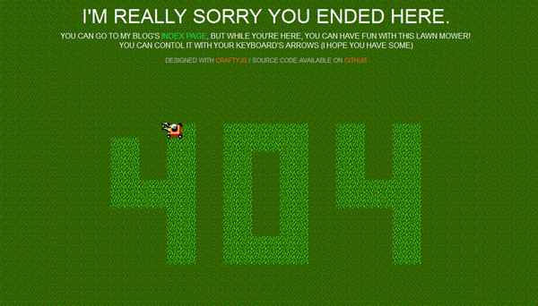
404 Error PageMade With CraftyJS
How to make people to stay for a while even when they are disappointed? Try to hold their attention with a help of a small game that lets them “mow the lawn”. Such an entertaining approach has certainly several advantages over static and boring pages.
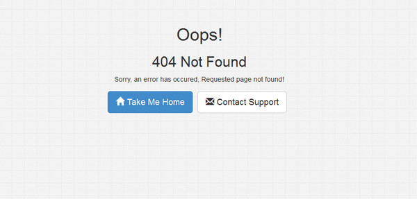
Simple 404 Not Found Pagу by BhaumikPatel
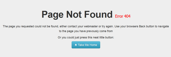
This is a regular, pretty unremarkable 404 page that covers everything that can help your lost users “to get back to the track”: “home” button and quick contact form. The key feature of this snippet is that it is fully compatible with Bootstrap-powered projects.
Sample 404 Page by Msurguy
Much like the previous example, this simple 404 page naturally collaborates with projects pulled by Bootstrap, it means that you can instantly add it to your website and provide mobile/tablet viewers with a user-friendly error page. As usual, the template looks simple, clean and plain.
Free Bootstrap 404 Error Page Template
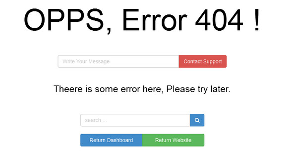
The Bootstrap-based flat style template has a well-balanced and properly-organized appearance. The horizontal line stripe presentation makes everything clear, eliminating any chances of getting lost once more as well as offering several helpful buttons and even a quick contact form for support.
404 – Tridiv by Nico van Zyl
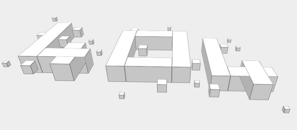
A perspective view is always able to catch attention, so why not to use its ability in your 404 page and make it look attention-grabbing and intriguing. Nico van Zyl shows how it should be done properly by providing users with an orthodox error page that features 3d typography spiced up with some transition effects.
Conclusion
Websites that are planned down to the latest details are very much appreciated in our times. Those who have taken into account even the smallest elements: have equipped their projects with informative and engaging error pages will certainly stand out from the crowd.


 [Review] Jupiter X – A Way to Create Pixel Perfect Websites on WordPress
  Freebie: 50 Vector Human Resources Icons
  Free Set of 404 Error Screen Templates
  [Review] Bootsketch – “Bootstrap + Sketch” Made Easy
  [Review + Giveaway] Now UI Kit PRO – Perhaps the Last UI Kit You’ll Ever Need
Ahhmed fATHY Oct 13, 2015, 9:31 am
THANKS FOR THIS.
Yavuz Abay Oct 13, 2015, 4:09 pm
Nice compilation! Thanks. I like “Tridiv” & “No Signal”