Majority of online shops left behind web trends whether it is an official website of a leading brand or a small local online shop. Usually they resort to the same old scheme – properly-organized layout that showcases goods in a grid-style manner, left/right sidebar with various categories, a small cart widget, a bunch of products, extensive intricate menu and lack of any embellishments. Everything boils down to a primitive well-tried presentation that, is really hard to argue, has its own considerable advantages; however, why not to bring some fun into your project, transforming your eStore into a delightful place for finding a necessary apparel.
Why not to add some cutting-edge elements and brighten an appearance of your website, giving it an enjoyable, eye-catching and most importantly a memorable outward. It should be something that will separate your website from millions of others, so why not to meet current web trends and make the most of them, jazz up your ecommerce website and keep abreast of developments.
If you are ready to make some far-reaching changes and enhance your online shop, or at least you feel highly motivated, then you should take a closer look at our exhibit that easily boasts of using various cool things, and at the same time, staying an effective tool for selling products.
So, let’s take a fantastic trip, feel a sense of adventure and enjoy a range of lovely clothes presented by Quechua, because this leading-edge topnotch eStore calls us to do namely these.
Start the Adventure
“Start the Adventure” – with this catchy slogan, which, by the way, is a title of a call-to-action button placed on the landing page of fashionable eStore Quechua, begins our journey in the world of modish and reliable outfit.
The Quechua (www.quechua.com/lookbook-spring-summer-14/uk/) is a small yet high-end brand store that sells a full line of outdoor and mountain clothing and equipment. Its main goal is to make your invigorating and energizing trip enjoyable and comfy. Whether you are up to hiking, trekking, camping, skiing, and so on, you will definitely find something useful. It covers various sport activities, so it’s not surprising that the front page of the website simply radiates of a strong adventure vibe. And we want to start our discussion namely with this essential, competent page, and to be more precise with the hero area that is a really popular and latter-day feature.
Hero Area
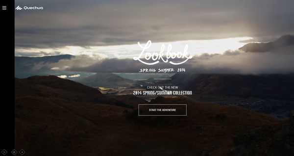
The website welcomes users with an incredible, dynamic, full of energy and positive landing page. There is a fantastic video-based cinemagraph-style background that depicts natural motives, an excellent mix of smooth and casual typography, ghost-style CTA button and an advanced non-static slide out menu. So, literally every detail here is a la mode.
You can easily distinguish 2 main sections. First one is some kind of a welcome section that unobtrusively and subliminally conveys a proper atmosphere with its short video. The stylish half-tone effect, which is applied to the backdrop, helps to clearly highlight a compactly-arranged text block and graphics, making them a centerpiece. The sound effect also contributes to the theme, effectively improving the general feeling in a place.
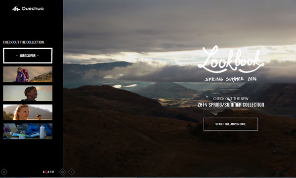
The second logical division is a slide out menu that magnetizes you through its dynamic photo-based items with a lovely 3d-dimension feeling. Though it leverages black as a core color, it actually allows the navigation to match the tone of the website, and at the same time, offer an optimal contrast for foreground elements.
On the whole, the hero area has a sophisticated and subtle appearance that is composed from tiny details starting from color scheme and ending up with small pleasant animations.
Details
Here, I want to fix your attention to some minor but important details. As all we know, the great impression is obtained from a combo of tiny well-elaborated pieces, and in this case the designers did not miss this moment. On the footer you will find 3 miniature buttons that serve as tools for allowing users to share data via social media, to turn off sounds and to set up resolution of video stream. The latter is responsible for making your presence on the website more delightful, since you can choose a quality of multimedia, and this is really nice. Moreover, all the graphics are made in a refined nifty contour style that adds extra flair.
Summarizing everything said above, you can definitely tell that the “cover of this eStore” carrying out its main purpose excellently; it effectively engages users into the website and exerts a powerful effect on the online audience.
And that’s not all, let’s enter the site and find out what it hides.
Delve into the website
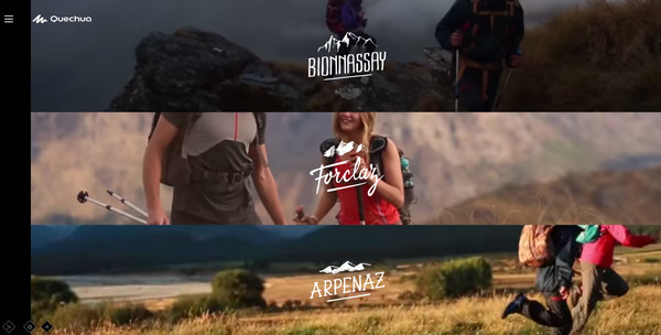
The website itself is a classy digital lookbook that walks you through spring/summer 2014 collection in a really awe-inspiring, unique and pleasant manner. As the slogan implies, it is really some kind of a little and wonderful unexpected undertaking. It is superb combination of visual effects, adventure vibe and clothes pieces that you can buy right away.
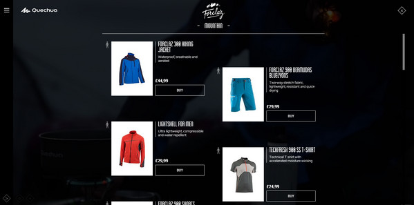
After you have entered the site you stumble upon a crisp video-based menu that gives you visual hints about 3 main categories. Each section includes a short spirited video that is linked to one of the circuit recap trips in New Zealand. If you find one of them appropriate for your next journey then you can explore the associated collection. The clothes are presented in action, so you can witness its beauty firsthand. The product page has an aesthetic formatting and based on a pleasant contrast. The refined line-style elements as well as sharp typography set the design off. This is a truly awesome solution that draws you in and unobtrusively foists goods.
Conclusion
Though actually you can’t make purchases directly, the button redirects you to the official website that includes the whole range of its top-class items, yet it is a really great solution for attracting people and encouraging them to buy your products. Making the most of modern styles and techniques is really beneficial. The eStore, which does not look at all like a standard ecommerce project will definitely stand out from the crowd. It relies on an excellent, well-though-out and scrupulous blend of various trendy elements such as video-based elements, sound background, modern line-style graphics, and pleasant dynamic effects and others that naturally establishes a harmonious rigid and even a bit juicy user experience and creates an enjoyable place.
So why not to enlighten your online shop with bold jaunty stylish elements, letting it meet current web trends.



 12 Web Design Trends to Look for in 2018
  Top 15 Material Design Themes
Astralis Sep 9, 2014, 7:13 pm
“Enter the site to find out what it hides.”
That’s the problem with this design and the worst thing you want to do in ecommerce is to hide your products.